Sunday, February 28, 2010

gina made me do it :)

i was planning a few crafty things yesterday, but in the end, i spent most of the afternoon writing a list of 100 things i love, and then turning it into a digital page. see, it was this way: gina made an amazing LO for this challenge at the digichick. i found both the idea (list 100 things you love right now...trying hard to be both specific and creative) and gina's take on it to be completely awesome, so of course i had to make one, as well. and since the challenge ends monday night, it was sort of "now or never"!

(~digital materials~ background paper and epoxy heart: "cherry sugar sunshine" kit, girl friday, digichick; bird and glitter sparkles: "my drama queen" kit, vinnie pearce, pixel canvas; frame: inverted hipster plume frames #1: anna aspnes, designer digitals; fonts: xenophone, 2 peas goofball, cry kitty & hurricane...all downloaded free from t'internet; software: broderbund printshop)

you may recognize the digital paper from yesterday's BG/2S4Y card. considering the theme, i decided that i should only use products i especially love to enhance my list! that paper, the mix of font styles, the color pink, and the grungy, flourishy frame are big on my hit parade right now, as is that divine bird! i'm quite happy with the way this turned out, actually...i think i am going to print it out and paste it into my art journal!

so what are some things
*YOU* love right now?
tell, tell!
better yet: make your own list...or journal page...or layout...and put a link in the comments!!!
♥♥♥


in case the photo isn't clickable...here's the text, just slightly bigger:

♥ 1. bacon 2. paul weller 3. bluebirds flitting through my yard 4. monsta tea towels 5. indian food/movies/music 6. shah rukh khan 7. henna tattoos 8. golden age mysteries 9. crispy fries 10. funnel cakes & fireworks at the fair 11. the beach 12. collecting shells 13. ice cream sandwiches 14. fried clams 15. sand pipers and pelicans 16. john sayles 17. russell t. davies 18. the bond films 19. doctor who 20. graphic novels 21. funky travelogues 22. art documentaries 23. andy goldsworthy 24. sophie calle 25. billy collins 26. ellsworth kelly 27. dina wakley 28. gina cunningham 29. watercolors 30. spraying ink on anything 31. vintage collage goodies 32. text incorporated into art 33. sheet music 34. mom mom's sewing machine 35. manual typewriter 36. i-pod...on shuffle 37. on-demand internet 38. nyc 39. art museums 40. tiny museums devoted to pez or lightbulbs 41. factory tours 42. a big box of crayolas and a niece to color with 43. addictive tv shows on dvd 44. dim sum 45. maps or newspaper as giftwrap 46. tiffany glass 47. the pre-raphaelites 48. jane austen 49. bryan ferry 50. riding bikes on the towpath 51. walking outdoors 52. chicken fried steak 53. "amelie" 54 bling & staples...together 55. ATC's 56. the coen brothers 57. art blogs 58. art books 59. art journaling (the magazine) 60. art journaling (the activity) 61. the butterscotch pudding at rosemont cafe 62. the valrhona hot chocolate at the new leaf cafe 63. rhonna farrer flourishes 64. technique videos on youtube 65. rummage & garage sales 66. lolcats 67. "overheard in ny" 68. rhino cd sets 69. amigurumi 70. playing dolls with the nieces 71. being read to by the nieces!!! 72. crossword puzzles 73. jigsaw puzzles 74. hello kitty 75. soma pj's 76. t-shirt sheets 77. buddha lounge 78. breakfast for dinner 79. "the big sleep" 80. "the maltese falcon" 81. the ramones 82. distressing corrugated cardboard 83. paper or fabric or paintings with clouds 84. paul matthews 85. the ocean 86. frozen mangos 87. pam garrison 88. edward gorey 89. justine hardy 90. fred astaire movies 91. roasted fruit 92. "art 21" 93. a perfect pair of scissors 94. dryline glue 95. the act of hand-sewing 96. any shade of pink 97. glitter nail polish 98. a foot rub 99. happy mail 100. the perfect cup of morning coffee ♥

Saturday, February 27, 2010

gotta love a card that multi-tasks!

eta sunday morning: holy moly--i made the FAB FIVE at 2sketches4you! many thanks to laura and the gang! color me a happy, HAPPY girl!

at the beginning of the week, i will often see 4 or 5 challenges i like the looks of, and grandly plan a card for each! by the end of the week, if i can make a couple of cards...or perhaps just ONE card that combines a couple of challenges, i am quite happy. it's called "real life", and i'm a fan! :)

so this time i've taken the basic grey color challenge...


...combined it with laura's sketch #46 at 2S4Y...


and this is what i came up with:

(patterned paper: basic grey + a couple of digi-papers printed on kodak photo paper: the oval is cut from girl friday's "cherry sugar sunshine" kit (digickick) and the rectangle is rhonna farrer's "french ooh la la" kit (house of 3); border sticker & (re-colored) rub-ons: basic grey; ghost butterfly: heidi swapp; chipboard word: ek success; heart stickers: sandylion; (re-colored) pearls: kaiser; inks: colorbox; pens: copic; adhesives: tombow mono runner & 3m foam tape)

obviously i had NO TROUBLE incorporating pink & maroon... (try STOPPING me, lately!) ...or in using several basic grey products! lemon yellow was much more of a stretch for me, but i *think* i did ok. with regard to the sketch, i've rotated it 90 degrees, and compressed it quite a bit, but i'm pretty sure you can still see the "bones" of it. (at least i hope you can!)

my favorite part of this card is a technique i haven't used for a while--i love to take a clear ghost shape and cover it with rub-ons! BG's floral paisleys are a big fave for this, being the perfect scale & easily trimmed to fill in small spaces. not having any yellow rub-ons, i used white; but i thought they looked a bit stark on the card. and then i had my BIG IDEA: what would happen if i verrrrrrrrrry lightly applied some yellow chalk ink? my prediction was that the color would stick to the rub-ons and wipe right off the acrylic...which is exactly what happened!


of course then the white *pearls* looked a bit funky, and chalk ink was no help at all, there...so i copic-ed those babies into lemony submission and called it a night!

Thursday, February 25, 2010

heart the art: week 8 (feel like)

did you ever start out with great inspiration, a favorite technique, awesome ingredients, and still wind up with a finished product you didn't really like?

in my case, i had the terrific heart the art prompt #8, a selection of spray inks and stamps, two entirely fabulous gauche alchemy color kits AND i even knew exactly what i wanted to say.

and i still don't really like the finished page.

(materials: gauche alchemy color kits in pink and red; vintage sheet music and japanese text paper sprayed with glimmer mist and smoosh spritz; heidi swapp floral stamped and painted with gesso; stampin' up distressed edge stamp; staz-on inks; stick-on velcro dots; copic outliner)

the prompt was FEEL LIKE. i wrote about the fact that lately i feel like i am on the verge of something really interesting creatively. and actually, i do believe this page reflects the fact that i've gotten braver, i'm less concerned about making "mistakes" and a lot more interested in process than results. if the price of that is posting a page that didn't entirely gel in the way i hoped, well heck, i guess i'll pay it, and gladly!


on the plus side, i do looooooove the (detachable!) flower, and the bold splashes of color, and the swirl of vintage beads and sequins. on the down side, i wish there was more (or SOME!) white space...the focal image is in the wrong place...and there's just all together too much going on here.

having said all that, i had ♥FUN♥ making this; which afterall, is the main thing. and guess what? on saturday morning, gina will post a brand new prompt and i'll get another chance to do what i love!

can i get a "woohoo"?!

Tuesday, February 23, 2010

sketchy and circley* and a bit zen-ish

having now done several of heidi's "second chance" sketches at sketchy thursdays, i'm very excited to finally complete one of diana's "first chance"...aka regular thursday sketches! here's the sketch:

i made a card; i don't really "do" layouts, as such, though i loooooove seeing other people's...and the ST team's are particularly cool for this sketch!


(glossy white cardstock: ranger; matte white cardstock & ink jet transparency: staples; patterned circles created digitally using anna aspnes' floral art brushes (designer digitals) layered on top of roben-marie smith's bennet's hammock paper (digichick); spray inks: glimmer mist, smoosh spritz & diluted grumbacher watercolor paint; florals: heidi swapp, prima, making memories, michaels; sequins: queen&co; rub-ons: making memories; inks: colorbox; adhesives: tombow mono runner, vellum gluedots, 3m foam tape; other: dymo labels, sewing machine, chinese text paper)

you can see i've used the results of one of my spray ink experiments as a background; i love how it turned out, it's actually a mixture of spray inks and sprayed water color, with judicious dripping, blotting, and blending of both! i've used some transparencies i printed out from various digi-brush experiements, as well; one is layered over chinese text paper, the other combined with a heidi swapp ghost clock. as for the rest, i've layered loads of different silk & paper florals, some fun sequins & gems, and the cool "typewriter key" exclamation point from a pack of decorative paperclips leah & i snapped up in staples' clearance aisle. fun, fun, fun!

*is "circley" a word? hmmmm... possibly not, but go with me, ok?! (it's definitely better than "zen-ish" anyway!)

Monday, February 22, 2010

playin' with: SPRAY INKS!

yes, i've been in mad scientist mode again. it's heidi swapp's fault. she made this video about glimmer mists, which pretty much forced me into spending a full morning playing with all of my spray inks, various masks and some stamps. i even unearthed the brayer i have had for 12 years and only used twice. it's a bit ink-stained now. my kitchen sink was a bit inked stained for a while, as well, but it was worth the effort of scrubbing it clean!

some conclusions from my essperiments:

1. glimmer mist is the sparkliest of the spray inks; followed by maya mist--which soaks in and dries the fastest; smoosh spritz is the least sparkly but has the most intense color. glimmer mist also blends the best, particularly with other glimmer mist shades.

2. diluted watercolor paint (the kind that comes in a tube) gives GREAT color and coverage...but dries much, MUCH slower than spray inks do.

3. diluted gesso makes an AWESOME spray of white dots...but will very easily clog your sprayer. (very easily!) (no seriously, VERY easily indeed. i cannot emphasize this enough!)

4. tim holtz & heidi swapp masks give a much crisper look than tattered angels' glimmer screens...but the wet glimmer screens can be flipped over onto another piece of paper and used as a "stamp" to very cool effect. lace is quite nice as as a mask, also; the more open the pattern the better it works.

5. brayering over a paper towel to blot & blend inks (like heidi does in the vid) leaves a very faint texture...but in a good way! the same goes for lace, or anything else with a texture.

6. none of the "color swatches" on the ink bottles are remotely accurate... (hence the test cards i made, above) ...which is why the smoosh brand's clear bottle is quite cool.

7. two ounce bottles do not last nearly as long as you think they will, unless you really turn out to dislike the color, in which case they are eternal!

this concludes my conclusions, but i welcome any and all insights! do you have any great spray ink tips? leads on a fab tutorial? favorite brands/colors/masks? let's hear 'em!!! (& thanks!) ♥

Sunday, February 21, 2010

lovely prizes!

it was another great mail week in these parts! i received my prize from the lovely ladies of sketchy thursdays, which was this gorgeous unity stamp set i can't wait to use!

i got my copy of randi feuerhelm-watts' completely awesome "wide open" art journaling set (this was a prize i actually awarded myself, in recognition of...ummmmmmm...extremely good internet shopping skills!) :)

my *TWO* utterly fab gauche alchemy color kits came (with many thanks again to the gals at the creative type!) and even the packaging on these was cool enough to need its own photo:

yeah--they're wrapped in a vintage pattern and tied with luscious lace! but trust me, they're equally cool unwrapped...see?!

oh and not to be outdone, lovely husband jeff received a very nice wristwatch as a gift from his employer, in celebration of his tenth year with the company. i don't have a pic because he's actually both at work and WEARING the watch at the moment, so you'll just have to take my word that it is--much like LHJ himself--stylish as well as practical! but here's the thing i wanted to show you; being a not inexpensive gift, the box in which the watch arrived was carefully sealed with special "tamper-proof tape". impressive that the shippers are so painstaking, eh?

it worked perfectly, too--i am happy to report that there was absolutely NO TAMPERING with the hinge of the box*!!! :)

*there was no tampering with any part of the box, for that matter; i just found this somewhat hilarious, while at the same time really hoping that this company is only responsible for securing watches and not nuclear power plants or airports or anything, lol! :)

Saturday, February 20, 2010

card conversion: digi to "real"

ok, so you may remember this digital card i made for missus trash's recent gala birthday festivities? well, it wasn't *just* a cyber-card. no, after i posted the digi version, i went back and printed and tinkered and layered...and then i mailed the 3-dimensional results to the diva in question!

before we get to the nitty-gritty i have a guilty confession to make: 99% of my digi-based hijinks take place in broderbund printshop, rather than photoshop. i do use photoshop for correcting & cropping pics, and SOMEDAY i will learn how to do blendable layers; (!!!) but when all i want to do is take existing digi-products and tweak, re-color, re-size and combine them, the system of layers in printshop is just a LOT easier and more intuitive; also, as soon as you want to add TEXT in photoshop, you are--imo--fighting the tide.... (granted, this is partially b/c i've used printshop for years; whereas i've been horribly lazy about learning photoshop properly!) ...so that's the way i do it right now!

anyway, on to the FUN PART! having composed the card digitally, the next thing is to think about is how to make it look nice in real life. which to me translates as, "how many (physical) layers and different textures can i add?"

first, the layers: in this case, the curtain is the perfect starting point, obviously it will make a fabulous layer all by itself, so i want to pull that element out and print it on its own, so it can be cut out and layered over the pretty background. thus, the background collage needs to extend BEHIND the curtain, 'cause you'll be able to see a bit of what's under there! (having done this before, i've already sized the background so that the "hidden bits" are still there & ready to be printed.) then, everything that's in front of the curtain in the collage can be cut out separately and popped up foam tape, for another layer of depth!

so now i'm ready to print, and it's going to need to be done in two batches. but first, let's think about paper: the curtain, background and birds are all going to look amazing on glossy photopaper...but for contrast, the ticket and the word slips really ought to be on plain paper. so now we have *3* print batches...but since printshop will let me move and regroup everything quite easily, i needn't duplicate anything unnecessarily--so i'm not wasting ink--and i can slip a few extra elements onto the bits of un-used photopaper--so i'm not wasting blank space there.


after everything is printed, but before it's cut out, is a great time to think about texture. that gorgeous curtain has absolutely beautiful depth and detail in its shadows and folds...wouldn't it be great to emphasize that with machine stitching and a bit of ink? the slightly surreal "night sky" background has layers of stars and twinkly "glitter" bits i've added digitally...but there's no reason not to use that as my guide to place a bit of actual glitter, and a few teeny gems, is there? the birds also have glittery bits, as well as tiny flower accents...some stickles and tiny primas adorned with mini-bling will enhance those perfectly.


since the collage is roughly 8x8" i've decided to mount it on a corrugated cardboard "tile" instead of a regular hinged card. i've distressed the cardboard by pulling off bits of the top layer of kraft paper and brushing the surface randomly with some clear glitter paint. i've inked the edges of all my fussy-cut elements, i've machine-stitched, and i've glued on bits of actual ribbon where the curtains are tied back. i had intended to keep the"night sky" background flat, but having printed a few extra clouds i couldn't resist testing them out as an additional layer, and they looked quite fab, so i've stuck them on with foam tape. the curtains have foam tape on their inner edge, but are stuck flat to the outer edge of the cardboard, to enhance the feeling of a window.

all that's left is to add the finishing touches: real ribbon in swirls (tacked with gluedots) being carried by the birds, the printed ticket adorned with an epoxy heart from my stash, and it couldn't possibly hurt to add a few dimensional flowers (with hot glue) and adhesive gems, now could it?!


et VOILA! it's ready to be padded with tissue paper and added to the box of presents!


~materials~ digi-stuffs: curtain, birds, ticket, hearts, ribbon, pink sparklees: my drama queen kit by vinnie pearce, pixel canvas; background paper, clouds, journaling strips: bennett's hammock kit by roben-marie smith, digichick; fonts: typewriter from 286 & hurricane, dafont; software: broderbund printshop; scrappy-stuffs: sm. flowers & gems: prima; lg. flowers & ribbon: michaels; gems: mambi; epoxy hearts: recollections; glitter paint: folk art; glitter glue: michaels & stickles; tiny nail art gems from the lovely terrie bailey; inks: colorbox & ranger; adhesives: tombow monorunner, 3m foam tape, gluedots, low-temp hot glue gun; other: cardboard cut from a box, sewing machine)

Friday, February 19, 2010

2S4Y...2♥'s...2gether

it's always a good week if i can get over to 2S4Y, grab the gorgeous sketch...like, say...this one here (kazan's 46):


and make a card...like, say...this one here (in which i have rotated & slightly skewed the sketch):

(patterened paper: prima, basic grey, love elsie; chipboard word: ek success; swirly heart: fancy pants (other heart traced from a heidi swapp chipboard); pen: copic outliner; ink: colorbox; adhesives: tombow mono runner, 3m foam tape, sewing machine)

and if i can swing all of that before the deadline... (admittedly it's JUST before the deadline, but it still COUNTS, ok?!) ...so much the better! so yeah, i'd have to say this was a good week!

♥♥♥♥♥


ps to folk who've been reading all week: this is the LAST card from the "riley pile"...i MADE MYSELF put every single thing away immediately after it was finished, for fear i would never again make ANYTHING that was not in these colors/patterns! (sorry leah, i didn't see your challenge beforehand, or i would've done it!!!) :)

Thursday, February 18, 2010

friday sketchers!

i've made it in just under the wire, about which i am very happy, because i love sketch #89! don't you?


just look at that neat diamond shape, with the oval nested inside it, and the strips along the sides that anchor it so beautifully. there are so many ways you could go with this, in pretty much any style you might choose. i went kind of shabby chic:

(patterned paper: prima, crafty secrets, sassafras, scenic route, basic grey, fancy pants; cardstock: core'dinations; bling circle and hibiscus ghost flower (used as a template): heidi swapp; chip circle: my mind's eye; cloth flower: maya road; ink: colorbox; adhesives: tombow mono runner, glue dots, 3m foam tape, sewing machine)

i've used more of the leftovers from the riley birthday set, actually. (yes, they were all still sitting in a pile, i am seriously sloth-based this week; i blame the snow!) lately i am obsessed with red, blue, pink and kraft; i'm not sure why, but at the moment a LOT of color looks really good to me! (ok, EVERYTHING outside my window is white, brown or grey...so again...i think i'm gonna blame the snow!) i went with loads of muted pattern, tons of flowery goodness, a little bling, a bit of stitching and ~WOOHOO~ another card ready for the postman!

Wednesday, February 17, 2010

oh yeah, there was a tag, too

dangling from the back of riley's giftbag...because i suddenly realized i didn't have anywhere to write a personal greeting and sign our names!

(tag: heidi grace; patterned paper: prima, scenic route, love elsie; diecut border: sassafras; happy day tag: cosmo cricket; lace paper: ki; chip & bling hearts + bling flourish: mambi; flowers: prima; pearls: kaiser; brad: doodlebug)

luckily all the stuff i used was still sitting in a pile, waiting to be put away. for those of you who'd enjoy a (SCARY!) little glimpse into my "process"...here is a photo of the ingredients i used for the riley giftset of banner, bag, and tag:


ok, so obviously, these are the leftovers...and it was admittedly a fairly elaborate project, but i am sorry to tell you that it's not particularly unusual for me to "pull" this much stuff at the start of something new. since i don't have a dedicated workspace, i like to start by getting everything out which might fit my theme--otherwise i'd spend half my time running back and forth between the dining room (where most of the crafty stuff lives) and the living room (where i generally set up my card table in front of the telly).

in the picture you see the entire photo file which houses my diecuts and pre-cut shapes, (flowers, hearts, birds, etc--there are some baggies to the right which live in this file) the bling drawer which sat next to me for the entire project, (and now has a few less packets in it!) a stack of patterned paper, (of which i really only used 5 or 6 types, but again, i like to pull ALL the options in my color scheme; it saves me shuffling thru paper files multiple times) and then there are packs of stickers & diecuts, a box of miscellaneous chipboard tags & assorted flowers, gluedots & decorative scissors...a little bit of EVERYTHING, really!

so how do YOU work? are you a "get it all out and play with it" type, as well? or do you compose in your head, and only access selected items you know you'll use? tell, tell!

Tuesday, February 16, 2010

heart the art: week 7 (never)

woohoo!!! i've made...and i'm posting...my heart the art page at the beginning of the week!!! i am a proud & happy art journaler today! :)

ok, so this week's prompt was "NEVER" and appropriately enough, i did two things for this page i have never done before: #1 i decided what i wanted to make--an indian-themed collage--before i knew what the page would be about; and #2 i googled the words "never" and "quote" to see if i could come up with something around which to base such a collage. the really weird thing is, one of the very first returned answers was a quote of the buddha's which completely enthralled me!

at that point, i did something i almost ALWAYS do: allowed the page i thought i was going to make to morph into something else entirely! yeah. i started out making a complicated, colorful and mannnnnny layered magazine collage...and when i had very nearly everything ready to be glued down, i suddenly stripped away 90% of it and went with just a few images on a plain black background. go figure! i really like how it turned out, though.


(glossy black cardstock: ranger: labels: dymo; sunflower diecut: colorbok; embossed decoupage butterfly: micahels; buddha image cut from a museum brochure; swirly yellow circles cut from a magazine; adhesives: uhu gluestick, 3m foam tape)

text reads, "the whole secret of existence is to have no fear. never fear what will become of you; depend on no one. only the moment you reject all help are you freed."

everything you see here was in the "original" collage, in fact the first three things i chose were the little buddha, the sunflower and that swirly yellow motif. i layered those on some text from a hindi newspaper, there were lots more circle and swirl-based images, and the quote was typed on a little piece of patterned paper that was affixed to the back of the sunflower--which was going to be detachable, in that version.

then at some point i caught sight of my dymo labeller, and it occurred to me how entirely COOL it'd look to have the dymo-ed quote on a background of plain glossy black. of course, it took AGES to punch the whole thing out, and then it was far too big to fit on a 4x6" page and put anything else on there! ...UNTIL...i decided to trim the label strips down, very close to the words. then it fit with room to spare, but obviously the background bits of the collage had to be discarded to make the new idea work. and suddenly i was right back to my three originally selected bits--full circle, if you like! ♥

btw, there is a rather fab flickr group that host all of our heart the art pages...if you have a few minutes to spare, i highly recommend checking it out!

Monday, February 15, 2010

happy mail...times *TWO*!

have i mentioned lately that i am the *LUCKIEST* so-and-so in the blogosphere?! well, it bears repeating, especially since on saturday, when i got out to my mailbox (go straight past the giant pile of snow, turn left at the GIANT pile of snow, it's right next to the *giiiiiant* pile of snow!) i found not one but TWO fabulous packages awaiting me!

my lovely norwegian friend linda and i decided a couple of weeks ago to swap cards, but i certainly never expected to receive a custom-made, especially-for-me, totally LAURENY funky robot masterpiece!!!

how flippin' adorable is that thing?! i LOVE it!!! but wait, you haven't seen the back yet:

could it even GET any better than that?! yeah, i didn't think so either...until i opened it!!!


it's a fabulous, beautifully constructed gift folder with two pockets inside, and the pockets are stuffed with a brilliant assortment of perfectly chosen goodies: there's a set of indian-themed basic grey clear stamps, adorable dimensional critter stickers, gorgeous cerulean blue ribbon, felt flower embellies, and my new favorite norwegian word: MELKESJOKOLADE!!! (that's the creamiest milk chocolate i've ever had in my life, in case you haven't guessed from the photo!) in short, miss linda has proven rather magnificently, that she is as lovely and thoughtful as she is creative and clever, and to her i say, most gratefully,

takk!
TAKK!
mange takk!!!
*****

as if that wouldn't be more than enough goodies for one girl on ANY given day, the very lovely cheryl nelson (whom i know you will all miss at 2S4Y as much as i will now that her DT term is over--waaaahhhh!!!) celebrated her very first blogiversary and 100th post recently. being an amazingly generous & giving woman, she made donations in honor of all the comments from the post that marked her celebration! (how COOL is that?! seriously, i'm in awe of people like cheryl and missus trash, who have the most amazing altruism hard-wired into their very souls which lets them see--especially in the midst of a crisis--such immediate and practical ways to help others!!! these are WONDERFUL ladies i am privileged to call my friends!) anyway, cheryl and the ladies at her church used these funds to assemble incredibly useful hygiene kits (full of soap, washcloths, toothbrushes, toothpaste, etc) which are being sent to haiti in the wake of the earthquake; you can read about that very worthwhile project here!

in addition to all of THAT, cheryl also had a drawing for blog candy, and i won a rather luscious array of scrappy stuffs!

so once again allow me to dust off my large print hearts and say,

♥♥♥
thank you miss cheryl!
your beautiful creations are equalled only by your beautiful spirit!

Saturday, February 13, 2010

HTA week 6: "INVISIBLE"

it's saturday, or as i think of it now, HEART the ART day! gina has a brand new prompt for us over at tyggereye art, so of course you'll be wanting to check it out, but first...want to see my page from last week? the prompt was "INVISIBLE". i was kind of puzzled as to what i'd do for this one, but over the course of the week, i kept thinking--FOR SOME REASON, can't imagine WHY--how very much i dislike *SNOW*...and how very, VERY nice it'd be if all of ours would just suddenly disappear! sadly, it did not, but the very thought was enough to spark my idea for a page:

(snowy tree photo taken by me, out my window, on wednesday 2-10 in the midst of a major snow storm; photo printed at 50% tint on plain copier paper, and again at 100% tint on kodak photo paper--the latter formatted as the letters "S-N-O-W" in arial font; transparency: hambly; diamond dust cardstock: paper adventures; dimensional snowflake stickers: jolee's; pen: zig; ink: colorbox)

text reads, "high on the list of things i would make permanently & irrevocably invisible: SNOW (can't stand it!!!)"

*****

unfortunately, this is one of those times when a photo just cannot capture the actual page. i've printed my snow photo at two different intensities, on two different types of paper, and then layered the hand-cut letters OVER their corresponding spot on the photo, so that the rest of the snow & the tree seem to be fading away leaving just the text. (at least...that was my *intention*...and i am fairly happy with how it worked out!) i tore the background photo roughly to size & mounted it onto a transparency outlined in white to increase the "INVISIBLE" feeling, and finally i popped a piece of glittery grey paper behind this page in my book.

and now i really just cannot wait any longer, i have to go and see the new prompt...want to come with?! ♥

********************

eta later on saturday: having suddenly become a daily spam recipient, i've changed my settings to dis-allow anonymous comments; i do not think this will effect any of my lovely blogging friends since we are all "registered users" (the next setting up) but if you have a problem commenting, just shoot me an email, and i'll re-evaluate. (i heartily DO NOT want to turn on word-veri...sigh...does anyone actually get *TRAFFIC* from these clearly spurious links??!?!)

Friday, February 12, 2010

it's in the bag!

riley's banner, that is. it's in the coordinating giftbag i made specially!* see?!


this week i was planning to make both riley's complete gift and also a fun & artsy guy card using the current "second chance" sketch over at sketchy thursdays, but as the days wore on and large chunks of my time unexpectedly got hijacked by snow management duties, i realized i would have to choose one or the other, and i was a bit sad...until i realized i could *combine* the two!


of course my fancy/girly version kind of ignores the fun grungy/industrial aspect of heidi's awesome sketch; but on the other hand it also shows how you can adapt pretty much ANY scheme you really like to any type or style of project you need to make! (having said that, at some point i definitely want to revisit this in a more casual & funky way!)

here's a closeup of the decorated panel:

(patterned paper: prima, scenic route, love elsie, basic grey; cardstock: bazzill, staples; border strips: heidi grace, k&co; tickets: making memories; clipart bird: anahata katkin; chipboard word: ek success; rub-on: basic grey; heart stickers: snadylion; bling frame: heidi swapp; florals: prima; pearls: kaiser; adhesives: tombow mono runner, gluedots, 3m foam tape, sewing machine)

i used the scraps & leftovers from the banner project along with a bunch of bits that didn't quite make it into the main project--like those fun tickets, and the glossy clipart bird. unusually for me, i have stuck almost 100% literally to the sketch without flipping, stretching, rotating or otherwise inprovising!

the deadline for this particular sketch has been extended from midnight tonight to midnight NEXT friday...so why not have a go yourself?! details are *HERE* if you're interested!


*originally--as leah can tell you--there was going to be a box, rather than a bag. one of those cute kraft-paper hatboxes they sell at michaels for us to decorate. i planned the banner *VERY* carefully as to size and shape, in order to be sure it would fit in the box. before i really got going on the "decorating" part of the project, i dry-fit the 5 pennants, stacked together sideways, gently curled in, to MAKE ABSOLUTELY SURE they fit in the box. it was a triumph of engineering, and i was VERY PROUD of having--for once--taken the time to think and plan! unfortunately, i didn't allow for the fact that the layered, smothered-in-stuff, fully decorated pennants would no longer be capable of being gently curled...and thus...would definitely NOT fit in the box. sigh. but gift BAGS are nice too, dontcha think?! :)

Wednesday, February 10, 2010

it's a banner day!

no, i mean it is literally, "a day with a banner in it". a banner made specially for niece riley's 8th birthday, coming up on sunday.* this banner, actually:

i was inspired by this gorgeous name banner i recently saw in luciane folch's SiS portfolio. i loved the bright colors, the eclectic mix of papers & elements, and OF COURSE the super-abundance of embellishments! :) i knew immediately that i wanted to do a slightly sparklier and more pink-n-red version...without getting tooooooo overtly valentine-ish; and i think i walked that line pretty effectively.

since it's hard to get blogger to display a seriously rectangular photo at anything larger than miniscule, and since there is approximately half a pound of fabulousness on each panel, howsabout a closeup of each letter?

(patterned paper: love elsie, w/scraps of making memories, dcwv, prima, core'dinations & origami paper; castle sticker: sandylion; word sticker: heidi grace; ticket: making memories; bling crown: mambi)

this is the only letter by which i am *slightly* frustrated: i reallllly wish the princess castle sticker was more visible...or that the bling crown was located an inch to the left. but that baby is stuck on there, i tell ya, and there's NO moving it without starting over, so i'm living with it! (on the plus side, it's nice to know this thing is sturdily made, right?!)

(patterned paper: prima, w/scraps of scenic route, frances meyer & basic grey; chipboard diecuts: sassafras; chipboard word: ek success; brad: doodlebug; bling heart: michaels)

i've had the adorable chipboard bunny and clouds for AGES...i've often thought they'd be "just right" for this or that, and i'd get them out...and then they didn't quite work somehow...until NOW, that is!!! :)

(patterned paper: prima & basic grey: bling word: mambi; flair button: ek success; velvet leaves: k&co; leaf ribbon: may arts; cardstock tab: sei; label: dymo)

everything you see in this project that is fussy-cut or die-cut was actually a leftover from something else: i nearly *always* cut too much and then i throw the leftovers into a snack-sized plastic bags, sorted by type in a small photo-organizer. when i need hearts or birds or butterflies...or gorgeous basic grey roses...chances are there are one or two lurkin' about just waiting for their shot at the bigtime!

(patterned paper & hydrangeas: prima; additional flowers: michaels; chipboard flourish: maya road (topped w/text from a russian book); pearls: kaiser; bling word & dimensional chipboard heart sticker: mambi; stick pins: joann essentials)

here's a lesson in economics for you: two of the shades of hydrangeas on this panel are fancy schmancy primas which come 20 to a $4 pkg at the lss; one shade is the pulled-apart single blossoms from a michaels' silk flower stem, where you get nearly 100 for $4. can you spot which is which? thought not. (nor can i!) ;)


(patterned paper: pink paislee + scraps of creative imaginations, doodlebug, making memories, provocraft, basic grey & japanese text paper; diecut border: k&co; butterfly punches: ek success & martha stewart; butterfly die: quickutz; bling: heidi swapp)

and finally, we reach the "Y" which marks the end of the banner!

for those of you interested in the engineering of such things: the individual panels were made of tan bazzill cardstock triangles measuring 5 x 7" which i inked & xyroned onto white cardstock, then trimmed with scallop-edged scissors. the "inner" panels of patterned paper are approximately 4.5 x 6.5" and were lightly inked, tacked with a teeny line of tombow runner, and then sewn on top. the large pink sparkly chipboard letters are from making memories a year or so ago. like most of the other embellies they were stuck on with a combination of gluedots and foam tape. the slightly fuzzy beaded ribbon from michael's--disappointingly difficult to tie as a bow on gift-wrapped packages--proved by its very stiffness to be the PERFECT THING on which to suspend a banner! the finished length is just over a yard, allowing for a bit of swag in the center and dangly ends.

if you have any questions about specific products or methods feel free to ask via email or in the comments and i will do my best to answer!


*yes, she was born on valentine's day, 2002; and is, appropriately enough, one of the sweetest and most loving girls you could ever hope to meet! i hope she will love receiving this as much as i enjoyed making it, and that this will be her best birthday yet!!! ♥♥♥

Tuesday, February 9, 2010

it's going to snow...AGAIN...

tonight. and whereas our part of new jersey has got off comparatively lightly in the last two rounds, it seems like this time we're in for it. so today i feel a bit like this:


anybody in the southern hemisphere in the mood for a house swap, effective immediately? anybody??

Sunday, February 7, 2010

heart the art week #5: THRIVE

this is one of the most fun things i have EVER made...and one of the most unexpected. at no point during this process did i really have a clear picture of what i was actually going to end up with. usually that would bug me, but i am determined to embrace the "process is more important than results" school of art journaling, and to that end i tried out an idea that my art journal idol dina wakley apparently teaches in her classes: try to use TWENTY layers on a page. and i did it! well, sort of. ok, first lemme show you the page, it's for the year-long weekly challenge my *other* art journal idol, gina, is hosting on her blog tyggereye art.

(materials: 4x6" piece of thin chipboard; illustration from a vintage book; scraps of hambly transparency, corrugated cardboard, japanese text paper & vintage sheet music; plain muslin sprayed with glimmer mist, maya mist & smoosh spritz; leaf ribbon by may arts; pink glitter glue, silk flowers & leaves from michaels; brenda walton alphabet stamps; stampin' up distressed edge stamp; silver glitter thickers; vintage button; dmc embroidery floss; uniball & micron pigma pens; inks by ranger, colorbox & staz-on; watercolor & acrylic paints; gesso; masking tape, staples, sewing machine & gluedots)

ok, so now onto the twenty layers: i think it depends on how we calculate them. it was smooth sailing at the beginning: cardboard base, gesso, watercolor, stamping, an illustration from a vintage book, the masking tape i used to cover the bit of illustration which didn't fit my theme, the distress inks which camoflauged the tape, the ribbon "vines" i've sewed over bits of the illustration, and so forth.

towards the middle it gets fuzzier: i made flowers out of a piece of fabric on which i had spray-inked & stamped...is that 1 layer or 3?? i figure all the little bits of paper that highlight my journaling count fair & square as a layer each, but how about the staples? and what of the *ONE* cool vintage heart-shaped button i attached at the end? it adds loads of impact, imo--but does it constitute a layer??


in the end, i don't particularly care whether that aspect of the page was successful or not...and i have a really strong suspicion i'm not meant to. i think the point of the exercise is to push yourself, step outside of your comfort zone, and stop worrying if one last layer is going to "wreck" your page; in which case: MISSION ACCOMPLISHED! :)

Saturday, February 6, 2010

welcome to *MONSTA*piece theatre


how funny & adorable is that MONSTA?! i fell in love with him (or her?) at christmas time when designer digitals was having discounts every day, he's from a set of digital stamps by jesse edwards... (he has brothers too--or perhaps sisters? it's hard to tell!) ...i digitally paper pieced him and added some birthday greetings in random bursts at various font sizes to participate in prompt #25 at the creative type, which is to incorporate type in your embellishments. (i've incorporated some of my type CORPOREALLY...do i get extra points for that??!)

i also used kazan's sketch #45


but i will forgive you for not believing me, since it is quite clearly round. i was completely inspired by the sketch, however; that's what made me cut out around the funky pointy shape instead of making a plain old rectangular card! i printed the monsta's body & cupcake base on photo paper, the mouth, teeth, eyes & cupcake icing on plain index stock and the background shape (with more bursts of text) on some grungy acid green paper, then cut everything out and popped the different layers on foam tape for added dimension. i'm pretty sure the birthday dude will not receive two of *THESE*!!! ♥


(finished card measures 8.5 x 8". digital materials: monstrous stamps by jesse edwards & pop icon shape by katie pertiet, both from designer digitals; papers: bennett's hammock by roben-marie smith & cherry sugar sunshine by girl friday, both from digichick; city streets by gretchen thomas & notebook paperpack by katie pertiet, both from designer digitals; cupcake dingbat from pea delilah's doodle font; text fonts: cry kitty, saco de pao, broken 15... all from dafont; scrappy materials: cardstock: basic grey, prima, core'dinations & plain white from staples plus staples' glossy photo paper; epoxy sticker: ki memories; pen: zig; ink: versamark; adhesives: tombow mono runner & 3m foam tape)

Friday, February 5, 2010

talk about your happy mail!

the most darling miss stephanie, already a figure of some repute in the field, has surpassed herself this time...see?


exhibit a:
a gloriously shimmery pink-n-brown card smothered with bling AND the eiffel tower on it! (inside is a cool stamped message which reads, "let's be satellites! that's like valentines, but more far out!") exhibit b: the most divinely & entirely laureny set of perfectly-ATC-sized stamps i have ever seen in my entire life! (to the point where i actually think the clear art stamp company may be SPYING on me...but if these are the results, it seems churlish to object!*) i'd like to talk some more, but right now i really think i need an ink pad...

(thank you thank you thank you!!!)


*i figure if they come out with a set of daniel-craig-themed stamps in the spring, we'll know FOR SURE! :)

Thursday, February 4, 2010

missus trash is *THIRTY*??!

hard to believe, i know, particularly since she certainly doesn't look a day over 25 and 1/2! but she's announced that this week she is celebrating a birthday with a zero at the end, so i guess we're just going to have to believe her!*

there's a bit of a shindig for her saturday night in a certain hilltop town. lovely husband jeff and i unfortunately will not be able to make it in person... (our lear jet's on the blink AGAIN; also, "burn notice" is on) ...so i am posting this lovely digi version of the card i made for her. (there's a real one, as well, but i do not think it will arrive in time.**)


and now all that is left for me to do is to make a little toast in honor of my lovely friend:


happy

HAPPY

happpppeeeeeeeeee

birthday

missus t!

(& i hope you will enjoy your most creative year yet!!!)

♥♥♥♥♥♥♥♥♥♥


*i mean it's not like she could be FORTY, for pete's sake; or that i would announce it on my blog if she was, obiously. so let's just stick with 30, ok folks? thanks.

**i'm pretty sure of this, actually, since it's currently still sittin' on my desk. one glaring deficiency of the USPS is an utter failure to show up a week before one's friends' birthdays and hector one into finishing promptly so that they can deliver things ON TIME. they should really work on that!!

for those of you interested in digi-details, here are the ingredients from the card: curtain, birds, ticket, hearts, ribbon, pink sparklees: my drama queen kit by vinnie pearce, pixel canvas; background paper, clouds, journaling strips: bennett's hammock kit by roben-marie smith, digichick; fonts: typewriter from 286 & hurricane, dafont; software: broderbund printshop

Wednesday, February 3, 2010

usually, i am more like the puppeh on the right:


but THIS morning i woke up to discover the hybrid card with a million digi-layers, which i had such a blast making last week, won the neutral palette challenge at the creative type! and the prize is an absolutely luscious color kit from gauche alchemy that made me drool all over m'keyboard. so TODAY...i am very much like the puppeh on the left! :)

many MANY thanks to the fabulous creative type team: you guys, i am loving your site and i'm already thinking about embellishments with text on them for the *new* challenge!!!

~♥♥♥♥♥~

Tuesday, February 2, 2010

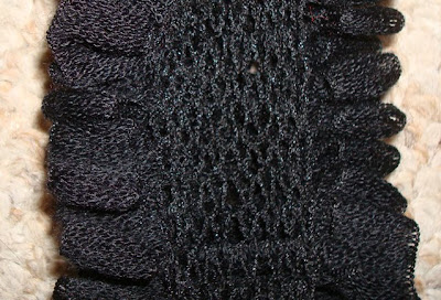
this would've been more impressive *BEFORE* the yarn bus, wouldn't it?

because in comparison, a hand-knitted scarf just isn't nearly as cool, is it?

even if it was made from a cool novelty yarn like trendsetter cha cha, that automatically makes these cool ruffles when you knit it up in stockinette stitch?

so that all you have to do is cast on eight stitches and in perhaps 10 days of intermittent knitting you're at the end of the skein and you've got this fun, ruffly thing that wants to curl in at the edges like stockinette always does...but for once...that makes it look even better!

yeah. it would've been more impressive if you hadn't seen the yarn bus first. that's all i'm sayin'! :)

♥♥♥♥♥♥♥

ps: i was very excited last night to learn i WON the fabulous ippity stamps at sketchy thursdays! even though it was a random drawing, i was especially proud to have won for this hybrid card that was SO MUCH fun to make! thanks, you guys!