Sunday, April 30, 2017

it's the last day of april?

seriously? how exactly did that happen so quickly?! ok, nope, i have no idea either, but i've got lots of neglected sketchbook goodness to catch up on, so i'm going to split it over today and tomorrow. today is entirely collage-related, the ones with titles were made as part of rae missgman's "artmarks thirty day challenge" which has taken place on instagram during the month of april.

"layered"
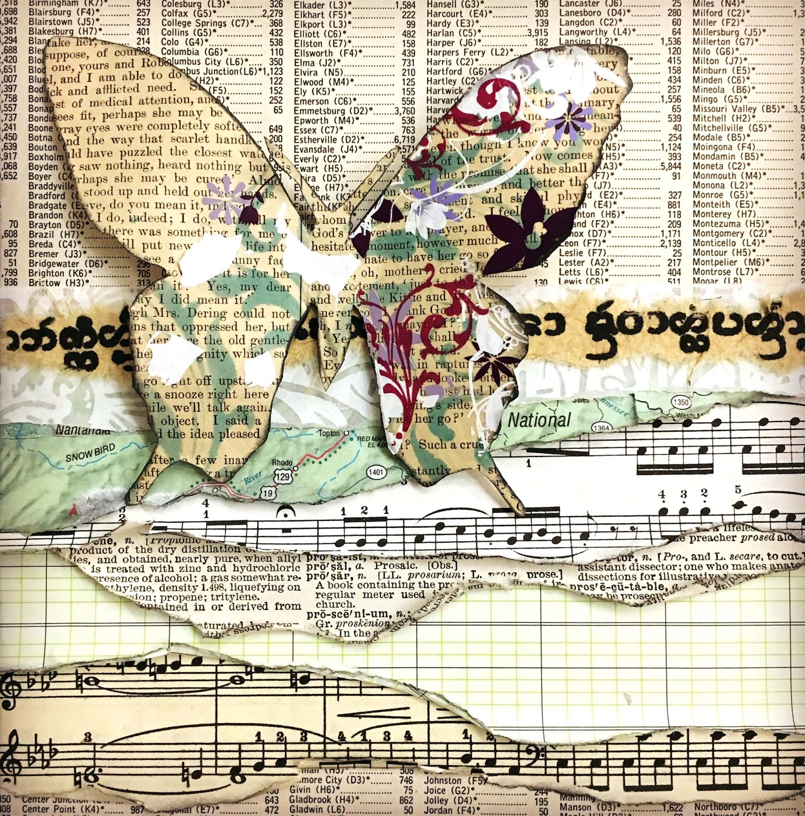
butterflies and torn layers of vintage paper are always a good idea. which is why i do it over and over. some day no doubt i will get bored of the effect. this was not that day.

(untitled)
sewing pattern ladies are an asset to any collage. fact. 

(untitled)
i have an instagram friend who takes amazing photographs of peeling poster walls. you know, the kind you find in cities? where layers and layers of old posters, flysheets, playbills, stickers, advertisements, etc, have just kind of built up over time and no one has even tried to remove the old ones before slapping up the next batch? they fascinate me every time, and whenever he's posted a particularly good one, i want to have another go at trying to make a collage that replicates the same aesthetic. this is my latest attempt.

"parallel"
...but then we're back to torn layers and vintage images!!! :)

"squared"
some of my collages pretty much make themselves, almost entirely serendipitously. this one evolved after i saw (in a pile of miscellaneous collage fodder) the torn edges of the tree (from a national geographic magazine, i think) sticking out from under the edge of the digital frame that i had printed out onto an inkjet transparency. 
(this is definitely a concept i will be revisiting; i like the idea of frames not necessarily being able to contain/constrain a whole image...)

"numerous"
back to the torn layers of paper, lol! this time with diecut chipboard numerals below and punched gelli print butterflies above.

Friday, April 28, 2017

"On the Twelfth Day of Christmas..."

"...my TRUE LOVE gave to me..." is the rather long title of this fortnight's theme at ♥JINGLE BELLES♥ but hang on for a second while i explain it, because there are some cool twists this time. first, let me tell you that the title and idea come from our lovely guest star, Lela Meinke,  whom we are thrilled to welcome back! but now let's consider the brief. this fortnight we'd like you to choose any of the following options:

Create a holiday card for your *TRUE LOVE* or for any extra-special person in your life 
OR... 
Create a holiday card with HEARTS on it 
OR... 
Create a holiday card that references any aspect of "The 12 Days of Xmas" that appeals to you

Here's a reminder of that dozen rather distinctive gifts!

 On the twelfth day of Christmas my true love sent to me: 
Twelve Drummers Drumming 
Eleven Pipers Piping 
Ten Lords a Leaping 
Nine Ladies Dancing 
Eight Maids a Milking 
Seven Swans a Swimming 
Six Geese a Laying 
Five Golden Rings 
Four Calling Birds 
Three French Hens 
Two Turtle Doves 
and a Partridge in a Pear Tree

so plenty of ideas there, eh?! i confess that i'd planned to stick firmly to option #2, when, during the recycling challenge, while flipping through my box of saved holiday cards, I came upon one that actually had all twelve of the items in question. well you just cannot fight serendipity like that, can you?? so here's my admittedly slightly cheater-feeling card:

"12 days" panel trimmed from an older store-bought card sent to us --or possibly to my mom-- in a previous year; patterned paper: october afternoon, echo park; heart brads: eyelet outlet; adhesives: elmers brand gluetape, 3m foam tape, sewing machine

since the panel was fairly large and already a bit busy, i only needed a sentiment, a couple of mats and yes... i couldn't resist a few eyelet outlet heart brads, lol... to complete the design. i used the current atlantic hearts sketch, though in the end, i elected not to tilt the central panel. i will completely understand if that disqualifies me, but i truly was inspired by the sketch AND i also wanted to thank them for the shout-out to my flourishy reindeer card from last week!


why not head on over to ♥JINGLE BELLES♥ and see lela's and stephanie's cards; then start planning your own bid for holiday card-making awesomeness!!!

Wednesday, April 26, 2017

Sweet As Candy!

Everyone knows that Eyelet Outlet makes (as the name implies, lol) eyelets; by now I'm pretty sure the secret of the awesome brads and washi tape are out, too! But today I'm on the Eyelet Outlet Blog with a card that celebrates the newest member of the Eyelet Outlet family, our super-fun Enamel Dots and Shapes! My inspiration is the fact that the round ones totally remind me of the brightly colored candies in the gumball machines that were on the counter of seemingly every store in my childhood.


There are so many shapes, colors and styles that I couldn't possibly show them all, but here are a few of my favorites in my own collection:


This time I went with classic round Enamel Dots since they look the most like gumballs! To make the machine, I printed out a piece of copyright-free clip art and used it to paper-piece the machine from cardstock and patterned paper. I filled my machine with all different sizes of gumballs, since that makes a design more dynamic. Plus, it filled the space better! ;) For the gumballs at the very bottom of the machine, I used my stout craft scissors to snip one edge flat, so that it would look more realistic.


For the background I made my own patterned paper by filling a 4x6" panel of white cardstock with neat strips of colorful Dot Washi Tape. I printed an appropriate computer-generated sentiment et voila! Would you care for a gumball?


I hope today will be an especially sweet day for you! If you need an extra treat, why not head over to the Eyelet Outlet Blog and see what my lovely DT sister Carri has made?! She has the post directly below mine! ♥

Tuesday, April 25, 2017

how have you BEAN?

this week's challenge at shopping our stash is a coffee lover's dream! because... you've guessed, haven't you? for "caffeine fix" we'd like to see coffee (or tea... or hot chocolate...) themed projects. of course my first thought was my favorite eyelet outlet coffee brads... and what's a coffee brad without a doughnut brad to go with it, eh??!


as always, my favorite part of an SOS card is the chance to pull out loads of scraps and older goodies and mix them all up together! how else would a colorful library card, older patterned papers and icons cut from newish journal cards all wind up together, eh? not to mention the paper i "made" by typing "HAPPY ANNIVERSARY" over and over (and over) on some lined paper.

but my favorite thing on this card *IS* still the coffee brad, though i confess that when i first attached the red brad to the pink heart, it kind of blended into the background a bit too much. this has happened to me a couple of times, and i always wish i could "ink the edges" of a brad and make it stand out a little more. well, this time, i decided to see if it was possible. and i'm pretty excited to tell you that running a black permanent marker verrrry carefully around the edges of a brad functions exactly like inked edges on paper! cool, no?!


meanwhile, there's lots more coffee-flavored goodness from the SOS design team... grab a cuppa, hop on over and be inspired!

Friday, April 21, 2017

rudolph the flourishy reindeer?

if a reindeer with a red nose caused a sensation, just imagine the reaction this guy would get at the north pole?! we are still rockin' the recycling for "peace on earth day" at ♥JINGLE BELLES♥ so i dug deep into my stash of xmas cards and other bits that were much too pretty to toss out!

recycled bits: green and red card base AND flourishy reindeer from (store bought) xmas cards we received last year; kraft colored reindeer "shadow" cut from a cereal box, ancient norwegian sheet music oval, scrap of shimmery tan wallpaper; wooden frame: michaels; florals: bazzill and petaloo; brad: october afternoon; ink: stewart superior india ink; adhesives: elmers brand gluetape, 3m foam tape, gluedots

in this case, i've used two different christmas cards: the flourishy one yielded the diecut reindeer, obviously, but would you believe that the green base card WITH the red strip was the front of a different card?


as soon as i saw this week's atlantic hearts sketch challenge (#208) i knew i was on to something!


when i first put this card together, i put the flourishy reindeer right on top of my gorgeously patina-ed norwegian sheet music (!!!) and even with strongly inked edges... you just couldn't see him. also, the flourishy paper was just a little too flimsy. so i grabbed a nice sturdy cereal box out of the recycling bin and cut a second backup reindeer that works as both reinforcement and a drop shadow. the only other recycled item is the tan strip of paper behind the frame, which is a scrap from a swatch of wallpaper and has kind of a mild shimmer effect irl.


stephanie has also made another amazing card to inspire you. why not hop over to ♥JINGLE BELLES♥ and check it out?! 

Wednesday, April 19, 2017

Flower Power!

Spring has officially sprung here in New Jersey, and I get excited by the new growth that is visible in my garden each day. I have more shrubs than flowers, so maybe that's why I tend to go a little "flower crazy" on my cards? That and the fact that there are sooooooo many bloomin' awesome flower-themed products in the Eyelet Outlet store! I've only used a few on these cards, but they're some of my favorites.


Bright Daisy Flower Brads are so fun and funky, I wanted to use them in a way that they could POP! I stamped a vine background and let the flowers grow right off the edge of the sentiment panel. Before I knew it, some Fresh Flowers had also sprung up, and they attracted a bunch of Mini Butterflies, as often happens.


Pairing the floral vines with one of my favorite friendship quotes, I wanted the word "friends" to really stand out. The Pink Floral Washi I used is sadly out of stock in the store just now, but many NEW tapes have just arrived! There's also lots of other varieties of Flower Tape. For that matter, this idea will work with absolutely ANY tape you like! Just adhere a few strips of washi neatly to scrap cardstock, burnish well, then diecut them like any other type of patterned paper. I love this technique, because it means that I can match the rest of the design perfectly... and I never, ever, run out of vowels, lol!


As much as I love tons of color, sometimes you need something a little calmer, right? The Bright Fresh Flowers also do a mellow vibe surprisingly well, don't you think?


Using a variety of sizes helps make any design more dynamic, so I threw in a couple of Mini Stitched Flower Brads as well. Finally I stamped --and typed-- another flower-related sentiment.


Whether your favorite spring pastime is gardening, card-making or something a bit more athletic, I hope you will get to do a little bit of it today. But first, why not check out what fabulous ideas my awesome DT sister Carri has to inspire you today on the Eyelet Outlet Blog?

Tuesday, April 18, 2017

everything's coming up ROSES!

therefore ♥ROSES♥ are what we want to see at shopping our stash this week! being a floral sort of girl, this was fairly easy for me and i had quite a few choices. so naturally i decided to go as deep into my stash as possible and grab some ancient rose-festooned cardstock diecuts. the age of these sort of suggests i should be slighly embarrassed... but no... what can i say? i still like these guys:


rose diecuts, label shape and a few of the paper strips: "madeline" collection by k and co; background paper: pink paislee; other patterned paper scraps: glitz design, prima, doodlebug, making memories, recollections, american crafts; pearl flourish and tiny flowers: prima; adhesives: elmers brand gluetape, 3m foam tape, sewing machine 

i'm also kind of  excited to have used loads of scraps for the background, as well. having found a photo in my inspiration folder of a scrapbook layout that used lots and lots (and lots!) of little strips of paper, all down the edge of the page, with a photo in the center as focal point, it made me wonder if that idea would work for a card? yep. it does! at least, i think so, anyway. :) i was also inspired by the awesome spring color palette on the simon says stamp wednesday challenge blog this week, though when i see the two photos together, i realize that my aqua is a lot softer than theirs is. ah well, i was still *INSPIRED* by the palette, which is lovely, see?

spring-inspiration-board

need more stash-centric ideas for rose-related projects? check out the gang at SOS, they are longing to inspire you right this minute, darlings! ♥

Friday, April 14, 2017

peace on EARTH DAY!

one of my favorite prompts of the  ♥JINGLE BELLES♥ year is the one that falls just before earth day, when we challenge ourselves (and our friends) to make holiday cards that re-use, re-purpose, re-cycle or up-cycle at least one element! this has led not to  just some of the most creative ideas we've seen, but also some of the most beautiful cards. plus, you know, i always have tons of old stuff i'm dying to use up, lol!


since nearly EVERYTHING on this card used to be something else, it might quicker for me to tell you what the new elements are: the tiny blue and white doilies that are matting the focal image and part of an eyelet outlet pearl bling flourish. yep, that's it. as for the rest? the cottage image was punched from one of the (store boughten) holiday cards we received in a previous year; the lace was a scrap from my mother's sewing room; the papers with images have come from several old xmas "ideals" magazines; the (cool, blue!) text paper came from an old falling-apart book i rescued; and the sheet music is... well, it's sheet music, lol... mostly from books that have pencil markings and "well done" stickers and things inside them.


to deploy all of this goodness, i used the current (rather fab!) layout from sketch saturday, though i did, admittedly, get rather carried away with my strips of paper at the bottom of the sketch, so i will completely understand if they feel i've strayed too far from the original. the sketch did totally inspire the design, however; for which i thank them!


speaking of thanks, i am lucky enough to have the nicest blogging partner and crafty buddy in the whole wide world! her name is stephanie, and if you don't know who i'm talking about, you need to hop over to ♥JINGLE BELLES♥ and check out what she's made this week. then start planning your own masterpiece and join the fun!

Wednesday, April 12, 2017

Let's Flamin-GO!!!

I suppose there must be people somewhere who dislike flamingos, but I (Lauren) have luckily never met them! And the new Eyelet Outlet Flamingo Brads are especially appealing, in my opinion! As it happens, I'm showing off a couple of Flamingo-centric projects today on the Eyelet Outlet Blog.


To show this handsome guy off to best advantage, I've chosen a palette of pinks, yellows and peach. This meant I could pull in some Sun and Cloud Brads, too; as well as a Heart Brad. With all that color in the little medallion shapes, I chose quite a neutral palette of text paper, with my favorite Leafy Coloring Book Washi Tape (left uncolored, however) and some Pearl Silver Swirl Bling.


This card was so much fun to make, I decided to use the leftovers to make an ATC, as well. I've used the same palette, and similar products, including another super-cute Flamingo Brad, obviously!


If flamingos aren't your thing, there's lots of other inspiration, every single day, on the Eyelet Outlet Blog. While you're there, why not scroll down and see what my design team sister, Carri, has to show you today, too? ♥

Tuesday, April 11, 2017

mama said knock you out (??!)

hey guys! it's l.l. cool j. tribute week at shopping our stash! ok, sorry, just kidding, lol! :) "mama said knock you out" really and truly *IS* the name of this week's challenge, though; but all we really want is for you to dust off some of your older punches and dies and use them on a project! easy, right?

various circle punches by fiskars and ek success, used on too many ancient scraps of patterned paper to possibly list, lol; hexagon punch: fiskars; "tag sale" alphabet dies: provocraft/cuttlebug; birthday die from a set of 3 by spellbinders; butterfly punch: martha stewart; background paper: basic grey, american crafts + a piece of a latitude chart from a falling apart old book; ink: colorbox; adhesives: elmers brand gluetape, 3m foam tape, sewing machine

i knew immediately i wanted to use the funky diecut chipboard letters i sell in my etsy shop, and that i would probably also get out at least one of the three or four birthday word dies i own but do not use often enough. i also wanted to use them on SCRAPS of paper to make it even more "stash-centric". but the real bonus was, just before i started working on this, i found a baggie FULL of assorted shapes that had been punched at various times, for different projects, and somehow never got used:


this seemed like an AWESOME time to thin out that particular herd, so i made two background panels.


card one used up most of the one inch hexagons. btw, here's the best "tip" anyone can give you for precise alignment of geometric shapes: if you use a background paper with a grid you don't have to measure!!! this particular patterned paper happens to be a literal grid of squares, but any small to medium print that's arranged evenly in lines will work.


my other card used up some (but not all) of the circles, in a much looser pattern:


this one was inspired by a sketchbook page i had-- quite coincidentally-- done earlier in the week, as part of an instagram inspiration challenge hosted by rae missigman, for which i combined the prompts "round" and "stacked". for this page, i used circles with more prominent flower patterns and funked it up a bit by outlining the flowers with a fine tipped pen. you can see that in the card version i omitted that step, so that the sentiment could be the focus of the design. (i'd bet you money that you WILL be seeing this idea again at some point, though!!!)


need a little more inspiration involving the clever use of punches and dies? my SOS dt darlings have lots and lots of it... go and see! ♥

Friday, April 7, 2017

i believe... in stephanie's sketch! :)

one of the best things about ♥JINGLE BELLES♥ being a fortnightly challenge is that we get to do *TWO* versions of everything... which is something i especially love when stephanie has drawn us a gorgeous sketch like this:


here's what i made this week:

stickers: doodlebug; candy cane and xmas tree brads: eyelet outlet; patterned paper: elle's studio, lawn fawn, basic grey; cardstock: core'dinations; adhesives: elmers brand gluetape, 3m foam tape, sewing machine

i've said it about a million times, but i'll probably just KEEP ON saying it: i loooooooove doodlebug designs, especially their christmas lines! nearly all the stickers on this card are from them, plus i've got a few festive paper scraps and a couple of adorable eyelet outlet brads. what else do you need, right?!


if you need a little more inspiration, the place to find it is ♥JINGLE BELLES♥ where stephanie has another card to show you and the readers' sketch gallery is pretty flippin' cool as well! ♥

Wednesday, April 5, 2017

Alien Brads: Out of This World!

Absolutely all of Eyelet Outlet's new Spring brads are awesome, in my opinion, but none are more fun than the Alien Brads, which are both adorable and otherworldly... so clearly I had to use them on a couple of different cards, which are on the Eyelet Outlet Blog today!


Scientists have recently confirmed that there *IS* life on Mars, but alas, there are no bakeries. So it turns out most of the UFO's sighted on this planet involved Little Green Men who have not enjoyed cake in far too long! 


I was happy to build these guys an appropriately-sized chocolate cupcake, then frost it with the help of two different sized cloud punches. I added a couple of Star Brads to make them feel at home. And obviously no cupcake is complete without a Cherry Brad on top!


One of my favorite ways to add a funky sentiment is with my trusty old-school label maker. In this case, I trimmed the labels down a bit, and affixed them kind of randomly, to fit the fun vibe of the card. I used another Alien Brad and the same set of supplies to create a sentiment inside, as well!


I often use funny quotes as inspiration for a card design, and I wish I could remember which comedian said, some years ago, that Area 51 didn't particularly worry him, but the thought of 50 OTHER such places made him a bit anxious! I typed the sentiment on clear labels which I affixed to a cloudy sky over a bit of patterned paper desert. Then I filled in the scene with another adorable Martian and a funky space ship made from paper, Glitter Silver Washi Tape and tiny 1/16" Mini Gold Brads.


Meanwhile, here in this galaxy, you may have noticed that we now have even more fun for you here on the Eyelet Outlet Blog... some days there will be more than one post per day, which means lots of great ideas to make your cards and projects out of this world! If you hop over to see the aliens, be sure to scroll down and see what Designer Carri (aka A Busy Bee) has to show you today, as well! ♥

Tuesday, April 4, 2017

tie one on!

for our first april challenge at shopping our stash, we'd like to see projects that feature a bit of ribbon, twine, cord, string, ric rac, yarn or... well, you get the idea, right? here's what i made:

(newish super-sale acquired) green patterned paper: recollections; pink paislee journal card from... 2014 or so? petaloo dogwood flowers and leaves from last year; ancient white vinyl thickers that i nearly threw out b/c i couldn't imagine using them plain... but now that i've stamped and grunged them up, they are MY FAVORITES, lol! pattern stamps on letters: hero arts damask, stampin' up typeface, glitz design music; pattern stamps on edges of journal card: stampin' up distressy fabric texture + cherry pie crackle stamp; inks: most of the various browns and tans of ranger distress ink; ranger black and brown archival (on the vinyl) as well as several shades of copic marker; "HAPPY" alphabet stickers are a couple of years old and were found at a thrift shop by a non-crafty friend who very excitedly and kindly bought them especially for me because, "maybe you could use them on cards?"! ♥ adhesives: elmers brand glue tape, gluedots, sewing machine

ok, yes, the smooshy, ruffley seambinding wound up getting a bit more covered up than i anticipated, but you can still see it (i hope, lol) and i assure you that it inspired quite a bit of this design! something else which inspired me is this fab sketch from the retro rubber challenge blog:


if you've ever played along at retro rubber, you'll know that one of their criteria is that participants must use at least one stamp that's more than a year old, AND mention/estimate the age of the stamp in question. which makes their challenge an awesome one to pair with shopping our stash, since we both value using our OLDER crafty items! in this case i've used three of my favorite pattern stamps to alter and embellish some plain, slightly shiny, white vinyl thickers that were the right font for my sentiment, but emphatically NOT the right style or vibe! the damask pattern is one of the very first hero arts cling stamps, circa... 2011 maybe? the sheet music stamp is part of a set of four or five 2x4" pattern stamps from glitz design that are not quite as old as that, but i definitely had them before we moved (2013) and i still use them quite often. the alphabet with the beautifully clear-but-tiny sans serif typeface is stampin' up stamp that i only acquired last august, but since i got it at the annual paper anthology papercrafting garage sale, i'm guessing it's at least a couple of years old. 


before i set about stamping the patterns quite randomly across my sentiment in various brown and black inks, i hit them with a celadon green copic marker, and added some darker green splodges, so that it would sort of chime in with the fab grungy green background paper i chose to use for my card base. i also did a little bit of inking and "distress stamping" with some very neutral patterns (crackle and a sort of denim texture--both of these stamps also date from 2011 or 12 i think?) around the edges of my greyish-white journal card, just because it looked a liiiiiiittle too clean and bright with the rest of the card, lol! 


be sure to check out the rest of the design team's goodness at SOS, it is a trip worth taking, i assure you! ♥

Monday, April 3, 2017

taco mandalas onna rollercoaster

if you're wondering about the title, it probably loses something in the translation from a rather hilariously random instagram conversation, held via the comments, on thursday night. which, by the way, is one of the things i love about IG, the fact that these spontaneous little discussions can occur out of nowhere-- sometimes with complete strangers-- and just totally make me think, "i've found my (admittedly slightly weird) tribe!" ♥♥♥


here's the sketchbook page that started it off; i was playing somewhat aimlessly with a ruler, a compass and a bunch of pens and at the end i thought, "it looks like the cyclone at coney island!" a fact that was (surprisingly) echoed by a few of my friends. then michelle saw the tacos!!! :)
(ok, yeah, you might've had to be there...)

"eggs"
super funky doodle action from a daily challenge called #LetsDrawSpring 
hosted by my friend @haleymadeillustrations

"clouds"
also from haley's challenge. i got a little carried away, partly 
because i mixed too much indigo and ultramarine colorburst. 
(yes, you can expect to see cards with cloud backgrounds at some point!)


freeform round(ish) swirls using very nearly every tombow dual brush pen i own. 
(by the time 10:30 rolls around, if i haven't had a brainwave or become immersed in a daily challenge, i usually just draw shapes in whatever colorful medium is nearest to hand.)


you guessed it... another "free form" day. playing with different combinations of older and newer shades of colorburst. this particular rainbow consists of: merlot, peony, tangerine, naples yellow, turquoise, prussian blue and wisteria. 
(yep, i'm pretty sure you'll see these again, too!) 

"fairy tale
the first prompt in @bybun's #AprilDrawingChallenge had me a bit stumped. 
but french-speaking kawaii colorburst frogs are ALWAYS a good idea, no??! ;)


and finally, your basic black mandala, done on a piece of watercolor paper on which 
i used up the leftovers of a colorburst painting session, from a while ago. 
it kind of looks like tie dye, dontcha think?

i hope the first monday of april is treating you well and that you will get to do something fun and creative before it's over! ♥♥♥