Friday, May 31, 2019

the write stuff

we're still celebrating the joys of text and typography at ♥JINGLE BELLES♥ and you still have time to join in, which we hope you will! here's what i made this week:

texty patterned paper: carta bella; other paper: paper pizazz, authentique; journal card: stimple stories; brads an gems: eyelet outlet; kraft cardstock base: bazzill; ribbon from my stash; ink for edges: colorbox; adhesives: elmers brand gluetape, 3m foam tape

i've combined one of my all-time favorite texty patterned papers (from carta bella, last year, i believe); a simple stories sentiment card and lots of fabulous eyelet outlet Pinecone, Poinsettia and Holly Brads. luckily i had this week's sketch saturday blueprint (#565), so i knew *exactly* where everything should go!


hop on over to ♥JINGLE BELLES♥ and see stephanie's beautiful texty card, then link up your own masterpiece!

Thursday, May 30, 2019

the *ULTIMATE* paper hoarding project!

most papercrafters have at some point come across a set of papers or embellishments that are just "too good to use", am i right? the tendency to hang on forever can become even more pronounced when the paper line goes out of print; or worse yet, the company goes out of business. case in point: hambly screen prints. back in the day, they were one of my very favorite companies... and honestly, i still love their designs! and NOBODY before or since has made transparencies of the same thickness and quality, imo, but i digress. the point of this story is that my sweet friend amy tsuruta recently de-stashed a bunch of hambly paper and was kind enough to send it to me. obviously i wanted to make her a thank you gift, and equally obviously, i had to use those papers. it occurred to me that sometimes what we actually want is to KEEP all those fun papers, but LOSE the bulk. what if i trimmed a bunch of them down to a more accessible size, and used my bind-it-all to make them into a book? so i did!

 
i decided on a page size of 5x7" on the grounds that it was big enough to serve as a journal or travel book if amy wanted to use it; but small enough to just stand on a shelf, and be flicked through lovingly, if she did not.


i made one page from each style of paper amy sent, and filled in with a few of my own. i also made half a dozen pocket pages from transparencies, which i scattered throughout the book.


i wrapped the front and back covers in arguably hambly's most famous and beloved design: the white chandeliers on kraft. for the endpapers, i cut one of the large 12x12" chandelier papers in half, and split it between the front and back covers. apart from adhesives, the only NON-hambly products involved in making the book were the puffy stickers for the word "forever" and the bind-it-all wire.


as i was making the book, of course i wound up with a bunch of offcuts, so i started thinking what i could make out of those. what would potentially be useful to a cardmaker like amy? well, card fronts are always good, right? so i trimmed a bunch of 4x6" panels of paper and transparencies into a stack. label shapes are perennially useful, so i diecut a few different styles, as well as some hearts. finally, i was down to quite small scraps, but at the same time, i was thinking about the book's cover decoration. i decided on the title "hambly forever" for which i diecut the letters that spell "hambly". i was so happy with the result that i knew i had to make an alphabet set for amy too. for the alphas, i backed the scraps with some plain white cardstock, then used my trusty (ancient!) provocraft "tag sale" alphabet. it's one of the very first die sets i ever bought, but it's still a big fave, and i use it quite often.


my intention was to tuck all of the "goodies" into the transparency pocket pages of the book. but that resulted in a very fat, very funky-looking book. so in the end, i covered a small gift box with two different colors of hambly's damask print paper, and just bundled the book and box together. 


i loved (LOVED!) making this fun little book and i'm proud to say that amy loved receiving it, as well. mission accomplished! well... maybe only half the mission... because i think i want to make one for myself now, too! ♥♥♥

Wednesday, May 29, 2019

Let's Hang Out

Hi folks, it's my day on the EO Blog again, where I'm showing off some fun cards featuring Eyelet Outlet Clothing Brads, including Dress, Wood Hanger and Jeans and Tee Shirt Brads!


One of my favorite ways to think outside the cardmaking box is to use what is called "negative space". By which I mean, instead of using the *shape* you get from using a circle punch, why not try using the hole from where the circle has been punched? So that's what I did on the "Hang Out" card. I strategically punched three one-inch circles on a piece of soft lavender paper, then I used that as my template for where to mount the brads on the blue dotty paper below. Since I wanted to show the clothing ON the Hanger Brads, I set the Hangers first, then carefully positioned the Jeans, Tee Shirt and Dress Brads on top.


My favorite way to do a custom sentiment is by formatting it on the computer and printing it out on clear labels made for ink jet printers, because then I can make it exactly the right size and shape for my design. The clear background of the label paper disappears completely on all but the very darkest plain papers, but if I'm not sure, I test it out by sticking a tiny piece of the sticker paper's border to the edge of my paper or cardstock. When I'm going to cut the sentiment into an interesting shape, as I did for all three cards, I cut the sentiment from the sticker paper with a nice wide border all around, peel and stick it to the paper I want to use on my card, then punch or trim the cloud, banner or flag shape. In this way, the edge of the sticker paper doesn't show!


When it came to making a laundry line card, I couldn't decide whether to use a landscape or portrait style format; and then I couldn't decide whether the line should be black or white. So I did BOTH! In each case I traced a dinner plate, verrrrrrrry lightly, in pencil, to get nice smooth curving lines. Then I took the panels to my sewing machine to add the stitching. In the end, I felt like it was a mixed verdict: I prefer the three tiers of the portrait style card... but the black stitching shows up best. I have filed these facts away for future reference, lol!


Thanks for coming along to "hang out" with me today, I hope you'll be inspired to test some of your own cardmaking ideas which feature Eyelet Outlet brads and embellishments! ♥

actually does not hate doing 
laundry all that much!

Friday, May 24, 2019

say the word

this fortnight at ♥JINGLE BELLES♥ our theme is TEXT. that could take the form of letter stickers, book pages, dictionary pages, texty patterned paper or just creating a card where the sentiment is the star of the show. which is what i did, see?

patterned paper, florals, chipboard sentiment and pink glitter holly leaves: prima marketing; white leaves: ken oliver crafts; rose brad and white lace from my stash; glossy white cardstock: the paper cut; adhesives: elmers brand gluetape, 3m foam tape, gluedots, sewing machine

i used an old set of oversized chipboard alphas as a template to cut the letters "J-O-Y" out of some prima "spring farmhouse" paper with a little bit of text detail. i added in some florals, lace and a chipboard sentiment and piled the whole thing on top of some pretty plaid from the "sweet peppermint" collection. 

hop on over to ♥JINGLE BELLES♥ to see stephanie's card and start planning how you will "text us"!

Wednesday, May 22, 2019

You Must Be 21 or Older to Enjoy This Post

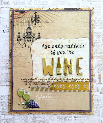
Just kidding! Hi guys, today I have a couple of fun and slightly snarky birthday cards featuring the new Eyelet Outlet Wine Brads (which feature bottles and glasses in both red and white) plus Grape Brads, which have red, green and purple grapes in each packet!


I've mentioned before that sometimes when I have two different ideas for a card, rather than trying to choose just one, I actually make them both. In this case, I wound up using two different sentiments, but I think you could easily interchange them. My first card is a bit more elegant, thanks to a scrap of pretty chandelier paper, gold metallic alphas, and some lovely newer tapes. I chose to emphasize the word "wine" by using larger letters and swapping out the "I" for one of the bottles in the Wine Brads set. Down in the corner, I added two glasses from the same set and a bunch of Grape Brads. I finished off with some gold foil XO Tape, as well as some Script Tape and Skinny Washi in a little cluster.


For my second card I again used a "half and half" sentiment, but this time the emphasized word is made with Foreign Text Chipboard Letters from my Etsy shop, Just Enough Stuff. Instead of swapping out a letter, I attached several bottles and a glass from the Wine Brads and bunch of Grape Brads directly to my oversized letters, which span the width of my landscape oriented A2 card. I like the funky vibe and especially that either card would work for a masculine or feminine birthday!


Contrary to my post title, you can actually buy Wine Brads --also Beer BradsCocktail Brads, and even Champagne Glasses in the Wedding Set-- at any age, so why not pop over to the Eyelet Outlet Store and see what delicious Beverage Brads are available?

Tuesday, May 21, 2019

cheers!

this fortnight at shopping our stash we invite you to "get your drink on" by which we mean make a card or project which features the beverage of your choice! i went with margaritas on a fun and funky (college) graduation card. see?

all patterned papers and the chipboard letters are vintage/hoarded basic grey; cocktail brads: eyelet outlet; tiny puffy heart stickers from the dollar store; glossy white cardstock: the paper cut; adhesives: elmers brand tape runner, 3m foam tape gluedots, scor-tape by sookwang

i had a totally different plan for this card which i immediately chucked out the window when i found the ancient patterned paper with those cuuuuuute birds on it. i'm not sure what they actually have to do with graduation, but they struck my fancy and matched perfectly with this compound patterned paper i made from strips and offcuts of classic basic grey papers. so i decided to just go with it, lol!


hop on over to SOS to see what delicious drinkies the rest of the design team have made especially for you! ♥

Friday, May 17, 2019

it's a very vintage holiday

we're still celebrating "an old fashioned christmas" over at ♥JINGLE BELLES♥ and you still have plenty of time to link up with us... in fact there's even a little prize this fortnight, from my etsy shop, just enough stuff! here's what i made this week:


i was in a collagey kind of mood this time, so i made a background with torn bits of holiday sheet music and book paper, then added some old xmas postage randomly on top. finally i added this glorious vintage santa, from an old children's book, to be my focal point. weirdly enough, the beautiful santa was actually my second choice; i had started out building the whole thing around an adorable reindeer i snipped from a piece of authentique's "nostalgia" line. but in the end, i felt like he was a bit undersized for the background. rather than trim off a bunch of those lovely old stamps, i went and found the santa, then made the reindeer a card of his own:


because, afterall, december will be here faster than we can possibly imagine. and the phrase, "darn, i wish i didn't have so many EXTRA handmade holiday cards" has never, ever, been uttered by any cardmaker in any language. fact.


hop over to ♥JINGLE BELLES♥ and see stephanie's gorgeous card, then start planning your own vintage --or vintage inspired--  masterpiece!

Wednesday, May 15, 2019

It's a Jungle Out There

Woooooooohooooooooo! There are so many awesome new brads in the Eyelet Outlet Store, my (Lauren's) biggest "problem" was choosing which ones to use first. But you definitely don't dis the king of the jungle, so in the end, I picked the Lion Tiger Zebra Brads, and made some appropriately jungle-centric ATCs.


Artist Trading Cards are a fun format in which to work, all the more so because there are groups all over the internet and social media where you can swap them. The official size is 2.5 x 3.5" which is exactly that of a standard playing card. In fact, I often build mine right on top of old playing cards I scoop up at garage sales.


For this set I combined leafy patterned paper with some neutrals --including an older paper from my stash which actually had a map of Africa on it! Then I added strips of Hardwood Floor Washi and Animal Print Tape to complete a suitable background.


I framed the Lion, Tiger and Zebra Brads in little label shapes to make them stand out even more. Then added sentiments I formatted on the computer (this free font is called Cafe Rojas) and printed out on clear labels made especially for inkjet printers.  


I had so much fun making these wild ATCs that I had to go back and make a coordinating set featuring the original Jungle Mix with the Elephant, Giraffe and Monkey Brads from last autumn!


I think you'll GO WILD when you see all the fabulous new brads, as well as our brand new coordinating washi tapes!!! ♥

is a big fan of
New Release Season!

Tuesday, May 14, 2019

card pals!

just a reminder, there's still nearly an entire week left for you to link up a blossom-bedecked project with us at shopping our stash for the "may flowers" challenge!

one of the best things about being lucky enough to have an awesome, brick-n-mortar papercrafting store, like paper anthology fairly nearby (in kenvil, morris county, nj) is that it's kind of half store and half clubhouse. and truly my favorite thing is how many cool people i have met and good friends i have made. elisabeth ostrowski, the owner, is constantly thinking up fun new ways for us all to interact, and the latest of these is called "card pals", which is kind of like a happy mail round robin. elisabeth tags someone in the group, who's given the snail mail address of another member. they make and send a card to that person. then it's the recipient's turn to send a card. and so on and so forth. last week i got the most beautiful flamingo card in the world from my friend samantha, which i will show you in a minute. but first, here's what i made for my (secret) card pal:


ok, so, one of my card making mottos is: when in doubt, go PRIMA! i mean, really, prima marketing is pretty difficult to beat in terms of elegance, and they have such wonderful embellishments, especially (but not limited to) flowers. unusually for me, nearly everything on this card is from one collection, "georgia blues", including both patterned papers, the large blue blossoms, the smaller printed flowers and that gorgeous butterfly. i used my spellbinders diamond nestabilities to cut a bunch of different sized diamonds, which i distressed, inked and tacked lightly onto my background with a taperunner. then i machine stitched around each one and when they were firmly affixed, i ran one blade of my tweezers around the edges of each to coax the edges upwards for even more dimension. i'm very happy with the result. here's a closer look: 


and now, as promised, here is the awesome card i received from my friend samantha klabenesh. YES, it had FLAMINGO CONFETTI inside!!!!!!!! ♥♥♥


hope you are having a good week so far, but if not, there are three more weekdays left, and thus plenty of time to practice! :)

Friday, May 10, 2019

Old-Fashioned Xmas

This fortnight at ♥JINGLE BELLES♥ we're celebrating the look and feel of Christmas long ago by making cards with an old fashioned feel. You might incorporate actual vintage paper or lace, or use any of the many beautiful vintage-inspired papers and embellishments on the market; even a stamp or illustration with an old-fashioned vibe as your focal point will work ... whatever feels like vintage to you! Here's what I made:

vintage bits: jingle bells sheet music from an old songbook, german scrap bells; plus a red doily that may have once been my mom's so shhhhh don't tell her lol; patterned paper: authentique, basic grey; kraft cardstock: the paper co; flowers: prima; velvet leaves: 7 gypsies; inks for edges: ranger distress in old paper, antique linen and frayed burlap; adhesives: elmers brand gluetape, 3m foam tape, scotch gluestick, gluedots, sewing machine 
It's no secret that I love --and tend to acquire-- plenty of genuinely older vintage paper and illustrations. In fact, I started my Etsy shop, Just Enough Stuff, partially as an outlet for all of my *extra* bits and bobs. So this week I'm super happy and proud to be offering a little prize from my shop to a randomly chosen cardmaker who links up with us this week! (Hop over to JINGLE BELLES♥ for details.)

Meanwhile, about my card: I was inspired by this week's Sketch Saturday (#562) because that funky-cool angle is just so intriguing! It took me a couple of tries and a bit of trimming to get the right shape, but once I did, I loved how it looked! 


My top tip for working with flimsy or fragile vintage paper is to stabilize and strengthen it before I start, by backing it with some thin cardstock. My favorite adhesive to use directly on vintage paper is a Scotch Create Gluestick, which I apply plentifully to the whole entire surface, especially around the edges. I place an old catalog or some scrap paper UNDER the paper to which I'm applying the gluestick, so that I can run the stick out over the edge, ensuring that there is plenty of glue at the very very edge. Trust me, this is crucial. If you want to use a more modern adhesive like a taperunner or Xyron, apply it to the modern paper, NOT your flimsy vintage sheet music! (A tape runner used directly on old, lignin-full paper will often lift a layer of paper, rather than apply a layer of adhesive. Ask me how I know...) Once your vintage paper is backed with cardstock, however, you can pretty much treat it exactly like modern cardstock... so go ahead and diecut, punch, glue, etc with abandon! Alternately, you can scan your vintage goodies and print them out on modern paper. This gives you the advantage of being able to use them again and again, plus... you can re-size them to fit whatever project you're working on. Because it's nice to have options, right?


Why not hop over to JINGLE BELLESand see Stephanie's card plus... details of the *prize* (if you like that sorta thing, lol?) and start planning your own version of "An Old-Fashioned Christmas"! 

Wednesday, May 8, 2019

Perk Up!

It's time for the Spring/Summer edition of the Coffee Loving Cardmakers' Blog Hop, so of course I couldn't resist showing off my Eyelet Outlet Coffee Brads. Plus a bit of Floral Washi Tape and some fun Paper Flowers, as well! I had been planning to also use my EO Coffee Stamps, but the other day Jeff mentioned how happy he was that our lawn and shrubs had "perked up" this spring, and i thought, "Aha! Card sentiment!"


I always try to incorporate the seasonal aspect of the blog hop, but frankly, sometimes I do better at that than others. This time I think I did pretty well with the Spring theme, though! I started right off with my carryout coffee cup. I wanted it to be flowery, so of course I could've used patterned paper, but I had this new Flower Washi I'm in love with and I couldn't resist! I applied it neatly in strips on a scrap of plain white cardstock, burnished it really well, then diecut the cup in the ordinary way.


Once I had the cup, I chose all of my papers based on the flower colors in the tape. I matted my label shape and the background for my A7 card, then added a little bit of decorative machine stitching. I made my sentiment flags using a nice petite size of foam thickers we just got at Paper Anthology, and then it was time for my favorite part: EMBELLISHING!


I added some Fresh Flower Brads and Mini Stitched Flowers to the cup itself and a few more to the label shape. I nestled the cup between the layers of several sizes of Solid Color Paper Flowers, held together with a Coffee Bean Brad and made leaves by snipping apart a large green flower. Then I assembles all the bits and finally scattered a few pale pink Heart Enamels at the very end.


I hope you'll check out all of the fab brads, stamps, tapes, enamels and flowers in the Eyelet Outlet Store, then come join the fun at the Coffee Lovers' Blog Hop which runs through this Friday, May 10th! ♥

Tuesday, May 7, 2019

SOS395: may flowers!

here in new jersey, we seem to still be getting our share of april-style showers,* but in fact the calendar says it's time for "may flowers" so that's what we'd like to see this fortnight at shopping our stash. i dug deeeeeeeeeeeeeep into my oldest papers this time. see?


yup, i found a whole entire sheet of "marzipan" paper, from possibly my all-time favorite classic basic grey line, lollipop shoppe! so of course i had to celebrate by cutting right into that sucker and liberating (and outlining) one of the gorgeous blooms. actually, i liberated a couple of them, but when i started composing the card, it turned out that the best fit --and most dramatic impact-- was to use just one. so i did. the stripey background paper is from authentique's year-or-two-ago "cuddle girl" collection, which always felt a bit like it was inspired by classic bg to me. the ledger and the gorgeous wallpaper-ish background pattern are both from the much too short-lived collage press; the green gingham diecut frame was a scrap of lilybee and the sentiment sticker is from crate paper's "pretty party" collection. so you can see i've used ALL stash, and most of it of an impressive vintage lol. the only new things on this card are the hero arts variegated sequins. because apparently... i'm in a sequin phase.


why not hop over to SOS and see what kind of gorgeous phase my design team sisters are in. then start making plans for linking up your own flowery masterpiece with us this fortnight! ♥

*it rained so much over the weekend, at one point my husband SWORE he could actually hear the grass growing, lol! :)

Sunday, May 5, 2019

it's a wrap!

i loooooove wrapping gifts. i may have mentioned that, lol. here are my three favorite tricks for making extra fancy presents that don't "get wrecked" when you open them. because yeah... in the past, i've had people just flatly refuse to open their gifts, lol. 

trick number one is everyone's favorite, the trusty giftbag. the only drawback with giftbags is that the fancy ones cost a fortune, but the plain ones are... well... plain! so i've dressed this one up with some handcut paper ruffles from one of my favorite recent prima marketing lines, georgia blues. once the ruffles were attached (i made them 12" wide, so the ends could tuck neatly into the folds at the side of the bag) i added a couple of doily scraps, some ancient prima pearl flourishes and a gorgeous paper and vellum butterfly that is also from the georgia blues collection.


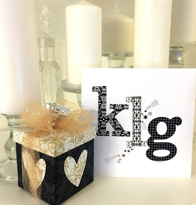
my second trick is to buy --or better yet re-purpose-- a little box with a lid, then cover the box and lid separately with giftwrap or with fancy patterned paper. in this case, it's some beloved and shimmery hambly paper. i use gluestick or nuvo deluxe adhesive to adhere the paper neatly, without bubbles or wrinkles. for this little box (which contains earrings for my cousin kerrie) i used a black damask pattern for the bottom of the box and a white doily print for the top, and the "appliqued" hearts on each side. i like to decorate the envelopes of my cards as well. this one has some oversized alphabet stickers, in the initials of my recipient.


my last trick might be the hardest to spot, because it kind of looks like i wrapped this pair of fancy candy bars in the traditional way, right?


but no... i've just made a sheath that wraps around the bars, leaving the ends open, so it can easily be slid off like this:


this one is made from a vintage map, which i've decorated with a fussy cut vintage car, and topped with a bow made from measuring tape twill. this time i did some handlettering on the envelope, using a vivid blue tombow dualbrush pen. i will tell you my two favorite tricks, that immediately make your lettering look very cool: #1. outline your handwriting! you can go all the way around every letter OR just choose a "plane" as i have done here, by outlining only the right side of every vertical line. trick #2: add a shadow to one side of your letters, it can be to the left or right, top or bottom, just be consistent. et voila! you've instantly got 3-D text!

and that concludes the spring birthday edition of the giftwrap chronicles. my only regret is that i didn't save one of those candy bars for myself... oh well...  ♥

Friday, May 3, 2019

merry sketchmas!

over at ♥JINGLE BELLES♥ we're still making cards using stephanie's beautiful sketch, which, if you recall, looked a bit like this:


and here's what i made this week:

car die: tim holtz/sizzix; tiny trees on a hill: penny black; sentiment sticker: echo park; patterned paper: glitz design, pion, authentique, basic grey, crate paper; wood veneer: altenew; metallic cardstock: tonic studios; glitter paper: best creation; kraft cardstock: the paper cut; sun and cloud brads: eyelet outlet; ink: colorbox; adhesives: elmers brand gluetape, 3m foam tape, sewing machine

ok, yes, it's a much looser interpretation, but i think you can see the "bones" of the sketch, right? but seeing as how i finally got my hands on the fabulous sizzix "home for the holidays" die with that amazing retro car, i absolutely HAD TO use it. and the shape of that sort of dictated the shape of my medallion and thus the card. but the great thing about a wonderful sketch is, you can do ANYTHING with it! 

stephanie also has a second card with which to inspire you, so you'll definitely want to hop over to ♥JINGLE BELLES♥and see for yourself!

Thursday, May 2, 2019

May/June Classes

It's May 2nd (*HOW* did that happen already?!) so we've got a brand new schedule of classes at Paper Anthology. There are some awesome ones this time, so you should really go see the whole list on the PA website, but meanwhile, here's what I'll be teaching:

Layered Blossom Cards

These bright and beautiful cards have not one, not two, but THREE luscious (easy!) layers for maximum dramatic impact. We'll make a simple collage of torn paper, add a little stenciling, then diecut the blooms and place the whole thing over a fast-but-bold blend of luscious ColorBurst shades. (Students might like to wear an apron for the ColorBurst portion of the class.)

3... 2... 1... SWAP!

Are you interested in Artist Trading Cards, Artist Trading Coins or Altered Rolodex, but don't quite know where to start? We'll talk about the "official" sizes, plus a few tips and tricks; then make a bird-centric version of the three most popular swap shapes, using stamps, washi tape, Eyelet Outlet Bird Brads and even a bit of found image collage. (PS: if enough of us are interested in these formats, there's a possibility of arranging official Paper Anthology swaps!)

Just a reminder that Paper Anthology is located on Route 46 in Kenvil, NJ; which is in Morris County, near Roxbury. Here is a map. Trust me, it's worth the trip! Full details of dates, times and prices are on the PA Class Page! ♥♥♥

Wednesday, May 1, 2019

Down on the Farm

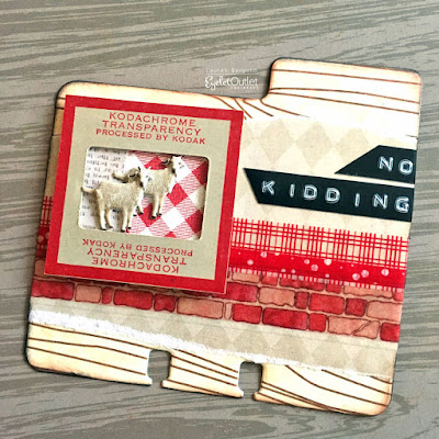
There's nothing more fun than a series of something, at least not to me. Especially a series of swap-able altered rolodex cards. With adorable Eyelet Outlet Farm Animal Brads... and... diabolical Farm Puns, lol!  


I was super-excited to see that Heidi Swapp recently re-released her Memorydex dies, which had been out of print for nearly a year. So I decided to celebrate by making some fun farm cards. 


These are similar to ATC's I made when the Cow and Goat Brads, Pig and Sheep Brads and Horse and Pony Brads first came out. But afterall, you don't sing a favorite song only once, so why not re-visit a favorite craft project from time to time? 


I like the larger size as a home for the vintage slidemounts, and also I chose a slightly lighter color palette this time, which I think brightens them up a bit. 


Plus we had fun new Brick Washi and Red Checked Tape that I think conveys the farm feeling really well, especially when mixed with some scraps of red gingham patterned paper.


For the diabolically punny sentiments, I used the third in a series of old-school Dymo Labelmakers I have had over the years. The trick to finding the analog ones that go "click-click-click" instead of the type which print a neat font on a flat label, is to search for an embossing label maker. They are easy to find and not expensive, but the new ones are made mostly of plastic and truthfully, if I ever find an old metal one at a garage sale, I will instantly give the seller their asking price, without even haggling. (Ok, ok, I would probably haggle a little; I mean, I'm still *ME*!) :) :) :)


I hope you'll be inspired to make some fun cards or swaps with our Eyelet Outlet Farm Brads. I'm sure they will be Outstanding in Their Field! ♥