Showing posts with label inspired by challenges. Show all posts

Tuesday, December 11, 2012

sentimentally yours, from SOS


have you already guessed the brief at shopping our stash? my title should give you a clue, and the photo of my card ought to help a bit, as well! but just in case, let me spell it out for ya: this week we're making cards in which a sentiment or quotation acts as focal point, rather than the more usual central IMAGE.

as a font-fancier of some repute, i considered composing my central panel digitally this time; but as a proponent of enthusiastic stash-usage, i re-thought that strategy at the last minute, and instead went seriously old school with two different types of ancient ki rub-ons, two colors of my beloved basic grey old school alphas, and an oversized EAD vinyl word rub-on. i'm sure you'll recognize the text as something scrooge says towards the end of "a christmas carol"-- it's a favorite holiday sentiment of mine, and some pretty good advice, i think, too! 

(patterned paper: my mind's eye, bo bunny, echo park, basic grey; vinyl "christmas" rub-on: EAD designs; blue alpha rub-ons: 2 sizes of ancient ki memories... that... for the record, i still LOVE; alpha stickers: basic grey; twine: doodlebug; small heart sticker: fancy pants, the two larger hearts were cut from patterned paper using other (non-matching) FP sitckers as a template; ink: colorbox; black pencil for outlining: prismacolor; adhesives: staples brand gluetape runner, 3m foam tape, sewing machine)

i feel compelled to mention that while this card looks ok in the pic... (this is my third attempt at re-lighting and changing background, and this is BY FAR the best version, alas) ...irl, this thing is SO MUCH COOLER! in fact, you're all invited round to see for yourselves!!! :)

i was "inspired by" laurel seabrook's 53rd photo prompt in some ways that are fairly obvious (the grid design, the pops of bright red against white, the twine on the little package) and some that are not quite so clear (my staggered hearts were meant to mimic the hanging wreaths, and i had even planned to give them ribbon accents, but the quote took up more space than expected, and frankly i just ran out of room!); one of my favorite things when i play along with laurel's challenges is seeing how close my finished card comes to my initial idea; sometimes it's a pretty straight line, sometimes it's obscurely circuitous, but it's ALWAYS a fun ride!!!


speaking of fun, this week's unscripted sketch (which i rotated 90 degrees) is pretty awesome, dontcha think?


something much less awesome is that i've been forgetting to link up with 52-card-pick-up in the last few weeks, so here's a card for miss patrice with my apologies! ♥

and now i think you will enjoy a little stroll over to SOS to see the other designers' cards, and thus i will stop talking so you can be on your way! happy tuesday, darlings; and happy hanukkah to all who are celebrating!!! ♥♥♥

Tuesday, December 4, 2012

inspired by... SHOPPING OUR STASH!

it's tuesday, and thus time to see what's cooking at SHOPPING OUR STASH this week! just to be timely, as we gallop full-tilt into december, miss carla has thrown us a super-easy and super-helpful challenge: make a hanukkah or christmas card... OR... make a card with a snow or winter theme! i'm guessing you could use a few of one or other of those right now, eh? so dig deep into your older stash, your remnants, your leftovers, your scraps and see what you can devise! here's what i made:

(vintage: eyelet lace, trimmed; santa element from polka dot pixels' "christmas shopping" digikit, two peas in a bucket; patterned paper--almost all scraps, woohoo: echo park, crate paper, basic grey, amy tangerine, doodlebug; ornament: crate paper; brad: doodlebug; ink: colorbox; adhesives: staples brand gluetape runner, 3m foam tape, sewing machine)  

i was SERIOUSLY "inspired by" (hence the name!) inspired by challenge #52 (and ♥CONGRATS, miss laurel, on your first full year of utterly AWESOME challenges!!!♥) which, as you can see, is soooooo totally rocking the vintage holiday flair, that i basically worked in as many elements from the photo as i possibly could:


at the same time, my layout was suggested by this week's gorgeous retro sketch #40, which i rotated a bit (i used scraps to make up the patchwork bit in the middle, and they just fit the santa tag better in this direction; because yes, this is how "scientific" my process is, lol!) but otherwise it's quite a faithful rendition:


now i hope you'll hop over to SOS and see what my uber-talented fellow DT members have cooked up for your inspiration... it'll be worth the trip, i promise! ♥

Wednesday, November 21, 2012

you know how sometimes the "whole" of a thing is greater than the sum of its parts?

well, it turns out, the converse can also be true; and this is one of those times. i really ♥LOVE♥ all the parts of this, and yet i'm not crazy about the finished product. interesting, no? having said that, it's not a bad card... see?

(patterned paper: amy tangerine, basic grey, dcwv, best creation; tape: love my tapes; thickers and rub-on letters: american crafts; brad: doodlebug; flower: prima; gem strips (re-colored with copics): recollections; ribbon: michaels; other: bit of a doily; adhesives: staples brand gluetape runner, 3m foam tape, sewing machine)

ok, so obviously, i totally loooooooooove the colors and the funky/kitschy graphic style, and those came from laurel seabrook's inspired by #50, which is downright awesome in anyone's book!


i also love the layout, which came from kimber mcgray's 11.17 saturday card sketch challenge at two peas (btw, you really HAVE TO go and see the card she made for this one, it is stunning!!!)


and of course i am utterly IN LOVE WITH the little cake, which i think is one of the best one's i've ever paper-pieced, mostly because i just literally enlarged the cake in the bottom left of laurel's inspo pic and used it as a pattern! the irony here, if you know me, is that whereas i am kitchen-lazy to the point of resenting the (very small) amount of "time and trouble" it takes to microwave a lean cuisine (you have to stop midway through and STIR it, for pete's sake!) it probably took as long or longer to create and assemble these eensie weensie bits o'paper as it would to bake an actual cake; but i have no problems at all with having spent that time cutting! go figure. :) :) :)


something i'm sure ♥YOU♥ would enjoy spending time on is a bit of a stroll through the galleries for both laurel's challenge and the card sketch, so why not check them out? oh and if you're thinking about cakes and/or christmas now, you might like to link up at JINGLE BELLES this week, as well. ciao, darlings! ♥

Tuesday, November 13, 2012

letters so old, i honestly don't know where they came from!

and that, my friends, is the GLORY of the shopping our stash challenge blog; not only does it make me feel willing to show off these ancient alphas, by jingo, i am *proud* to have made them the centerpiece of my card! i think it proves that we can mix our very oldest stuff with our very newest... and have it ALL look pretty darned fab! this week, in case you were wondering, the brief is to make either a thanksgiving card, or a thank you; i went with the latter:

(giant epoxy letters: from somewhere ??? far back in the olden days of papercrafting, lol!; patterned paper: crate, amy tangerine, sei; tapes: crafty basics + heidi swapp (remember how she did decorative tape like TEN YEARS AGO and nobody seemed to care? and now suddenly washi + deco tapes are EVERYWHERE, i think we all owe heidi an apology and our thanks, don't you?!!); twine: doodlebug; ink; colorbox; adhesives: staples brand gluetape runner, plus a little scotch tape holding the twine in place on the back!)

this is the last of the cards made when my power was still out, though, thankfully, i was able to photograph it in the let-there-be-light-again box, making life ever so much easier! and yeah, the letters are ANCIENT, but i still think they are fun, especially blended with some crate and amy tangerine papers, plus a few fab tapes; i have a couple of these awesome kraft #10 envelopes from the divine miss stephanie, so i decided to make a long card. i was also very inspired by (hence the name, lol!) laurel seabrook's fabulous inspiration photo #49 this week--plus, it's SO exciting to be able to play a few challenges again!


i mostly took the colors here, but i sort of worked in the feeling of the circles and half-circles with my rounded edges and things. this was one of those times that "inspired by" didn't entirely lead to "looks like"... but my favorite thing about this particular challenge is feeling one hundred percent free to go *WHEREVER* it takes me!

the card makin' mamas are also looking for thanksgiving or thank you cards this week, so why not jump in with a two-fer, eh?!

and now i hope your t'internet surfing will take YOU over to SOS to see the amazingly fabulous work of my fellow design team members, whose friendship and inspiration make me feel thankful in a BIG way, every single week!!! ♥♥♥

Monday, October 29, 2012

and a very merry monday to ♥YOU♥!

i'm already having one, thank you very much, since the lovely lesley croghan and the merry monday gang very kindly chose this monsta xmas card as their winner for last week, and invited me along as guest artist today! of course i was excited, especially when i saw the gorgeous sketch!


awesome, am i right? so it was no problem at all to whip up a little something special with such a helpful and inspiring road map:

(vintage: birch tree illustration from an old copy of "ideals" magazine + square doilies + funky dogwood flowers; patterned paper: pink paislee, basic grey, crate paper, ki memories, crafty secrets; brads: my mind's eye; reindeer die: tim holtz; snowflake dies: spellbinders; ink: colorbox; adhesives: staples brand gluetape runner, 3m foam tape, gluedots, sewing machine)

i went with a reindeer not only because that MIGHT be my all-time favorite tim holtz die; but also, i wanted one more shot at our "holiday creature feature" prompt over at ♥JINGLE BELLES♥; there's still time for you to get in on it, as well, it runs through6pm (est) on halloween!

something else that's well worth doing by wednesday night is making something inspired by laurel seabrook's current challenge:


how gorgeous is that ♥PINK♥ vintage royal typewriter?! are you swooning, as i am, just at the thought that some of those still exist somewhere in the world? i think my inspiration was quite clearly-- and quite literally-- EVERYTHING about this, from the colors, to the flower details, to the rounded corners on the photo itself! 


and of course the  sketch is soooooooooooo very fab that i followed it straight down the line... though obviously in my own laureny and super-embellished sort of way! i hope you will hop over to merry monday and see the rest of the amazing DT's lovely creations, and then start planning your own holiday sketch card, i can't wait to see what ♥YOU♥ will make!

Tuesday, October 9, 2012

wanna play crafty tic-tac-toe with us?

because that's the challenge this week at shopping our stash. just pick any row, column, or diagonal and use all three items in your card or project--easy peasy!


want to know which line i chose?  ALL OF THEM!!! why? because in any given group there always has to be a wise guy, doesn't there? and i can't leave it to leslie EVERY week, lol! :) :) :) 

(vintage: text page from an encyclopedia; patterned paper: making memories, the paper co, hambly; kraft cardstock: hobby lobby; transparency frame: best creations; flowers: prima, doodlebug; black gem flourish (on frame): imaginisce; tibbon: tim holtz, michaels; tag and brad: my mind's eye; border punch: recollections; adhesives: staples brand gluetape runner, scotch gluestick, 3m foam tape, gluedots, sewing machine)

ok, so, i *think* you can see most of the elements, but just in case i will clarify: the sparkle (gem) brad is attaching my sentiment; which along with my card base is kraft. the black damask print paper (& the little border strip) just happened to have some embossing in their patterns; the black and white gingham ribbon is sewn down under my lovely stack of sparkly white and yellow gingham flower(s). and thus all nine elements of our tic-tac-toe board have been incorporated.

one of the things that made ALL of that as easy as pie is that i was, as always, inspired by the lovely laurel seabrook's gorgeous photo challenge for this week (#41) which is totally rockin' the white+neutral+hint-of-yellowish color palette, along with the goth/elegant "grown up halloween" vibe. very me, right?!


in terms of placement, the current unscripted sketch (#179) was tremendously helpful (plus, fun!):


you can see that this is yet another occasion when, by dint of using that fabulous prima blossom, i've got quite a bulky "profile" to my card:


if i were sending this through the post, i'd either slide it into a padded jiffy mailer or enclose it in a roomy gift bag or box with a present; as it happens, this is the birthday card of a friend i shall see in person on friday, so i'll just wrap it in a bit of pretty tissue paper or part of a vintage sewing pattern and tie it with ribbon.

and now i really must insist you pop over to SOS to see the rest of the design team's glorious creations; and be sure grab that tic-tac-toe board so ♥YOU♥ can play along!!!

Thursday, September 20, 2012

inspired by... AUTUMN! ♥

by now i expect everyone knows that one of my all time favorite challenge sites is inspired by which of course is hosted by the lovely laurel seabrook. so you can probably guess how excited i was when that good lady asked if i'd like to guest design with her some week. "just tell me *WHEN*!" i said immediately; turns out, it's today!

so without further ado, here is the inspiration photo:


and here is my card, which is absolutely, completely, totally, 100% UNLIKE what i was planning to do:

(vintage: book paper for leaves (using cuttlebug dies); woven rattan background: the paper co; pumpkin clip art: from t'internet; patterned paper: authentique, scenic route, 7 gypsies; journaling card: basic grey; happy rub-on: my mind's eye; flower stickers: martha stewart; other: denim from an old pair of shorts (xyroned onto index stock); inks: colorbox; adhesives: staples brand glue tape runner, 3m foam tape, sewing machine)

you see, i had thought i'd make a "guy card" for my brother-in-law. i figured i'd start with a fabulous antique truck image and then build up from there, working in some of the textures from the photo-- metal, wood, etc. great idea, right? yeah, i thought so too! with ALL THE VINTAGE stuff i have... wouldja believe... i could not find even *ONE* truck photo, drawing, or illustration??! NUTHIN'! so instead i went MEGA-literal with the colors, the pumpkins, and the general fall goodness. i really like how it came out, and it's perfect for my aunt marilyn's birthday in mid-october; but i'm still feeling a bit vexed at bein' thwarted, lol! :) :) :)

so what elements of that gorgeous photo are speaking to you right now? the colors? the textures? the pumpkins?? why not start with one... or all of those... but with the idea in mind that you're willing to follow wherever the inspiration takes you?!

another great place to begin is over at inspired by, where you can see laurel's project and read all the details for linking up your own! ♥ 

Monday, September 10, 2012

this has a LOT of layers... (even for ME!) :)

it's biiiiiiiiiiiiiig for a card, as well, at nine inches square! i'm not worried about mailing it, as it's my mom's birthday card, and i'll be seeing her on the day. though if it had to be posted, some corrugated cardboard and a padded mailer would see this safely to its destination; another strategy i employ with "lumpy" cards is to save them for the folks to whom i am also mailing a gift... then everything just goes in a box together and you're golden!

you'll notice that whilst this card OVER-achieves in almost every other category, what it doesn't have is a huge range of color, and that's because my lovely blogging friend linda robinson is hostess at the city crafter challenge blog this week and she's invited us to go monochromatic. so i did!

(vintage: advertisements and text from "the deliniator" magazine published by butterick patterns, 1907; sheet music (also early 20th century), trading stamps, sewing pattern, lingerie lace, beaded trim; patterned paper: basic grey; vintage style embellishments: tim holtz, girls' paperie, pier one; pearl flourishes: want2scrap; giant rhinestone (on a pebbles xl brad): glitz; lace tape: love my tapes; flowers: from michaels' silk flower dept; other: feathers, lace; leaf dies: cuttlebug; inks: ranger, colorbox; adhesives: staples brand gluetape runner, scotch gluestick, gluedots, 3m foam tape and double stick tape, hot glue, sewing machine)

i went with shades of cream because it's my mom's favorite color, and also because this week at inspired by laurel seabrook is embracing earth tones:


this is yet another week in which "inspired by" did not turn out to mean "looks like the picture" lol! but that is one of my favorite things about laurel, that she STARTS with a photo, but is willing to go wherever it takes her; and willing to follow us there, as well! in this case, my primary inspiration wound up being the color, the idea of texture, and a lot of fabric/sewing details, also i've worked in a little bit of an autumnal feeling by using die cut leaf accents!  (as a bonus, that bit of sheet music is a song entitled "falling leaves" though, sadly, in the end the title just stuck up too far and got trimmed off!) 

for placement i used this fabulous sketch from cherry bits, the blog for the online papercrafting store a cherry on top; i've rotated it 90 degrees clockwise, and taken a few liberties, so i may not actually qualify, but it's a corker of a sketch and it was a big inspiration to me, so i'm giving credit where it's due!


i'm also jumping in on this cool tic-tac-toe challenge at a new (to me!) challenge blog called come and get it, i've done the top row across: pearls, lace and die cuts!  


here's a closer look at my tic-tac-toe elements, and just generally at the wide range of embellies, lol!


finally, my apologies to miss patrice: i've been linking my jingle belles card to her 52-card-pick-up challenge each week, but last friday i totally forgot, so here's a different link in lieu, missus, i hope you like it! ♥♥♥

Tuesday, September 4, 2012

wooden it be nice?!

the new challenge at shopping our stash has placed the beach boys' hit permanently on play in my brain, but it's such a fun one, that i can easily put up with some mental-music side effects! yes, you've guessed it, this week you can use anything that reflects wood: woodgrain, wood embellies, trees, log cabin, etc. there are so many options out there, how can you NOT want to play along? 

(patterned paper: studio calico, pink paislee; pennant stickers and journaling card: pink paislee; veneer birds, woodgrain tag: studio calico; yo-yo sticker: american crafts; ribbon: making memories; music twill: from miss leslie, ta missus!; ink: colorbox; adhesives: staples brand gluetape runner, 3m foam tape, gluedots, sewing machine)

weirdly enough, i've got nearly as much new stuff as old in this card because coincidentally, my moxie fab prize arrived last week and it just happened to have a whoooooole bunch of awesome studio calico stuffs, including the wood veneer birds, the woodgrain paper, and the little glossy woodgrain tag! :)  but... to be stash-centric... i made my card base out of ancient yellow cardstock, embellished the birds with a woodgrain stamp purchased during the nixon administration, and assembled all my other layers outta scraps. yahoo!!!


i was, as the name suggests, INSPIRED BY laurel seabrook's current challenge, for which THIS is the photo; amazing, no? i've really only scratched the surface by choosing some of the bright colors and working in my triangle pennants; but then the "wooden bits" all over my card are a nice serendipitous bonus for this one, eh?!


in terms of layout, i gratefully used deconstructed sketch #67:

do check out these fun challenges and then hop over to SOS to see the amazing creations my awesome fellow DT-members have made in honor of this occasion! afterwards, why not sort through your supplies for some wooden goodies-- real or faux, or BOTH?!-- and start working on your own entry! ♥

Wednesday, August 8, 2012

what do you call something that's one-sided, and too big for an envelope, but smaller than a layout?

ok, sorry, that's a bit of a trick question. i actually still call it a card, no matter what size or shape it is, and whether it has photos or collage elements or... whatever. if i make it for, and give it to you on your birthday, it's a birthday card. the end. :) in any case, they are currently calling for birthday projects of all types over at corrosive challenges; whereas opus gluei challenge #136 is to celebrate the season(s) of your choice (mine being summer!) so this, ummmmm... thing... i made for my brother works for both of those, whatever you call it:

(vintage photo sleeve shared with me by my fellow thrift shop warrior, kirsty vittetoe--ta, missus!; notebook paper + stylized ocean waves from a magazine; fancy "s" from t'internet; alphas: making memories, american crafts, ki; clouds and airplane brad: amy tangerine; heart deco tape: love my tapes; ribbon: girls' paperie, ki memories; heart + arrow chips: heidi swapp (and i mean the ooooOooOoLD "hs for advantus" heidi swapp, people! still looks *good* though, dontcha think?!)  magnetic metal buckle: basic grey; font: B0bmono; adhesives: staples gluetape runner, 3m foam tape, gluedots, staples, sewing machine)

i was very inspired by laurel seabrook's awesome superhero party photo, obviously; and used almost every aspect of it, FULL ON:


and then there was the rather fab coincidence that my mother had just happened to give me a little stack of instamatic family photos, of which this one, of my not-quite-five-year-old brother, is a big favorite:


it's not technically a *GOOD* photo, i suppose. i think it must've been at the end of the roll of film, because there are some big streaky light flares down one whole side of the frame (for once, that is not my bad photo of a good photo, that's really on the print); for another my brother's eyes are shut; which is probably why my mom (who's on a big "clean out, pare down" mission) elected to discard it. i don't care, i love it! i love that he's showing us his "muscles" with such concentration; i love that you can see a little bit of wildwood, nj, c.1973 in the background; i even love the processing defects and the off-center placement that just seemed to cry out for me to embellish it! i love that when i give this to bill, my nieces will see that their daddy liked the beach as much as they do; and liked posing for silly photos as much as they do; and that despite good health and plenty of yummy nutritious food, he occasionally grew fast enough to look just a wee bit too skinny, like they sometimes do. 

it's the last couple of points that matter most to me, a fact i discovered during a discussion with my husband over whether my brother would appreciate this or not. we went back and forth a bit; and i still honestly have no idea, but i finally said, "riley and lindsay will LOVE IT, though!" to which jeff immediately agreed; and i realized that's more than enough for me.

it's a bird... it's a plane... it's ♥SUPER BILL♥!!!

ps: i was pretty excited that miss laurel singled out my round birthday party card from last week, and also the very talented folks at merry mondays had some nice things to say about my santa baby card; but you could've knocked me over with a hexagon-shaped feather when i saw this comment (towards the end of the post) from cath edvalson about my we've been hexed card at moxie fab world!!!!!!!!!! could i possibly trouble someone to bring a ladder and get me down offa this cloud now?! ok, on second thought, maybe not quiiiiiite yet...... gimme a couple more minutes, k?! :) :) :)  (thank you thank you thank you to all concerned!!!)

Wednesday, August 1, 2012

inspired by... mojo*!

i'm always blown away when people are able to combine a whole bunch of challenges in one project, that seems to me to be quite a talent; i'm pretty sure if you can do that, you are probably also great at games like bridge and chess where you not only need to remember every move that has been made by every player, but you should also be thinking and strategizing a few steps AHEAD. for some reason, i just cannot do that. in fact, when i try to stuff too many elements into my head at once, it's like my brain gets overloaded and calls for a "fire drill" scenario, in which all of my ideas form a straight line, march quickly and quietly out of the building, and stand about in the courtyard until a guy from the fire department calls, "all clear"

but sometimes i can manage two or three... like, say, a color challenge, a manufacturer and a required technique; or, in this case, a photo inspiration and a sketch:

 (patterned paper: amy tangerine, recollections, heidi swapp, prima, pink paislee; die cut cake: pink paislee; pearl frame: want2scrap; florals: prima; brads: my mind's eye; ribbon: creative imaginations; heart dies: cuttlebug; circle punch: ek success; pin: little yellow bicycle; ink: colorbox; adhesives: tombow mono tape runner, 3m foam tape, sewing machine)

the photo inspiration is, of course, from the lovely laurel seabrook, i ♥LOVE♥ the photos she chooses, i love the projects she makes from them, and i love the way she delights in the diversity of the entries which come in. here is inspired by #34 ... admit it, you feel happier just looking at the photo, don't you?!


the sketch is from mojo monday (#252); once again, a site i really like, because i find the sketches to be consistently wonderful: not too spare, but also not so detailed that you can't carve out your own unique take. i especially like that the last monday of the month is "round or square", it usually reminds me that i haven't made a round card in a while, which means it's time!


speaking of time, i have finished my ICADs, and am looking forward to showing off the last few-- and my completed album-- just as soon as i have a few minutes to photo those babies. ciao for now, darlings! ♥

*yes, i know, my titles lately have been the embodiment of "lackluster"... but if i just sat here and waited for a great one we'd all get really, really bored, so i'm rollin' with it, k?  :)

Sunday, July 15, 2012

this one morphed more than the entire cast of "transformers"!

does that ever happen to anyone else? you start out with a very clear and specific idea--a road map, if you will; but an hour later you suddenly notice that you took two left turns back in albuquerque and you're headed for the border?! (metaphorically, i mean!) :)

anyway, here IS my card, which i like, despite the fact that it's not what i was expecting to make:

(patterned paper, old school alphas (arguably the best alphabet stickers EVER MADE in all of history!) and pearl flower sticker: basic grey; rub on ("day"): fancy pants; brads: mme, doodlebug; plastic flowers and heart gem: queen and co; pennants: pink paislee, mme, and hand cut from scraps; epoxy stickers: imaginisce; flowers: prima; adhesives: tombow mono runner, 3m foam tape, sewing machine)

i started out with laurel seabrook's "inspired by" photo (#32):


and the intention of using the full-on, full-strength colors, plus a string (or banner or SOMETHING) of beads. then i saw this week's awesome sketch on the basic grey blog:


and decided the rows of little blocks should be pink patterns from various older BG collections... and as it turned out this just worked better to turn the dial down to "softer pinks". 

i do still have some little hits of the bright magenta and teal from the inspo pic as accents; my string of "beads" has become a banner, though! however, one of the many things i love about miss laurel is that when she says, "inspired by" that is what she MEANS; she's giving us a starting point, and our finished projects may or may not look like the photo. it's VERY freeing and helpful, and i thank her for that! ♥

someone else i'd like to thank is miss patrice, for reminding me to come and link up at 52-card pick-up, on her blog, the old back porch, where she has a round-up of creative card makers every week, and there are, as she puts it, "no rules, just sharing the fun of making your own cards"!  awesome, no?

why not check out all of these fine blogs, then c'mon back here tuesday when i will have not one, but two lovely posts--for city crafter AND shopping our stash! ciao till then, darlings!

Wednesday, July 11, 2012

inspired + retro + love

if you're getting slightly tired of seeing papaya art's glittery "muses" stickers on my cards, then i feel a bit bad because the lovely miss stephanie gave me a whoooooooole bunch of 'em and i love them to bits!!! i've teamed this particular lovely lady up with some rather fab tape, fussycut paper and vellum, plus various stickers, to wind up with something that looks a bit like this:

  (patterned paper: amy tangerine, pink paislee; vellum: dear lizzy; "muse" sticker: papaya art; other stickers: october afternoon, crate paper, EAD designschipboard stars: october afternoon; rose washi and dotty fabric tapes: love my tapes; pink lace washi tape from the lovely linda brun (takk!); dogwood flower: prima; rub-on sentiment: pink paislee; star stencil: julie balzer; pink glitter glue: michaels; adhesives: tombow monorunner, 3m foam tape, gluedots)

here is this week's glorious photo goodness over at laurel seabrook's inspired by challenge (#31):


you can see i've used the colors most prominently, but i've also worked in the flowers, the stripes, and a bit of the grid design on the cupboards. oh yeah and i've put it all atop a bright white background!

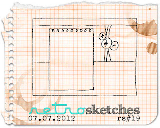
retrosketch #19 is rather fab, and after rotating it ninety degrees, i've used it pretty faithfully, if you allow for the fact that-- me being me-- i also embellished all over top of the "bones" of the sketch:


finally, the july challenge on the love my tapes blog is to include stars (in addition to washi tape) in one's project. my stars are quite a small element-- both in terms of size and theme-- but they really add something, i think! btw, two of the three tapes on this card were from the amazingly gorgeous and very friendly booth that fine company had at scrapbook expo when it came to somerset new jersey last month. after which, they had a bit more money, and i had A LOT more lovely deco tape!!! (i'm pretty sure we both thought we'd got the better end of that deal, which is always the mark of a happy sales transaction, eh?!)

hope you are having a fun week, try to make sure that there are one or two treats in store for you... even if you have to make them yourself! :) :) :)

Sunday, June 24, 2012

because it's SUNday...

...and because i can never resist a title which writes itself, lol! ...and because i'm so excited about this one i'm going to show you my card first thing and then explain:

(patterned paper scraps--off the top of my head: paper co, glitz, imaginisce, echo park, dcwv,  sei, k and co, 7 gypsies, current, gcd, creative imaginations + origami paper + pink paislee packaging + some glimmer mist experiments of mine... a little bit of EVERYTHING really!; decorative tapes: freckled fawn, hambly, making memories, heidi swapp, ocheck, 7 gypsies; plastic alphas: tim holtz; adhesives: scotch gluestick, tombow monorunner, sewing machine)

i'm absolutely ALWAYS inspired by laurel seabrook's "inspired by challenges", even in the weeks i don't get a chance to play. i love the variety of the images, i love the unique and amazing projects laurel creates each week, and i love how open she is to an array of entries which take ANY facet of the inspirational image and run in ANY direction with it, however tangential the finished item might turn out to be! this time, however, i've gone preeeeeeeeeetty much as literally as one possibly could without using fabric. you've seen my card, so now here's this week's "inspired by image" (#29):


told ya!!! :) but then i really do just ♥LOVE♥ making sunburst cards* and haven't made one in far too long, so i could not resist. also, i happened to see the photo, after unexpectedly coming across the yellow torn-paper-mosaic (made but abandoned some time ago) and i knew it would make an awesome sunshine; plus... i'd just seen this week's colour q palette (#142) which is BRILLIANT in every sense of the word:


of course, i realize i have A LOT more shades of yellow, and hardly any coral, so i will understand if my card is disqualified for that one!


whatever happens, i do hope this day will find ♥YOU♥ awash in sunshine... whether it be the literal weather-based type, or the figurative "pleasant weekend" type. shine on, darlings! ♥

*the lovely miss june reminded me recently that i actually wrote a little semi-tutorial a few years ago, on how to very easily make nice neat sunburst sections; however i didn't use it to make this one, i just winged it, cutting wedge shapes, letting them overlap a bit, and "adjusting" a bit using decorative tape over top. i kind of like the wonky look, actually, but it you don't, use a ruler and make your segments uniform for a more polished take!

Monday, June 18, 2012

this is by far the most buttons i've ever used on one project!

but this week the ladies at city crafter challenge blog wanted to see LOTS of buttons, so by golly i've pulled out all the stops! here is my seriously button-intensive card:

 (vintage: buttons + lace; patterned paper: dcwv + a bit of tim holtz packaging and some torn cardboard from a discarded mailing box; cardstock: core'dinations; brackets: pink paislee; chipboard sticker: my mind's eye; pearls: kaiser; ink: colorbox; adhesives: tombow monorunner, 3m foam tape, hot glue, sewing machine)

the idea of the button-encrusted heart came serendipitously from this awesome button animal tutorial that was in miss stephanie's "link love" post last thursday; the focus on textures (particularly the corrugated cardboard) and neutral colors with little pops of steely blue came from miss laurel's "rustic wreath" inspired by challenge (#28) for which this was the photo prompt, you can see i've not used it very literally, but i most definitely *WAS* inspired by it, so i hope that counts!


as it happened, that photo coincidentally chimed in rather well with this week's color throwdown palette, #196:


whenever i make a card like this people ask, "but how the heck are you going to MAIL THAT?!" well, in this case, it's most likely going to be my sister's anniversary card and thus will be delivered in person; but i do actually send things like this in the post quite frequently, in a small padded jiffy mailer. with a piece of cardboard placed over the lumpy bits for protection, and a bit of packing tape for reinforcement, it will arrive at its destination just fine!

i hope whatever ♥YOUR♥ destination is this monday morning, you arrive there happily and in good health, with plenty of energy and excitement for this brand new week! (or, alternately, with plenty of coffee to get you moving!) :) :) :)