
i was super-excited to see the amazing frida kahlo exhibit that is currently at the brooklyn museum, and what made it even cooler was that i went with my friend linda brun while she was here for a visit! linda and i both love making little books, so the idea of making a small remembrance was already in my head before we even arrived at the museum. when we got there, i was somewhat flummoxed by the strict NO PHOTOGRAPHY policy for this exhibit. because there were so many amazing images, words and ideas i wanted to remember and convey when i made my book. *HOW* could i do that without pictures? as it turns out, i think the restriction actually helped me... because it forced me to work in completely different ways. and while that doesn't always feel comfortable, i think it almost always leads to some interesting epiphanies!

first, let me tell you the nuts and bolts stuff: this book is 6" tall and 5" wide. it's got 18 pages that range from 2 x 4" up to 4.5 x 5" some of which are neatly trimmed with a paper cutter, while others have randomly torn edges. its single signature is bound with a 6-hole pamphlet stitch, using waxed floss. traditionally, you'd keep the stitching hidden inside the cover of the book, but i sometimes like to stitch right through the cover and let the mechanics of the binding be part of the design, which is what i did here. (this is either lazy or innovative, depending on your perspective!) instead of trimming the ends of the floss and weaving them in, i left them long and tied a few small "milagro" charms i found in a funky shop in encinitas, california, on vacation last month.

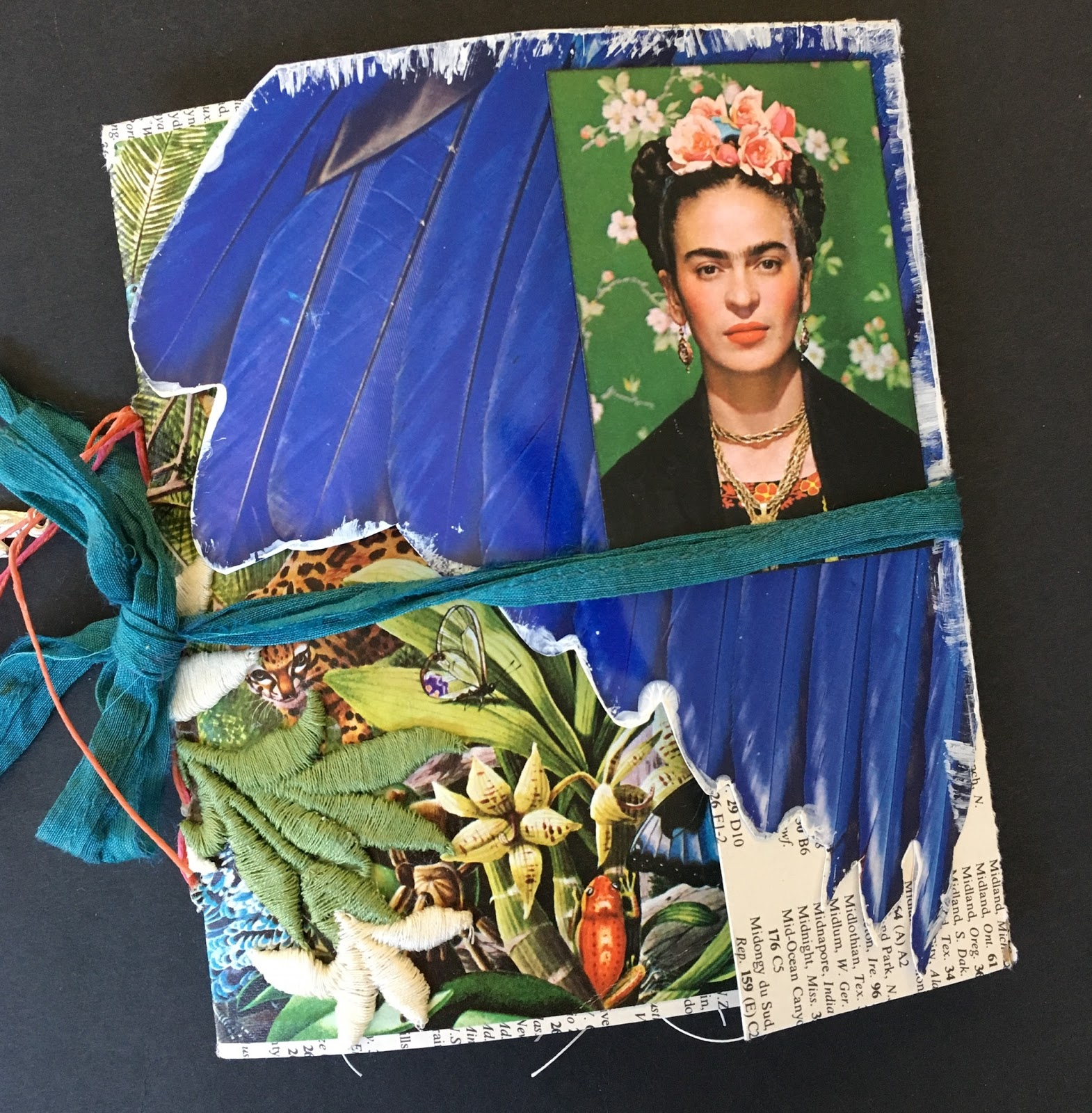
the cover is made from very thin chipboard, like the kind from which cereal boxes are made. (i sometimes use a cereal box for this if i don't have any "clean" cardboard on hand!) i wrapped the chipboard with an oversized index page from an old atlas and used some floral illustrations from a calendar as the interior endpapers. i decorated the outside with a jungle illustration, a few fussy cut magazine images and a vintage daisy applique that i got a few years ago at a thrift store in the same brooklyn neighborhood as the museum is in-- park slope. that is what you call "full circle" right there, lol!

since i knew i wouldn't have my own photos to work with, i was secretly hoping the museum's gift shop would have lots of amazing postcards and greeting cards. ahem. they did not. at this point, i was starting to think there was no way to make a *VISUAL* book, since i had no actual images to use. but luckily i'm a very stubborn person!

as i was going through the exhibit, i got glared at by some of my fellow attendees for typing into my phone. i think people thought i was texting continuously, but really what i was doing was making notes! and this turned out to be the "twist" that made this project different than anything else i had ever made. because instead of photographs, what i had when i got home was about 15 short emails that contained quotes from and about frida, snippets of her letters, phrases she used a lot, descriptions of many of the objects in the show, notes about her clothing, her hair, the plaster casts in which she recuperated after the many spinal surgeries she went through after being struck by a trolley. in short, i wrote about the articles and artworks in the show instead of photographing them.

so instead of starting with images, i was starting with words this time. i narrowed down to about a dozen of the quotes i thought were most meaningful, and then tried to find images that conveyed similar feelings to those inspired by the show.

i did get one postcard in the giftshop (the b&w image of frida and diego above) and i found two brochures at the museum which had photos of frida, including the image i used on the front cover. for everything else, i just kind of improvised.

since i love collage, i have a pretty good collection of falling-apart old books and magazines that i buy at garage sales. the worse shape they are, the better i like them, lol! because i usually get them really cheaply ...and...i don't have to feel guilty about cutting them up. i realize this whole subject --cutting up books-- freaks some people out. so much so that years and years ago, i wrote a post about my experience at a local book sale, when i found out what usually happens to the leftover books at book sales. it's archived here, if you'd like to read it, but spoiler alert: most leftover books at sales are recycled or discarded... in other words, the day after the sale, they will no longer be "books" in their current state. that was the turning point for me!

so i started looking through some of my "collage books" for images that would work. i knew i wanted some exotic plants, birds and animals, since frida used so many in her paintings. the exhibit featured some of her clothing, which had bright colors, beads, pleats and beautiful embroidery, so i looked for that as well. i also looked at nearly everything i have that's in spanish, for obvious reasons, lol. and it seemed like maps would give a sense of place; so then, i reasoned, old maps would maybe give a sense of the time in which frida lived?

but i tried not to be too literal about my selection of images... basically if it "felt right" i put it aside. there were a few images i wanted that i couldn't find. i wanted a row of tall cacti, like the cactus fence at frida's home, casa azul; and also an artists' palette. in the end, i did without them. but... i found the large blue wing image that's on the front of the book on the cover of an art magazine, and it's the same shade as the blue of casa azul. i also had a fun kawaii version of frida (above) from a set of playing cards my friend stephanie gave me for xmas. i couldn't quite bear to cut it up or staple it, so i made a little pocket from a glassine envelope to serve as one of the book's pages.

once i had my selection of pages, i had a pretty good idea of what size my book needed to be. i had planned to make a book about the size of that cool playing card, but it would've meant cutting a lot of medium-sized images quite small; so i did a re-think, midstream. (this is why i always make my pages first and my covers LAST!)

i folded my pages and arranged them in order. then i thought about how to add all of those snippets of text i had made notes of in the exhibit. my first idea was to type them, on vellum, so i could layer them right over my pages and still see the images underneath. but that made the text very small indeed. so i kept the vellum idea but used a medium-sized set of wood-mount alphabet stamps to add the text. i considered staples and handstitching to attach the vellum pieces, but in the end, i used my sewing machine.

i am still not sure the recycled sari silk ribbon with which i have tied the book shut is quite right. so i haven't attached it permanently. i'm hoping to have a brainwave at some point, where i suddenly figure out what to use as the "real" closure. in the meantime, i find that i prefer to display the book standing open, as it is in the first photo of this post. who knows, maybe that is the answer, afterall? maybe some books are not meant to close flat. frida kahlo's life was definitely not ordinary, so maybe this book shouldn't be, either. ♥
♥♥♥♥♥
"appearances can be deceiving" will remain at the brooklyn museum until may 12, 2019. it is a very, very good idea to book tickets in advance, especially if you go towards the end of the run. for this special exhibition, the museum is also open on mondays and tuesdays, though you will only have access to the first floor on those days. there is NO photography allowed within the exhibit and you will be asked to check any large bags or backpacks.
♥♥♥♥♥
Wow! This is fabulous, Lauren, Jo x
ReplyDeleteAWESOME!!! must admit i had to google her as i had no clue lol yup i am not an artsy person ;)
ReplyDeleteAmazing.
ReplyDeleteThis book is so wonderful and shows you had a memorable visit. It's funny because yesterday I watched on a craft TV channel a programme which featured a couple of stamps of Frida. The programme was on Hochanda and is available online to view . Indigo Blue was the company and they are all about altered art and all things you like to do 😊. The woman that was fronting the show was in love with Frida and what she accomplished in her lifetime and viewed the exhibit in London when it was here.
ReplyDeleteBack to your book though I love all your keepsakes and what a brilliant way with the vellum.
Sorry about the book lol. Crafty hugs. Xx