Showing posts with label something completely different. Show all posts

Tuesday, November 30, 2010

something completely sketchy thursday different!

yes, you've guessed it, i've combined two challenges for this one, and i think it has made the card in question twice as cool! :) but then, if you have a plan from sketchy thursdays you're already halfway there, right?


how FAB are the little banner flags? and the offset mats? yeah! i was already pretty psyched just seeing that thing...but then...i found out that this week's theme at something completely different is LET IT SNOW! and of course, like everyone else, what i need to do right now is make holiday cards!!! so i did. see?

(patterned paper: my mind's eye, echo park, dcwv, love elsie, basic grey; glossy cardstock: ranger; stickers: echo park; bling: recollections; border punches: ek success, martha stewart, recollections; snowflake punches: paper source, martha stewart, chipboard sentiment: fancy pants; inks: colorbox; adhesives: tombow monorunner, 3m foam tape, sewing machine)

almost everything on here is leftover from either the november pixie dust paperie kit, SNOW SHOE; or the december one, which is just previewing today on the PDP blog! so i've got loads of lovely xmas goodies from there...and a few leftovers from my regular stash of holiday fun, so i say: SNOW FAR, SNOW GOOD! ♥♥♥

Thursday, October 7, 2010

heart the art: week 39 (& SCD!)

our heart the art prompt for week 39 was AUTUMN, which coincided nicely with this week's SHADES OF AUTUMN theme at something completely different; so i made a multi-taskin' 4x6" page that covers both in one fell swoop!

unlike most of my HTA pages, this one has content on the back, as well:


because as much as i do genuinely enjoy the crisp days, cool nights, and vivid colors of fall in the northeastern united states...i can never quiiiiiiiiiiite stay "in the seasonal moment" enough to ignore the fact that these will inevitably be followed by WINTER. bleck.

my favorite parts of this page are texty, fluttery, many-toned, diecut autumn leaves. wouldja believe i spent most of an evening making those?? uh huh. it involved watercoloring (with more enthusiasm than skill!) on various scraps of old book paper & then stamping on top of that...

backing the thinner bits with index stock & diecutting the leaves with the cuttlebug...

swiping the intricate edges (to very little effect) with distress ink ...and finally... wonkily outlining them in black pen.

as you can clearly see from the photos i took afterwards of the leftovers: at NO POINT until the very verrrrrrrrrrrrrrry end of all that did it look like i was going wind up with ANYTHING good! but while i was working, i was half-consciously thinking about bruce mau's amazing incomplete manifesto for growth* (yes, STILL--ever since january!) in this case the relevant points are 4, 6, 8 and 13; and...especially...#3, "process is more important than outcome"!


in the end, as it happens, i am rather *thrilled* with the outcome, but at no time during the process did that seem likely, so i am rather proud that i kept going anyway! ♥


*if you don't know what i'm talking about, why not take five minutes to read these brilliant, inspiring & practical thoughts on thinking and working more creatively? if you DO know what i'm talking about, why not take five minutes and RE-READ these brilliant, inspiring & practical ideas for thinking and working more creatively?! :)

Thursday, September 30, 2010

meet archie byrd*

this week's theme at something completely different is "birds" ...which is rather me, right?! also, it's the last week of september's marvelous ARCH format, so i had to get this baby made & posted at the very very verrrrrry last minute!!!

(vintage: book paper, postage stamps, and illustration of birds (used as a guide to cut layers of book paper and cardstock); digital: asian script brushes #4 (printed on inkjet transparency) anna aspnes, designer digitals; flowers: prima; cardstock diecuts: k&co; brad: my mind's eye; leaf mask: heidi swapp; spray inks: glimmer mist & diluted ranger re-inkers; pen: copic multiliner; inks: ranger & colorbox; adhesives: uhu gluestick, gluedots, tombow monorunner, sewing machine)

occasionally i feel unbelievably silly about the packrat tendencies that make me SAVE the birds i cut out for a collage and didn't use... the masked and inked background paper that didn't quiiiiiite work at the time... or the bits of transparency on which i printed extra chinese characters just to fill up the page; AND THEN there will come a night that i am able to grab my "leftovers" folder and make a little collage quite quickly just using those items and some pre-made store-bought embellies! so to my darling, patient, utterly understanding husband i say, "sorry honey...we are ALWAYS going to live surrounded by little boxes and baggies and folders full of 'cool stuff' i might need someday!!!" ♥♥♥


*don't judge me, ok?! titles are HARD!!! :)

Thursday, September 23, 2010

ok, van gogh!*

arrrrrgh it has been TWO WEEKS since i've done a challenge at something completely different, which is especially upsetting because this month's format is ARCHES! i looooooooooove arches!!! sheesh. anyway, sliding in at the very VERY last minute with this week's theme of stars i decided to cheat and (sort of/kind of) copy van gogh's starry night. because if you're going to copy...pick something AWESOME, right?!


since i am emphatically NOT an oil painting genius, my version consists of spray inks, watercolors, and hand- and machine-stitching for texture. ok, it's a loose version. very loose. no town, no trees, no mountains...i stuck with the much-easier-to-render stars and swirls. of course, my canvas is a lot smaller (roughly 7x6"); on the plus side, i do still have both my ears! :)


tune in next week when i'll be re-creating boticelli's la primavera entirely out of elbow macaroni.**


*speaking (tangentially) of the band "ok, go!": i did not think anything could beat the here it goes again video for sheer creative hilarity; but that was before i saw THE DOGS!!! :) :) :)

**kidding! (it's a funny mental picture though, isn't it? i'm seeing an entire gallery of the uffizi devoted to masterpieces made of pasta!) (...i should really not write blogposts whilst hungry, should i...?!)

Thursday, September 2, 2010

torso: week four(so)

(ok, sorry, titles are always my weakest blogging link!!!)

for this, the last week of torso-shaped ATC's, the theme at something completely different is "...OF THE SEA". of course this was verrrrrry easy indeed because as soon as you think "torso" and "sea" you pretty much immediately come up with only one mental picture, right??!?!?!

♥ well, helllllllooooooooooo! ♥

despite the inarguable beauty and perfection of both my argument and the image in question, i can forsee being disqualified on the grounds that neither googling nor drooling can fairly be counted as artistic pursuits; so just to be safe i made a vintagey/collaged torso, as well. sorry daniel, you were my first choice, though, obviously! :)

(vintage: illustrations & poem from two children's books, accounting card (that YES, did really have "tulip coral" typed on it!), shell ribbon; prima flower; ranger distress ink; wired pearls from michaels; adhesives: hot glue, gluedots & uhu gluestick)

and now i am off to pack one torso from each week of august and send them to the lovely carol for the big swap!!! tomorrow being the first friday of september, there will be a whole new format at SCD...can't wait to see what is next!

Thursday, August 26, 2010

this week's torso, courtesy of stendhal*

or to put it another way: this week at SCD the theme is color-based...we're using red and black!

(vintage: tickets, postage stamps; patterned paper: mustard moon; transparencies: making memories; heart rub-on: marah johnson; bling heart: mambi; ink: stewart superior; adhesives: tombow monorunner, uhu gluestick, sewing machine)


something you'll have noticed almost immediately: there is only *ONE* torso this week!!! most non-triumphant!!!** but we had company, and chiropractor, and other time-consuming scenarios (senari? scenariae?? what's the plural? anyone??!) so i sorta ran out of time. not to worry, there are still 4 or 5 torsos hangin' out from the last few weeks, so she is not lonely! :)

the other rather un-laurney thing about this one is--and i know this will SHOCK YOU as it does me-- despite the 17 layers of paper & transparencies on this thing, it is almost entirely FLAT!!! unheard of!!! (but i still think it's pretty cool!!!)


*this is a really reallllllllllly obscure english major joke, for which i apologize. it's just that the 19th century novelist stendhal was the author of "the red and the black" and i just COULD NOT RESIST showing off, because let's face it, in the fast-paced world of papercraft blogging there are not very many ways to work something like that into casual conversation!!! :) :) :)

**bonus ninja points to anyone who can tell me...WITHOUT GOOGLING...the movie from which this exclamation hails! :)

Thursday, August 19, 2010

more torsos!

i cannot say that ATC-sized torso-shaped cards are anything i'd've ever thought of making on my own, but that's what is *GREAT* about online challenge sites, right?! they push you to think "outside the box"! in this case, the site is something completely different, the format for the month is the aforementioned torso, and this week's theme is MEMORIES. i played around with a few different ideas for this. i'm not sure i knocked any of them out of the park, but there are things i like about each one.


elegant victorian
i used a bunch of different elements from rhonna farrer's "french ooh la la" kit on this one...but then i got a little carried away with rub-ons...ah well...those ladies are awesome, though, aren't they?!


lady liberty
i *LOVE* this quote of the reverend jackson's, and the photo is a fave from making stef's big apple book. i am not sure i've really done either one justice, but it kinda works, maybe??

vintage and random
i made this right before bedtime, and i'm not sure it totally makes sense, but i think i sort of love it anyway. (you know me: the weirder they are, the better i like 'em!)

the new theme goes up tomorrow, but what is great about this month at SCD is that there's an opportunity to swap these babies! more details on this post or you can contact the very lovely and very helpful carol, who is hosting the swap! :)


(~materials~ victorian: images & papers from french ooh la la 12x12 kit by rhonna farrer, house of 3...printed at varying sizes on both plain paper & photo paper; fancy pants rub-ons; tiny paper roses from the ink pad; ribbon from brooklyn general; liberty: photo taken from the staten island ferry, enhanced in photoshop & printed on kodak photo paper; sparkly foam stars from michaels; text typed on manual typewriter & cut apart; vintage: photo of woman from a vintage magazine; old sheet music sprayed with various shades of glimmer mist; butterflies cut from an elderly--& falling apart--nature handbook; text formatted on computer using susie's hand & mom's typewriter fonts)

Thursday, August 12, 2010

a torso...or so...

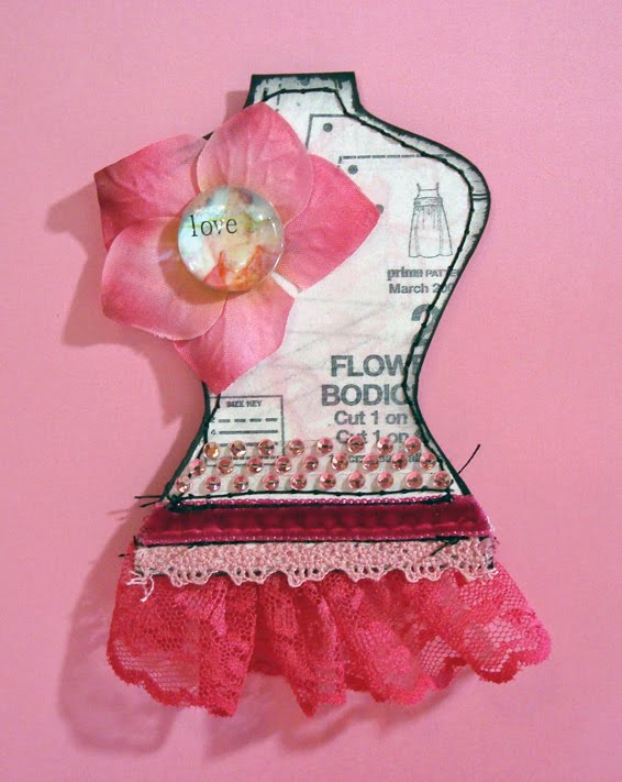
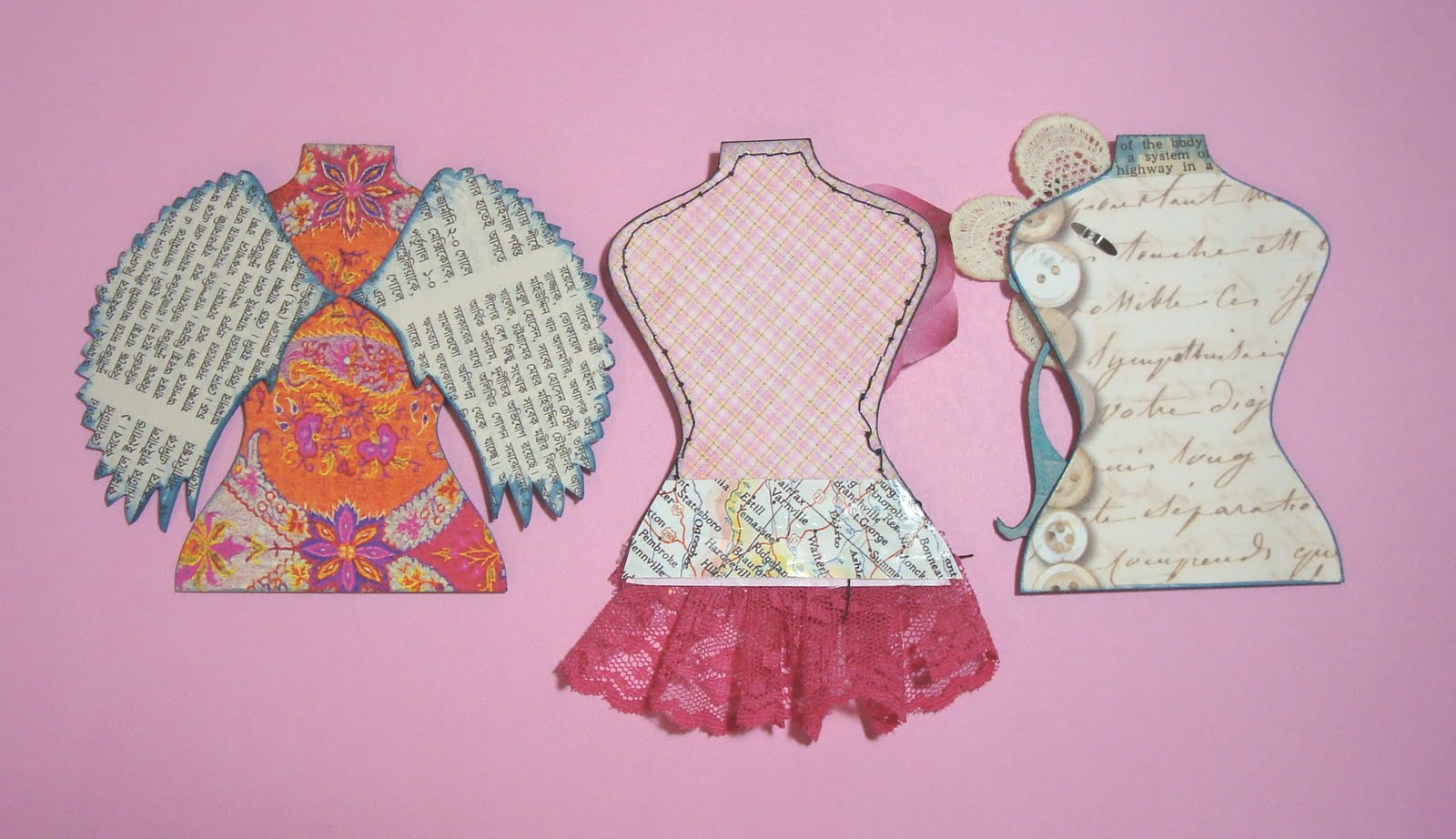
...for something completely different! this month's format is to make ATC-sized torso-shaped cards (there's a template on the SCD blog, or you can wing it) ; this week's theme is BLING! (wahey!)

here's my top tip for working in a format that requires specific dimensions: make a mortice mask! ...by which i mean... trace the exact size and shape on a piece of index stock, and cut the center out neatly with a craft knife, so you can use the negative space as a frame while you work. seriously, it takes about 3 minutes and will save you hours of heartache, because you can see before you cut exactly how much of your design is going to fit in! i keep mine in a notebook with sketches & inspirations; i have inchie, twinchie, ATC, skinni, gothic arch, etc...and now i have a torso template, too:


ok, so, the cards themselves...i had about a zillion ideas, but i settled on making three:


vintage femme fatale

dreamy indian-inspired

(this one needs a co-credit b/c that gorrrrrrgeous lotus was stamped on sticky-backed canvas and painted magnificently by my lovely friend marisol...who excels in all things inky! thanks, miss mari!)

and finally...pink-n-girlie!

i don't usually do much on the backs of my cards...but at the end of the month there is a chance to *SWAP* these with the other entrants, so i made a bit more of an effort than usual! :)


you can find all the details... (and the torso template) (and some rather FAB dt examples!) ...on the SCD blog-- enjoy! ♥


(materials femme fatale: vintage paperback cover, dictionary page & battenburg lace; marah johnson brad; grunge board flourish; mambi bling word; ranger distress ink; colorbox chalk ink; indian: vintage travel book page & a bit of hindi newspaper; anahata katkin clipart wings; recollections bling; ranger distress ink & distress stickles; girlie: vintage sewing pattern reduced & copied on to sandylion patterned paper; vintage lingerie lace; petaloo flower; prima glass pebble; velvet ribbon from a trimmings shop; heidi swapp bling; stewart superior & colorbox inks; sewing machine)
totally unrelated ps: scroll down a couple of posts to see my funky vintage blog candy...it is open until midnight on friday 8-13!

Monday, June 21, 2010

why do the really inky artsy ones...

...never look like i've done very much to them?? case in point, this week's 3x5" "skinni" for something completely different, for which the theme was "blue and white":

(patterned paper (as a verrrrrrry thin frame around the edge): bo bunny; spray inks: glimmer mist + ranger distress re-ink & perfect pearls; stamping & distressing inks: ranger distress, colorbox chalk, tombow markers; stamps: tim holtz, stampin' up, purple onion design, tattered angels; masks: tim holtz; florals: prima; brad: k&co; embroidery floss: dmc; inkjet transparency: 3m; font: carbon type; adhesives: uhu gluestick, tombow monorunner)

i started with white paper (!!!) on which i used masks and spray inks; then i used several different stamps with distress ink, chalk ink and markers; THEN i added my text* on a transparency; finally i stitched a few swirls with embroidery floss. at least you can really SEE those! :)

*this was the quote of the week on stef's blog recently, and i ♥LOVE♥ it! i was thrilled that we were sort of "themeless" this time so i could build my card around it.

Sunday, June 13, 2010

ummmm......"MEOW?"

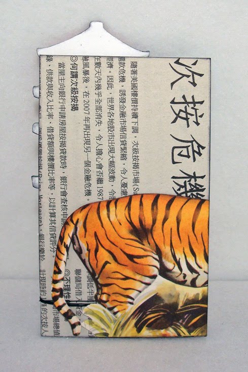
you may remember that last week's theme on the something completely different challenge blog was "home", for which i made my very first 3x5" "skinni" (similar to an ATC, only taller); this week the theme is "cats". i was a little stumped at first. i mean, i like cats, and i love the lolcats, but i wasn't sure how to make them visually interesting as a collage. then i remembered that in chinese astrology, 2010 is the year of the tiger...and tigers are, afterall, cats...so i was all set!


i think i may have set a record for sheer amount of images incorporated into a 3x5" format: i've got a chinese newspaper background, a pagoda drawing from a "learn chinese" textbook, cliffs and forest from a travel book, and a beautiful tiger illustration from a children's dictionary. you know how much i like things to have depth, so each layer is mounted on foam tape on top of the others; in the end, the space between the tiger's head and the background is about half a centimeter! a chinese coin attached with jewelry wire and a dymo labelled title complete my collage...except for this:


i don't generally decorate the backs of things, but in this case i had quite a bit of leftover tiger, and it seemed a pity to waste him! :)

and now i am looking forward to friday for the next theme!

Wednesday, June 9, 2010

making a scene...

...for the current challenge at something completely different! this month the format is going to be "skinnis". (ok, no, i hadn't heard of them either; but they're 3x5" and kind of fun!) every friday SCD will give us a new theme--this week's is HOME and here is my skinni:


(patterned paper: prima, doodlebug, basic grey + vintage book paper & a bit of marbly red from an advertisement; cardstock: core'dinations whitewash collection (embossed with paisley cuttlebug folder); label die: nestibilities; bird rubber stamp: hero arts; flowers: prima; decorative woodgrain packing tape: tapeswell; spray inks (used to make background): glimmer mist, radiant rain & a couple of (HEY MARI!!!) distress ink + perfect pearls custom combos! :) adhesives: uhu gluestick, 3m foam tape)


my drawing skills are seriously limited and date from in nursery school, but one thing i can draw, or even freehand-cut confidently, is clouds! (also trees and big funky flowers...actually i draw the same thing for all three and just change to an appropriate color in between!!!) :) when i saw heidi's herringbone-embossed clouds the other day i knew i wanted to try a similar look...how cool to have the chance this soon! (mine are paisley, but i still love 'em.) meanwhile, the second card in this post of leslie's reminded me how much i love nestie labels...and makes me want to try layering several shapes together! (i kind of ran out of room on this thing, so it's just got one, but NEXT TIME, i tell ya!!!)

the entire time i was working i had the traditional sentiment "home is where the HEART is" in mind; only at the very verrrrrrry end (when i was actually TYPING the words, in fact) did it occur to me to substitute ART, but i think that might be my favorite thing on here! ♥

Thursday, June 3, 2010

twinchies: betcha can't make just one!

this was going to be *tomorrow's* post...until i re-read the particulars at something completely different and realized they post a NEW theme every friday morning, so i have to get these in tonight to make the deadline!

anyway, their challenge for all four fridays of may was to make twinchies... (like inchies...but 2x2" instead of 1x1") ...and this week's theme was "crowns". for some reason, the lovely miss stephanie thought i'd be interested in making crown-themed items (go figure!!!) so she sent me a link! (thanks, stef!) :)

i had a LOT of ideas, but probably the strongest involved...for some reason...butterflies, so i went with a "monarch" theme, and tried it three different ways.

a diecut & some german scrap on a fancy digi-background:

a vintage lady with punched butterflies & a patterned paper crown:

and an inky machine-stitched silhouette with a 3d sticker:


those are my takes on twinchies with crowns. i wonder what this month's format will be? can't wait to find out! ♥


(materials: digi papers: landscape art #6 by anna aspnes & fancy garden edgers by katie pertiet, both designer digitals; vintage & misc items: german scrap crown, hindi newspaper, vintage lady illustration & text from a book, sheet music, dymo labels; patterned paper: k&co, teresa collins, basic grey; gems: recollections; crown sticker: jolees; butterfly punch: martha stewart; adhesives: uhu gluestick, 3m foam tape, sewing machine)