Wednesday, August 30, 2017

Bring on the Bling

I'm still mildly obsessed with all the beautiful glittery *BLING* options available in the Eyelet Outlet store! This time, I've combined some of my favorite shapes with stencils and blendy ink!


For my first card, I used a favorite stencil with a mixture of different sized Maltese crosses. I blended several shades of blue and purple ink, over some designer paper with a subtle "resist" pattern built into it. I added Purple Flower Jewels ringed with Clear Bling to the largest; Single Gems to the smallest, and a mix of Blue Pearls and a few Teardrop Jewels (coming soon the the shop!!!) to the rest.


This lacy, floral stencil was a bit of a challenge, because it wasn't quite large enough to cover the entire panel on the front of my A2 card. So I filled as much of the bottom of the card as I could cover; then moved the stencil up to the top... and covered the seam with Pink Foil Tape, Glitter Gold Washi and Long Bling Strips. I scattered a few more Flower Jewels over the design and added bits of a Champagne Bling Swirl that I had snipped apart to make it fit better!


A regular, geometric pattern is often less appealing to me, but as a base for bling, it turned out to be really fun. this time I created my own pattern around the inked diamonds, using Green Flower Jewels, Clear Oval Gems and snippets of a Green Pearl Strip.


I hope you'll be inspired to combine Eyelet Outlet Bling with some of your favorite stencils, I'd love to see what sorts of designs you can come up with!  


Be sure to tag @EyeletOutlet if you post on social media, and come find us on FaceBook! ♥

Tuesday, August 29, 2017

'tis the (FAVORITE) season

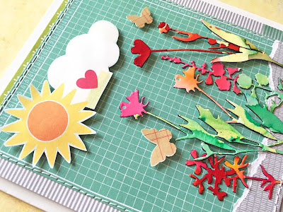
this week at shopping our stash we're making cards (or other projects) inspired by our favorite season. traditionally, that would give us winter, spring, summer and fall; but then there are less conventional choices, like football season, or the holiday season, right? so there's a fair amount of scope on this one, and if you can make a convincing argument, your project will almost certainly count! i chose spring, and here is my card:

watercolor flowers painted in various shades of colorburst on strathmore watercolor paper and diecut with tim holtz's "wildflowers 2"; patterned paper: amy tangerine/american crafts, simple stories; butterfly stickers: studio calico; glossy white kromekote cardstock: the paper cut; ink: colorbox; adhesives: elmers brand gluetape, 3m foam tape, sewing machine 

spring really is my favorite season, though i confess that part of the reason is that it comes at the end of winter, which is my least favorite. my card is a kind of funky landscape that represents the things i especially love about spring: the way the sun gets stronger and warmer each day, the fun of watching the trees and grass come back to life, and my very favorite part... the return of the flowers, in every size, shape and color imaginable!


my card is pretty straightforward, though i do have a little stash trick of which i am a tiny bit proud, so i'll share it with you. i often wind up with strange, narrow offcuts of watercolor paper that are too small to save, but too big to throw away, if that makes sense? having recently acquired a gorgeous set of long skinny flower dies (tim holtz's "wildflowers 2") i've found that they are absolutely the perfect solution! so any time i have my colorbursts out, i'll paint a few of the strips with whatever flowery shades i'm using at the top, and whatever greens i'm using at the bottom. then, when i need wildflowers, i have plenty of choices all set to go, in beautiful watercolor shades! in this case i adhered all of the stems directly to my "landscape" panel, but popped the larger flower tops up on small slivers of foam tape for extra dimension. at the end, when i sewed around the panel for decorative purposes, i made sure to catch the bottom of each stem, just for extra reinforcement.


the SOS gang have lots more inspiration to share with you, from every season of the year! why not hop over right now, darlings?!

Sunday, August 27, 2017

i haven't done...

...a round up of funky/weird/fancy giftwrapping in a while. so hey... let's do that now! :)


one of my favorite things to use in place of traditional giftwrap is an old map. it doesn't have to be vintage, necessarily, though this one is. in place of ribbon, i love to wrap long strips of tissue paper or wall paper (this has both, actually) around a package. in lieu of a traditional greeting card, i've topped off with a random stamp/stencil/ink extravaganza that i made for an art journaling prompt at some point; with a personal message written on the back. a bit of thin cord with beads on it literally ties the whole thing together.


for a smaller present, a vintage book page can serve perfectly as gift wrap. in this case it's a page of applique patterns for a quilting friend. i added a couple of strips of butterfly washi tape to give it a bit of color and topped off with twill that's printed like a tape measure, and some slightly frayed and faded silk flowers i got at a garage sale. the most interesting thing about this, though, you cannot quiiiiiiiite tell from the pic: the top and bottom ends of the giftwrap are not actually sealed. so essentially, this is a sleeve of paper that i've wrapped around and attached at the back, which it is possible to leave intact, but still slide out the gift. which sounds like a crazy thing to do, unless you've had people refuse to UN-wrap their gift because it's too fancy to "ruin" lol. 
and then it makes perfect sense, trust me!

here's a set of photos that better illustrates what i mean:

behold a fun vintage map collage, featuring a volvo that is the same model (but a different year) as my chiropractor's most prized possession. it looks like any other wrapped present, but really it's just a sleeve that isn't attached in any way to the gift itself.


see?!
you can slide the gift-- in this case dvds-- out with no injury to the collage.


i'm definitely not the first person to notice and appreciate how convenient giftbags are. i tend to bulk buy the plain ones, then dress them up. sometimes i attach decoration directly to the bag, but often i decorate a panel... which i then attach to the bag with minimal adhesive (like 4 small squares of foam tape) so that it can be removed and saved, if the recipient desires. this is something i started doing when my nieces and nephews were young, in their case, i usually made a "happy birthday" sign with their name on it. but it's also kind of good for using up random watercolor or collage panels, made to try out an idea or in answer to a prompt or challenge. this one was for a "rainbow" theme, and i had painted the hearts in loads of shades of colorburst, then let the colors drip and mingle. the "happy" was an experiment using variegated yarn that didn't quite work for what i needed at the time, but i liked it too much to chuck out. to round off the theme, i smudgily colored some white plastic letter stickers with alcohol ink markers. 


and finally, a way to wrap a gift using patterned papers which are much too small for the gift in question: sew a bunch of them together, end to end!!! this example is from several months ago. it consists of five coordinating patterned papers, with twill in place of ribbon and a mixed media butterfly instead of a bow. scroll down for another example that has step-by-step directions! 


this is especially fun when you have a bunch of partial sheets of patterned paper you'd like to use up. or if you have some fragile sheet music or book pages you'd like to incorporate, which really would not be strong enough on their own. 

here are the steps:

1. gather your papers

2. tack the pieces together 
...on the back, using your favorite dry adhesive quite sparingly; tear the edges, if you'd like, to give the final product a bit of texture.

3. sew along each of the joins
...with one or two lines of machine stitching; feel free to ramble a bit, and make more than one pass if you'd like; choose a coordinating thread color if you want it to blend in, or a contrasting one to STAND OUT! :)

4. wrap your gift
...in the ordinary way, or construct a sleeve, like i've done here.

5. check placement
...before you secure the ends; in this case, i shifted the whole design over about three inches, so the most interesting seams would show on the top of the package!

6. decorate the package
...with ribbon, cord, yarn, or-- in this case-- a double bow of sparkly tulle and a big silk peony!

♥♥♥
i hope you'll be inspired to try some "funky" giftwrap styles, the next time you have a present to wrap. meanwhile, i hope you're having a wonderful sunday afternoon!

Friday, August 25, 2017

a very vintage xmas

we are still celebrating "the spirits of christmas past" at ♥JINGLE BELLES♥ by making holiday cards that use vintage-style ingredients-- whether they are actually old, or beautiful reproductions-- or otherwise evoke the feeling of an old fashioned christmas. and yes, there is even a little prize this time, in fact its a christmas ephemera pack from my very own etsy shop, just enough stuff. so you know i had to use one or two things like you might find in one of my packs!

vintage goodies: snowy cabin illustration and snow trees illustration, both from old copies of "christmas ideals" magazine; glitter paper: american crafts pow; glossy white cardstock: the paper cut; florals and leaves: petaloo, prima; sticky back pearls: eyelet outlet; ink: colorbox; adhesives elmers brand gluetape, 3m foam tape, gluedots, sewing machine

one of the things i keep an eagle eye out for at book sales and rummage sales are copies of the old christmas ideals magazines, because they have the best photos and illustrations! they seem to be getting harder to find these days, but one way in which i have an advantage is that i don't need to find pristine, perfect copies. in fact i quite like the ones that are a bit wrinkly, or missing their front cover, or in which one of the original owner's grandchildren decided to do a bit of (presumably unauthorized, lol) coloring with crayons! people often ask if i scan the pages and use copies in my cards and occasionally, i do; especially when i want to re-size the item because it's too big or too small. but really, i love the originals... they have a patina and a vibe to them that is one-of-a-kind, which i find precious and beautiful.


something else that is both of those things is this week's atlantic hearts sketch, which was EXACTLY the right way for me to showcase a portion of one sweet blue ideals landscape illustration framed up in a second beautiful snowscape! i've added loads of textural and glittery flowers as a finishing touch.


stephanie has also made a second vintage-inspired card to help inspire you, why not hop over to ♥JINGLE BELLES♥ and check that out, ASAP?!

Wednesday, August 23, 2017

Do You Know How Many Types of Bling Eyelet Outlet Sells?

Ok, that's a bit of a trick question that I'm posing on the Eyelet Outlet blog today, because I actually don't know the answer. But it's *A LOT* lol! We have Individual Jewels (in many sizes), Swirls, Strips, Shapes, Bumpy Bling, even Bling surrounded by More Bling... all of which come in at least six colors; and then nearly every variety is also available in Pearls. Like I said, it's a lot of bling, so if you cannot find a variety you like in the Eyelet Outlet store, it may not actually exist on this planet. All of which may have tipped you off to the fact that my project this week is bling-related, lol!


One of the first things I thought of when I saw the new Fancy Bling Borders-- which are part of the amazing Fall Release, and will be in the shop verrrrrry soon-- was that their size and shape made them a substitute for places where I'd ordinarily use ribbon. And since they're very sticky, and quite bendy, I wondered if i could even use them in a 3D application, like say, on a gift package. Obviously, it'd have to be a special package, and reusable, so I separately covered the lid and the bottom of a small box with some glossy pink giftwrap. Then I trimmed a section of the border big enough to drape across one corner of my package, and wrap down onto the vertical surface of the box top. I un-peeled and stuck the center (horizontal) bit on first, then carefully pressed down first one side and then the other. When the entire segment was adhered, I trimmed the excess at the lower edge away with scissors.


The only thing you cannot do with the Fancy Bling Borders is tie them in a bow. But luckily Paper Flowers make an equally nice embellishment. Especially if you adorn them with even more bling, lol! On the smallest flower I used a Pink Flower Jewel. On the largest, I used another, but then surrounded it with Clear Oval Jewels and small Pink Gems. For the middle flower, I used a 12mm Round Pink Jewel with the Clear Edge, and surrounded it with Tear Drop Jewels, which are technically not quiiiiiiiite in the shop just yet, they're part of a huge update of new styles that will be coming ANY MINUTE! (& totally worth waiting for!)


Of course you cannot give anyone a package as fancy as this without a card. And it's going to have to be pretty bling, to hold its head up, right? Still playing with the "embellished flower" ideas that I used on the package, I made blossoms with 12mm Pink Jewel Centers surrounded by Clear Oval "petals". For stems, I carefully positioned some Champagne Bling Strips so they looked like they were bending in the wind, and added leaves made by cutting apart some of the brand-new, coming-soon Heart Jewel icons. This may be the heaviest A2 card of all time, lol, but I love how it came out!


I hope you'll be inspired to check out the many beautiful varieties of Eyelet Outlet Sticky-Back Bling and create your own stunning combinations! ♥

Tuesday, August 22, 2017

WOOD-n't it be nice?

time for another brand new challenge at shopping our stash, it's called "wood is good" and we'd like to see WOOD or WOODGRAIN on your projects. because we know you still have some of those little wood veneer shapes left from when they were The Big Thing a couple of years ago. or maybe, like me, you've never, ever, walked past a piece of woodgrain patterned paper --be it realistically brown, whimsically pink, or somewhere in between-- without purchasing at least one piece. and since we're all about using up those older goodies it's time to dust them off and do something FUN! for example, did you know that you can stain wood with ColorBurst??! if not, you probably want to watch this ken oliver video ASAP. but first, just take a gander at my card, k?

wooden letters from target's "kid made modern" line stained with peony, gamboge, chartreuse, cerulean and wisteria colorburst; patterned paper: echo park; cloud vellum that i have noooooooooo recollection of buying, and it must've been YEARS ago: american crafts/dear lizzy; (ancient) letter stickers: ki memories; sun and cloud brads: eyelet outlet; white kromekote cardstock: the paper cut; adhesives: elmers brand gluetape, 3m foam tape, sewing machine

i should point out that this technique is only going to work on raw, unfinished wood. if the product has already been sealed or poly-ed, the color is obviously not going to sink in properly. in the video, ken uses burnt umber to get a beautifully realistic woodstain look. which i can see being handy for all sorts of things. but you know i had to try out as many other colors as possible. so that's what i did. i made a few little discoveries, which i'm happy to share, o'course! i started out thinking i'd need to use dark shades and plenty of pigment; but after a bit of experimentation, i discovered that i really liked the reverse better, at least for this particular project. lighter shades, applied a bit more sparingly, seemed to show the woodgrain more... go figure?! this is one of the many reasons that, as with any brand new technique, i highly recommend doing a "test run" whenever possible. thankfully, the wooden alphabet i used had plenty of extra letters, as well as punctuation and numerals. if you have only ONE of what you need, maybe try out your color on the back... just to see how it looks. in the interests of full disclosure: no, i didn't seal my letters after they were stained. mostly because i knew they were going on a card. if you're trying this with any project that's going to be handled, or come in contact with other surfaces --like a frame or box or decor item-- you'll want to seal it!

here's another somewhat gratuitous photo, because this one shows that the letters are popped up on foam tape for even more dimension, and the layers of paper that make up the background are left loose at the edges. (the latter because it's a cool look i discovered during ICAD and have been trying to figure out how to do in a more mainstream card context!) if you're wondering did i use special adhesive for the vellum? nope. just use my plain old tape runner thingie. i did place the adhesive strategically, so it's hidden under the wooden letters and the letter stickers. of course, i later added stitching to the stickers, as well as a couple of cute eyelet sun and cloud outlet brads, so really i didn't even NEED adhesive, afterall!


be sure to check out all the other ways that "wood is good" over on the SOS blog, darlings! ♥

Sunday, August 20, 2017

collage, collage, color and... more collage

time for a round up of this week's freestyle art:


in addition to being a place to make art, my sketchbook is also where i test pens, try out stamps, debate over ink colors, clean off stencils, and glue random bits of paper that i'm too lazy to clean up properly. so there are some collages that kind of organically evolve over the course of several weeks. this was one of those. on the night i finished it, i only added the top layer of paper scraps, the awesome vintage irish photo, and the colorbursted poppies. which took about 10 minutes.  

or 2 weeks and 10 minutes... 
if you allow for all the other layers...


conversely, this one was built from the ground up on the night i posted it to instagram. it's on a plain white background. which in this case works, because the frame of paper scraps really stands out, and forces your eye inwards to the vintage diving ladies. who *INSIST* on being the stars of this, and would most certainly not put up with any distractingly cool background hijinks on their watch.


just in case you thought there was not going to be any rainbow colorburst action this week... ohhhhhhhhh yes there is. first up, my second go with the skinny skinny artist pinstriping tape, which does indeed work considerably better as ONE single layer. the cloudy swirly-looking bits in each color are what you get if you add a single drop of platinum colored liquid metal to very wet colorburst watercolor, in a way that i saw ken oliver do in this video. pretty much totally in love with liquid metals now. ♥


during ICAD i had a bit of a mini-obsession with handcutting the layers of a mandala from vintage paper, colorburst pages, patterned paper... anything that came to hand, really. this is my first effort at a "full sized" piece in that method. it's about 9x9". the fact that some of the layers are made from watercolor paper means that they were harder to attach (i've done a bit of absolutely necessary machine stitching to go with the purely decorative machine stitching!) 


...but... 
you can also bend them a bit to make the mandala petals stick up like a lotus flower. see?


this is one of the fastest collages i've ever made. until i had to find a background. which took FOR-flippin'-EVER!!! i have no idea why. i don't even really love the ledger paper i settled on, but at some point ya gotta glue things up and go to bed, kwim?

hope this finds you in the midst of the
BEST
SUNDAY
EVER!
♥♥♥

Friday, August 18, 2017

old fashioned christmas

time for a brand new prompt at ♥JINGLE BELLES♥ and this fortnight we are celebrating all things vintage! as you know, i happen to loooooooove vintage paper and ephemera, in fact i even built my etsy shop, just enough stuff, around it! but for this challenge you needn't have actual OLD stuff; you can use vintage-style products or images; we've also got a few digital scans over at jingle belles that you are welcome to test drive! but basically, we just want to see holiday cards using whatever conveys an "old fashioned" vibe to you!

vintage goodies: sheet music, darkly patina-ed dictionary paper, greenscale forest-y illustration from an old christmas ideals magazine, lace "liberated" from my mom's trimmings collection; cherry wood veneer paper: altenew; glitter paper: american crafts POW; patterend paper: authentique, glitz design; cardstock: bazzill; ink: prima; adhesives: elmers brand gluetape, 3m foam tape, scotch gluestick, sewing machine

I'm absolutely in love with this "small cabin" die from impression obsession, it has exactly the right amount of detail, imo. the first time out, i cut all the cabin bits from both plaid paper and sheet music and tried to use the inlay method to combine them, a procedure i found frustratingly fiddly. so finally i put a bit of adhesive on the backs of the plaid window frame and door/porch section, stuck them both to an uncut scrap of sheet music, and trimmed off the excess with scissors. it was *MUCH* easier, and i honestly don't think you can see the difference in the finished card!


my layout was inspired by this lovely roadmap from sketch saturday, which i think you'll agree is pretty flippin' awesome. sadly, i didn't realize until too late that it was LAST WEEK's sketch. so obviously i can't link up, but i still thank them for the inspiration! ♥


stephanie also has a gorgeous vintage-inspired card that you will love; and there may actually be a little prize involved this week...? so i'm pretty sure you need to hop over to ♥JINGLE BELLES♥ darlings!

Wednesday, August 16, 2017

Love and Butterflies

It's my day on the Eyelet Outlet Blog where I mention that I had the very great pleasure of meeting Suzanne Marchesano, the owner of Eyelet Outlet, and my design team sister Kim Venezia at the Stamp and Scrapbook Expo in Edison, NJ last week! Let me just say this: if you ever get the chance to visit the EO booth in person, TAKE IT, because seeing that many cool brads, washi tape varieties and types of bling all together in one place... not to mention ALL of the amazing samples made by the EO designers... is just sooooooooooo very cool! I guarantee you'll come away with loads of inspiration as well as fantastic products; though I confess I did get some really cool goodies, too! This week I'm all about butterflies!

 
I was inspired by the gorgeous Butterfly Music Wide Washi Tape, which I've paired with Butterfly Brads, Butterfly Profile Brads, and Mini Butterfly Brads, to make a card and a tag in two different colorways. I should mention that all of the butterfly varieties come with an assortment of colors in the same packet, so you don't have to choose just pink or just yellow... you can have the whole rainbow on one card if you like!


At the show on Saturday, Suzanne told me a really cool idea she had for using our Long Bling Strips to frame silhouetted shapes, so I definitely wanted to give that a try. I've used them on straight outlines before, but it didn't occur to me that I could bend them into softer lines, around curves?


It worked really well, though. I took a Pearl Black Bling Strip, started at one end of a butterfly diecut I'd fashioned from cardstock covered with Music Note Tape, and kept following the contour all the way around. I *LOVE* how this came out, so you'll definitely be seeing the technique again!


To finish up the card I framed the Butterfly Music Tape with some Pink Argyle Tape and loads of machine stitching.


For the tag, I used most of the same ingredients, but in a scaled down version, and with yellow butterflies instead of pink. This time I used the leftover Pearl Black Bling Strips as a border to the Butterfly Music Tape, which is one of the fastest ways to get totally elegant dimension and texture on any project.


Of course, since the Bling Strips are 12 inches long, come four to a packet, are available in both gem and pearl versions, and sport LOTS of colors...there's sure to be a variety that's perfect for whatever you'd like to make today! ♥

Tuesday, August 15, 2017

chillaxin' and relaxin'

did you know that today (aug 15) is national relaxation day? ok, nor did i, until i saw this week's challenge at shopping our stash. but now that we're all aware of this crucial fact, it's no surprise that what we'd like is for you to create a card or project that illustrates something you find relaxing. personally, i like the beach; it's the one place in the world where i can just sit still*. and, as my lovely blogging friend sue crease will attest, i'm always especially happy when i have a good excuse to add a totally gratuitous flamingo to my project, wahey! :)

loads of ancient stash-using bits in this card, woohoo! patterned paper: echo park, my mind's eye, amy tangerine, basic grey; stickers: doodlebug, photoplay, echo park; glossy black cardstock: ranger; adhesives: elmers brand gluetape, 3m foam tape

i was inspired by a great sketch at sketch saturday:


since this card is for my niece lindsay, who is quite a beach bunny, i'm also jumping in on the current simon says stamp wednesday challenge blog theme which is "for a child".


why not celebrate national relaxation day with a leisurely stroll through the amazing projects by my DT sisters at shopping our stash?!

*if you know me IRL, you'll realize what a big deal it is, for an old-school hyperactive type like myself to sit still, lol. ♥

Sunday, August 13, 2017

~freestyle~

would this be a good time for some random sketchbook goodness that i've perpetrated during the first two weeks of august? (be a sport and say, "yes" k, otherwise the whole rest of this post falls kinda flat.)

having spent the first two years of my colorburst watercolor enthusiam trying to apply the pigment neatly in controlled ways, i'm now really into drips, drops, runs and spatters! obviously. :)

it is written: "any random collage is enhanced by the presence of a 1970's sewing pattern lady". ok, technically, it was written by me. but that doesn't make it wrong, surely?

again with the messy colorburst. in this case, the outer bits started to run unexpectedly, so i just went with it, and the result is actually quite a bit cooler (imo) than what i was originally trying to achieve. this is why PLAYING with art supplies is such a crucial endeavor in the laurniverse.

i have a ginormous art crush on a collage artist called sophie klerk. this piece was 100% inspired by a collage she made a couple of weeks ago.

an experiment with pinstriping tape, that very nearly almost worked, lol. it turns out that you don't want to put more than one layer of this tape down at any one time, bc the upper layers will not be sufficiently attached to your paper to mask it. which is a bummer if you want perfectly crisp lines and pure colors; OR a positive boon if you want them to mix grungily at the borders!!! ;)

hope you are having an awesome weekend that includes at least a little bit of art play and LOADS of gorgeous bright color, darlings! ♥♥♥