Tuesday, June 28, 2016

i'll use any color you want, as long as it's green

this week's challenge at shopping our stash is called "how does your garden grow" and we'd like to see, well, gardeny things, lol! that could be flowers, trees, veggies, gardening tools... if it's in your garden, it's fair game. my first idea was to do a flower painting, but i do A LOT of those, so i thought this time i'd try something different, like all foliage, maybe? and it came out pretty well, i think. so here's my card:

colorburst pigment powders by ken oliver crafts painted on strathmore watercolor paper, outlined with a faber-castell pitt artist pen with an XS/.1mm nib; text paper flowers cut with a TH/sizzix "tattered florals" die; brad: american crafts; burlap paper from a mixed media texture pad by dcwv; white glossy kromekote cardstock by the paper cut. ink: colorbox; adhesives: elmers brand tape runner, 3m foam tape, sewing machine

one of my favorite ways to watercolor is using color burst pigment powders, mixed with water. they become, essentially, liquid watercolors. they blend beautifully and dry with such clarity; plus the absence of binders means it's easy to outline on top without killing your pen nibs. a few people have asked me how i go about this, logistically, so i thought i'd photograph my setup to give you an idea. this palette (from walmart, i think, or target, about a year ago) has nice deep wells which is nice, because unlike the type of watercolor that comes in tubes, the liquid will slosh over if it's not contained. and colorburst mixes IMMEDIATELY!!! so if your colors touch even slightly, they are a gorgeous new color right then! in this case i knew i wanted to use a lot of different shades of green so i had chartreuse, lime, terre vert and pthalo all ready to go. but to get even more variety in monochrome, it's good to venture into the colors on either side of yours on the color wheel. so also i have lemon yellow, yellow ochre, turquoise and ultramarine.


i always layout my colors in spectrum order and shades from light to dark. (remember that i'm completely self-taught --and also slightly weird-- so if you've been to art school and are chuckling at my method, just know that this works for me!) i put a few grains of each color i want to use into separate wells and then add a few drops of clear water-- and yes, i use an eye dropper for this rather than a mister, b/c the powder is verrrrrrry lightweight and can be blown around by the action of the mister. i leave an empty well between the colors if possible, so that i can use them to mix median shades. i will often put intermediate colors into the top sections of the palette so that they can easily be added to other colors. i usually stand my water cup (which yes, has big bird on it, lol) on the other side of the palette to catch my drips. i work on top of an old quilting mat of my aunt's (it has a grid on the other side) because it's indestructible and can be rinsed off in the sink. 


i've been trying to let the brush and the paint do more of the work for me, so whenever possible i jump in without a sketch. since i paint flowers and leaves fairly often, this was one of those times. i do often outline with a thinner brush to kind of map out the shapes i want, as you see above. sometimes i will even use a tombow (waterbased) marker for this, b/c it gives me more line control, and the color will blend in when i add water and paint. i do some wet mixing to get a nice "watercolory" look... but if you want separate colors, you really need to work in layers. start with the lightest shades, not too wet, and put successive colors on top of each other, after the lower layers have dried, or at least almost dried. when i'm done, or think i'm done, with color, i let the whole entire thing dry completely before deciding if i want to outline it with either pen or stitching. again, if you've been to art school, you're probably thinking, "hey lauren, REAL watercolorists NEVER do this!" uh-huh, you're right. but i do. so there ya go! :)

to complete the card i added a soft turquoise burlap mat, a little bit of machine stitching (that's also holding my stiff watercolor paper to the textured burlap) and a text paper flower; all on top of a glossy white card base. et voila!


there's LOTS more inspiration waiting for you at SOS... off you go, darlings! ♥

Sunday, June 26, 2016

and now for something completely different...

more ICAD, woohoo! sorry if this is boring for non-participants, but in june and july most of my "free" crafting time is spent on index cards: thinking up what to do, doing it, posting it, looking at others' work, etc... 'tis the season; the ICAD season, darlings!

cards 19a + 19b: snowflake
round or square subjects are always a bit dicey in the 3x5 format of an index card, so i'm not sure HOW it's taken me this many years to realize i could spread the design over two cards?!??! 

card 20: the sixties
peace, love and music, pretty much sums it up, right? 

card 21: invent a prompt
i chose "aloha" because... well, because i'm *ME* lol! :)
 
card 22: neon
gelly roll pens on black paper are just sooooo dreamy, am i right?

card 23: winter
a very abstract collage featuring torn and layered vintage paper with a few swipes of the luscious golden acrylics i treated myself to using a serendipitous one-day coupon...

card 24: magenta
magenta and mandalas... perfect together! ♥

card 25: song
i chose "box of rain" the only grateful dead song i really *LOVE*; i was test-driving a couple of new pens, with sort of mixed results, but ICAD is definitely a time to try new things and experiment!!!

meanwhile, sunday is an excellent time to hang out with family and friends, also to do fun creative things... and i hope you're doing just that this lovely sunday! ♥♥♥

Friday, June 24, 2016

i have a bizarre form of crafty amnesia

because whereas i always remember how much i love making and sending clear cards, somehow i never recall how hard they are to photograph and edit; until, that is, it's time to photograph and edit them. then it all comes back quite quickly lol. so please accept my apologies as to the quality of the pics in this post, and please believe that my card for the second week of our ♥JINGLE BELLES♥ challenge, "it came upon a midnight clear" is easily 30% nicer than it looks here. maybe even 35%!

snowflake transparency: hambly; xmas tree diecut from a collage of torn and layered vintage paper using sizzix' christmas tree #2; patterned paper: blue fern studio; deco tape: october afternoon; acrylic snowflake: heidi swapp; gem snowflake: want2scrap; brad: my mind's eye; adhesives: elmers brand gluetape, 3m foam tape

sad to say i am down to my last few pieces of holiday hambly, despite stephanie's magnificent job of scouring the midwest for leftovers and my own valiant efforts at hoarding. so i do feel a certain responsibility in terms of making especially nice cards with them, and i'm pretty pleased with this one, as a matter of fact.


there are a few questions i get every time i post a card that's built on a transparent base, so i'll just save time and answer them straight off: "how do you write inside this card?" i glue a little panel of patterned paper inside. in this case it was easy, because i've glued a little panel of patterned paper outside, as well which hides it perfectly; but even when i've done a looser collage of elements on the front, it's always possible to place a small square or label shape in a way that coordinates with the design, as long as you work that into the original plan of the card.


here's another question, "doesn't the adhesive show?" yes. it does, a tiny bit, as you can see here:


there are a couple of ways to avoid this: one is to glue ANOTHER panel, the same size as this one, to the outside back of the card. another is to use the special adhesives made for vellum... which actually might still show a tiny bit, but less than regular old tape runner which is what i've used. the third method is to apply the adhesive neatly around the edges, then don't worry about it. this latter course is almost always the one i choose, and you can see i've done so here. life's too short, imo! hopefully the front of the card is sufficiently attractive to make folks not really dwell on the back of it. on the other hand, it seems like the people of the world who are actively looking to find fault really enjoy succeeding... so this can be an extra element of my holiday gift to them. :)

stephanie has also made a brand new card to inspire you, and it's waiting to do so at ♥JINGLE BELLES♥. won't you hop over and enjoy that right now? you'll be glad you did!

Tuesday, June 21, 2016

say yes to the dress

this week's challenge at shopping our stash is called "always a bridesmaid" and we'd like to see projects with a dress form or a dress on them. sounds like fun, no? here's what i made:

well dressed lady from a vintage sewing pattern; patterned paper: basic grey; journal cards: pink paislee; sheer journal card: pink fresh studio; lovely sticker and camera border: amy tangerine/american crafts; flowery tape: little b; tape measure clear sitcker: hambly; florals: prima; dimensional sticker: crate paper; fall stitched flower, mini stitched flower and strawberry brads: eyelet outlet;  

my dress is on a sewing pattern lady. she'd've been a favorite even if i hadn't happened upon her, already fussy cut and ready to roll, whilst looking for something else entirely. the only mystery here is what circumstances would've made me NOT use her for whatever the original project was? b/c seriously, it's hard to imagine the situation in which she was not the perfect choice! but for whatever reason, she was there, i found her, and i was thrilled!

i used this week's (#417) sketch saturday a bit loosely, and rotated 90 degrees, but i think you can still see it?


there's loads more lovely inspiration at SOS from my design team darlings; do give yourself the treat of hopping over!

Monday, June 20, 2016

new york, new york (so good they named it TWICE!)

hi guys, it's my day on the eyelet outlet blog again, and i've got a pair of fun NYC themed items to show off! yes, i know, you would think that living in new jersey, and spending a fair amount of time manhattan, that at some point i'd stop being excited about new york themed art supplies... but it hasn't happened yet, lol! my latest obsession? eyelet outlet's new york city washi tape, which I've used as the sentiment on this city-centric card:


can you spot the other EO goodies on this card? yep, there's an uber-cool taxi cab brad and it's sitting on a strip of road washi. anything else? howsabout the cloud washi, glitter black and glitter silver tapes?! because there are soooooo many cool uses for tape, and one of my favorites is to apply it neatly in strips to scraps of cardstock and make custom patterned papers! in this case i've used the clouds as a background and the two glitter tapes have been diecut into streets full of buildings. fun, right? and really... except for the "new york" banner this idea works for ANY city... 


i realize that not everyone is quite as "maximalist" in design as I am, so here's a more pared down version of the same idea. i've teamed the taxi cab brad and road tape again... (well, let's face it, they are perfect together!) ...and added a little bit of music note washi, too. 


this time i've stamped the cityscape and used a heart brad to visualize one of my all-time favorite sentiments. 


because yes, I do... and always will... *love* new york! ♥♥♥

Sunday, June 19, 2016

now even ICAD-ier!

would you like to see my index cards from week three? before you answer, i should probably warn you that if you say, "no thanks" --as of course is your right-- the rest of the post falls kind of flat... no pressure, tho! :) :) :)

card 12: off-prompt
not to be obnoxious, but i love this one! the irony is that everything i like best about it was something added to cover up a "mistake" of some sort: the harlequin stencil shifted, i got a big navy blue smudge before i planned to use navy blue (so WHERE'd the ink even come from to be smudgey in the first place, we ask ourselves...??!) the pen went wonky, etc etc; the point is that sometimes improvised "fixes" actually turn out cooler than the things we originally PLAN to do, which is why if you have a little extra time to experiment, it's great to keep going rather than start over when things go wrong... just sayin'...

card 13: playground
these clever playful pandas have organized themselves into the world's first panda mandala... or "pandala" if you will? or, maybe not. :0

card 14: venn diagram
after the smashing success (in my head, anyway) of "pandala" i thought venn diagram + zentangle might result in a cool "venntangle"? it's not what i expected, but it kinda works.

card 15: bouquet
not much to say, i was in a flowery mood, i had markers...

card 16: wallpaper
stencils and inks and pens are all quite fun to play with at the end of an evening. so this night, that's exactly what i did!

card 17: landscape
for this one, i had a great idea about "thread painting"... but by the time i came to work on it, lovely husband jeff was sound asleep in the room directly above my sewing machine. so i settled for markers. i must say, this really is a fun and soothing way to color...

card 18: orange
colorbursts in tangerine, orange and burnt orange... with special guest stars yellow ochre and fuchsia! (yes, there are A LOT of mandalas in ICAD; basically if i get to the end of the day without a specific plan or concept for the prompt, the ICAD machinery automatically defaults to its mandala setting, lol.)

hope you're having a lovely weekend, generally; a great father's day, in particular; and that sometime before it's over you get to do something creative and fun! ♥♥♥

ps: it is DEFINITELY not too late to start ICAD; it's never too late to start a daily art-for-art's-sake practice, heck, you could do it in february if you want! if you've been thinking about it, don't worry about catching up or planning ahead or anything else... JUST START! check out the official ICAD FAQ page at daisy yellow art for all the details and check out the #dyicad2016 hashtag on instagram and facebook for some amazing ideas and to make a new friend or two! if you're blogging ICAD, be sure to link up on this post here!

Friday, June 17, 2016

it came upon a midnight clear...

can you guess from the title what this fortnight's assignment is at ♥JINGLE BELLES♥? yepper, it's to include a clear element of some sort in your holiday card design... from professionally silk screened transparencies, (oh hambly, how we miss thee!) to digital elements printed on ink-jet transparency, to journal card overlays, to acrylic embellishments, or even something as simple as a window or shaker card with plastic packaging taped behind the aperture. like... say... this one:

clear elements: a scrap of inkjet transparency used to create the shaker card window, plus tiny clear acrylic balls inside the shaker; vintage sheet music from my stash; patterned paper: blue fern studio, glitz design, making memories; glitter paper: american crafts POW; white kromekote cardstock: the paper cut; deer and birch dies: impression obsession; nestabilities frame dies: spellbinders; ink: colorbox; adhesives: scotch brand gluestick, 3m foam tape, elmers brand gluetape, sewing machine

this card is an object lesson on the slippery slope of crafty enable-age: the deer and birch trees are impression obsession dies that belong to stephanie. i've always admired them, so when she came east recently for some irl art time, i asked her to bring them, thinking it'd save me from having to purchase them myself. soooooooooooo wrong!!! of course as soon as i used them, i wanted to make a card (see above); and as soon as i made a card, i wanted to make another card; and as soon as i started thinking about another card, i realized i was going to run out of my pre-cut elements. so obviously i *needed* to own the dies. yeah. let this be a lesson to you... just cave right away and buy the dies, lol, it's quicker! :)

speaking of stephanie, she's also made a card that is clearly awesome... why not check that out at ♥JINGLE BELLES♥ right now?!

Thursday, June 16, 2016

mama CAS?!

the other day stephanie found a cardmaking challenge with an "aloha" theme... which is totally up my alley, eh? except the blog in question was addicted to CAS, and as anyone who's ever been to my blog for more than 30 seconds can tell you, i can't do "clean and simple" to save my life. don't get me wrong, it's a style i love, and i sooooo admire the people who can pull it off, but it's just not my thing. funnily enough, though, i couldn't quite stop thinking about the fact that i just AUTOMATICALLY decided not to even consider taking part. that kind of knee-jerk decision worries me a bit. because a lot of times when we're saying, "i can't" what we really mean is, "i won't"; and the reasons why we won't might have more to do with habit and comfort zone than actual skill. i should also mention that all of this took place on the last day of our "art camp" vacation, during which we make a point to experiment and try new things. so in the end, i decided i owed it to myself to have a go. i made three cards, but only this top one is for the official addicted to CAS "codeword: aloha" challenge!

cardstock: bazill; tapes: love my tapes, heidi swapp, freckled fawn; vellum letters: amy tangerine/american crafts; palm tree paper: sandylion; hula girls: long's drugs, ala moana center, waikiki; adhesives: 3m foam tape

i can't say i'm in love with any of these, but they're all fun and they're definitely quite pared down. i've put them into the post in reverse order of making them. the white one above was made last, and is the one that's closest to the picture i had in my head. it has the most white space, and it has the most color, too, which probably makes it more appealing to me. also, it features a couple of the tiny hula dancer stickers i got at long's drugs in waikiki.

the middle card is more masculine... it has a cool tiki guy and a surf board and one of my all-time favorite eyelet outlet washi tapes with clouds on it:

cardstock: paper accents; cloud washi: eyelet outlet; stickers: creative imaginations, jolee's; vintage sheet music copied onto an inkjet transparency; adhesives: elmer's brand glue tape, 3m foam tape, sewing machine 

finally, here's the card i made first, and about which there is some debate as to whether it's "really CAS" or not. some people may consider that the palm tree cuts too far in to the white space; though i'd argue that a card with a total of FIVE THINGS on it and a plain cardstock background is sort of automatically clean and simple, but then a maximalist like myself would say that, right?!

cardstock: core'dinations; stickers: creative imaginations, jolee's; vintage sheet music copied onto an inkjet transparency; adhesives: elmer's brand glue tape, 3m foam tape, sewing machine 

so has all of this converted me to the true path of minimalist design? well, no, not really. i'm probably still a "more is more" kind of gal at heart. i did enjoy the challenge, though, and i'm proud to have produced cards that i think are rather nice, and quite pared down. will i be attempting CAS again? sure! not today, though; today i'm going to dive head first into a giant pile of vintage paper and attempt to use as much as possible on ONE PROJECT, lol! :)

Tuesday, June 14, 2016

SOS256: let me take a selfie!

before you get too worried, NO, you don't have to use an actual photo of yourself to qualify for this week's challenge at shopping our stash, we actually want to see projects that feature a "faux polaroid" scene. here's what i made:

statue of liberty pic taken from a very old, outdated guidebook to new york; patterned paper: blue fern studios, amy tangerine; white kromekote card stock: the paper cut; eyelet outlet washi tape: cloud tape, nyc tape, road tape; felt thickers: american crafts; puffy heart sticker of unknown origin; ink: colorbox; adhesives: elmers brand gluetape, 3m foam tape

ok, so, what if you don't have any of the gazzillion stamps, papers, or embellies which feature a polaroid theme? don't panic, they're actually the easiest thing in the world to fake... just combine your elements into a square shape, then mount the square on a piece of white cardstock. trim three sides to an equal border, but make the bottom edge approximately twice as thick, et voila! you've made your first "faux po"! (but not... i predict... your last, 'cause these are fun!)

need more inspiration? i've made a few of these including last week's eyelet outlet "summer love" card, this cuuuuuute little deer, this (gah, pink!) monsta xmas card, and this pun-tastic anniversary. need some vaguely *sensible* ideas? the SOS dt have a whole bunch of gorgeousness to help you out! check it, asap, darlings! ♥

Sunday, June 12, 2016

icad: week 2 (the saga continues)

what's that? you wish there were more blog posts full of index card art? well, by golly, i'm here for you! here's what's been happening in my personal version of the index card a day project:

card 5: clouds
the first thing that occurred to me is that A) clouds are fun to paint and B) i'm not the first one to think so. i can never see painted clouds without thinking of billy collin's poem "student of clouds" which is (loosely) about the 18thC english painter, john constable. i typed the first stanza of the poem on a separate index card, so it could live in my ICAD book with the clouds.

card 6: top ten
i thought this one was a "gimmee" b/c i immediately knew i wanted to do favorite books and i knew they'd be fun to paint and decorate. what i hadn't reckoned on is HOW HARD it'd be to only choose *10* and how resentful the other books would be upon discovering they were left out. i'm pretty sure middlemarch was glaring at me this morning, and if all of dickens' works ever organize themselves and work together, i'm toast.

card 7: off prompt
luckily i had used up the leftover colorburst from card 6 to add some swooshy, vaguely flower-shaped swirls to a second card, because this was the day i met up with my crafty bff stephanie in new york city, and by the time we got back to the hotel that evening, all i had energy for was a little outlining and shading.

card 8: island
for this day we were still in manhattan, which, is of course, AN ISLAND, so it was sort of a no-brainer. also, we'd been to the ink pad where i treated myself to a new michelle ward stencil which is an ink pad exclusive, so again, the choice was pretty simple.

card 9: compass
inspired by the cool buildings in the stencil above, i made a sort of mandala/compass thingie...

card 10: cobalt blue
by this time, we were back at my house and deeply immersed in a sort of mini art camp event that was ALL ABOUT monoprinting with gelli plates, so OF COURSE i had to use a bit of one for my card and another one as a backdrop!
(yes, i'll be blogging about this more thoroughly in future, meanwhile, there are a few pics on my fb page

card 11: baseball
ordinarily, this would've been my cue to go immediately waaaaaaaaay OFF PROMPT, but luckily stephanie suggested a mandala built around a baseball diamond, and once i got going i had a lot of fun with the idea!
(being born and raised in the philadelphia area, OF COURSE i had to go with phillies colors and logo... i may dislike baseball, but i'm a big fan of geographical loyalties, lol)

in case you're thinking to yourself, "gee, this whole ICAD lark does look kind of fun!" let me say that it's not too late to participate this year, and you don't need to catch up... just START and see where it takes you... ♥♥♥ 

Friday, June 10, 2016

frosty's baby pictures :)

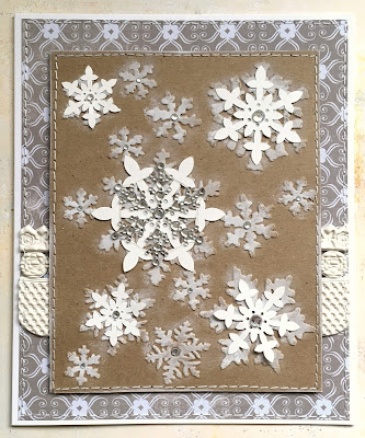
we're still celebrating snow in all its forms at ♥JINGLE BELLES♥: snowmen, snowflakes, snowfall, snowscape, snowstorm, snowcones... (ok that last one is a little shaky, but i'm hungry, lol) ...if it's snow-related and you can put it on a card, by golly, we want to SEE IT! here's what i made:

tim holtz snowflake e/f embossed on hobby lobby kraft cardstock and sponged with liquitex gesso; showflake stickers: basic grey; snowflake rhinestone embellie: want2scrap; extra gems: recollections; border stickers: pink paislee; patterned paper: autumn leaves; adhesives: elmers brand gluetape, 3m foam tape, sewing machine

yepper, i've gone with snowflakes again. what can i say, i had another cool idea (well, i thought so, anyway) i wanted to try out: what if i embossed snowflakes on kraft cardstock and then sponged them with a little gesso? yep, that worked pretty well, made a nice soft effect. i added some embellies and then matted and stitched and called it a (snow)day!

stephanie has also made a lovely card to inspire you, why not check it out right now?! ♥

Wednesday, June 8, 2016

summer ♥love♥

hi guys, it's my day on the eyelet outlet blog again, and i'm in full-on summer crafting mode! when i was a kid, the big treat in the summer was to go "down the shore"... which is new jersey speak for a trip to the beach, no matter what geographical direction you headed to get there. i still love the sand, the surf, the sunshine, and heck, even the seagulls*! luckily, eyelet outlet has brads that satisfy all of my summery needs.


i've used Tall Palm Tree Brads, Eye Glass Brads (backed with a scrap of charcoal paper to make them sunglasses), Spring Bubble Brads, Seagull Brads, Sun and Cloud Brads, and a single Heart Brad to capture everything i loved --and still love-- about those days!


these days i spend more of my summer in the garden than at the beach, but that is equally fun!


i don't grow roses, but i might, if they were as lovely as this vintage applique, and attracted wildlife as beautiful as these Butterfly Brads. one of my favorite things about these guys is that they come twelve to a packet, in six colors; half of which face left and half of which face right! (a boon to my OCD lifestyle, lol!) i've also added a few strips of Glitter Washi Tape in Copper for a bit of glamour!


what's your favorite thing about summer and how could you use it as inspiration for your next card or project? check out the Eyelet Outlet Blog every day for a different designer's perspective, not to mention LOTS of amazing inspiration! ♥

*i'm not sure about the rest of the country, but in big shore towns like atlantic city, the seagulls are both smart and aggressive. (some say factions of them are also mafia-connected, but i believe that to be an exaggeration.) anyway, to illustrate the smart part, for example, they *know* which stores on the boardwalk sell french fries, and they will hover around outside, waiting for a customer to emerge from such a store with a big cone of fries, SWARM HIM** in an attempt to make him drop the fries; at which point it's lunchtime, baby!!!

**i SWEAR i am not makin' this up!!! (no srsly, this is absolutely true!)

Tuesday, June 7, 2016

SOS255: tea (or coffee!) for two

can you guess the theme of this week's challenge at shopping our stash? you can, right? yepper, it's coffee or tea! though i suppose you could also slip in hot chocolate or soup, for that matter... if it's served in a mug, a china cup, or one of those takeaway cardboard thingies with the sleeves that fall off and make you almost spill them, you're probably safe! i went with coffee b/c i just so happen to have a lovely blogging friend (becca cruger, the damsel of distressed cards!) who designed a coffee-themed stamp set for stamplorations which i absolutely ♥LOVE♥ and don't use nearly often enough!

literary caffeine-ations stamp set by becca cruger for stamplorations; mug pattern paper pieced from a piece of free clipart; patterned papers: amy tangerine, glitz design, basic grey; label sticker: papaya art; floral: prima; brad: my mind's eye; pearly  swirl thingies (cut apart and re-arranged to fit on the mug): recollections; doily from my stash; inks: ranger archival for stamping and colorbox chalk ink for edging; adhesives: elmers brand gluetape, 3m foam tape, sewing machine

obviously i wanted the sentiment to be really prominent, but you need a mug or a cup or a SOMETHING to reinforce the theme, am i right? which i didn't have. so i did what i usually do, which is print out a piece of clipart and paper-piece it. here's a little glimpse at my "gettin' ready to make a card" jumble, which i'm showing you because the clipart mug is in it AND because it illustrates the problems i thought i had with my papaya sticker: a) it had an extraneous (for my purposes) lady on and b) the open part of the sticker was on the wrong side. as it turns out, i solved both of those by covering the lady with the mug and stamping on the left where i wanted to stamp. go, me! :) 


in terms of placement, i used this week's sketch saturday sketch (#415) though admittedly it's rotated and kind of loose, but i think/hope you can see it?


there's loads more caffeinated wisdom and inspiration from my lovely SOS darlings, o'course... why not replenish your beverage and hop over to peruse that awesomeness right now?!

Sunday, June 5, 2016

i came, i saw, ICAD! ♥

yes, it's that time of year, the time of infinite possibilities, artsy essperiments, and the headlong pursuit of crazy ideas! ok yes, i know, i do most of those things ALL THE TIME, but now it's early june and i'm immersed in the index card a day project, at the daisy yellow art blog, for my fifth year! wahey! let the tiny, funky, art-ification begin! (this year i'm going to be reposting the square format instagram pics i post daily from my phone, rather than re-taking rectangular pics b/c i just don't have time to do that job twice!)

card 1: mixtape prompt
a sort of mission statement/forecast of what i might want to concentrate on this year, it also brought back many fond memories of the homemade tapes full of favorite songs which filled my teenage years!

card 2: pyramid prompt
i started out by wondering what kind of pyramid i should do: the egyptian kind, the one at the louvre, the pink floyd prism/rainbow thingie? and the answer was, "YES!" lol.
(the day after i finished this, my niece maddie** texted hers which was a hand drawn pyramid of OREOS! idea envy! idea envy!!!!!!)

card 3: off prompt
it was day 3 and i still hadn't drawn a mandala or done any hand lettering. which clearly was a big problem!!! :)

card 4: typewriter prompt
of course as soon as you say, "typewriter" i think, "rainbow"!!!
(ok, no, i have no idea how i got from one to the other, but i did and i like it so that's just how it is.)


need more ICAD info? here's the FAQ; here's the first week of prompts; here's the second week of prompts; here's the facebook group (it's a "private" group in order to keep spam and off-topic posts at bay, but if you ask to be included they'll say yes!) here's my fave instagram hashtag #icad2016. okey doke, i think that's about it, but if you have questions feel free to ask in the comments or email me via the link in my profile, i'll help if i can. a few quickies i can answer right off:

NO, you don't have to use the prompts at all, much less in order. 

NO, you don't have to do every day and OF COURSE you won't have "wrecked" it if you miss a day!!! 

NO, you don't need to be able to draw or paint or have "art experience"; you can make collages, print out photos, write haiku or poetry, doodle, stamp, color or... well, basically you can embark on any art form, any way you want to, any day! 

there's only one real "rule" of icad, and that is YES, you must use cheap, crappy index cards* like they sell in the grocery store or at the office supply store; NOT watercolor paper or bristol board cut to 3x5" because a huuuuuuuuuuge part of the point is that you're using something that's inexpensive and plentiful and trying to record ONE IDEA each day. these aren't supposed to be beautiful permanent pieces of art, they are more like kickstarts that reinforce a daily art practice! tammy garcia, founder of icad, has more to say about the ephemeral nature of these things in this post which i really like. the bottom line, though, as in any art pursuit: MAKE IT WORK FOR YOU, and you'll be much more likely to establish a fun and fulfilling habit, rather than being "stuck" in an overwhelming commitment! ♥♥♥

*they can be 3x5" or 4x6" or mini's; even rolodex cards are ok. don't like the lines? there are unlined and graphed ones. want something a little sturdier? use the oaktag divider thingies or the alphabet tabbed ones. wanna get funky? they make them in colors you know... just sayin'... ♥

**all four of my nieces are participating this year as time allows, and my mom has been chiming in, too. i'd LOVE to show them off, but there are multiple sets of parents with posting rules, and various comfort levels of sharing art, so we have a little direct-message group that's just for us. which... NO... it wasn't me who established it, it was one of the girls, and they're INTO it this year! i'm in heaven; i know that ppl talk about kids and technology and how it isolates them from "real life" and from family, but in my case i actually get MORE TIME to spend with them and we're making and talking about and thinking about and strategizing about ART... i think i'll just go knock wood and count my blessings and shut up right now, lol! ♥♥♥