Saturday, October 31, 2015

what's cute and mythical and BRIGHT PINK??!?

pretty much everything i've drawn in the last week, lol! you may remember the pink narwhal from a couple of weeks ago? well she's got company now, in the form of a unicorn...


 ...and a dragon! ♥♥♥


before you think i've totally lost my mind* i should mention that these last two were a couple of the daily prompts from 365 doodles with johanna fritz. i'm not participating every day, but i love seeing what people post on instagram, and whenever i have a little time at the end of the evening i check out the topic of the day and see if i have an idea that'd work.


i've also been throwing some of these in with kathy racoosin's latest daily marker coloring challenge, even though --as you can plainly see-- that whereas my drawing has improved LOTS this year; my coloring is still only "meh". this third round of the challenge is wrapping up today, actually. but since it's a huuuuuugely popular event, i'm hoping there'll be a fourth time... in january, maybe...?? and that might be THE ONE in which i really practice properly and get a bit better! meanwhile, whether you already love coloring, or are just beginning to learn techniques, i highly recommend kathy's blog and instagram stream!


here's another entry for both challenges; the prompt that day was "a song"... and you can see i do own some other colors:


but for the "necklace" prompt, we're back to pink, lol. this is based on something lovely i saw on etsy (which irl is gold, and thus more sensible to wear but less fun to color!) and my drawing shares a sketchbook page with an idea i wanted to remember about layered hexagons:


so i think that's about it for now, except to say i hope you're having a fabulous saturday, a happy halloween, and maybe some fun art time today! i'll be back soon with a few things that aren't pink, i promise!!! ♥

*lost my mind worse than usual, i mean, obviously; b/c that ship sailed lonnnnnnng ago, as you know, lol! :) ps the "fluffy" reference is from this scene in despicable me, which is completely awesome. and SOOOOOO FLUFFFFFFFY!!! 

Friday, October 30, 2015

still sketchy over here

at ♥JINGLE BELLES♥ that is; we're happy to have a second week of stephanie's lovely sketch:


and thus a second go at making cards based upon it. like this one, right here:

patterned paper background: craft and you; torn layers: doodlebug glitter paper, oct afternoon, basic grey and pink paislee; tree: kaisercraft, graphic 45 + torn scraps of doily; ink: colorbox; glossy white cardstock: paper accents; xmas tree die: sizzix; adhesives: elmers brand gluetape, 3m foam tape, sewing machine
ok, so admittedly, this is a pretty loose take on the sketch, but i think (hope?) you can still see it. i had to flip the design horizontally to place my layery tree amongst its pre-printed brethren. and i had to compress the swooshes a bit so that my trees would be standing on the snowy "hills" rather than hovering over them. the latter is a safety issue, really... hover trees? very dangerous! :) :) :) i'm happy with how this came out though, and it was quick to make because i had the super-fab sketch to guide me!

be sure to check out the gorgeous reader's gallery and stephanie's brand new sketch card at ♥JINGLE BELLES♥!

Wednesday, October 28, 2015

aloha, darlings!

no, alas, i'm not in hawaii, but a couple of weeks ago our sisters with heart in art instagram prompt was "ALOHA" (yes, it was my turn to pick, how did you guess, lol?) so i made a super-fun hawaii-themed collage, with some handpainted letters. this is one of those ideas that i think you'll be seeing again --probably on cards--because those "custom" alphabets* are just soooooooooo much fun to make!


last week we celebrated "THINGS WITH FINS" so obviously i drew half a mermaid! ok, yeah, i actually had a waaaaaaaaay more sensible idea about fish but then i saw this shirt on etsy. for the record, i'm not in love with the finished piece on this one... (i feel like the quote and the illustration are fighting each other for attention; also i colored in the letters with water-based marker before painting the background so OF COURSE everything smeared all over the place) ...but for me the whole point of working in a sketchbook is to practice, to try out ideas, and to look at what i've done and be able to evaluate: what do i like or dislike, what could i do better, what was so much fun i can't wait to do it again, etc; so i'm not having a moan here, just sharing my process! :) one of my collage/art journal heorines, kelly kilmer, recently wrote a great blog post about this very topic that i highly recommend reading.


this week we're all about "FLOURISHES" and no, this time it wasn't me who set the prompt, but you know i'm all over it!!! i started off by doodling the word  --i often begin with a bit of lettering (my drawing "comfort zone") when i'm not sure what i want to do; it seems like if my pen is moving sometimes it'll jump start an idea better than if i'm just sitting there-- and it occurred to me that "flourish" is a verb as well as a noun, so in addition to swirly bits i've got some flowers in there, too.


we'd love for you to join us on any of these prompts; we start a new theme every wednesday, but the old ones never expire, and there's no need to "catch up" or play along every week. just post your work on instagram with the hashtag #sisterswithheartinart and we'll come along to ooooooh and ahhhhhh at your creations! ♥

*i didn't think to take photos as i was working, but the basic process for the "ALOHA" letters is pretty simple: trace your favorite chipboard or plastic alphabet onto watercolor paper... add a pattern and/or paint to each letter... wait for them to dry and cut them out... mount on foam tape over the project of your choice whilst grinning like a loon. :) :) :) 

Tuesday, October 27, 2015

proud as a... well, let's just say pretty proud, lol

because this week at shopping our stash we'd like you to "go paperless" --by which we mean create a project that uses absolutely no pre-made patterned paper-- and for once i was able to face this task with equanimity thanks to my current obsession with stencils, watercolors and glitter embossing paste. woohoo! :)

peacock painted on strathmore water color paper with artists loft paints; quatrefoil stencil by folk art inked with fossilized amber distress stain + saffron archival ink + wild honey distress ink; flourish stencil by tim holtz filled with champagne glitter embossing paste by viva decor; flowers and blue gems: recollections; white glossy cardstock: paper accents; adhesives: elmers brand gluetape, 3m foam tape, gluedots 

i should probably mention that my friend kim ♥LOVES♥ peacocks and has a november birthday. so this isn't the first peacock-themed project you've seen on my blog during autumn, and i have no doubt there'll be more. last year i drew and watercolored a stylized peacock feather that came out pretty well. i also made a peacock mandala that i quite liked. but this year i wanted to try doing the entire article, so to speak. i wasn't sure i could pull it off, so i started early and had a "plan b" in my head. it took me two goes. i got the body and head the first time... but the wing and tail feathers went awry. so i cut out the top half, and tried again. probably my best tip for beginners learning to draw is look at a lot of images. i looked at real peacocks, peacock illustrations, watercolor peacocks, stylized peacocks, standing up peacocks, full-face peacocks, just-the-tail peacocks... ok, well, you get the idea, right? then i tried to take my favorite elements from each of the images i liked but turn it into something that was just mine. i'm pretty happy with the result.

there's lots more inspiration... but absolutely nooooooo patterned paper... at SOS this week. drop in and enjoy it, won't you?

Friday, October 23, 2015

hooray for sketches!!!

and especially hooray for sketches by stephanie, who has outdone herself for this fortnight's ♥JINGLE BELLES♥ prompt, which is to make a card (or more likely cards because it's way too cool to use just once!) using this gorgeous thing right here:


when i was a kid, my dad's "shortcuts" were a notorious (and dreaded, lol) part of any family vacation or road trip. because unlike the traditional shortcut --an alteration in course that is quicker and more direct than one's ordinary route-- in gallagher family lore, shortcut meant an alteration in course that takes waaaaaaaaaaaaay longer than expected and ends far, far away from the intended destination. possibly including within it "a stroll" to a service station after running out of gas. ...but i digress... the point of the story is that in my personal history of cardmaking, generally whenever i "know in advance exactly what i'm going to do" for a particular assignment, a similar phenomenon occurs and the outcome is not even close to what i thought it would be. and/or looks like something that might've been pulled out of the recycling bin. after it'd been dumped onto the recycling truck, under some heavier, messier stuff. i mention all of this because for the first time i can remember, that's *NOT* what happened here! in this case, i had an idea, i carried it out, and it looked like i hoped it would... maybe even a little better... how the heck did that happen??! musta been the sketch!!! ♥

patterned paper: craft and you, pion design, marian smith; plus vintage sheet music from my stash adorned with viva decor glitter embossing paste thru a tim holtz flourish stencil; poinsettias: prima (big) and petaloo (little) brad: my mind's eye; shimmery kraft cardstock: bazzill; chalk ink: colorbox; adhesives: elmers brand gluetape and gluestick, gluedots, sewing machine

so yeah, i bought some utterly gorgeous new holiday stuff at paper anthology on saturday, which was burning a hole in my creative brain. as soon as i saw the sketch, i thought how cool it'd be to tear the papers into shape and layer them with vintage sheet music... then pop one of the beautiful prima glitter poinsettias on top to act as the focal/circular element. so that's what i did. and it came out pretty awesome if i do say so myself! (which... apparently... i do, lol, sorry that's not very modest is it?!)

i bet you're longing to test drive this thing, as well, so i'll shut up... right after i send you to ♥JINGLE BELLES♥ to see stephanie's beautiful card; plus be sure to scroll down to the pink christmas wrap-up post and take a bow-- you guys helped us raise over $350 for the breast cancer research foundation! thank you!!! ♥♥♥

Tuesday, October 20, 2015

coffee tawk :)

this week at shopping our stash it's all about our "caffeine fix" so we'd like to see your best coffee or tea themed projects!

"literary caffeine-ations" stamp set by becca cruger for STAMPlorations; patterned paper: amy tangerine/american crafts; crate paper, recollections + scraps of glossy white cardstock for the lid and faux polaroid; flair + felt dimensional sticker: american crafts; ink: stewart superior india ink; adhesives: elmers brand gluetape, 3m foam tape

i've been really into free-form paper piecing lately, so i built a takeaway coffee cup using a clipart image as a template, some super-fun papers and a really cool (really ollllllllllllld!) dimensional felt element for the center bit. luckily i had the *perfect* stamp set for the sentiment, "literary caffeine-ations" from STAMPlorations designed by my lovely blogging friend becca cruger. check it out:


i used the current (awesome!) retro sketch (#186) though admittedly i've played around with the proportions in a big big way:


the other SOS designers have some pretty fabulous projects to show you as well, darlings... why not hop over and check those out, then come play along, won't you?! ♥

Friday, October 16, 2015

think pink (and christmassy!) ♥


PINK CHRISTMAS♥ is always one of my favorite fortnights at JINGLE BELLES and the 2015 edition is off to a fabulous start! there's still plenty of time to play along and remember stephanie and are each donating $2 per linked up card to the breast cancer research foundation, so the more you play, the bigger our contribution will be! ♥

here's this week's card:

watercolor paints: artists loft; watercolor paper: strathmore; pink patterned paper: k and co; glitter embossing pastes: viva decor=champagne and copper, bo bunny=blue, tho i've toned them all down slightly with ranger's hickory smoke distress stain for a more vintage patina; stencils: tim holtz=flourishes; the crafter's companion=flowery star; heidi swapp=ogee pattern; white glitter chipboard letters: mambi; white xl pearls: zva creative; white glossy cardstock: paper accents; chalk ink: colorbox; outlining pen: faber-castell pitt in xs; adhesives: elmers brand gluetape, 3m foam tape

i was in the mood to play around with some watercolor paints and glitter embossing paste, so that's what i did, lol! (my process is VERY scientific, as you know!) i have a little collection of cardstock ornament templates that i've either drawn or made from clipart images, i've used three of those here. i traced the shapes in pencil on my watercolor paper (i often work on the back if i know i want to outline later, because it's less textural) then filled in with washes of color. after the panel dried, i added a few shades of glitter embossing paste to give each ornament a bit of sparkle... though i actually toned the colors down slightly and applied them a bit roughly through my stencils, so they'd look like a tiny bit tarnished and worn like the ornaments my own vintage bauble collection.

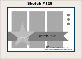
i found this fantastic sketch at atlantic hearts sketch challenge, and it really inspired me. i flipped it horizontally so the sentiment wouldn't cover too much of my painting:


i hope you'll jump over to JINGLE BELLES to see the already impressive ♥PINK CHRISTMAS♥ gallery and link up your own fabulous masterpiece(s)!!! ♥

Tuesday, October 13, 2015

i can see clearly

happy tuesday y'all and hooray for a new challenge at shopping our stash. this week it's "i can see clearly" and what we'd like to see (clearly, lol) are projects with some sort of transparent element. so you could make a clear card, or construct a window or shaker, or just play around with a few prominent acrylic elements, or... well... whatever else you can think of that meets the brief. i made a clear card, because it's been ages since i've done so.

pink flourish transparency: hambly screen prints, oh how i miss you!; notebook patterned paper: basic grey; tag: amy tangerine/american crafts; florals: prima + petaloo + garage sale sunflower + joann fabrics tiny felt blossom; brads: my mind's eye, doodlebug, we r memory keepers; acrylic heart: heidi swapp; puffy stickers: recollections; tapes: freckled fawn, lora bailora, october afternoon, love my tapes, heidi swapp, recollections; tiny scraps of ribbon from my stash; adhesives: elmers brand gluetape, 3m foam tape, hot glue, sewing machine

i ♥LOVE♥ clear cards but it's funny, because i can forget all about them for months at a time until someone says, "hey let's make clear cards!". this week's retro sketch (#185) is especially cool, and i thought it'd work really nicely for this since that horizontal strip (mine is composed of various washi and deco tapes) lets you hide your interior sentiment and greeting behind it.


i know it's sometimes hard to tell which bits are where on a clear card, so here's an "action" shot with the front lifted up. and thus you can see (i hope?) that the larger notebook paper panel is inside the card, whereas all of the other decorative bits are outside.


there's loads more inspiration over at SOS this morning, won't you stop in and enjoy some of it right now?

Friday, October 9, 2015

♥PINK♥ christmas! (2015 edition)


if you've played along with us at ♥JINGLE BELLES♥ in any of our previous years you probably already know that the first prompt of october --which is, of course, breast cancer awareness month-- is always PINK CHRISTMAS, that the brief is to make a holiday card which (perhaps you've guessed, lol?!) has at least a bit of pink in it, and that stephanie and i each donate $2 for every card linked up with us during this fortnight.

this year we'll be donating to the breast cancer research foundation, which focuses strongly on the research aspect of the disease and has earned very high marks from charity evaluation sites such as charity navigator, charity watch and give.org. we'd love for you to join us this fortnight, just link up on our pink christmas post before 6pm on wednesday, october 21st! easy, right? ♥♥♥ 

meanwhile, here's what i made:

eiffel tower cut from a very verrrrrry old piece of michael miller fabric paper that i'm pretty sure they don't make anymore;  patterned paper: marion smith designs, basic grey, sei; flowers: michaels; brads: oriental trading, queen and co; memory box jingle bell die used on american crafts POW glitter paper which is extraordinarily sparkly without being textural and diecuts LIKE BUTTAH!!!; border punches: martha stewart; doily from my stash; white glossy cardstock: paper accents; computer generated sentiment flag in "quill" font; adhesives: elmers brand gluetape, 3m foam tape, gluedots
ok, yeah, this is one of those times when i almost feel like i'm cheating because let's face it, i looooooove pink, and i make plenty of pink cards all year round. none of them mean as much to me as the ones i make in october, however, so i like to go all out, as you can see. since i just happened to find a bit of somehow totally forgotten (?!) pink fabric paper with eiffel towers on it, my card took a bit of a french twist, with a sentiment to match. i used the very last (boohoo!) cardabilities sketch (#132) to guide my layout:


i hope you'll join us for PINK CHRISTMAS --early and often!-- this fortnight, and to that end i'm gonna stop talking right now and send you to see stephanie's lovely card over at ♥JINGLE BELLES♥!

Wednesday, October 7, 2015

journal page to card: butterfly edition

i'm not sure i'd ever done a direct, art-journal-to-card conversion before the narwhal card from this past weekend, and yet i've already done another one. i'm onna roll. or something, lol. first here's this week's sisters with heart in art page, our prompt is "things with wings". we'd love for you to join us and all types of art are welcome; post your art on instagram with the hashtag #sisterswithheartinart.


ok, so, a mixed-media extravaganza right here and i had twenty-four hours of dark blue inky fingertips to prove it! lots of vintage paper, stencil action, modelling paste, stamping and a boatload of loose and swirly machine stitching... the whole nine yards of grungy je ne sais quoi. in the course of which, i made that butterfly into a stencil... (it was a piece of copyright-free clipart i found online, re-sized and cut from stencil film) ...and since i can never, ever, just cut one layer of anything, there were a couple of extras. meanwhile, i wanted to make a very special card for a friend who is having a really really hard time of it at the moment, and it occurred to me that butterflies are an awesome symbol of both hope and transformation. so basically i scaled the whole thing a bit smaller and simulaneously turned the grunge knob down and the glam control up. et voila:


oh and is it just me who winds up with two or three (or fourteen lol) "rejects" for every stenciled or spray-misted background that turns out looking really cool? well, *don't* throw those out because they make absolutely awesome die-cutting fodder!!! in fact both of the butterflies above came from "essperiments" that were... ahem... seriously (SERIOUSLY!) unsuccessful, and yet they are my favorite element of both these projects! so there. :)


Tuesday, October 6, 2015

you say it's your...

...BIRTHDAY??!? well that's awesome because this week at shopping our stash we want to see your oldest birthday-themed supplies!

patterned paper: dcwv, junkitz, sei, basic grey; balloon stickers: susan branch/colorbok; cupcake sticker: martha stewart; paper flowers: making memories; brad: american crafts; tape: love my tapes; heart gem: queen and co; glossy white cardstock: paper accents; adhesives: elmers brand gluetape, 3m foam tape, sewing machine

if you've been papercrafting for a while, you'll no doubt recognize with nostalgia how much golden-oldie goodness is on this card. because YEAH, we're goin' back a bit! suuuuuuper-old dcwv birthday stack paper without which the early-21st-century craftroom was incomplete... cupcake and greeting from the front and back of my favorite junkitz ('member them??) pattern... susan branch balloon stickers so old i had to put new foam adhesive on them... ok, so you get the picture, this is OLLLLLLLLLD stuff. and yet, i have to say, i still kind of like all of it, and i think it makes for a fun card. so there!

something else that pretty much guarantees a fabulous outcome is the use of a crooked stamper sketch challenge sketch in the making of one's card. as you can plainly see. (ok, yes, admittedly i've piled quiiiiiiiiiiiiiiite a bit of stuff on top of miss leslie's glorious CAS lines, but it's there, i promise!) :)


speaking of miss leslie, of course she has made an awesome card to inspire you... so have all the other lovely SOS ladies... won't you hop over and enjoy those right now?! ♥

Monday, October 5, 2015

words... and rust...

once again i somehow missed posting not one, but two, sisters with heart in art (#sisterswithheartinart) prompts so let's remedy that right now. first this week's topic, which was chosen by me, and it's "WORDS". as always, it can be interpreted in whatever literal or tangential way you'd like: song lyrics, hand-lettering, poetry, collage of text papers, photos of great typography or signage, anything goes! i went with a quote over top of some hand-cut stencils. because... ok, really, there was no great thought process, i just happen to really love this quote:


last week's prompt was "RUST" and i had an equally fun time making my page, which was inspired by what i've always felt were the "beautiful ruins" of the old bethlehem steel plant that's about an hour from my mom's house in pennsylvania. apparently i'm not the only one who loves the history and the industrial vibe of the place, as a few years ago, the sands casino built a fairly large and deluxe hotel, casino and entertainment center ...but kept the old stacks as a backdrop. i think that's pretty cool.


whatever you're making today, i hope you have as much fun as i did making these! ♥

Sunday, October 4, 2015

because... ♥NARWHALS♥!!!

i could call this post, "why it's not always a bad idea to do something pointless just because you feel like it" but for one thing, that's a really long title; and --more importantly-- it doesn't mention ♥NARWHALS♥ at all!!! i've been slightly obsessed with said unicorns of the sea ever since sprint used the narwhal song in a commercial that only ran for like three days in may, but made an indelible impression on both lovely husband jeff and myself. then last week i saw this pink plushie narwhal on etsy. consider my mind officially blown. clearly the two ideas were meant to be combined in my sketchbook. clearly. duh. :)


my excuse at the time was that it was the first day of kathy racoosin's third  "30 day coloring challenge" (#thedailymarker30day3) and i did this in marker, and even shaded it a tiny bit, but really... i just wanted to draw a pink narwhal in a swirly sea with hand-lettered lyrics. so i did. i've found that when an idea --however silly or tangenial-- is burning a hole in my brain, it's best to just go with it and get it over with. but in this case, it actually led to what i think is a pretty cool (well, definitely unique, anyway, lol!) birthday card for niece lindsay. because having drawn a narwhal, it occurred to me i could paper-piece a narwhal; and then obviously i'd also need to paper-piece a skyscape* for her to inhabit. with a rainbow that emerged from clouds of ice cream. obviously. 

white ledger paper background: basic grey; other paper scraps from: recollections, scrapbook wizard, prima, k and co, american crafts, glitz design and... probably a couple more too small to identify; also a scrap of hobby-lobby kraft cardstock that i had "faux croc-ed" and then not used... turns out faux croc makes an AWESOME ice cream cone... just sayin'; tiny "birthday" letters: mme; "happy" is cut from scraps of vintage music paper, i had actually stamped the letters using an old autumn leaves alphabet set but wound up using this layer --that was held behind the one where the actual stamping took place. so basically, there's another "happy" in this same font that will get used eventually; there might also be another couple of pink patterned narwhals, who can say??; brads: oriental trading and queen and co; wooden sunshine: freckled fawn; cloud punches: ek success; ink: colorbox and ranger distress; adhesives: elmers brand gluetape, 3m foam tape, gluedots, sewing machine

the really interesting thing about this card is that lindsay-- who just turned TWELVE, btw (!!!) --and her cousins had absolutely no problem with the logic of it in any way. afterall, we spent the summer drawing kawaii foods, feathers, minions and in nephew matthew's case, quite a few "lego guys"; to them it is perfectly reasonable that you draw whatever you most love drawing at any given time, and further, that you give your favorite drawings to your favorite people on their birthdays. period. i think there's a fairly awesome lesson right there: stop overthinking and just make something you love... then give it to someone you love. easy peasy. i'm off to do just that darlings and i hope you are, too! ♥♥♥

*for those of you who'd argue it should possibly be a seascape i'd like to point out that whereas ordinary narwhals swim... the pink plaid ones totally fly. seriously. you could look it up in narwhalpedia. g'head, i'll wait. :) :) :) 

Friday, October 2, 2015

kinda flaky

...and this week it's not just *ME*, lol, my ♥JINGLE BELLES♥ card is kinda flaky too. snowflaky, that is! because we're still making cards for our friends who don't necessarily celebrate christmas, so there are a few different choices as far as themes go: hanukkah, solstice, kwanzaa, new year or... as i've done this time... a sort of general "happy winter" type of thing; for which snowflakes are spot on, dontcha think?

colorburst watercolor powders: ken oliver; watercolor paper: strathmore; snowflake dies: tim holtz/sizzix + spellbinders used as both diecut elements and to make a little stencil through which to apply versamark ink and emboss with psx white powder; glitter paper: pow/american crafts... which... is AWESOME, you guys... suuuuuper-sparkly but diecuts amazingly well, it comes in loads of fah colors too!; silver mirror cardstock so old i'm not sure whence it came; star/snowflake stamp: psx from like a million years ago; rhinestones: recollections; brad: my mind's eye; ink: colorbox; glossy white cardstock: paper accents; adhesives: elmers brand gluetape, 3m foam tape, sewing machine with denim blue coats and clarks thread

i'm still having loads of fun with the colorburst powders over here. this time i used a few different shades of blue in an emboss/resist technique and i love how it came out. and yeah, i know, i make a lot of cards with a stack of snowflakes on them; mostly because i have a number of different snowflake dies and a serious jones for sparkly glitter paper. so there ya go. if it ain't broke, don't fix it, that's my motto! :)

miss stephanie's mojo is most definitely in good condition and to prove it she's made a lovely card to show off to you at  ♥JINGLE BELLES♥ so off you go darlings!