we're celebrating our roots this week at shopping our stash. for "welcome home" we'd like you to create something using items that represent where you live; or maybe where you come from? i grew up pennsylvania, but have lived in central new jersey for my entire married life ...which is coming up on 33 years next week!!! most people from my home town consider philadelphia their city, but for me it has always been new york. and i'm now lucky enough to live within walking distance of a commuter train into manhattan, which is really quite a nice thing.* so my card is entirely new york centric:
you may be wondering why there's a big "20" in the center of my design? i confess it's because i did a bit of creative multitasking, and actually made this to also be my entry in the ink pad's 20th anniversary postcard contest! i haven't known anna chiang for quite as long as that, but we've been friends for a good decade, and i wanted to join the celebration of that awesome store! i confess i was excited when i saw that my card was in the midpoint reminder FB post about the contest. and i was quite amazed that on the day it ran, two different friends messaged me to say they were sure card with the vintage slidemount MUST be mine! :) :) :) thus, i'm showing the pic in question; and also because although i never show the envelopes i mail or hand to my card recipients, they are often decorated, and i was pretty happy that my rainbow stamped envie made it into the shot! for once, i added lots of detail to the back of the card, as well, but of course i forgot to take a pic of that. dang.
be sure to check out all of the amazing projects from the design team darlings at SOS and then get cracking on your own "home" work! ♥
*though you would probably not envy our traffic. or our property taxes.
Tuesday, September 18, 2018
Friday, September 14, 2018
give peace a chance
we're still celebrating a peaceful holiday at ♥JINGLE BELLES♥ and you're still invited to join the fun! here's what i made this week:
once again i've incorporated the prompt by using a peaceful scene (in this case from a vintage ideals xmas magazine) and the word peace. i've used lots of lovely and elderly bits of leftover basic grey holiday papers (for the record: basic grey, how i miss thee!!!) my snowflakes were diecut from a (rejected) colorburst background* i made with various shades of blue with white modelling paste on top.
*i hardly ever throw away colorburst essperiments, however weirdly they turn out, because honestly i find the ones i like least in their "raw" form make the best diecuts! ;)
Wednesday, September 12, 2018
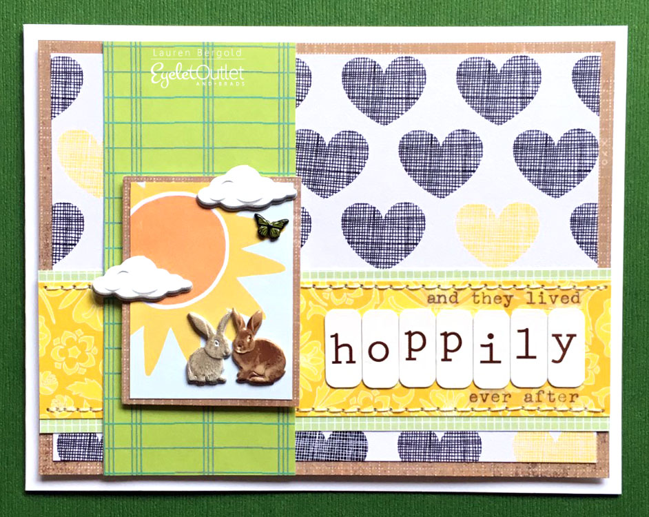
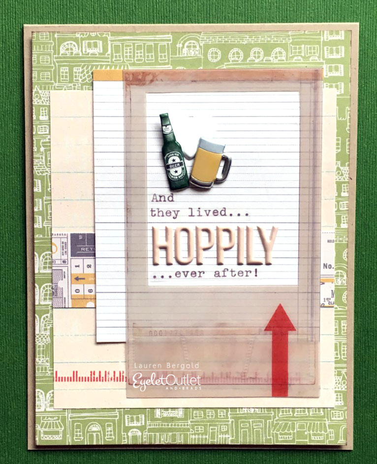
Hoppily Ever After
This card also includes one of my favorite hacks for our Paper Flowers. I've mentioned before that I love cutting the petals of the green flowers apart, to make leaves and vines. This time I cut the whole flower across the center to make a lilypad!
Of course, no one likes a uni-tasking pun, right? Luckily we also have Rabbit Brads, which work equally well with the sentiment. I liked the little "scene" in the frogs' card, so I tried to give the bunnies a bit of context by putting them on a sunshiney mini journal card and adding a cloud from the Sun and Cloud Brads as well as a Mini Butterfly.
As I was grabbing the ingredients for the other two cards, I came across the Beer Brads, and realized that "hop" can be a noun as well as a verb. So obviously I had to make a third version. I couldn't come up with a realistic landscape for this one, but I added one of my favorite Heart Brads for good measure!
I hope you're having a very HOPPY day, and that you'll be inspired to make a fun card (or three!) before it's over! ♥
Tuesday, September 11, 2018
SOS371: upcycling
i love challenges where i get to re-use, re-cycle or up-cycle a non-crafty ingredient, especially when it's something i might actually have thrown away. more on that in a minute, but by now you'll have sussed the this week's challenge at shopping our stash is to perform such a feat, and here is the card i made:
yes, that's TWO shaker cards this year-- a new record for me, lol! but i recently found an entire tin of little crystal beads, which reminded me of the glass marbles used in flower arranging, and thus the idea for a vase/shaker emerged. luckily, i had the sturdy plastic box in which my colorburst inks and reinkers were packaged, so i had the perfect material to make a somewhat realistic mason jar:
I stamped the jar with staz-on, and used the coordinating die on my absolutely ancient k and co paper... which, by the way, i still really love! i've got a sort of secondary-line in upcycling on this card, too: instead of stamping or diecutting flowers, i chose a lovely vintage illustration from a falling-apart garage sale book, backed the slightly brittle paper with scraps of cardstock, and fussycut the flowers. i generally run just a tiny bit of distress ink around the edges at times like these, otherwise you get that glaring white of the cardstock backing. i mounted the blooms on a bit of foam tape for even more dimension, and this pretty butterfly sticker came and perched on the leaves!
don't forget to check out the glorious cards from the SOS design team for more inspiration!
yes, that's TWO shaker cards this year-- a new record for me, lol! but i recently found an entire tin of little crystal beads, which reminded me of the glass marbles used in flower arranging, and thus the idea for a vase/shaker emerged. luckily, i had the sturdy plastic box in which my colorburst inks and reinkers were packaged, so i had the perfect material to make a somewhat realistic mason jar:
I stamped the jar with staz-on, and used the coordinating die on my absolutely ancient k and co paper... which, by the way, i still really love! i've got a sort of secondary-line in upcycling on this card, too: instead of stamping or diecutting flowers, i chose a lovely vintage illustration from a falling-apart garage sale book, backed the slightly brittle paper with scraps of cardstock, and fussycut the flowers. i generally run just a tiny bit of distress ink around the edges at times like these, otherwise you get that glaring white of the cardstock backing. i mounted the blooms on a bit of foam tape for even more dimension, and this pretty butterfly sticker came and perched on the leaves!
don't forget to check out the glorious cards from the SOS design team for more inspiration!
Friday, September 7, 2018
peace on earth...
...is the theme this fortnight at ♥JINGLE BELLES♥ so we'd like to see holiday cards that include the word peace, OR the peace symbol, OR a scene that evokes peace for you. i combined the first option with the third:
i used a (scanned and reduced) vintage postcard for my peaceful scene and trimmed the word "peace" from a journaling circle in which the overall design didn't fit my vintage vibe at all, but the script word worked just fine! i'm still obsessed with heartfelt creations' dimensional flower system, so the sweet poinsettia clusters are making another appearance; this time in white and gold. if i had set out looking for flowers to specifically fit around the circle shape in the postcard without covering all of the holly, i don't think i could possibly have hoped to do better than this, lol! i partook of this week's awesome sketch saturday layout (week #529) though i rotated it ninety degrees counter clockwise.

be sure to check out stephanie's beautiful card and start planning your own peaceful masterpiece at ♥JINGLE BELLES♥!
Wednesday, September 5, 2018
down on the farm (part two)
Last Autumn I made a set of Farm Animal Artist Trading Cards to celebrate the release of our adorable Eyelet Outlet Cow and Goat, Pig and Sheep and Rooster Brads. Recently it occurred to me that I'd left out the Duck Brads and it was a shame the Horse and Pony Brads hadn't been available yet. So I thought I'd go back and fill in the blanks!
I made all of the short, punny sentiments with my old school Dymo labelmaker, having recently found Dymo brand tape for sale at Target, of all places! (There are other brands of tape that fit the Dymo, but they don't all STICK like Dymo, and I'll never experiment again, no matter how pretty the colors are!)
ATC's are traditionally the size of a standard playing card, which is 2.5 x 3.5". These ATC's are, in fact, built on top of actual playing cards. Because they are quite sturdy, plastic coated, and really there isn't much else to do with a deck when you've lost or damaged one of the cards!
Each ATC in this set features a base of ledger paper, an appropriate dictionary definition, and a strip of Red Dot Washi plus some Skinny Gold Tape.
But the real stars are the Animal Brads, which I've framed up in some vintage slide mounts. You can build a little scene right on top of the image, but generally I remove the original photograph and adhere the cardboard mount to some sturdy patterned paper. Then I set my brads within the window, which is a perfect size to show them off!
In this second set I've featured the Horse and Pony Brads (which combine a mix of two colors of adult horse, plus adorable foals), Duck Brads, Llama Brads, Trout from the Trout and Bass Brads and Sketched Owls which I think are one of the prettiest designs we have.
I made all of the short, punny sentiments with my old school Dymo labelmaker, having recently found Dymo brand tape for sale at Target, of all places! (There are other brands of tape that fit the Dymo, but they don't all STICK like Dymo, and I'll never experiment again, no matter how pretty the colors are!)
I hope you'll be inspired to make some fun ATC's featuring your favorite Eyelet Outlet Brads and Washi Tape!
Tuesday, September 4, 2018
crazy for coloring!
yes, that's the name of the new challenge from shopping our stash, so break out your favorite coloring media --markers, pens, pencils, gelatos, or all of the above-- and get going! personally, i'm more often crazy *FROM* coloring, because realistic shading is one of my weakest attributes. so even a few small images (like those below) take me several hours to complete. i should probably practice more... ah well... i'm pretty happy with the results this time:
there's loads more inspiration awaiting you at SOS, where my design team darlings have gone all out. i know you don't want to miss it, so off you go! ♥
my usual coloring method is to do a "base coat" with my tombows, then add shading, blending and highlights with prismacolor pencils. and that's what i've done here. i thought about painting a beach background again. as you know, i LOVE painting beach backgrounds. but having just done that last week, i thought i'd change it up and paper piece the background instead. which let me use up a bunch of seriously old paper scraps... very much in the SOS spirit there! i couldn't resist a few eyelet outlet brads in the foreground either. the beachy ones are some of my faves.
i haven't linked up with retrorubber in a bit, and probably getting back into the habit would help me stamp and color more confidently, right? their current challenge is "anything goes" so i'm cool on that score. you also need to use stamps more than a year old, which is perfect, because i know that this adorable mft hula girl was a birthday present from stephanie last june.
as adorable as the girl is, my favorite stamp in this set is the chameleon. he could probably be my spirit animal, one of the few creatures on earth who loves COLOR as much as i do, lol! originally my plan was to place him on the lower righthand side, where the brads are. but somehow, as i was applying foam tape to the back of the heart, i managed to get a big black smudge up towards the top. so a hasty chameleon relocation operation took place at the last minute. (shhhhhhhh don't tell, k?!)
there's loads more inspiration awaiting you at SOS, where my design team darlings have gone all out. i know you don't want to miss it, so off you go! ♥
Subscribe to:
Posts (Atom)