Showing posts with label ink over collage. Show all posts

Monday, July 15, 2024

Index Card a Day (Week 7)

We're rounding the corner into the second half of July (already?!) and here's my own output of Index Card Art from this past week:

ICAD24-45: Mandala Monday

Wouldja believe... It's a Marvin Mandel Mandala Monday?! In perhaps the most stunning case of vintage-paper-related serendipity EVER, I found this business card stuck into one book, and the illustration of this (completely unrelated) gentleman in another book about ten minutes later. I went looking for the name "Mandel" in an old telephone book I rescued to use in collages and did NOT find a Marvin, but there were half a dozen others which are partially obscured by the mandala petals. I used a combination of Wendy Vecchi Archival Inks, a white Posca pen and Prismacolor Pencils to add color; and Ranger's Letter It Fineliners for all the shapes. As always, my Helix Circle Maker Tool was invaluable.

ICAD24-44: Seashell

Super-literal take on the prompt: I white-embossed a set of HoneyBee Seashell stamps; blended some of my favorite Wendy Vecchi Archival Inks on top; then splattered and outlined and played with the results.

ICAD24-43: Fragile

 My collage admittedly has a #FRAGILE connection to both the prompt and to reality. But… you know… in a good way! I am especially proud of the way most of the design is built around a similar color palette; AND, especially the fact that the banana, the ballet dancer and the Chinese character for banana all have a similar shape to them. 

ICAD24-42: Off Prompt OSC

And here we have world’s most random One Staple Collage! FYI, One Staple Collage is an ICAD tradition; the brief is to create a collage which is held together with… wait for it… one staple! Slightly trickier than it sounds but a lot of fun!

ICAD24-41: Forest Green

I set out with the intention of working on today’s prompt of #FORESTGREEN and thus handcut some beautiful wonky leafy shapes from every green EXCEPT forest green… then branched off into altered/doodled patterned paper scraps in various shades of blue. But that’s why they’re called “prompts” rather than assignments… they’re meant to get you started and you can go in any direction from there! 

ICAD24-40: Off-Prompt

Today's is actually not my favorite card, although I love the funky ink-splotch colors; and stand by my decision to cut around the flower edge on the right hand side. Plus… to enjoy and learn from the process rather than focusing purely on outcome is (to me!) the true spirit of ICAD, so woohoo!

ICAD24-39: Off-Prompt

Yes, I do tend to save my scraps of patterned paper, even quite small ones that I probably shouldn't bother with, but they're excellent for stamping and paper-piecing, not to mention for those nights when I just feel like cutting out random shapes, stacking them, and arranging the result into a funky pattern. 

Monday, January 1, 2024

Happy New Year!

And here's the first Mandala Monday of 2024! 

This very vibrant mandala features lots of my favorite shades of Wendy Vecchi Archival Inks from Ranger, including Rosy Posy, Sunflower, Prickly Pear, Sky Blue, Carnation Red, Leaf Green, Violet and Peachy Keen. Scroll down to see a little bit about the process, and how I finished off this extra-large piece.


I *think* I invented Ink Over Collage, or at least, I don't believe I've ever seen anyone else do it...? The first project I made with this process was the GIANT pair of Mandala Canvases from January of 2016. If you want to see a step-by-step tutorial featuring the process This Post is not bad. In the meantime, here's a bit more detail on today's mandala.


Ink Over Collage generally starts with (...wait for it...) a collage. I use plain white 110lb cardstock as a base, a good quality gluestick for my adhesive, and mostly white or slightly off-white vintage and found papers (sheet music, text pages, etc) that I tear and stick on fairly randomly. I'm not too worried about being absolutely symmetrical, but I usually like to start with a perfect circle; you can use an old school compass, a Helix Circlemaker or just trace a roll of masking tape or a Tupperware lid. You can definitely outline first and then fill in with color, but using Archival Inks and an Ink Applicator, Detail Applicator or dauber, I found it hard to be 100% accurate, so at some point, I started putting the ink on first and outlining around it (I use Letter It Fineliners) afterwards. 


Obviously you don't need to fill an entire 8.5 x 11" sheet, but in this case, I had a plan (which you'll see in the next step) so that's what I did. 

At this point, I should apologize for a bit of a cheat, because in between the photo above (where all the shapes are just solid Archival Ink) and the photo below (where there's LOTS more detail) I somehow skipped photographing the step where I added extra black line work, as well as tone-on-tone colors applied with markers, and some dots and outlines with a white paint pen. This intermediate step can take five minutes or a year, it just depends what you feel like doing on that particular occasion. 

I will say that for me (here's a bit of a secret) usually the places that have the heaviest lines or the most dots, details, cross-hatching, etc... are "inspired" by the fact that I made some sort of mistake that needed to be covered up; which then had to be carried consistently throughout the entire piece. (So now ya know!)


Here's where the aforesaid Plan came in; why I made such a big mandala, and why I placed it dead center of the paper: I knew I wanted to split it into four panels, to make a set of notecards!


After using my guillotine trimmer to make four equal rectangles, I rounded opposing corners, matted on coordinating cardstock, and machine stitched each one to a white A6 card... Et voila

Stay tuned for another Mandala Monday... approximately a week from now; in the meantime, Happy New Year to you!

Sunday, July 16, 2023

ICAD, Week 7

The NJ weather is pretty warm, but the Index Card inspiration on Instagram (aka #dyicad2023 hashtag) is red hot! Here are my cards from the past week:

Day 40: Mandala Monday

It's an Ink-Over-Collage Mandala Monday, featuring some of my favorite, extra-vivid Simon Hurley create inks, including Clear Skies, Later Gator, Shooting Star, Remember Me, Prom Dress and Roar!

Day 41: Off-Prompt

A surprising proportion of my collages are composed based on color; in this case cerulean blue and sunshine yellow. On a vintage library catalog card.

Day 42: Off-Prompt

Freeform funky flower doodles on a smooshed background of  Wendy Vecchi Archival Inks.

Day 43: Patina

Quite a loose take on today’s prompt of #PATINA because usually rust isn’t blue… 
(Ok yes, busted: this is basically just an excuse to sequentially smoosh some of my favorite Wendy Vecchi Archival Inks, including Night Sky, Prickly Pear, Sky Blue, Leaf Green and Morning Glory; and doodle with Ranger's Letter It Metallic Markers.)

Day 44: Wabi Sabi

Several years ago, during ICAD, was the first time I had ever heard of Wabi Sabi (the Japanese ethos of embracing the inevitable decay and perfect imperfection of the physical world) and the first image that I consciously recognized as being Wabi Sabi happened to be a crumbling brick wall with some vines growing randomly out of the mortar. Since then, I think I've made a Wabi Sabi Brick Wall card every year; and here's the 2023 version: handcut patterned paper bricks, pink index card mortar and stapled on wonky leaves. Not gonna lie... I really love this one! 

Day 45: Repeat

Pretty sure the "REPEAT" prompt was not intended as an invitation to repeat my favorite technique of a random collage featuring a historical lady, a sewing pattern layout, S & H Greenstamps, sheetmusic and found text (topped off with a few sticker butterflies) but... that's how I chose to interpret it!

Day 46: Millefleur

Millefleur is French for a thousand flowers, and has its origins in Medieval tapestries, where the foreground would have figures, animals or structures and the background would be filled in with lots of tiny plants and flowers, usually surrounded by green. Nowadays a millefleur pattern can be taken more loosely to be any allover pattern with smallish plants and/or flowers. In Italian, Millefiori also means a thousand flowers and generally refers to millefiori glasswork which comprises a bunch of glass canes all fused together and then sliced to resemble a sort of mosaic, vaguely floral, pattern. My card has very loose fleurs painted in some of my favorite Wendy Vecchi Archival Inks (Orange Blossom, Cornflower, Violet, Night Sky and Carnation) then outlined and detailed with Letter It Fineliners.

Monday, May 8, 2023

Mandala Monday: Ink Over Collage Tutorial

It’s an ink over collage mandala Monday featuring all my favorite Wendy Vecchi Archival Inks… with photos to show you all the steps!


Step one: Make a random collage of vintage text paper, keeping the paper patinas fairly light and consistent.


Step two: Scribe a circle at the center of your collage and fill it with the ink of your choice; in this case Wendy Vecchi Orange Blossom Archival from Ranger.


Step three: Add petals, circles, hearts and other shapes in rings, working outward, using the Ranger Archival inks of your choice.


Step four: Use a fine tipped black pen to outline the basic shapes. Use Ranger Detail Applicators to fill in any blank spots with ink.


Step five: Add additional line details and, if desired, add some additional color contrast or shading with markers. And maybe a little white with a Posca pen...?


Step six: Trim the completed mandala into four equal pieces. Mat the four quarters on a coordinating color of cardstock and adhere to four A6 white cards. Stitch around the edges of the Mandala panels if desired.

Monday, January 2, 2023

MM001

Happy New Year! For the first Mandala Monday of 2023, I've broken out lots of my favorite Wendy Vecchi Archival Ink colors for some ink-over-collage action! 

Wendy Vecchi Designer Series Archival Inks in Sunflower, Tea Rose, Rosey Posey, Cactus Flower, Bluebird and Leaf Green; Letter It Fineliners and of course the awesome Helix Circle Maker Tool

Monday, December 26, 2022

Take Five!

This being the last Mandala Monday of 2022, it seems like a good time to look back on all the mandalas I made this year and pick some faves. It was considerably harder than I thought, but here are five, in random order:


1. I made this sticker mandala at the height of my obsession with season two of "Only Murders in the Building"; perhaps the New-York-iest television show EVER. It uses a lot of well-hoarded (tiny!) Pipsticks plus a few other bits and bobs.


2. Every favorites list I ever make will likely feature at least one collagey thing; this ICAD Ink-Over-Collage mandala features Wendy Vecchi's Summer 2022 release of Archival Inks in Rosey Posey, Morning Glory and Peachy Keen.


3. Thanks to Stephanie, I have several different types of Magic Pencil sets (which I don't use enough... note to self for next year!) but when I do, I think of an especially wonderful trip to NYC's Metropolitan Museum of Art with my friend Paul, who bought me my first Magic Pencil in the gift shop.


5. By far the easiest type of mandala to make, with NO DRAWING required, is the kind that uses punched shapes--mostly circles and hearts. For this version, I used vintage and found papers for the layers with a nice big spray of gardening magazine peonies on top.


5. Watercolor is my go-to for coloring mandalas; whether it's using actual watercolor paints, Tombow Dual Brush Pens, or, as in this case, ink pads "smooshed" onto the Wendy Vecchi Craft Sheet that's attached to the back of my STAY-tion, where I picked up the color with a waterbrush. These beautifully luscious shades are all from Simon Hurley's create. Dye Inks collection.

♥♥♥♥♥

I'll be back next week with a brand new Mandala Monday design to welcome in the brand New Year! In the meantime, I hope you will be able to squeeze a little bit of art time into this last fun and hectic holiday week of 2022!

Monday, July 25, 2022

Cruising Into the End of July...

...and here now is the penultimate ICAD Round-Up; starting with today's Mandala and working backwards through the past week:

Day 55: Mandala Monday
An ink-over-collage scenario, featuring some beautiful vintage "Big Dollar" trading stamps from Stephanie, and the three newest shades of Wendy Vecchi Archival Ink from Ranger: Morning Glory, Rosey Posey and Peachy Keen.
(There might just be a new WV release tomorrow, too... you never know...)

Day 54: Wander
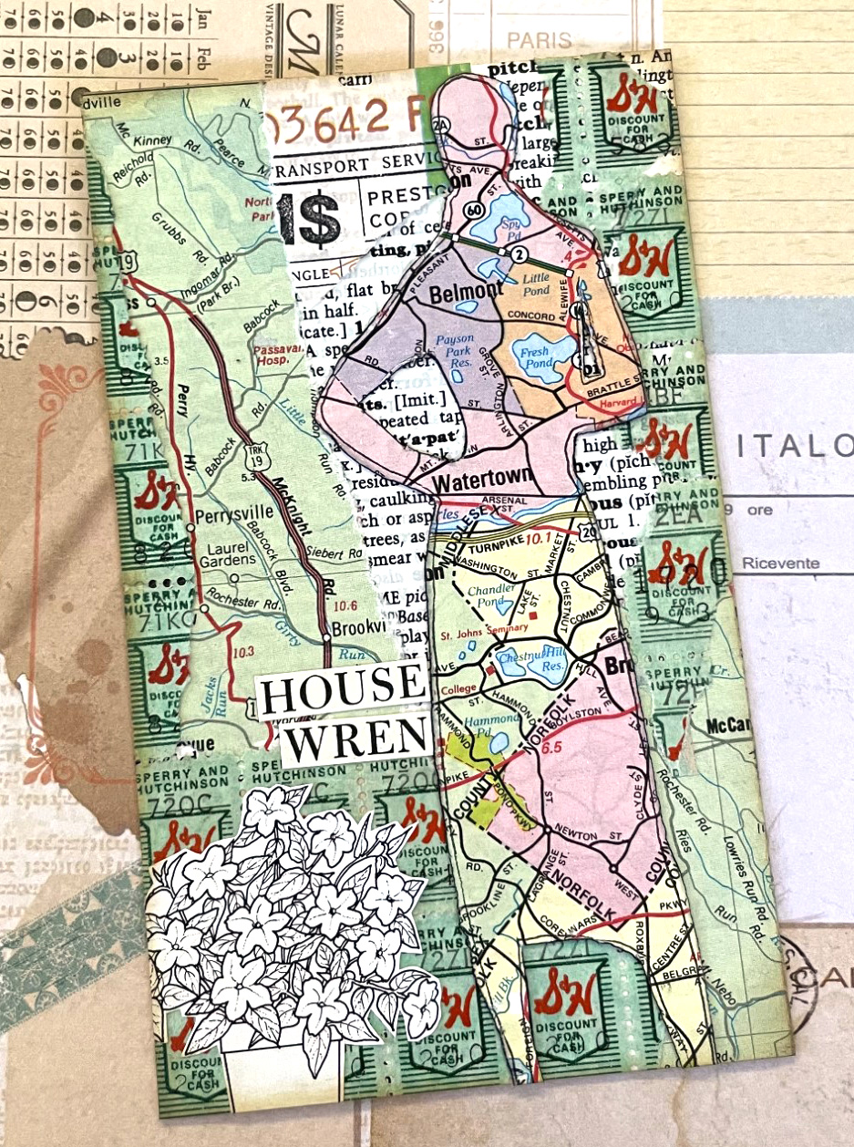
This silhouette of a magazine model, cut from a vintage map just happened to be in my box of collage bits! I have no idea what my original intention was for her, or why it didn't happen...

Day 53: Dawn or Dusk
Currently the only time it's less than sweltering here in central New Jersey, and it's amazing how the critters who frequent our feeder and birdbath (birds, squirrels, bunnies and chipmunks) instinctively know that. (Ok, yeah, not really prompt-based; it's just a garden-themed vintage paper collage!)

Day 52: Together
This pre-cut-out vintage illustration was sitting in my box of collage fodder and for some reason the amount of shopping they're carrying screamed, "Green Stamps" to me! :) 

Day 51: Chevron
Circling back to a prompt from last week when I had an idea but no doodling time!

Day 50: Detour
Very verrrrryyyyy loose version of the prompt, but het... there's a map!
(Ok, really I just wanted to use another of Gina's awesome Critter Stickers; this one's calle Anxious Pastel Pacu!)

Day 49: Wallpaper
Quite a tangential take on the prompt, but I like how this grouping came out; it's the last 3 or 4 images from an ancient pack of rub-on transfers, layered over a torn paper collage.

♥♥♥

Tuesday, June 9, 2020

Look Out For Those UFO's!

Because I'm pretty sure we all have at least a few half-completed backgrounds... or some pretty flowers we spent time fussy-cutting and then they didn't fit;  or the images we stamped but didn't color, or colored but didn't use... in short we all have Un-Finished Objects, aka U-F-O's! This fortnight at Shopping Our Stash we want to to retrieve a few of those and actually use them to make a card or other project. Sound good? Yeah, we thought so too.


I always have tons of leftovers and/or discards, because I often change my mind midstream, lol. I do go back and use them fairly regularly though. I have a storage section that has card-sized collaged or inked or colorbursted panels; a set of small drawers that's just xmas diecuts; and a whole series of envelopes that hold pre-fussy-cut collage elements. I raided the collaged panels and fusscut goodies and actually managed to pull together a four cards in an evening! Geez... I should do this more often!


The tulips miiiiiiiight be my fave. It's a simple card, but hey, who doesn't like a macro flower pic against a collage panel? I used one of the collage paper backgrounds (I often make a totally random "clean up collage" of leftover text papers instead of putting them away or throwing them out); a heart cut from some gorgeous Blue Fern Studio patterned paper and a mat of mustard-colored cardstock that I cannot imagine having bought, but it was *perfect* with the tulips.


I used another of the pre-made collage paper backgrounds make an "ink over collage" mandala using distress inks and pitt artist pens, then added one of the fussy-cut roses. I made a simple sheet music background for another of the roses with just some White Lace Tape and a skinny pink mat to serve as a sympathy card. Finally, one of the illustrated roses got added to the last collage background, which I trimmed down a bit. I confess that I've never seen a sparrow land on a flower in real life, but he's super-cute, so let's pretend it makes sense. It needed one more thing, so I scattered some Pretty Pink Posh champagne-colored sequins. The End. :) 


Of course you only need to make one UFO-centric card to join us at SOS, but who knows? Maybe you'll get on a roll too! ♥

Monday, October 16, 2017

ink over collage: all the steps

last week when i posted an ink-over-collage mandala for mandala monday, a few people (ok, technically just barb and dawn mercedes) asked if i had any plans to make a video of the process. which is a very sweet and flattering question. but no. at least for now, the closest i'm going to get is remembering to photo all the steps of a project, then making them into a flipagram or a photo tutorial with captions. for this mandala, you can find the former on my facebook and instagram accounts, and the latter right here:


supplies: 
miscellaneous vintage papers
a good gluestick (i like scotch brand)
a substrate on which to build (mine is 5x5" chipboard)
plain white modelling paste and a few stencils
various colorful dye-based ink pads 
fingertip applicators for the inks (yes you do actually need them)
a compass, cup, or roll of tape for making a perfect circle
various pens for outlining (i like faber-castell's pitt artist pens)

(if you decide you'd actually like to try this method, scroll down to the bottom of the post and read the footnotes, 
especially the part about gluestick because it's fairly vital!)


start with your base and a selection of papers that have been trimmed --or torn-- to size. it's a good idea chop off big blank borders and margins. i like to mix text papers with a variety of languages and fonts, some charts, some sheet music, etc.


add the papers one by one, adhering them with a really thorough coat of good quality gluestick, applied edge to edge. i like all of my text to be right side up, and fairly straight, but i don't agonize.


entirely optional texture layer:
when the based is completely covered, choose one or two fairly low-key stencils, and apply them almost randomly. this is a good way to cover any too-dark text, or seams you don't like the look of, or any other "mistakes" you notice after you've covered the base.
(i love the look of the extra texture this gives, but it does make applying color and outlining a little harder, so you might like to skip this step your first time out!)


after the modelling paste is completely dry, sketch out your mandala design with a soft, erasable pencil. (to make the outlines visible for the photos, i've drawn them much too dark.) i nearly always start my mandalas with a perfect circle --or a portion thereof-- using a compass or a roll of tape. i don't mind how messy they get later, but i love that the center is precise.


now comes the fun part: adding color! 
i use the little fingertip applicators you see in the photos, because they are big enough to spread the ink quickly, but small enough for all but the most detailed sections. you'll notice that the various papers take the ink quite differently, so there are lighter and darker patches. if this is going to bother you, stop reading right now, lol! because i haven't found a way to do it better, so i've tried to make it part of the design. the nice thing is, that once you go "a bit grungy" it takes the pressure off having to do anything perfectly neatly! ♥


i always work from the center out. and i like to put colors that play well together next to each other because it's impossible to apply them perfectly, so the edges will tend to blur and blend. which again... once you embrace the imperfections of this method, makes for more interesting looks!


as i'm working, i will occasionally decide i don't like the first choice of a color. in which case i'll correct it by choosing something darker. this time i applied cobalt blue over ultramarine to get a stronger contrast. 


i try not to make collage mandalas too detailed because it's difficult to apply color in tiny sections. i have some sponge applicators for detail work, that i found in the pastel section at blick. (you can use makeup ones, but they tend to be flimsier and they shred pretty quickly.)
 

when the entire mandala is filled in and you're happy with all your color choices, go back and erase as much of the pencil line as possible. be sure to TEST your own particular eraser on your own particular ink, because sometimes smearing will occur. if you're erasing around modelling paste, you will need a stiff brush to get rid of the eraser crumbs. (if you've used really light pencil lines you can probably skip this step and just ink over them.)
 

now it's time to add your inked lines!
if you're wondering why i don't do this first, it's because the ink and the sponges can sometimes blur the lines, and i like them to be really crisp and bright. faber-castell's pitt artist pens are my favorites, and i always have 1.5, S and XS sized ones on hand. most of the dark outlines here are the 1.5 which is arguably a bit too much on a small scale, but the bullet tip flows so much better than a metal nib over collage. 


at the very very end i sometimes like to add lines or dots in other colors. i like posca's paint pens for this, but i use them absolutely last and i try to be very careful, because they are much more likely to smear than the permanent ink pitt pens.


et voila!
that is the entire process from start to finish.
if you're still awake, i thank you very much for coming along 
and wish you the happiest monday of the whole entire week, darlings!
♥♥♥♥♥


footnotes about the supplies that you only need to read if you really want to TRY THIS, or alternately, if you have seriously bad insomnia:

papers: mine are mostly vintage and mostly white or off white; i don't like too much color variation for this, because it gets distracting. i tend to keep the illustrations to a minimum for the same reason. and i try to choose papers whose ink won't get too smeary, though there's always one that surprises me, lol, so i don't get too bogged down choosing.

gluestick: do you really need one? YES. i know, i know, a lot of them are really crummy and don't actually work. at this point, the only mass market brand i'm willing to recommend are the scotch brand (regular or craft) which you can sometimes find at a big box store, but may have to purchase online from staples, or if you're really lucky and have a great lss like paper anthology, the owner may start to carry them just for you! :) you will also need an old magazine or quite a bit of scrap paper because you need to apply the gluestick evenly all over each piece of paper, and take care to coat the edges really well. for which you need to be able to apply the stick out OVER the edges... or i guarantee they will not stick. i save old catalogs and mags to use especially for this purpose, since they let me have a new clean page for each item, thus making it much less likely i will drag the next collage piece through the old glue. (at this point any serious collage artist is horrified that i have not mentioned gel medium, which is what "real artists" use for collage. i actually find it too wet, and thus nearly always use gluestick, especially for this particular method. if you really want three (additional!) paragraphs as to why, send me an email, lol!)

substrate: this collage was built on medium-thick chipboard, but canvas works well, or foam core, or a cereal box, or even just good sturdy cardstock. (it really depends on what you want to do with the collage in the end.)

inks and applicators: i mostly use ranger archival or distress inks because they have the most variety and can be found everywhere, including paper anthology where i teach. but use whatever fairly fast-drying dye ink pads you like best. the non-negotiable part of this --for me-- are the little round fingertip applicators with rounded edges, which i like much better than any other type, especially the inexpensive ranger sponge applicator refills which are admittedly much cheaper and easier to find. (i buy the fingertip ones in bulk and i go through TONS of them because using them over modelling paste shreds the spongey part.)