Showing posts with label #patternjanuary. Show all posts

Sunday, January 27, 2019

a smattering of patterning

i haven't been able to participate every single day of pattern january on instagram, but i've still been jumping in here and there as time permits. and i continue to find anika starmer's prompts --not to mention the amazing variety of ways the other participants are interpreting them-- incredibly inspiring. here are a few more of mine:

day 10: beach
i confess i loved making this more than i love the finished product, but then, PROCESS is the main point of a daily sketchbook challenge, imo! it's a great time to practice, to brainstorm, to think of something you wouldn't normally have any reason to do. just stepping out of my normal, practical area of expertise can give me a whole new perspective. 

day 11: furniture
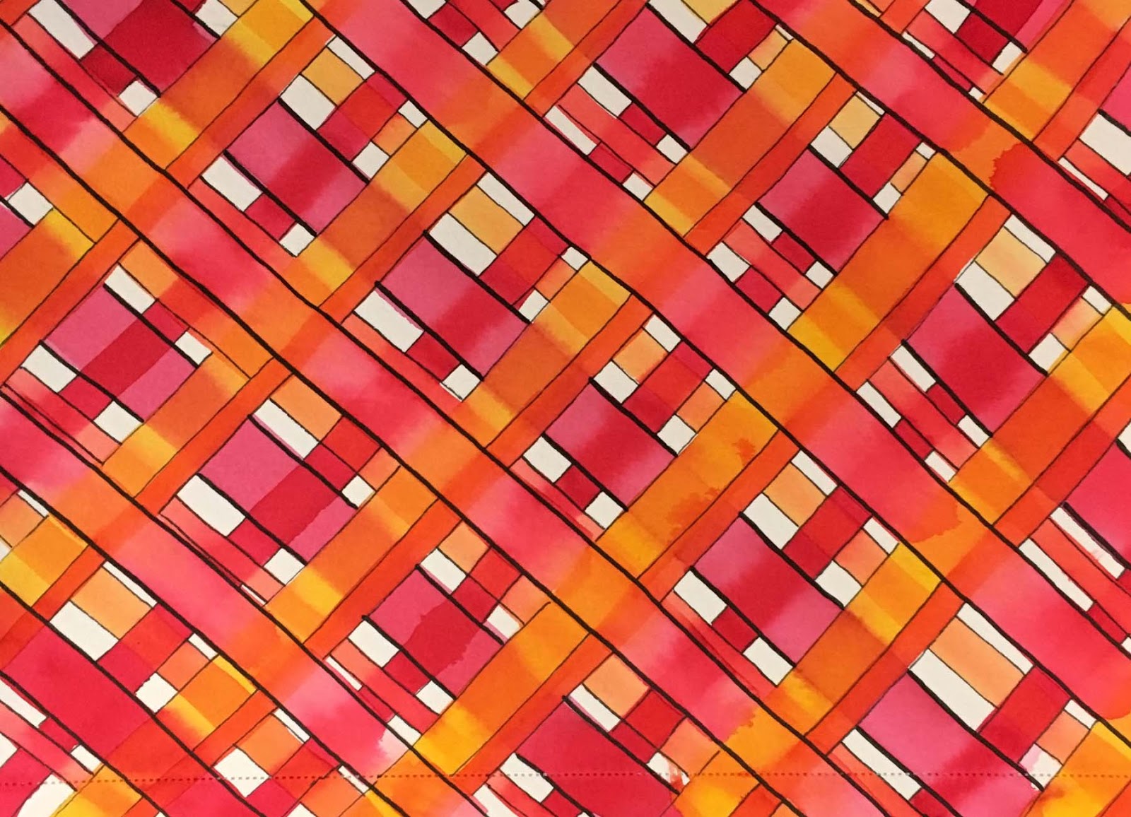
ok, yes, this one's a bit tangential: i painted some uber-bright madras plaid, of a sort you might see on patio furniture... you know... in the summer, when it's WARM OUT.
(ps: painting plaid... or stripes... or curvy lines... is a great way to build up your brush control, which is one of the most crucial skills for painting. outlining the results with a pen adds line control, which is equally important. and before you say, "i don't have a steady enough hand to paint straight lines" i should mention that NOBODY starts out with a steady enough hand to paint or free-draw straight lines; hence the need to practice!

day 12: fruit or veggie
i chose fruit, as you may have noticed. and i painted this last sunday, when i didn't have an idea for mandala monday the next day. because that's how scientific i am on these occasions, lol.


day 13: woodland
inspired by my fellow IG pattern enthusiast by aarup who posted her digital version of a gorgeous birch grove. i used an easy washi tape mask and two favorite shades of blue colorburst: cerulean and ultramarine. then outlined and added details with pen.

day 16: pen.man.ship
i somehow managed to post this on jan 23rd, which turned out to be national handwriting day. an attempt to seamlessly transition various rainbow shades using tombow dualbrush pens in about 14 colors! i'm somewhat proud that after practicing (and practicing... and practicing...) i now feel happy enough with my letterforms to not necessarily outline and touch them up.


day 17: weather
funky patterned clouds in a funky patterned sky. with tombow and posca pen details added last, when the watercolor was bone dry. inspired by the "no lines" watercolor method of stamping, i drew my basic cloud pattern using the lightest shade of blue tombow dualbrush i own, then painted the sky in cornflower and cerulean colorburst.

day 20: scallop
just a fabulously fun rainbow-fest here!
(ok seriously, this was really really fun to paint. but again, it's a brush control exercise in disguise. the point being to add successive rows of scallops, without waiting for the last to dry, by leaving a 1/16" gap of dry paper in between. using ten different, super-bright shades of colorburst, and turning it into an interesting-to-look-at pattern, is just a sweetener. like taking a fun, rowdy zumba class instead of slogging away on the treadmill by yourself!)

♥♥♥
hope you're having an awesome weekend and that
 you'll find time to do something fun and creative just for YOU!
♥♥♥

Sunday, January 13, 2019

the pitter patter of pattern january

more fun sketchbook goodness, YAY! ♥

day 6: fair
i was thinking of a fun fair, so i went crazy with colorburst bunting. like ya do...

day 7: coral reef
this was a stumper because i decided i had to combine pattern january with mandala monday, which turned out to be harder than i thought. this doesn't entirely work (either as a mandala or a pattern, lol!) ...but... i definitely learned a lot AND got to use wisteria, cornflower and orchid colorburst!

day 8: kitchen
in a very verrrrrrrry tangential take, i painted some beuatiful arabesque tile i saw recently at home depot, that i would love to be our backsplash when we (eventually) re-do our kitchen. 
(technically, the tile i saw was neutral beige-on-beige, but that's not especially fun to paint, kwim?!)

day 9: starts with w
my "default mode" for pattern january is to go with very literal brush lettering whenever i can't decide what to do. this was one of those times. i cannot say i like this as a finished piece, but i had a lot of fun trying to make as many W color names as i could think of into visual patterns. i predict you might see some of my letter styles again, in something a little more finished looking.
(note: i've spelled "wedgwood" two different ways... BOTH are wrong...)

♥♥♥
pattern january is devised and hosted by anika starmer, aka a is for anika, on instagram and facebook. everyone who'd like to participate is welcome, in any media they enjoy!
♥♥♥

Sunday, January 6, 2019

pattern january!

i'm pretty excited that anika starmer is celebrating "pattern january" again this year on instagram and facebook. i'm planning to play along as often as possible. here's what i've done so far:

day 1: tea party
here's a secret: i'm really interested in handlettering again, so for the prompts where i'm not immediately sure what to do, i'm going to do something in the text art arena.
(i find a "default mode" HUGELY helpful when embarking on a daily challenge!)

day 2: wood grain
just in case you're wondering, you can get a really great wood look by painting alternating patches of burnt umber and sienna colorburst with a flat brush, letting it dry and then adding grainy details with a pretty dry fan brush in slightly darker versions of both colors... and maybe a little lamp black, as well. ;)

day 3: nocturnal
i had a lot of ideas for this one, but only one EYE-dea, lol!

day 4: prism
or... in this case... more of a prism break. definitely not my favorite in the series, but the nice thing about a daily challenge is you get another chance every single day!

day 5: sushi
more colorburst fun facts for you: a 3:1 mixture of pthalo green and lamp black gets you the perfect shade of nori; while 2:1 peony and lemon yellow is really very shrimp-like! :) 

ps: EVERYONE can play, all media are welcome and you needn't participate every single day. check out a is for anika on instagram for the prompt list and some really fab inspiration! ♥♥♥

Sunday, February 5, 2017

au revoir, pattern january!

et bon jour daisy yellow wonder31! as you know, i had a blast playing along with anika starmer's #patternjanuary event on instagram. so much so that i was a bit bereft at the thought of being left to my own devices for february. luckily tammy g of daisy yellow jumped in with a new venture. thus, here are the last sketchbook pages of january, and the first few of the new month:

"floral"
i never get tired of drawing (...or painting, or stamping or doodling...) flowers! these were done with tombow markers and faber-castell's pitt artist pens


"string"
i'm not sure what on earth made me think about macrame this long after the 70's, but i did. and it was really REALLY fun to draw!

"kaleidoscope"
last summer i found some amazingly cool vellum stickers at target and used the whole entire set of 450+ in like 2 weeks, making mandalas and other patterns during ICAD. luckily, at xmas, i found MORE OF THEM!!!!!! :)
(and yes, they seem to still be available on target's website!)

"pomegranate"
yep, it's a pomegranate mandala. nope, i didn't really see it coming, either, lol.
 
"fruit salad"
when i'm stumped for an idea whilst drawing or lettering, i often just fall back on alphabetical order and write (or in this case, draw) a list!

and thus, we wave goodbye to january and HELLO to the shortest month!

"minimal"
is the first of the #dywonder31 prompts. a lot of people would say the total absense of white space might rule this thing out pretty quickly; but it's only got one layer, one color, one line, one medium...
 (let's face it, my minimal is never going to be like ordinary minimal, is it?!)


"snow globe"
for the record... this is the kind of snow i like... the fictional kind!!!
(this page is white gellyroll pen over smooshed colorburst in indigo, cerulean and violet)

"butterflies"
doodle-y ones!

"1970's"
i was starting to miss collage, so here's a one-staple one, with a little bit of everything from my childhood in suburban philadelphia. i'm almost positive my mom made me the outfit the little sewing pattern girl is wearing... she did make a lot of my clothes when i was little and certainly i had at least one blouse with the really puffy sleeves... 

ok, so that turned into a lonnnnnnnnnnnnnnnnng post, but i'm all caught up now! and i have a nice sensible cards with only a pic or two pictures on deck for the next couple of days, darlings, i promise! ♥♥♥

Thursday, February 2, 2017

forever (wonky, hand-painted) plaid!

last fall, when i painted some plaid backgrounds to use in holiday cards, a few people asked me how i did it, and could i show the steps? being in the midst of holiday chaos, the answer was, alas, "ummmm... not right now..." but i promised to take photos the next time i painted some plaid. so i did. and here they are. :)

what you'll need, or rather, what i used in this example: flat brushes in several sizes, color burst pigment powders in fuchsia, tangerine, alizarin and gamboge (or ANY group of analagous colors* you like),  water, watercolor paper, selection of black permanent ink pens and a heat gun... OR... the patience to allow paint to dry between steps--which i soooooo totally do not have, lol. but this is a really flexible idea, so use your favorite supplies and make it your own!


step one: choose a direction, a brush and a color. paint lines in that color, spacing them evenly across your paper in one direction. I like to work on the diagonal because it's more dynamic, more interesting, and when my lines get a little wonky you don't notice quite as much.


step two: choose a different color and a different size brush, and paint a series of lines that run perpendicular to your first set. it's kind of important (imo!) to alternate between directions, so that your paint lines cross each other. and now you know why i said to pick analagous* colors... because even if your first lines are BONE DRY when you start the second set, you will still drag a bit of the pigment away as you cross over them. to me, this actually looks really cool and once you get used to it, you'll like it, but if you choose red and green as your paint colors you will wind up with brown everywhere they cross each other... (which, hey--might look good?)


step three: repeat step two until you have a plaid pattern that you like... OR your paper is full... whichever comes first.


an important note: you will need to allow your paint to dry completely before proceeding further. if you use a heat gun for this step, make sure you dry the front of the paper thoroughly, then flip it over and dry the back of the paper, as well!  (watercolor paper is very porous, it has long fibers that stay damp for longer than you think!) so yeah, you really need your paper to be thoroughly dry before you go to the next step, which is...


step four: add pen details. I suggest using a couple of different nibs of black permanent ink pen. I like a super fine point, an extra superfine point and maybe a medium or a 1.5mm bullet tip. my personal favorites are the pitt artist pens by faber-castell, but use whichever brand you like best. again it's important to alternate between directions and to let some lines appear to go over and some to go under various blocks of color to get a woven effect. 


when you're all finished, you might well wind up with something that looks a bit like this:


i hope you'll be inspired to paint your own wonky plaids... or wonky stripes, wonky dots, wonky text patterns... whatever fun and unique patterns your creative mind can dream up! ♥♥♥

*because we'll be painting layers, and because watercolors re-activate and blend when you cross dry lines with a wet brush, I STRONGLY SUGGEST choosing three or four colors that are next to each other on the color wheel, such as: red, orange and yellow; yellow, green and blue; blue, purple and red, etc; if you're using media that won't blend after it's dry (such as acrylic craft paint) you can probably get away with a lot more variation!

Saturday, January 28, 2017

round up the usual suspects...

...here comes another week's worth of sketchbook fun! :)


i wish i had taken a photo of this gelli print before i started working on it, but i didn't so i'll just have to tell you, lol. when stephanie and i were in the midst of a printing frenzy last june, i had placed my hand-cut buddha stencil on top of the plate, so there was white space on the actual print; as it turned out, instead of gluing things on top of it, i cut out the void and layered the gelli on foam tape OVER the collage of sheet music, chinese text, doilies, etc... i really like this look, so i'm sure you'll be seeing it again...

"bicycle"
for #patternjanuary; clearly a pretty loose take on the spokes and wheels of a bike. with loads of bright color burst shades and tons of doodle-y pen detail.

technically, not in my sketchbook... have i mentioned lately how much i loooooooooooove wrapping presents?! (i love wrapping presents!!!)

"folk art"
pattern january, again. i went with mexican folk art, and a much more regular/repeating pattern than usual...b/c you've gotta try EVERYTHING, right?!

pattern january two-fer: "rain" plus "black and white"
a much more sensible way to do a repeating pattern is to cheat, lol. i added some strips of black paper to my sketchbook, punched a bunch of clouds from black and from white and THEN... did pen doodles on top of both. (b/c srsly, if i had to draw all the clouds and paint in a background, this thing would still not be finished!)

"turquoise"
i always love the look of sprinkling color burst powder directly onto wet paper and just letting it do what it does. this is the first time i've ever tried it on top of metallic paint pen doodles. it won't be the last, though...

we are headed to the chiropractor this morning, which means crocheting on the way (for me, anyhow) and saladworks on the way home. i hope you will get your fair share of pleasant pastimes and healthy treats today, too! ♥♥♥

Saturday, January 21, 2017

palm fronds and donuts...

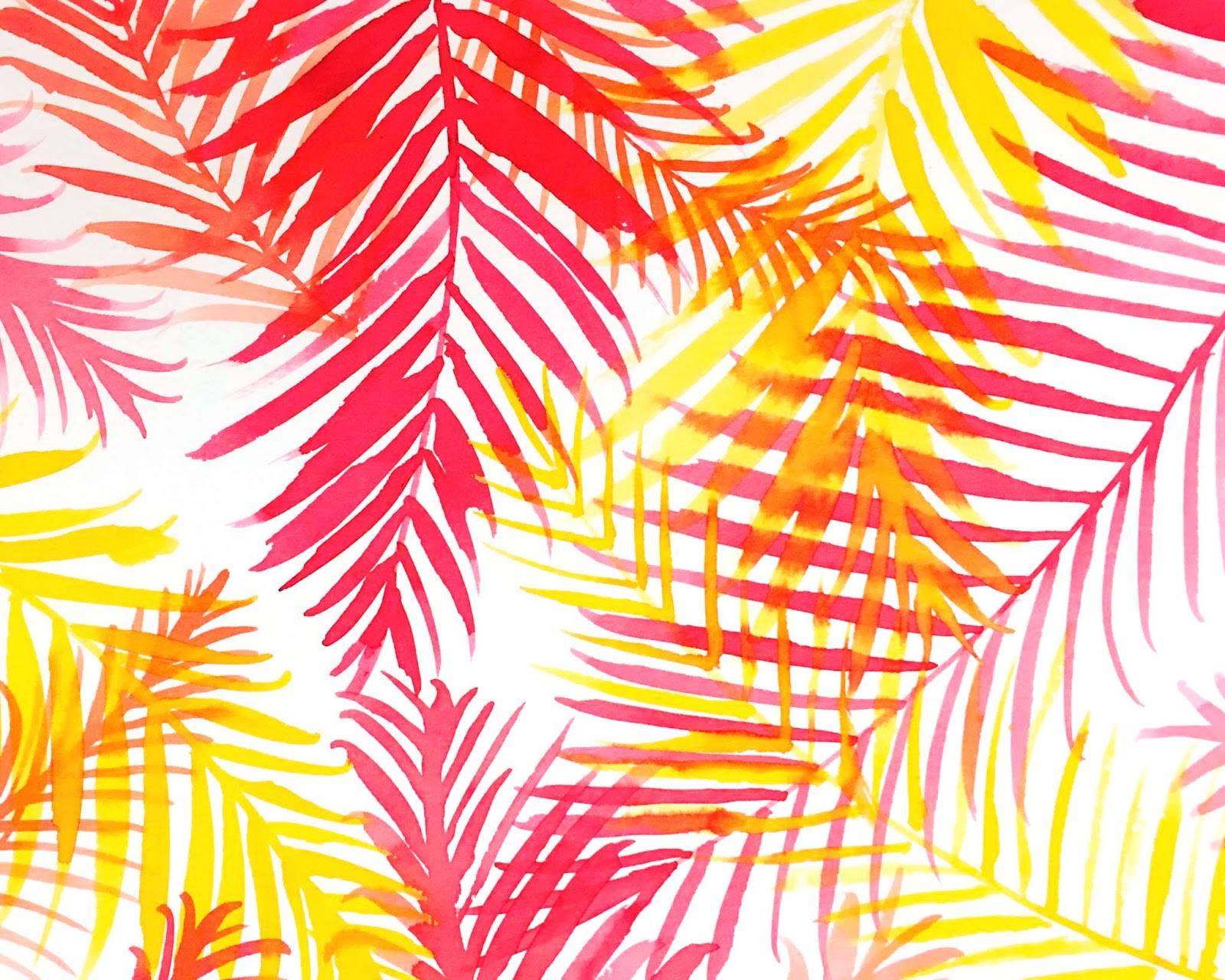
...are two of the great pleasures of life AND, coincidentally, the subjects of quick color burst watercolors in my sketchbook this week. both were prompts from anika starmer's #patternjanuary event on instagram. if you're wondering why i always seem to be participating in some sort of challenge or prompt list when it comes to my sketchbook, the answer is that by the time my "free drawing" opportunity arrives (usually about 10pm) i will still have the energy to create something, but not enough to think up what! the latter, for some reason, is usually harder for me. i'm not sure why, but there ya go! :)

combination of the prompts "palm" and "bright"
i think you'll agree it does both of those pretty straightforwardly

"baked goods"
i think technically, donuts are fried? they are also surprisingly fun to paint!
(to achieve the PERFECT color for dark chocolate icing, mix a teeeeeeny bit of alizarin crimson into your burnt umber!!!)

"cut and paste"
collaged bits of gelli print for this one

"fan"
also gelli-based. i've been having a real craving to get my gelli plate out and do some printing!
 
"greenery"
more colorburst. every shade of green, as a matter of fact.

"number"
or in this case, numerals. all of them. done with tombow dualbrush pens. 
(unless, of course, you count ZERO... which one of my wise guy IG friends pointed out was also a number. i didn't quite have time this week to travel all the way to norway and smack him, but i thought about it, lol!) 

"tile"
mine look a bit more like bricks, though i think that's mostly my choice of alizarin crimson, cadmium scarlet and fuchsia colorburst


one final thing i made last week was a pair of swatch books-- one for myself and one to hang next to the color burst display at paper anthology. they have each color painted as well-mixed watercolor on one side, and using the "spritz and sprinkle" method on the other. i highly recommend swatching of paint and pen colors --even if it's just on one of the back pages of a sketchbook-- not only is it ♥FUN♥ to use every single color, it makes it easy to choose exactly the right shade for any project!

************
i do hope this weekend finds you well and planning something fun and creative... after all your chores are done, of course!