

Sunday, September 29, 2019
So Nice They named It Twice!
New York, New York, that is! Home of The Ink Pad where you will find many treasures, including a whole line of exclusive stamps and stencils designed by Michelle Ward. The Downtown NYC Map Stencil is one of my favorites and I've used it on this card, the entirety of which you can see in my Stencil Sunday feature on the Ink Pad Blog today! ♥


Friday, September 27, 2019
have a happy, happy, happy, happy hanukkahhhhhh!
we're celebrating our friends who observe the non-christmas winter holidays this fortnight at ♥JINGLE BELLES♥! which means we want to see cards which celebrate hanukkah, solstice, hogmanay, kwanzaa, new year OR... you can make a completely non-denominational WINTER-themed card.
i went with hanukkah, as you can see. luckily i had an awesome new-to-me hero arts happy hanukkah stamp set that was absolutely perfect for the job; though i have made plenty of hanukkah cards through the years which just used blue and silver patterned paper, with candles made from strips of patterned paper or washi tape! my dreamy background layer is a leftover panel sprinkled with various blue shades of colorburst and spritzed; the multicolored layer further back is an alcohol ink essperiment that did not come out as i intended, but was too pretty to throw away, lol. btw, eyelet outlet tear drop bling makes outstanding menorah flames... just sayin'...
stephanie has an equally cool non-xmas card to inspire you, plus there miiiiiight just be a little hanukkah-related prize on offer this time. you should probably hop over to ♥JINGLE BELLES♥ and check... just in case!
ps: just in case you love adam sandler's hanukkah song just as much as i do, here is a direct link! ;)
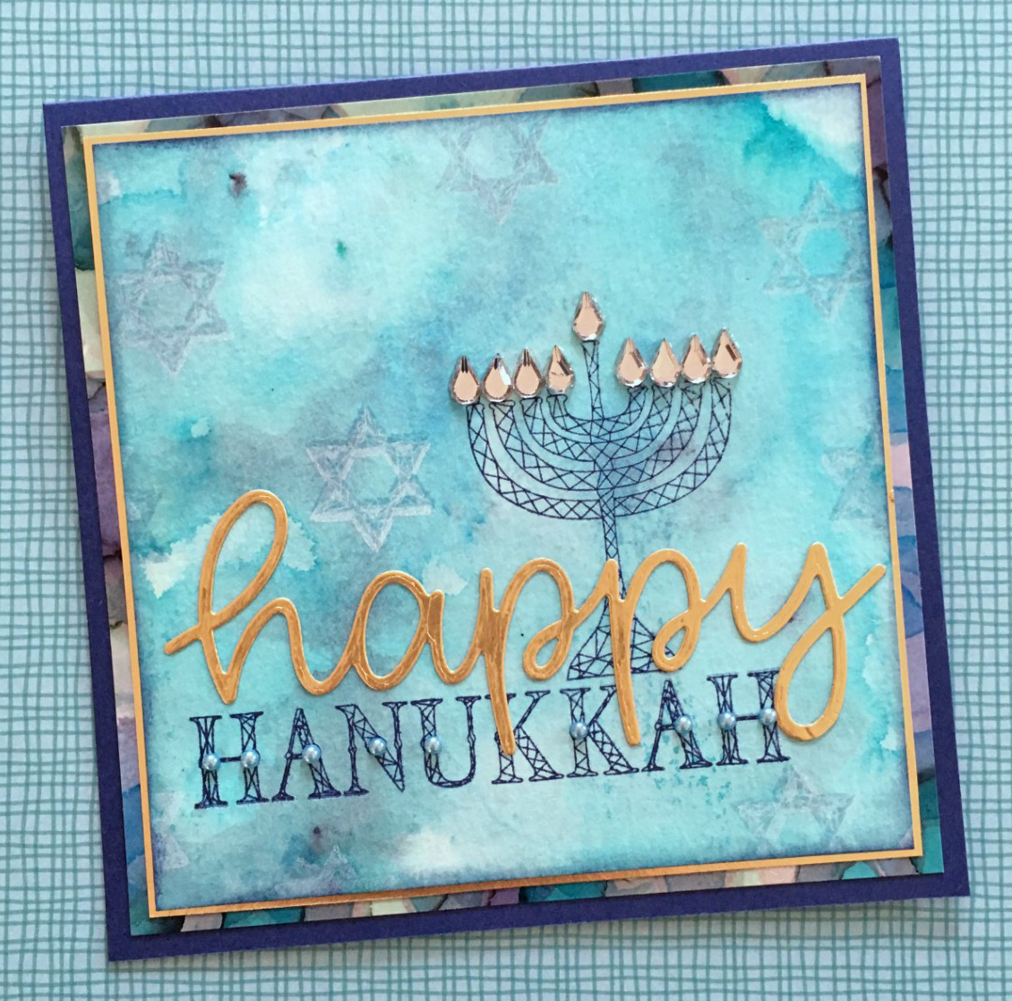 |
| hanukkah stamps: hero arts stamped in cobalt and blue sky archival ink; happy die: sunny studio; pale blue background paper made with ColorBurst pigment powders by ken oliver crafts on strathmore watercolor paper; lower layer multicolor paper made with ranger alcohol inks on glossy yupo paper; gold metallic cardstock: idea-ology; blue cardstock: bazzill; tear drop gems and tiny blue pearls: eyelet outlet; adhesives: elmers brand gluetape, sookwang scor-tape |
i went with hanukkah, as you can see. luckily i had an awesome new-to-me hero arts happy hanukkah stamp set that was absolutely perfect for the job; though i have made plenty of hanukkah cards through the years which just used blue and silver patterned paper, with candles made from strips of patterned paper or washi tape! my dreamy background layer is a leftover panel sprinkled with various blue shades of colorburst and spritzed; the multicolored layer further back is an alcohol ink essperiment that did not come out as i intended, but was too pretty to throw away, lol. btw, eyelet outlet tear drop bling makes outstanding menorah flames... just sayin'...
stephanie has an equally cool non-xmas card to inspire you, plus there miiiiiight just be a little hanukkah-related prize on offer this time. you should probably hop over to ♥JINGLE BELLES♥ and check... just in case!
ps: just in case you love adam sandler's hanukkah song just as much as i do, here is a direct link! ;)
Wednesday, September 25, 2019
It's Fall, Y'all!
I'm not sure how it's possible, but my calendar indicates that we're into the LAST week of September somehow? This seems like a good time for some fall cards, especially since the new Scarecrow Brads have just made their debut in the Eyelet Outlet Store!

Here's a shocking true confession: I don't actually like scarecrows!!! But these Scarecrow Brads are so adorable, they've even won me over! Something else I realized as I sat down to make my first card... I had never used the Tractor Brads that came out in the spring release. So this seemed like a good time to remedy that. I like the way the Pumpkin Brad looks super huge when it's placed on the trailer. Just goes to show you what a good job those scarecrows did over the summer! I found some plaid patterned paper with exactly the right colors and diecut the word "FALL" from cardstock I had covered with this awesome Sparkle Copper Tape.

My second card features handcut letters from scraps of that plaid paper. But of course you could use stickers, diecuts or computer-generated text. The oversized text gave me so much extra room I was able to include all the brads from the first card PLUS a trio of Sunflower Brads! Oh and you'll notice that there are two color variations in the Tractor Brads!

My third card shows off the Sunflower Brads again, as well as another pumpkin, two varieties of Paper Flowers and some fun Hardwood Floor Tape; not to mention letters diecut from Script Washi.

Tuesday, September 24, 2019
(sorry about the earworm)
this fortnight at shopping our stash we proudly present "The Embossible Dream" for which we'd like to see... (do i even have to spell it out?) ...projects which feature heat embossing, pressure embossing or embossing paste. i unearthed a bunch of sadly neglected embossing folders for this one and got to work:
i had a couple of really colorful and *pretty* card ideas involving embossing folders, wax resist and colorburst! but when it came down to it, the thing i needed to make on this particular night was a gift bag for nephew matthew's 12th birthday, so i downshifted into masculine mode instead. i adhered very thin, very sticky silver metallic tape from the hardware store (it's like duct tape, but made specially for high temps) to two layers of scrap cardstock, cut it into my letter shapes, then embossed, using a different folder for each letter. this was quite easy to do, but nearly impossible to photograph well, so please forgive the only ok pics, lol.


 |
| plain brown gift bag from the big box store; silver metallic hvac tape from the home supply store; embossing folders: cuttle bug, darice, taylored expressions, sizzix; patterned paper: graphic45; wide washi: eyelet outlet; ink on edges of metallic letters: a copic marker; plain white cardstock: staples; adhesives: elmers brand tape runner, 3m foam tape, sookwang scor-tape |
i had a couple of really colorful and *pretty* card ideas involving embossing folders, wax resist and colorburst! but when it came down to it, the thing i needed to make on this particular night was a gift bag for nephew matthew's 12th birthday, so i downshifted into masculine mode instead. i adhered very thin, very sticky silver metallic tape from the hardware store (it's like duct tape, but made specially for high temps) to two layers of scrap cardstock, cut it into my letter shapes, then embossed, using a different folder for each letter. this was quite easy to do, but nearly impossible to photograph well, so please forgive the only ok pics, lol.

i actually had all of my letters cut out and stuck on the strip of torn patterned paper i affixed to my plain kraft bag, when i realized that their metallic/reflective surface made them blend in a bit too well to my understated background. so i went back and UNSTUCK each letter, affixed it to another layer of plain white cardstock and cut around, so they were matted and showed up better. this took longer than all the other steps combined, but was worth it in the end.

there are lots more "embossible dreams" awaiting you courtesy of the design team darlings at SOS. i hope you'll head over there and enjoy the inspiration!♥
Sunday, September 22, 2019
It's... Stencil Sunday!
Over on The Ink Pad Blog, that is. Where I've used Michelle Ward's Hash Pattern Stencil, an Xacto knife and an extremely old map of New York to make... actually, I'm not going to tell you, so you'll have to hop over, lol! But here's a bit of a hint...


Saturday, September 21, 2019
hold the peanut butter
because it's ALL GELLI around here, during the third week of 30 days of gel printing with birgit koopsen via instagram!


day 14: texture
birgit showed a really cool technique to make your own texture blocks using a variety of foam and cardboard shapes. coincidentally my aunt had just given me half a box of self adhesive foam letters in truly ugly neon colors, which i came very close to tossing away. as it turned out, they made the perfect tool for this!

day 15: fall
i used the "color within color" technique where you're essentially lifting off some paint thru the stencil, then replacing it with a different color, so it looks sort of like stained glass. this one is a testament to how different a print looks when you add just a teeny bit of pen doodles on top.


day 16: yarn
(mandala monday)
yarn (like lace) is a surprisingly good mask! above are my yarn-centric prints, and below is the mandala i made by using circle and heart punches on the dry prints and building the shapes into a mandala.


day 17: texture plates
the name refers to some very cool specialty tools, which are a bit like rubber stamps, but unmounted and made specifically for gel printing. alas, i don't have any, lol. so i tried some embossed foam sheets (which kinda worked) a flat plate for building lego's on (worked really well) and my little hand made foam letter tool thingie (worked pretty well). i was also testing some chalk-like acrylic paints which are sort of cool, though they dry quite a bit faster than ordinary ones.
(due to time constraints and a surprise party we threw for my mom this week, i skipped over day 18: vegetables and day 19: complementary colors; hope to double back and get to those next week; but honestly i'm slightly shocked to have kept up as well as this anyway!)

day 20: felt tip pens
another technique i would never have tried if i wasn't participating in this challenge and checking out birgit's post most days! basically, you just color on the plate with kid markers... in this case i had laid down a background of pigment ink and colored thru a stencil. this is easy and fun, but don't attempt anything super formal because you definitely see the pen marks on the plate.
Friday, September 20, 2019
give peace a chance
over at ♥JINGLE BELLES♥ we're still making cards that feature the peace sign OR the word peace OR with a peaceful scene. i've got two out of three. see?
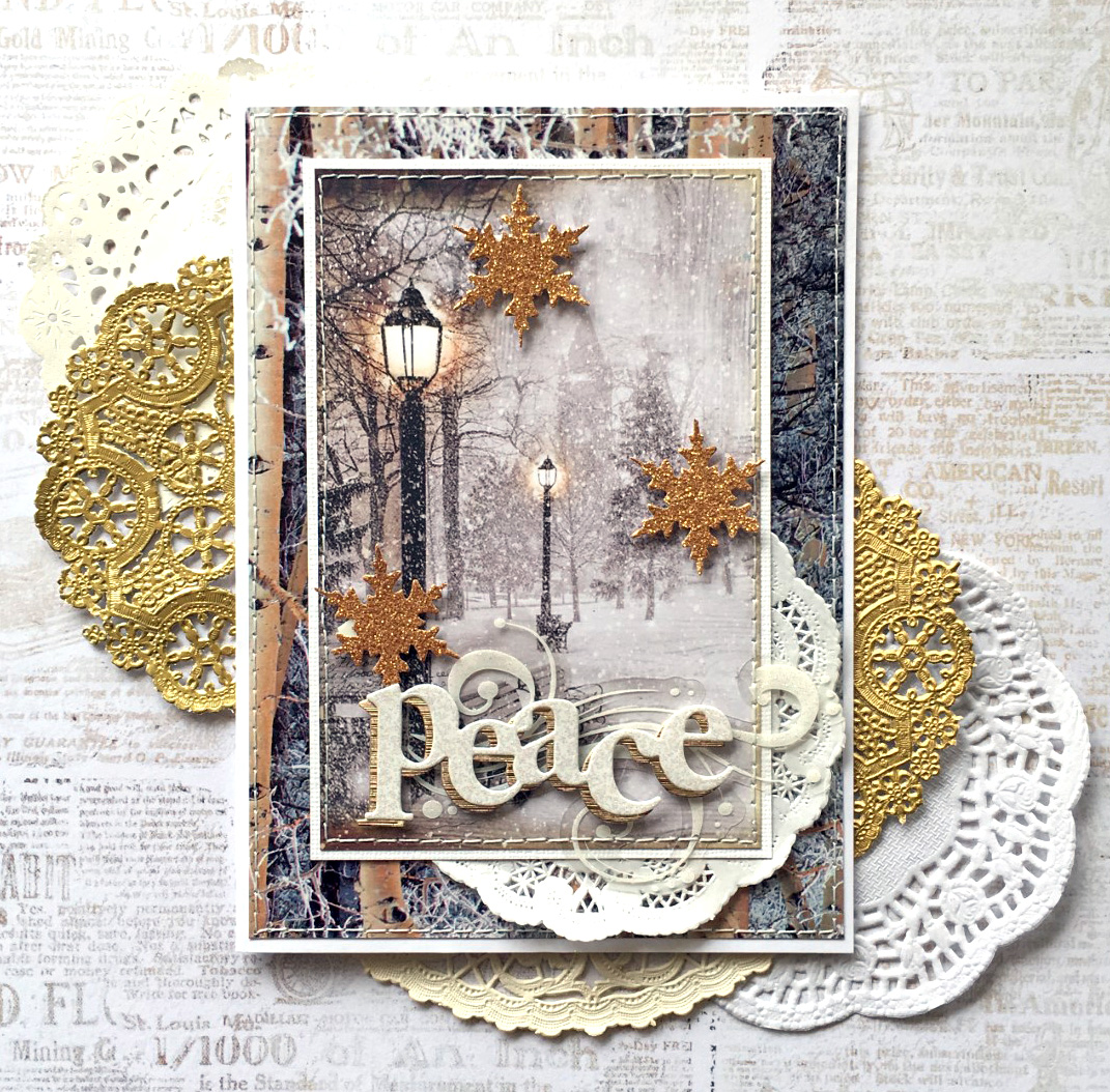 |
| patterned paper: ciao bella, plus the birch trees photo which is from a catalog last december!; peace die: spellbinders; snowflake punch: paper source; glitter paper: best creation; white cardstock: staples; adhesives: elmers brand gluetape, xyron, 3m foam tape, sewing machine |
the peaceful scene i've used as a focal point is a beautiful journal card from the "snow and the city" collection by an italian paper company called ciao bella, which i got at my lss paper anthology last december. the background panel- with the birch trees- is, believe it or not, the cover from a holiday catalog! all i needed to add to make those two lovely pieces of paper into a card was a couple of skinny white mats, a diecut sentiment, part of a doily and three glittery copper snowflakes. et voila, la paix!
hop on over to ♥JINGLE BELLES♥ and see stephanie's beautiful card and link up your very own!
Subscribe to:
Posts (Atom)