Showing posts with label alcohol inks. Show all posts

Tuesday, October 22, 2024

SOS533: Birds of a Feather

This fortnight at Shopping Our Stash is for the birds! Or, more accurately, about them. Because we'd like to see cards that feature our fine flying friends OR their feathers OR both! 

I have A LOT of bird stamps... and dies... and vintage bird books; but as I was deciding which of those to choose from, I realized I've had a beautiful set of Jane Davenport Feather dies for at least a couple of years and NEVER used them, so this seemed like the perfect time. I diecut the feathers from a "rejected" Alcohol Ink background (no idea WHY I didn't use it at the time but happy to find it now!) and then used the cut out feathers to position the dies on a watercolor background and cut out the shapes so I could back the apertures with deep blue cardstock and inset the feathers. The sentiment comes from Dina Wakley's Scribbly Birds Stamp Set which I've had for probably close to a decade and used many mannnnnny times; I don't think I've ever used the sentiment WITHOUT the birds before, but I thought it was just right for this card.

The SOS Crew have been working hard to inspire you, so there are plenty of birds and feathers flocking together at Shopping Our Stash; why not fly on over and check them out? Then start planning what you will link up with us between now and Monday evening, November 4th.

Thursday, June 25, 2020

Thank You, Mr. Holtz!

Have you been watching Tim Holtz's series of FaceBook Live Demos? If not, I recommend cruising through the archive, because arguably no one in the craft industry has introduced us to more specialty products; and for sure no one uses the TH products better than the man himself! Last Saturday (6.20) was the first half of a feature on Alcohol Inks, in which Tim reviewed all of the "basics" including the different varieties of ink and the other products which work with them; this Saturday (6.27) will be more focused on techniques. Not only did I learn some really cool things in the "Basics" episode, I was super-inspired to get out my AIs and accessories and use them to make a bunch of backgrounds plus a couple of fun cards! More details and links to all the products I used on The Ink Pad Blog today!

Friday, September 27, 2019

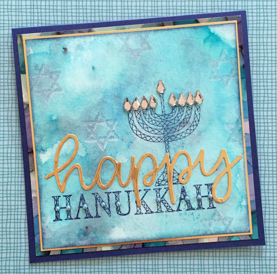
have a happy, happy, happy, happy hanukkahhhhhh!

we're celebrating our friends who observe the non-christmas winter holidays this fortnight at ♥JINGLE BELLES♥! which means we want to see cards which celebrate hanukkah, solstice, hogmanay, kwanzaa, new year OR... you can make a completely non-denominational WINTER-themed card.

hanukkah stamps: hero arts stamped in cobalt and blue sky archival ink; happy die: sunny studio; pale blue background paper made with ColorBurst pigment powders by ken oliver crafts on strathmore watercolor paper; lower layer multicolor paper made with ranger alcohol inks on glossy yupo paper; gold metallic cardstock: idea-ology; blue cardstock: bazzill; tear drop gems and tiny blue pearls: eyelet outlet; adhesives: elmers brand gluetape, sookwang scor-tape

i went with hanukkah, as you can see. luckily i had an awesome new-to-me hero arts happy hanukkah stamp set that was absolutely perfect for the job; though i have made plenty of hanukkah cards through the years which just used blue and silver patterned paper, with candles made from strips of patterned paper or washi tape! my dreamy background layer is a leftover panel sprinkled with various blue shades of colorburst and spritzed; the multicolored layer further back is an alcohol ink essperiment that did not come out as i intended, but was too pretty to throw away, lol. btw, eyelet outlet tear drop bling makes outstanding menorah flames... just sayin'...

stephanie has an equally cool non-xmas card to inspire you, plus there miiiiiight just be a little hanukkah-related prize on offer this time. you should probably hop over to ♥JINGLE BELLES♥ and check... just in case!

ps: just in case you love adam sandler's hanukkah song just as much as i do, here is a direct link! ;)

Saturday, June 9, 2018

more icad?

yep... almost a week's worth! and here they are now:

day 5
so far this has been a VERY collage-intensive ICAD year. there's just something about torn vintage paper, machine stitching and index cards...

day 6
yep. a very collage-intensive ICAD year. i might've mentioned that, lol?

day 7
the prompt on this day was "haunted house" so i started with a vintage key... and then went back to the torn and inked papers collaged together. this one's a little different, though, because i can see this being a style that could cross-over into cardmaking.

day 8
*NOT* a collage!!!!!!!!!!!! :) :) :)
this time i splashed drops of alcohol ink onto a clear plastic index card divider thingie; then after it dried, i turned it over and added sharpie and paint pen doodles on the other side. i like the idea better than the results, possibly because i made this in the grips of the worst neck headache EVER and all i can see is how badly my head hurt right then. i think there are seeds of usable technique here, tho...

day 9
today's prompt is "chevron" so i made a little template and trimmed the shapes from a panel of swooshy rainbow colorburst watercolor. (reason #147 why i NEVER throw colorburst "rejects" away, lol... i always know i can use them for SOMETHING!)

♥♥♥
if you're intrigued by the index card a day project, it's NOT too late to start! 
click the link to visit the ICAD base page at daisy yellow art.

what can you do on an index card?

~try out new techniques or supplies~
(like alcohol inks or colorburst)

~practice old favorites, like coloring with copics or colored pencils~
(the daily marker 30 day coloring challenge is taking place right now, btw, you could combine it with ICAD by stamping and coloring on index cards while you practice shading or blending!)\

~do something you've never done before~
(because hey... it's an index card... it's ok to "wreck" a few!!!)

there's no need to catch up or keep up...
 just start where you are and go on for as long as it's fun!
♥♥♥

Sunday, November 12, 2017

miscellaneous round-up of miscellany

miscellany that needed rounding up, that is. miscellaneously. of course. by which you'll have guessed that once again i have a backlog of totally unrelated artsy things and decided to clump them all together. you're welcome, lol.


there's a new junk journal junkies club starting up at paper anthology. the first meeting is friday night (11/17) and if you're anywhere near kenvil, morris county, nj, i'd love for you to sign up and come along! (complete details are on the PA website!) this is one of the little journals i made when my friend anna (who is the queen of elegant junque journals!!!) was here a few weeks ago for a playdate!


i got a fab stash of alcohol inks at the papercrafting garage sale in september and made loads of fun experimental panels; some on yupo and some on regular glossy paper. this is one of the yupo ones. what an awesome surface to doodle on... yowza!


here's a flamingo sticker mandala i made in my sketchbook recently. yep, this is yet another weird little niche craft i keep coming back to. my sticker mandalas are not a patch on the ones i saw on honestly wtf last year --which in turn were inspired by a sticker artist called lauren venell-- but they are always a ton of fun to make!
 (i vehemently deny that i only make these to garner comments from my nieces on instagram, altho clearly that is a nice fringe benefit, lol!)


finally, here's a "cleanup collage" from my sketchbook. it's got scraps of torn vintage paper (some with modelling paste) ancient rub-on transfers that no longer transfer perfectly, a single diecut frame from the bag of scraps i bring home from paper anthology periodically to clean out, a rose i cut out for something else but didn't use, a lone diecut butterfly who didn't fit in the project for which he was intended, and loads of utterly random, grungy stamping. all of which i expect will convince you that when i say "clean up collage" i really do mean i've made a collage from all of the random stuff that was on my worktable, which i was too cheap to throw away and too lazy to put away!!! :) :) :)

♥♥♥
hope you are having an awesome weekend, and that you'll take some time to make something FUN just because you want to! 
♥♥♥

Saturday, October 28, 2017

his & her alcohol ink cards

i'm still fairly smitten with the new gold and silver metallic kraft-core cardstock from idea-ology that i got at paper anthology. especially now that i know how cool the combination of embossing and alcohol inks is. see?

metallic cardstock: idea-ology; embossing folders: cuttlebug/provocraft; ledger paper: pink paislee; cardstock: core'dinations; sentiment sticker: girls' paperie; alphas: making memories; dimensional rose: petaloo; fish illustration cut from a vintage book; alcohol inks: ranger; chalk inks: colorbox; adhesives: elmers brand gluetape, 3m foam tape, gluedots, sewing machine

my first experiment involved using a swirly embossing folder on silver cardstock, then adding drops of various blue and green alcohol inks. it took a little time to figure out how to get the best mix of colors and how long to wait before blotting up the excess color. i found that the longer you wait, the more chance you will get blotches and maybe a little bit of "crust" at the edges of the embossing. but in this case, i like the grungy look of that, so i just went with it. when i had a mix i liked, i added mats and a rather handsome focal fish that i cut from a vintage book.


i used this cool sketch (#124) from sweet sketch wednesday 2 to design the layout of my card:


when i moved on to my second card, i used a flowery e/f on the gold color of the cardstock. to get a more even shade all over, i found that it was best to stick to one color of ink (this is raspberry) and to apply it in sections, spreading the excess over the rest of the card and sort of blotting up any puddles at the same time. i really love the soft "rose gold" shade that appeared. since on this particular folder the design is kind of half em-bossed and half de-bossed, i decided to sand some of the raised areas a bit, to get more variation in the design. i also serendipitously discovered that a piece of un-colored gold on which i had tested the same e/f just happened to line up perfectly midway down the design of the pink panel, so i matched up the flowers carefully and attached it on top!


i'm sure there are still about a thousand more tricks and techniques i could try with this fun product... and i'm pretty confident you'll be seeing at least a few of them here in future! ♥

Saturday, September 30, 2017

the whole entire rainbow (in convenient blogpost form)

or, if you prefer, a roundup of mostly unrelated ColorBurst experiments from my watercolor sketchbook, as well as some random combinations i made with the set of alcohol inks i scored at the paper anthology garage sale last weekend! ;) 

i've said this a million times, so i'm sorry to be dull, but whenever i don't know what to paint i just fill a page with a shape or a pattern. that's why you see so many watercolors of circles, or plaid, or rainbow-hued lines. they are relaxing and fun to paint, plus you get to use LOTS of colors! in this case, peony, marigold, gamboge and alizarin crimson colorburst! ♥

a pretty basic mandala, but i kept adding the next layer of colorburst before the last was entirely dry, to get that weird tie-dye blendy effect. which sometimes gets VERY messy, but in this case i really like it. i also tried a trick i saw in a ken oliver video: flick some drops of clear water onto your page when the piece is almost dry... let it sit for a minute, then blot it off and watch it "lift" some of the color away. i will definitely be re-visiting this idea!

this started out as colorburst flourishes, but ended up more like tentacles, lol. so i shifted gears and added loads of pen doodles. inspired by one of my all-time journal/collage artist heroines, @jenndalyn who often adds black and white doodles to colorful painted or collaged pieces in ways that make me swoon...

last weekend i lucked into an AMAZING bargain on a big set of ranger alcohol inks, blending solution and even a case to keep them in. which is hilarious, because, unlike everyone else who fell in love with these when they first came out, i kind of missed that phase and was just getting interested in the format based on a few artists i've seen on pinterest and IG recently. talk about perfect timing!!!

experimenting with the different color combos and ways to apply the ink: adding droplets straight down vs using the applicator like a pen and sliding one color around another. i can see some really loose florals happening this way.

finding out what happens when you add drops of blending solution before the ink, or to wet ink, or to almost dry ink. also kind of crushing on this combination of neutrals plus eggplant and butterscotch...
(not a sentence i can imagine typing in any other context!)

for some reason i am fascinated by geodes recently. when stephanie and i were playing with marble paints i kept trying to make geode-like creations, and now i've been trying it out with the AI's. i don't even try to fight it any more when i hit a "phase" like this, i just roll with it. something cool i discovered is that the metallic additives are rather thicker in consistency and can be used to sort of "fence off" a portion of partially dry color.

this is my favorite geode so far, and one of my favorite color combinations: 
slate + stonewashed + copper + silver

**********
i'd love to stay and talk more, but the ♥COLORS♥... they call to me!!!
hope you are having the best saturday of the whole week! :)