Wednesday, September 12, 2012

it's a post-modern, cubist representation of ELO's "mr. blue sky"... obviously...

i mention that in case the first of my latest round of daily paper prompt journal pages, inspired by the daisy yellow art blog, was somehow obscure to you? nahhhhhh, surely not! :)

for this prompt the very cool and very talented marit invited us to make a page inspired by a favorite song or artist. for some reason the first thing that popped into my head was an oldie but goodie (i'm not sure i'd call it a fave, though i do quite like it!) "mr. blue sky" by electric light orchestra. i had planned to make a more traditional sunburst, but at some point it turned into a layering of all right-angled shapes; i had also planned to put the lyrics (or at least the chorus) on here somewhere... but in the end this piece sort of just declared itself *DONE* and refused my efforts to add anything else, so i stopped. :)

in a reverse of the above, for this prompt, which was meant to be incredibly simple, i just could not stop playing around! i painted my lines on the off-cuts of watercolor paper i save to do brush and paint-color testing. i painted fat ones and thin ones, curvy ones and straight ones, dark ones and light ones; i practiced mixing different shades; then at the end i took all my strips, cut them into squares and/or triangles, and made a mosiac. why? i have NO IDEA... but it was fun and weirdly soothing!
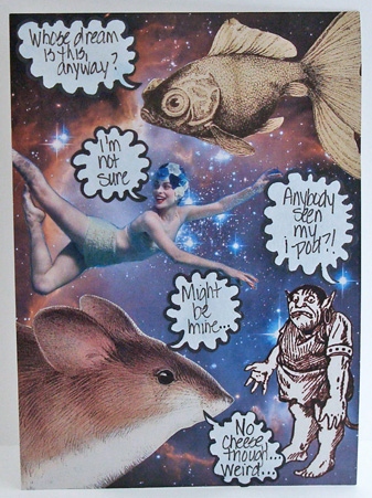
this was a fun one! just a straight up collage, where each "character" has something (weird and laureny!) to say. 

ok, yeah, i totally cheated. i did actually take some silhoutte "still life" photos of the shadows cast by various objects and ornaments in my home, and i'd planned to use one even though none of them were (to me) particularly interesting. but then, while i was looking for the hibiscus photo below, i found this picture (which i LOVE) snapped last october on waikiki beach at sunset, and it was practically a silhouette anyway, so i converted it to black and white, played around with it in PSE, printed it, and called it done.

i'm pretty sure i've only written one other haiku in my entire life and that was in the third grade. i was stumped for the entire day, and had begun to try to think of "another way to go" on this prompt, when, right before bedtime, this whole entire thing popped into my head fully formed (including the stamping on the photo and the bamboo mat) so i just ran with it!

speaking of running, i have to, right now! ciao darlings! ♥♥♥

Tuesday, September 11, 2012

3... 2... 1... GO!

another awesome challenge starts today at shopping our stash so let's get right to it!

Challenge 68: 
3, 2, 1 
use 3 of something + 2 of something + 1 of something 
for example: three different pattered papers, two colors of cardstock, one stamped image 
(you can have other elements on your project, as well, in addition to the 3, 2, 1.)

for my 3, 2, 1 i chose:
3 rows of hearts, 2 sets of alphabet stickers, and 1 super-mega-deluxe washi-tape grid background!

(patterned papers (all SCRAPS, wahey!!!) glitz design, my mind's eye, echo park, graphic 45, anna griffith; alphas: making memories + absolutely ANCIENT plastic letters from oriental trading co; tapes: love my tapes, heidi swap, prima, recollections, tim holtz, 7 gypsies, bazzill and... ok there might be a few more... i went a little KER-AYYY-ZEE, ok?! :) ink: colorbox; adhesives: 3m foam tape, sewing machine, and well... lots and lots of tape!!! :)

this is an idea i came up with while participating in the index card a day journaling project on the daisy yellow art blog over the summer, that i've adapted for use on a greeting card, and i think, if anything, i love this version EVEN MORE than the original! it's the easiest thing in the world to do, as well, just cut a piece of cardstock to a hair less than you'd like your finished piece to be (mine's 6" square) then layered it with various washi tapes, laying some vertically and some horizontally, until the entire square was covered. if you use cardstock with a lined or grid pattern, it's even easier to get your strips to line up perfectly, but really it does NOT need to be precise at all!!! it's also super-fun because you get cool effects within the layers themselves, depending on the width, design, and translucency of each particular tape!

i've had this idea in my head ever since i made that index card back in june, but i've given it a comeback now in honor of the september challenge on the truly inspiring love my tapes blog, where they'd like to see a layout or card with the elements lined up in a grid design... (hence the rows of hearts!) ...which also uses decorative tape in a cool way (hence the grid!). many of the tapes i've used actually came from the LMT booth at scrapbook expo, but they have a pretty awesome online shop, as well!

i'm also throwing this in over at a superb new-to-me challenge site called the pink elephant, where they are looking wedding or anniversary themed cards this week!

and now i hope you'll join me in "oohing" and "ahhing" over m'colleagues' gorgeous work at SOS and then thinking up your own fabulous 3, 2, 1 card! ♥

Monday, September 10, 2012

this has a LOT of layers... (even for ME!) :)

it's biiiiiiiiiiiiiig for a card, as well, at nine inches square! i'm not worried about mailing it, as it's my mom's birthday card, and i'll be seeing her on the day. though if it had to be posted, some corrugated cardboard and a padded mailer would see this safely to its destination; another strategy i employ with "lumpy" cards is to save them for the folks to whom i am also mailing a gift... then everything just goes in a box together and you're golden!

you'll notice that whilst this card OVER-achieves in almost every other category, what it doesn't have is a huge range of color, and that's because my lovely blogging friend linda robinson is hostess at the city crafter challenge blog this week and she's invited us to go monochromatic. so i did!

(vintage: advertisements and text from "the deliniator" magazine published by butterick patterns, 1907; sheet music (also early 20th century), trading stamps, sewing pattern, lingerie lace, beaded trim; patterned paper: basic grey; vintage style embellishments: tim holtz, girls' paperie, pier one; pearl flourishes: want2scrap; giant rhinestone (on a pebbles xl brad): glitz; lace tape: love my tapes; flowers: from michaels' silk flower dept; other: feathers, lace; leaf dies: cuttlebug; inks: ranger, colorbox; adhesives: staples brand gluetape runner, scotch gluestick, gluedots, 3m foam tape and double stick tape, hot glue, sewing machine)

i went with shades of cream because it's my mom's favorite color, and also because this week at inspired by laurel seabrook is embracing earth tones:


this is yet another week in which "inspired by" did not turn out to mean "looks like the picture" lol! but that is one of my favorite things about laurel, that she STARTS with a photo, but is willing to go wherever it takes her; and willing to follow us there, as well! in this case, my primary inspiration wound up being the color, the idea of texture, and a lot of fabric/sewing details, also i've worked in a little bit of an autumnal feeling by using die cut leaf accents!  (as a bonus, that bit of sheet music is a song entitled "falling leaves" though, sadly, in the end the title just stuck up too far and got trimmed off!) 

for placement i used this fabulous sketch from cherry bits, the blog for the online papercrafting store a cherry on top; i've rotated it 90 degrees clockwise, and taken a few liberties, so i may not actually qualify, but it's a corker of a sketch and it was a big inspiration to me, so i'm giving credit where it's due!


i'm also jumping in on this cool tic-tac-toe challenge at a new (to me!) challenge blog called come and get it, i've done the top row across: pearls, lace and die cuts!  


here's a closer look at my tic-tac-toe elements, and just generally at the wide range of embellies, lol!


finally, my apologies to miss patrice: i've been linking my jingle belles card to her 52-card-pick-up challenge each week, but last friday i totally forgot, so here's a different link in lieu, missus, i hope you like it! ♥♥♥

Sunday, September 9, 2012

sweet sunday sketch guest designer!

i was super-excited last week to learn that my vintage-laden "dress of paris" card was chosen as a winner at the sweet sunday sketch challenge, and even happier to learn that such an accolade earns one a guest spot with their uber-talented design team, the sweet sunday stampers! first let me show you the sketch, because it's fab and i know you'll want to play along:


and now here's my card, i've even STAMPED for this one, can you spot where?  (un hint: ou est c'est la tour eiffel?!)

(vintage: sheet music; patterned paper: basic grey; perfume label sticker: laughing elephant; eiffel tower stamp: hero arts (stamped on a scrap of 3m inkjet printer transparency with stewart superior india inkpad) dimensional sentiment sticker: pink paislee; diecuts: k and co; florals: prima; brads: my mind's eye; pearl flourishes: want2scrap; fabric tape: love my tapes; washi tape: recollections; adhesives: scotch gluestick, staples brand gluetape runner, 3m foam tape)

lest you think i'm so intrepid that i stamped fearlessly right on top of my fancy french perfume label, let me assure you, there's a TRICK: i stamped in permanent ink on a scrap leftover from an inkjet printer transparency sheet, then cut the image out; thus i was able to take my time in choosing where i wanted to add it in to my collage! (note: because you'll be stamping on the reverse side of the transparency-- the pebbly bit, that's designed to hold the ink-- if your image has text it'll be BACKWARDS when you turn the sheet over!) luckily the eiffel tower is pretty symmetrical, so the "flipping" issue was no problem for me.

something else which is never a problem for me is adding in lots and lots of layered embellies; au contraire; in fact, that's kinda my best thing, lol! :) here's a close-up so you can see my collection of diecuts, fabric florals, brads, pearls, fabric tape, and... well... there's a little bit of everything, all stacked up on some lovely vintage sheet music!


i used the palette (and the aforesaid flowers!) for the current color throwdown (#208):


being generally, as you know, a big user and aficionado  of "light red" (lol, sorry, leslie!) i was pretty excited last week to discover a an entire card making blog being run by fellow fans of that color, called in the pink! this fortnight the challenge is anything but square, and you have to go see the absolutely drool-worthy cards being posted over there!

in the meantime, i hope you'll head over to the sweetest thing and grab this sketch, see miss karen's gorgeous card, and check out the rest of the AMAZING design team cards! then start plotting and planning your own card so that maybe ♥YOU♥ will be the next guest sweet sunday stamper!!! ♥

Saturday, September 8, 2012

stitching, drawing, lettering... and taxidermy!

ok, thankfully, there isn't actually any taxidermy at all in this post. but the daisy yellow art blog is so very eclectic and inspiring, i think that's about the only medium we haven't tackled at some point during the course of the daily paper prompt experience! for september, tammy's lined up some amazing guest hostesses, thus making the exercise even more interesting and inclusive; i find that i can hardly wait to see what  the next thing will be each day. i've posted these out of order so that my favorite one could be on top... because it's my favorite one! :)

i'd been admiring natasha white's free-form found word poetry and gorgeous backgrounds on her blog, and secretly wanting to try out the idea. it was fun doing the background with my (inexpensive, from michaels) new set of water-soluble wax crayons, and i was shocked and delighted to find this little "article" about poppies in a children's book i chose purely for its font, but the result was frankly nothing to write home about, so i set it aside until the next day. then i decided to add a few machine stitched outlines... and suddenly the thing just sort of took off. I LOVE IT WHEN THAT HAPPENS!!!

the brief was to incorporate a wordsearch, sudoku, or other puzzle into a page somehow; as i was pondering the patina-ed beauty of this one from a cool vintage book of dutch crosswords i found at a book sale earlier this year, it occurred to me how similar the grids for puzzles and needlework are, so i did a little cross stitch on it. the end. :) 


as you can see, i've loaded two pics for this one, just in case you cannot quiiiiiiite tell from my gorgeous drawing what my ten tiny things are, lol! actually, i am rather proud of this, because despite my total inability to make ANYTHING look 3-D (i just CANNOT shade to save my life!) i *think* pretty much everything except the pencil eraser is vaguely recognizable... which, for a non-drawing-type like myself is a BIG honkin' ACHIEVEMENT!!!

in grade school and high school the inside and outside of all my notebooks were full of things like this. come to think of it, i guess we were ALL "art journalers" a bit in school, weren't we?! funny that it's taken some of us thirty years to get back into the habit, eh? (never too late, though!)

tomorrow i am VERY excited indeed to be guest designer at a certain lovely sketch challenge blog, so i hope you'll stop back and hear all about that, and see a card of which i'm rather proud! ♥

Friday, September 7, 2012

we're going POSTAL...

...but in a GOOD way... at ♥JINGLE BELLES♥ this fortnight! thanks to a brilliant suggestion from our lovely guest star lela meinke, we're embracing all things postal and mail related, with a few different options for creating your cards:

create a holiday card which includes postage, faux postage or postal images 
(mail boxes, stamps, postoids, cancellations, postman, etc)
OR 
create a holiday postcard 
OR 
create a holiday card with a matching (decorated) envelope
i went with option one in the form of "postal images" by incorporating a scan of the front and back of one of my treasured vintage postcards, which was sent to a pair of sisters by their aunt in bethlehem, pennsylvania, on december 7th, 1907!*

(copy of a vintage 1907 holiday postcard from my collection, front and back printed on kodak premium photo paper and staples brand ivory colored inkjet cardstock, respectively; patterned paper: autumn leaves, echo park, basic grey, jenni bowlin; fabric ribbon (from leslie, ta!!!): webster's pages; (partial) floral stem: prima; "believe" sticker: sandylion; red sticky-back pearls: kaiser; distress inks and tools: ranger; adhesives: staples brand gluetape runner, 3m foam tape, hot glue, sewing machine)

i used kimber mcgray's card challenge sketch at two peas this week, which i think you'll agree is rather fab:


i was excited to learn that this fortnight the anything goes challenge blog is featuring early christmas, and the creative card crew are also clebrating christmas cards with their challenge #18 ... because of course i am ALL OVER that, lol! my fellow year-round xmas card makers at the holly jolly christmas challenge are calling for christmas florals, the use of which is never a problem for me; actually i have a hard time NOT putting flowers on pretty much everything i make, whether holiday-related or not! (this might explain why i find "guy cards" so much harder to make: no flowers, no bling, no bright pink... whatsa girl s'posed to DO??!) :) :) :)

i do hope you will take some time to check out the fabulous eye candy involved at all of these fine challenge sites, and don't forget to stop over at ♥JINGLE BELLES♥ to leave some love for stephanie's and lela's absolutely gorgeous takes on our postal hijinks! whilst you're there you can read all the challenge details and see a photo of the prize that one lucky cardmaker will (appropriately enough!) be receiving in the mail at the end of the fortnight! enjoy, darlings!

*strictly speaking, when it comes to collecting vintage postcards, the pristine, unsent ones are actually worth quite a bit more; but i really love and prefer the ones that have been written on! in this case "aunt ruth" has sent a christmas greeting to "dear little helen and cora" to remind them they must "do what santa claus is telling all the children to do" so that he will come and visit them later in the month! i will gladly forfeit the physical perfection of an un-mailed version every single time, in exchange for such a wonderful little glimpse into someone's life, a century ago! ♥♥♥ 

Tuesday, September 4, 2012

wooden it be nice?!

the new challenge at shopping our stash has placed the beach boys' hit permanently on play in my brain, but it's such a fun one, that i can easily put up with some mental-music side effects! yes, you've guessed it, this week you can use anything that reflects wood: woodgrain, wood embellies, trees, log cabin, etc. there are so many options out there, how can you NOT want to play along? 

(patterned paper: studio calico, pink paislee; pennant stickers and journaling card: pink paislee; veneer birds, woodgrain tag: studio calico; yo-yo sticker: american crafts; ribbon: making memories; music twill: from miss leslie, ta missus!; ink: colorbox; adhesives: staples brand gluetape runner, 3m foam tape, gluedots, sewing machine)

weirdly enough, i've got nearly as much new stuff as old in this card because coincidentally, my moxie fab prize arrived last week and it just happened to have a whoooooole bunch of awesome studio calico stuffs, including the wood veneer birds, the woodgrain paper, and the little glossy woodgrain tag! :)  but... to be stash-centric... i made my card base out of ancient yellow cardstock, embellished the birds with a woodgrain stamp purchased during the nixon administration, and assembled all my other layers outta scraps. yahoo!!!


i was, as the name suggests, INSPIRED BY laurel seabrook's current challenge, for which THIS is the photo; amazing, no? i've really only scratched the surface by choosing some of the bright colors and working in my triangle pennants; but then the "wooden bits" all over my card are a nice serendipitous bonus for this one, eh?!


in terms of layout, i gratefully used deconstructed sketch #67:

do check out these fun challenges and then hop over to SOS to see the amazing creations my awesome fellow DT-members have made in honor of this occasion! afterwards, why not sort through your supplies for some wooden goodies-- real or faux, or BOTH?!-- and start working on your own entry! ♥