Showing posts with label cardabilities. Show all posts

Friday, October 9, 2015

♥PINK♥ christmas! (2015 edition)


if you've played along with us at ♥JINGLE BELLES♥ in any of our previous years you probably already know that the first prompt of october --which is, of course, breast cancer awareness month-- is always PINK CHRISTMAS, that the brief is to make a holiday card which (perhaps you've guessed, lol?!) has at least a bit of pink in it, and that stephanie and i each donate $2 for every card linked up with us during this fortnight.

this year we'll be donating to the breast cancer research foundation, which focuses strongly on the research aspect of the disease and has earned very high marks from charity evaluation sites such as charity navigator, charity watch and give.org. we'd love for you to join us this fortnight, just link up on our pink christmas post before 6pm on wednesday, october 21st! easy, right? ♥♥♥ 

meanwhile, here's what i made:
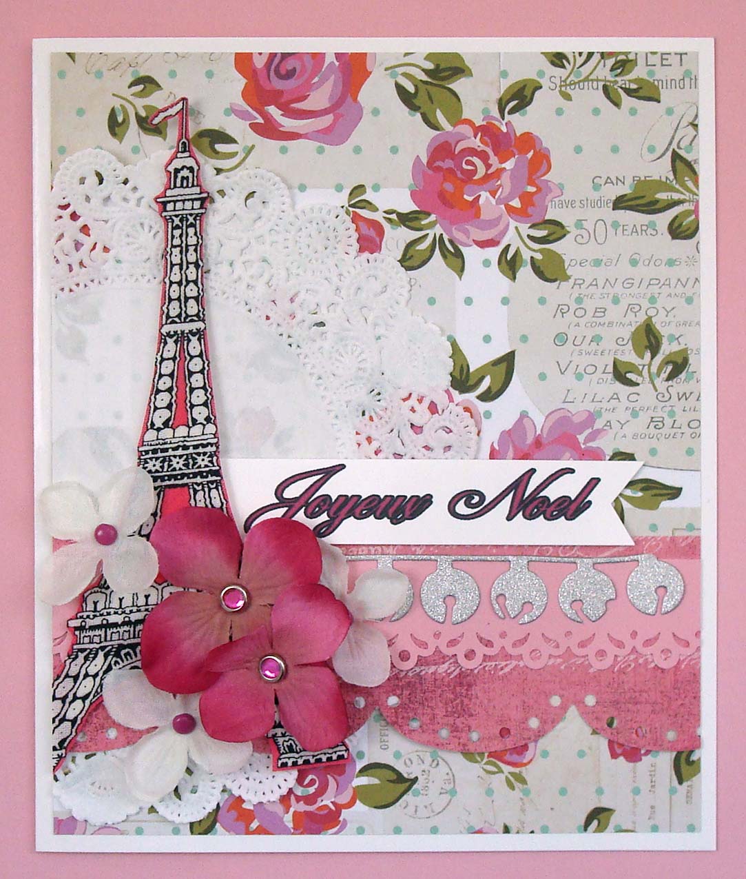
eiffel tower cut from a very verrrrrry old piece of michael miller fabric paper that i'm pretty sure they don't make anymore;  patterned paper: marion smith designs, basic grey, sei; flowers: michaels; brads: oriental trading, queen and co; memory box jingle bell die used on american crafts POW glitter paper which is extraordinarily sparkly without being textural and diecuts LIKE BUTTAH!!!; border punches: martha stewart; doily from my stash; white glossy cardstock: paper accents; computer generated sentiment flag in "quill" font; adhesives: elmers brand gluetape, 3m foam tape, gluedots
ok, yeah, this is one of those times when i almost feel like i'm cheating because let's face it, i looooooove pink, and i make plenty of pink cards all year round. none of them mean as much to me as the ones i make in october, however, so i like to go all out, as you can see. since i just happened to find a bit of somehow totally forgotten (?!) pink fabric paper with eiffel towers on it, my card took a bit of a french twist, with a sentiment to match. i used the very last (boohoo!) cardabilities sketch (#132) to guide my layout:


i hope you'll join us for PINK CHRISTMAS --early and often!-- this fortnight, and to that end i'm gonna stop talking right now and send you to see stephanie's lovely card over at ♥JINGLE BELLES♥!

Friday, July 10, 2015

christmas, with bells on!

we're still celebrating "silver bells" at JINGLE BELLES again this week, by making holiday cards that feature silver... or bells... or both! this week i've gone with just the bells:

vintage sheet music from my stash; patterned paper: basic grey; transparency: hambly;
journal card: jenni bowlin; florals: k and co, petaloo, recollections; leaves: prima;
sentiment sticker: crate paper; kraft cardstock: bazzill; ink: colorbox;
adhesives: elmers brand gluetape, 3m foam tape, gluedots, sewing machine

i used the latest sketch at cardabilities (#126) for my layout:


why not jump over to JINGLE BELLES to see stephanie's gorgeous card and link up one of your very own?!

Friday, May 22, 2015

dashing thru the snow... seriously?

why, yes! what could be more appropriate to kick off the unofficial start of summer than to make holiday cards which feature snow?! ok, yeah, it might not be the typical memorial day weekend activity, but it *is* the sort of thing we love to do at ♥JINGLE BELLES♥!

watercolor paper: strathmore; paints: artist's loft; kosher salt: wegmans; white glossy cardstock: paper accents; patterned paper: basic grey, glitz design; white glitter snowflake stickers: recollections; white glitter alphas: mambi (courtesy of miss leslie, ta v much!); label die: tim holtz; xl snowflake punch: ek success; silk poinsettia: michaels; brad: american crafts; doily "liberated" from my mom's china cupboard; adhesives: elmers brand gluetape, 3m foam tape, sewing machine

as you know, i've become pretty addicted to watercolor paints lately, so when i had trouble finding just the right shade of blue in my paper collection, i decided to make my own. i painted a few different shades of blue and grey in random patches, then sprinkled a little bit of salt on top and let the paint dry. when i rubbed off the salt, there were cool little crystaline clusters of white, that kind of resemble the frosty patches you see on windows when it's really cold. i added a few white white glittery snowflake stickers, a flower + snowflake cluster and sparkly letters before calling it a (snow) day! the effect is hard to capture in a photo (at least it is if you're me... which... i usually am...) but here's a closeup that's slightly better:


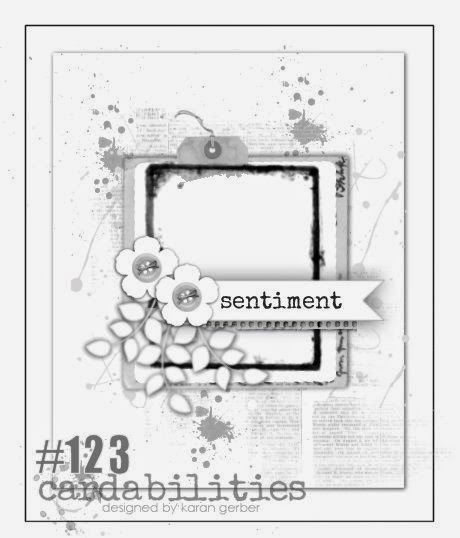
for the placement of my elements, i used the current cardabilities sketch (#123) again... mostly because i thought i could do a much more faithful version of the sketch than i managed the other day (even though i do like that card, too).


need some more snowy inspiration to get you started? well, i happen to know that stephanie has made an awesome card just for that purpose. go check it out at ♥JINGLE BELLES♥!

Tuesday, May 19, 2015

happy 4th anniversary, SOS!

we are celebrating our FOURTH anniversary at shopping our stash, a pretty fab milestone, as i think you'll agree. about the only thing that'd make it even better is if you'd come along to celebrate with us. so let's get right to the challenge: we want to see projects that have some silver and some gold on them. easy peasy, right? here's what i made (sorry about the not very awesome photo, but literally EVERY element of this thing is reflective, so you know how that goes):

silver and gold printed india paper of unknown origin; white silk flowers with gold and pearl centers from michaels; antique white mulberry paper leaves: recollections vintage silver doily; silver cardstock: the paper co; glossy white cardstock: paper accents; adhesives: elmers brand gluetape funner, 3m foam tape, low temp hot glue, sewing machine

i should probably mention that your card does NOT have to be ALL silver and gold... you just need to work in a little of each. in my case i knew i was going to need an anniversary card for my aunt whose favorite color is *white* so this is what happened. i used the current (gorgeous!) cardabilities sketch as my inspiration, though admittedly, mine is a pretty loose version:


now why not check out all the other gorgeous design team cards at SOS... it's totally worth the trip, i promise!

Friday, May 8, 2015

happy hybrid holiday!

this fortnight at ♥JINGLE BELLES♥ we are especially excited to have deedee's digis as our lovely new sponsor. not only are they offering a fabulous prize for one lucky random cardmaker who links up with us, they've also created a brand new kit especially for us to use (how cool is that?!) AND they are going to offer that kit absolutely free to our readers during the course of this challenge. awesome or what??! yeah, we thought so too! speaking of the challenge, i bet you've already guessed that the brief is to use a digital element of some sort in your brand new holiday card. it can be a brush, a paper, a digistamp... whatever you like! don't have anything fab? jump over to deedee's digis and grab the very festive free kit, "JINGLE ALL THE WAY!" which looks a bit like this:


want to see my card? (please say yes, or the rest of this post falls kind of flat, lol!) awesome! here it is now:

"jingle all the way" digital kit available *FREE* this fortnight to JINGLE BELLES readers at deedee's digis! i've used the bell image (as a template to paper piece), the "jingle all the way" sentiment and the red grid paper here. other ingredients: core'dinations cardstock, petaloo flowers and leaves, a fabric covered brad of unknown origin, and scraps of red and gold ribbon from my stash.

my favorite thing about digital supplies is how much freedom they offer: you can make the elements any size and scale, print on any type of paper, use a pre-colored image OR go to town with your own markers and pencils... the choices are pretty limitless! then when you add in the fact that they NEVER run out, that's kind of hard to beat, right? for this card (which is 5x6.5") i printed the plaid/grid paper as a 5x7 panel on regular old copier paper and the sentiment as a wallet-sized photo on soft tan cardstock. i formatted the outline of the jingle bell as if it were a 3.5x5" photo and printed it on plain copier paper, too, which i then used as a template to paper piece twice; once on the sand-colored cardstock and once on some super-sparkly gold glitter paper! i used my cropodile and a craft knife to cut out the holes in the bells and backed the interior with scraps of black paper; it's hard to see in the pic, but in real life it adds just that little bit of extra texture. speaking of texture-- which you know i lOOoOoOooove-- i swapped out the printed bow in the image for a "real life" version in red satin, that i embellished with dimensional florals and velvetty leaves. all of the above are popped up on textured red cardstock layered with a scrap of chunky metallic ribbon. will this card fit in a standard envelope? maybe not, but i always have a bunch of gifts to mail at christmas, too, and nothing decorates a plain wrapped package as well as a unique and fabulous card, am i right? ;)


speaking of unique and fabulous, we have another treat in store at ♥JINGLE BELLES♥ as *four* of the very talented designers from deedee's digis  have joined us to show off this festive kit! why not hop over and see the lovely work of TamaraMarjiDonnaFaith, not to mention our own amazing stephanie! and be sure to JINGLE ALL THE WAY, darlings! ♥

Tuesday, April 21, 2015

SOS198: texture me!

this week's challenge at shopping our stash is technique-based: we want you to use your oldest embossing supply, whether that's a folder, powder, or even kickin' it old school with a stylus and brass template. sound like fun? awesome-- go grab your supplies! meanwhile, i'll show off my card:
 
(scraps of) patterned paper: teresa collins, doodlebug, sei, basic grey; glossy white cardstock: paper accents; pale pink cardstock with a darker pink inside: core'dinations; swirly cling stamps (that actually don't cling very well anymore so i just used them loose... which turns out to be harder than it seems like it would be...): rhonna farrer/autumn leaves; white embossing powder: personal stamp exchange; embossing folder: cuttlebug; ink for edges: colorbox; adhesives: elmers brand gluetape, 3m foam tape, sewing machine

i may have semi-cheated, because my first embossing supplies consisted of the original psx blue-ish/clear embossing ink and gold powder, both of which got used up quite some time ago. like seriously, during the clinton administration*. so in the spirit of the challenge i used the closest thing i still have: a versamark pad and some ancient psx white to emboss the swirls i stamped as cupcake icing. to hedge my bets, i also used my very first embossing folder, which-- coincidentally-- also has swirls; i embossed a scrap of core'dinations cardstock so that when i sanded it the texture would show up even more. paper-wise i'm all scraps here, and some of those are impressively elderly; the only full sheet i cut into was the white glossy cardstock i used for my card base. so i feel like i'm pretty firmly on the moral high ground of meritorious stash-usage. which is always nice, right? :)


i started out using the current (#121) cardabilities sketch and intended to load up on flowers and other girly embellishments, but somehow nothing really looked quite right on top of all those awesome swirls. so eventually i gave up and just stretched the basic shapes of the sketch, which is quite lovely:


speaking of lovely things, each and every one of my SOS design team sisters has a glorious card to show you, why not go and see those right now? ciao, darlings! ♥

*holy carp, you guys, i just did the math: that was TWENTY YEARS AGO!!!!!!!!!!! how is that even possible??! i think i just freaked myself out a little bit. sorry, nevermind, let's go back and look at the cute card again, k?

Friday, March 6, 2015

holiday brights... with a flourish!

with a BUNCH of flourishes, actually, possibly a lifetime supply of flourishes if you're a CAS kind of person, lol! but i'm getting ahead of myself. first let's remember the fabulous holiday tablescape we're using as our inspiration this fortnight at JINGLE BELLES:


now i'll show you my card and you'll see immediately that i was inspired by the color palette and the sparkle factor, but mostly, i wanted to make a card version of that amazing placemat. so i did!


i started with the black patterned paper panel, which had the blue dots, faded text and even a few blue flourishes on it. i added some diecut flourishes in bright acid green, then finished off with the big dramatic black pearl flourish, which i cut apart so it would fit better. 

for the layout of the card i used the current sketch (#118) from cardabilities:


ok, yes, i know what you're thinking, you're thinking, "hey lauren, that's not a very christmassy card, is it? also, there is NO sentiment!" and you're quite right on both counts. the only "holiday" products are the poinsettias and the purple glitter snowflake; and there is no sentiment. but on the other hand, not everyone celebrates christmas, so it's nice to have a few cards on hand that are bright and festive and wintery without having ties to any one particular holiday. plus it's not like you can say this one doesn't have enough going on already, right?!


stephanie has also created a vibrant and glittery card this week, that i *know* you will want to see, so why not hop over to JINGLE BELLES right now?!

Tuesday, February 17, 2015

la carte fabuleuse d'amelie poulain

i've gone a bit of french in honor of this week's challenge at shopping our stash, which is called "inspired by a movie". one of my all-time favorite films, and the first one that came to mind when i thought about the challenge, is the jean-pierre jeunet film whose full title is, "le fabuleux destin d'amelie poulain" but is better known as "amelie". here's my card and then i'll explain:

page from an old dictionary; eiffel tower image from anna aspnes' "french kiss" brush set printed on an inkjet transparency; plain (ancient!) basic grey chipboard letters... painted with acrylic craft paint and stamped with glitz design's damask pattern in ranger archival black ink; florals: prima, recollections, petaloo; brads: mme, queen and co; pearl flourish and gem embellishment: prima; stencils: tim holtz, glitz design, heidi swapp; red and purple inks: colorbox; pens for outlining: faber-castell pitt xs in black; sharpie poster paint fine tip in white; adheisves: xyron, elmers brand gluetape, 3m foam tape, gluedots

i was inspired by the current cardabilities sketch (#117) though admittedly my rendition is a bit loosey-goosey:


for that matter my card doesn't make ANY direct reference to amelie, but if you've seen the film you'll probably notice some of the ways i was inspired: the eiffel tower is pretty obvious, it swaps our for the "A" in paris (and in amelie!); the rich red and purple shades are taken from the colorful, slightly vintage decor of amelie's flat; the pearl flourish represents the box of marbles amelie finds at the beginning of the story; the text paper refers to the letters that "cher mado" has saved from her long lost husband; there are flowers from the garden amelie's father tends... but really... i was going more for a vibe than any direct image from the movie, and i feel pretty happy with the result!


and now, why not head on over to SOS to see additional movie-inspired fabulousness, and start planning your own bid for cinematic card domination?! au revoir, darlings! ♥

Tuesday, February 10, 2015

SOS188: tp or not tp...

...that is the question, or rather, that is the challenge this week at shopping our stash. so what do we mean? let's check out the official SOS description:

Challenge 188: TP or not TP  
use the patterns from your paper towels or your toilet paper as inspiration 
OR use paper towels or TP to add texture, 
OR actually use one of them on your project.

ok, so, first i'll show you my card and then i'll essplain it:

inspiration towel: wegman's brand select-a-size paper towels; patterned paper scraps: crate paper, basic grey + part of an old sparkly storebought greeting card; glossy white cardstock: paper accents; textured white cardstock: bazzill; white glitter paper: best creation; heart dies: cuttlebug; border punches: recollections; velvet flower: maya road; leaf: recollections; doily from my stash; adhesives: elmers brand gluetape, 3m foam tape, gluedots, sewing machine 

i had to really think about this one because all of our paper products are plain and white, which at first glance doesn't seem to offer much inspiration. but when i really looked at our wegman's brand paper towels (there's one behind my card in the photo above) i realized they had a kind of quilted geometric pattern that was pretty cool, so i decided to make a version of that to be my background. but how? i tried out a few different ideas, including free-form stitching, making a hand-cut template, using diecut leaves as appliques, etc...


...and some of those looked interesting, but none of them were quiiiiiiiite right. then it came to me, i could use my favorite border punch on both sides of some thin strips of white cardstock, tack them loosely to a glossy white cardstock panel, and sew along the edges. here's how that came out:


pretty nice, right? so then i just needed to make the background panel into a pretty card. luckily i had the current cardabilities sketch (#116) to help:


i used lots of stash to make the heart collage in the center, including paper scraps, a sparkly flowery store-bought greeting card, a velvety flower and a lacy heart-shaped doily backed with pink paper so it would stand out from the all-white background.


now why not hop on over to SOS where there are lots more clever crafty ideas from my awesome DT sisters, which ask the musical question, "tp or not tp"! :)

Friday, January 23, 2015

more "NEW" goodness

we're still celebrating and showing off our latest and greatest supplies at JINGLE BELLES this week, as we "bring in the new"! here's my card:

NEW stuff: crate paper glitter snowflake, my mind's eye pearl brad, basic grey snowflake border sticker, SRM sentiment, and best creations silver glitter paper; OLD stuff: fancy pants, pink paislee and my mind's eye patterned paper, kaiser pearls, felt snowflake and silk flowers from michaels

i've got a real mix of old as well as new this time: my crate paper glitter snowflake, my mind's eye pearl brad, basic grey snowflake border sticker, SRM sentiment, and best creations silver glitter paper are all new; the rest of this card is stashy goodness, and the background paper was SCRAPS-- which, it's hard to see, even in real life, but there are actually two different patterns of the same shade making up the blue panel; the seam is just under the snowflake border! i have to (quite immodestly!) say that i love the way this one came out, and i especially love the stitched swirls that i sketched very lightly with a pencil before outlining with white thread in my sewing machine.

i used the current sketch at cardabilities (#115), which explains why the layout is rather fab, doesn't it?


meanwhile, there are some gorgeous cards in the readers' gallery at JINGLE BELLES, not to mention a lovely new one from miss stephanie-- be sure to check it out!

Sunday, January 11, 2015

it's a fact of crafty life...

...that the projects you like best always photograph worst. or at least, it's a fact of my crafty life, anyway. possibly because i loooooooove to use lots of shiny and reflective elements? on the other hand, to prove the universe has a sense of humor, i sometimes find that projects i don't care for at all wind up looking pretty fab online. and since this fact has helped me out more than once, i guess we'll call it even. just bear all of the above in mind when you see my card, and mentally give it 15-20% higher of a cool factor, k? thanks.

"muse" sticker: papaya art; patterned paper: pink paislee, k and co; tiny thin mats of silver glitter paper: best creations; white glossy cardstock: paper accents; flowers: prima, recollections; brad: my mind's eye; bling circle: (ancient) heidi swapp; circle punches: ek success; inks: colorbox chalk + ranger distress; adhesives: elmers brand gluetape, 3m foam tape, sewing machine

i spent an embarrassingly long time on this one, too; especially when you consider that i started with the current cardabilities sketch, so my job was kind of short-cutted from the jump. 


i think it's a pretty good version of the sketch, though, and i'm especially proud of the swirls i sketched and stitched over and over on my sewing machine, using the highest possible number of stitches per inch so that the curves would be really smooth and tight. so let's give those guys a close-up:


yep, this one just doesn't really cut it, photographically, so i guess the only thing to do is go mail it to someone cool, right? off to the PO, darlings, ciao for now!♥

Tuesday, December 9, 2014

SOS180: favorite technique

i don't know about you, but when it comes to challenges, i'm excited to hear the word "favorite" in the title, because it means i get to do something i already love! don't get me wrong, i also enjoy challenges that make me stretch, but the occasional "gimme" is nice, isn't it? i mention all of this because it just so happens that this week's challenge at shopping our stash is called "favorite technique" so you might want to come along and show us one of yours! be sure to mention what it is, as well, k? as you know, my favorite technique is collage, especially the kind that has layers of vintage paper and/or doilies. so you probably won't be surprised too shocked to see a layered doily tree on my card:


not to be obnoxious, but i really love how these trees look and they are soooooooooo easy to make! if you're interested in trying it out, i've actually made a little step-by-step tutorial, which, by a lucky coincidence, is located in the post directly below this one. :)

as for layout, you can never go wrong with a sketch from cardabilities, am i right? this is the current one, #112:


meanwhile my lovely SOS dt darlings have all made gorgeous projects featuring their favorite techniques, so why not hop over and check those out!

Friday, November 21, 2014

anyone for a christmas feast?

ok, yeah, i know, here in the united states we have a thanksgiving feast to enjoy first, but today is friday, and at ♥JINGLE BELLES♥ between january and november, friday means, "it's time to make a christmas card!" we've got a brand new theme this week, would you believe it's our last official prompt of the year? how is that even possible?! i have no idea, but i can tell you that the feeling of, "omg! it's the middle of november already!" is easier to cope with when you're sitting next to a box with 48+ finished holiday cards in it. anyway, in honor of thanksgiving and the rapid approach of the official holiday treats season, we are looking for cards that have some sort of FOOD on them: christmas cookies, plum pudding, a wassail bowl, buche de noel, gingerbread houses, the grinch carving a roast beast; you get the idea, right? there are lots of fun ways to take this. i went with sweets, because... well... i almost always do... in both art AND in life! :)
 
patterned paper: hambly, we r memory keepers, making memories; sentiment sticker: fancy pants; florals: prima, making memories and recollections; very cool plastic-but-really-looking candy cane from miss ros, ta v much!; scrap of seambinding of unknown origin; white glossy cardstock: paper accents; adhesives: elmers gluetape runner, 3m foam tape, gluedots, sewing machine

i used the gorgeous current cardabilities sketch (#111) to help arrange my card:


i've still got a little stash of hambly paper and transparencies that i'm not so much hoarding as using judiciously. but then, i'm pretty sure that's what all hoarders think, isn't it? (uh oh.) the amazing miss stephanie who knows me very well indeed-- and yet still likes me, bless her!-- has helped to increase it this year, so it may be a while yet before i really feel the absence of that fine company, but it's still quite sad when something fab reaches an ending, don't you think? on the other hand, it's all the more reason to enjoy and appreciate good things while they last! i knew i wanted to use one of the VERY realistic candy canes (they are actually twisted strands of some sort of high-end plastic and thus quite lightweight!) that my lovely friend ros sent me a year or two ago, and when i found the hambly holiday paper with the candy jars, it seemed like the perfect match!


meanwhile, the aforesaid stephanie has made the most awesome and original card you can imagine... or maybe you can't imagine it... so really, you should just go see it, darlings, at ♥JINGLE BELLES♥!

Tuesday, October 7, 2014

shopping our (COLORFUL!) stash

this week's challenge at shopping our stash (#172) is called "the most colorful time of the year" and we are looking for cards and projects full of autumnal color. easy peasy, right?! especially if you happen to live in the northeastern united states, like i do, where the trees are already starting to turn splendiferous shades of red, orange, yellow, gold, rust, brown and... well, you get the picture. speaking of pictures, want to see my card? please say, "YES" because i'm pretty happy with this one:

patterned paper: tim holtz, k and co, basic grey, anna griffin; floral with leaves and border punches: recollections; cardstock diecuts: k and co; ink: colorbox; adhesives: elmer's brand gluetape runner, gluedots, sewing machine

i used a mix of brand new and really old supplies; not to mention the current cardabilities sketch, which i really love:


speaking of love, you NEED to go and see the rest of the DT cards right now, they are all wonderful, and be sure to say hello to to the SOS gang, ok?! ♥

Friday, September 26, 2014

we three (or more!) kings

this fortnight at ♥JINGLE BELLES♥ we have an awesome challenge, but admittedly a pretty lame title. what we want to see are cards that use at least three different patterned papers, we just couldn't come up with any other christmassy trio, so "three kings" it is! anyone who's been to this blog even once will have sussed that i *love* combining patterns, so this one was right up my creative street! and here's my card now:

patterned papers: mme, 7 gypsies, k and co, basic grey, glitz design; glitter sentiment banner: papaya art; glittery vintage style embellishment tag: k and co; medallion cut from snowflake lace paper: ki memories; fabric poinsettia: micahels; snowflake dies: spell binders; (hidden) brad holding snowflake stack together: we r memory keepers; adhesives: elmers brand gluetape runner, 3m foam tape, sewing machine

i've actually got six different patterns here, can you spot them all? the my mind's eye blue background is pretty obvious, as are the two different reds by 7 gypsies from which i've die-cut my "appliqued" quatrefoils. pattern number four is the very pale white-on-white by k and co which makes up my card base; whilst the last two are snowflakes in my focal point stack: reddish/pink polka dots by glitz down towards the bottom and pale blue swirlies by basic grey up towards the top!

i've used the current cardabilities sketch (#107), which i think you'll agree is a pretty foolproof way to make an AWESOME holiday card!


how many patterns can *you* combine in one card? or perhaps you'd prefer to choose exactly three and make them work? the choice is yours! meanwhile, come and see what stephanie has done and start planning your own bid for pattern combination domination at ♥JINGLE BELLES♥!

Friday, September 5, 2014

gilt trip!

we're still celebrating all things golden, gilded and glittery at ♥JINGLE BELLES♥ with our lovely guest star lisa hausmann, won't you join us? here's what i made this week:

glitter cardstock that looked burnished gold in the store but somewhat more coppery here at my house: best creation; patterned paper: lily bee, mambi and some swirly india paper of unknown origin and a doily from my stash; florals: michaels; rhinestone snowflake: want2scrap; doily die: cheery lynn designs; snowflake die: spellbinders; snowflake sticker and diecut NOEL: making memories; adhesives: elmers gluetape runner, 3m foam tape, sewing machine

i used the current cardabilities sketch (#106), those are absolutely ALWAYS fab, aren't they? this one sort of sums up what i looooooooove about sketches: i would never have thought to use the matted pennant shape on my own, but it's my favorite part of the card, and definitely something i'll be adding to my repertoire in future!


something else that sets the highest possible high marks for fabulousness is this week's ♥JINGLE BELLES♥ post which contains the newest cards from both lisa and stephanie, and since you need to see those right now, i will stop typing so you can go and do that! :)

Friday, July 25, 2014

lilac, kraft, silver and white...

...possibly my new favorite christmas colors?! it's a palette i'm not sure i ever considered for a holiday card before; although admittedly, i did make this year's ♥JINGLE BELLES♥ header using those colors and elements from mary pop designs' christmas joy digital kit, which i got at o'scraps:
 
full image credits for this header are on this post

but it wasn't until our lovely guest star and fellow christmas cardmaking enthusiast marie bingaman suggested we use the header as our inspiration this fortnight, that i thought about making a card in those tones. and now i can't stop! here's what i made this week:

(patterned paper: girls' paperie, lilybee design, recollections; white glitter cardstock: doodlebug; white glossy cardstock: paper accents; diecut-able wood veneer sheet: kate's paperie; reindeer die: tim holtz/sizzix; poinsettia flowers: from a deconstructed garland bought at michaels; snowflake brad: oriental trading; sentiment sticker: making memories; partial pearl flourish: prima; silver hydrangeas from my stash of vintage goodies; adheisves: staples brand gluetape runner, 3m foam tape, sewing machine)

something else i can't seem to get enough of is the current cardabilities sketch (#103). i used it pretty loosely earlier this week to make my fruity SOS card, but this time i've been a lot more literal!


i mentioned last week that a lot of my purple and kraft elements were from my regular, non-xmas stash, and that's true again this time. the reindeer die is christmassy, of course, and i used it on some very thin wood veneer sheets that stephanie and i found at kate's paperie in new york. i'd like a bit more of that stuff, actually. i might have to arrange a little detour down to soho on my next trip into the city! :)


be sure to stop over at ♥JINGLE BELLES♥ to see marie's and stephanie's amazingly gorgeous cards, and start planning one of your own!

Tuesday, July 22, 2014

fruits and veggies...

...are an important part of a healthy diet; and this week, they're the inspiration for the new challenge at shopping our stash: we want to see projects with fruit or veggies (or both) on them! here's what i made:

(patterned paper: sei, my mind's eye, amy tangerine/american crafts, studio calico, bo bunny, ki memories; stickers: crate paper, fancy pants, american crafts, basic grey; glossy white cardstock: paper accents; ink: colorbox; adhesives: staples brand gluetape runner, 3m foam tape, sewing machine)

yep, it's an anniversary card with a visual pun based on pairs/pears, featuring some very old... but still quite beloved... "fruit stand" paper from sei. i've made quite a few different versions of this joke over the years; as with "best fishes" on birthday cards, it's a favorite that i enjoying revisiting from time to time. plus, those pears are just soooooooooooo very appealing, aren't they?

i used cardabilities sketch #103 to guide my layout. admittedly, mine is a pretty loosey-goosey interpretation of the sketch, but it really did inspire me!


another "recycled" element of this design is the faux polaroid. it's one of my favorite ways to make a smaller-sized element, like these pears (which are only 1.5" tall) a little more substantial. there are some cute dies on the market, but really all you need is a square of paper to be your background (clouds work really well, imo) and a slightly larger bit of white to make the frame. i save my offcuts of glossy cardstock or photo paper just for the purpose. technically speaking, the inner corners of authentic old polaroids were not rounded; but i like the look, so mine usually are. i mean, if we want to get realllllly accurate i'm pretty sure i've never seen an authentic photograph of two pears hovering above the earth in a beautifully cloudy sky, either, so i think it's ok to stretch a point. :)


i happen to know that the lovely gang at SOS have been working hard to impress you with their latest projects, so please pop over there and admire the fruits... and veggies... of their labor! ciao, darlings! ♥