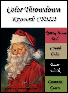
...on the color challenge i'm entering. but we'll get to that. at the moment i'm so excited to have had a little extra blogging, surfing, and unscheduled card-making time this week, that i'm almost giddy! it's all because of the floor re-finishing escapade, of course. because i have to be HERE in the house... but i'm basically trapped in the guestroom to escape the noise and mess. there are definitely worse fates, don't get me wrong!
so yesterday on my SOS teammate
jessi's blog i saw the great multiple-sketch scenario to celebrate
tuesday morning sketches' fourth birthday and i was determined to play. then i saw the berry berry fun
"strawberry farm" challenge at city crafter, and i thought, "oh yeah!". finally,
the current palette at color throwdown seemed like the perfect jumping off point for combining the other two. in a wave of enthusiasm, working with my rolling office chair pulled up to the edge of the bed, i made this:
 |
| (flower photo taken by me, printed on kodak premium high gloss paper and cut out; patterned paper: echo park, glitz design, basic grey + gingham gift wrap + old book paper that's been misted a bit + a digital music brush printed on inkjet transparency; strawberries: very old pack of glitter rub-ons from the $1 aisle at michaels; punches: ek success, recollections; alphas: american crafts; labels: dymo; washi tape: recollections; ink: colorbox; adhesives: staples brand gluetape runner, 3m foam tape) |
ok so... for starters, it's not BERRY BERRY strawberry, is it?! nope. there's only one little berry on there!
in my original idea there was a whole border of them!!! but somehow the big flower sorta took over. i've still got the sentiment, though; and to make up, i put some more berries inside. see?
i did a lot better with the sketch part. i chose the one on the lower right, obviously:
admittedly, again, the big honkin' flower really took over, didn't it? i could've trimmed up, but it was so beautiful i didn't quite have the heart, so i just let it burst off the card! then there's the color palette, which is luscious, don't you think?
but you see the problem, right? i think my turquoise shade is more green than it ought to be; the one in the palette is quite a bit bluer. partly it's the way the card photographed, but also, when i saw the palette originally, it was in the evening and on my iphone, so i thought i was pretty close. in the daytime, on the big computer screen, i have my doubts. so i will totally understand if i am disqualified, especially since color throwdown is ALSO celebrating their anniversary... (FIVE years! congrats!) ... and they have some awesome prizes you should really check out!
i'll be back tomorrow with my second card for our
JINGLE BELLES cardstock christmas prompt; i'm pretty proud of this one... i actually broke out quite a few rubber stamps, and serious inkiness ensued! ciao for now, darlings!


