Friday, August 22, 2014

it is a truth, universally acknowledged...

...that the cards we love most are always the hardest ones to photograph. a fact i shall be happy to prove in a moment; but first, allow me remind you that this fortnight's card prompt at ♥JINGLE BELLES♥ is called "the hanukkah song"* and the brief is to make cards for our friends and relatives who don't necessarily celebrate christmas. despite the title, you're not limited to hanukkah however; ANY of the "other" (aka non-christmas) winter holidays will work: kwanzaa, new year, hogmanay, solstice... OR... you can go completely non-denominational and make a general winter-themed card.

i went with hanukkah this time, and built my card around a grungy, layery, digital collage i made in photoshop and printed on an inkjet transparency. that's where the photo troubles began. because of course anything reflective is almost impossible to photograph in sufficient light. which essplains why the background of picture has such a grey cast. sigh. but the card's pretty cool anyway, i think:
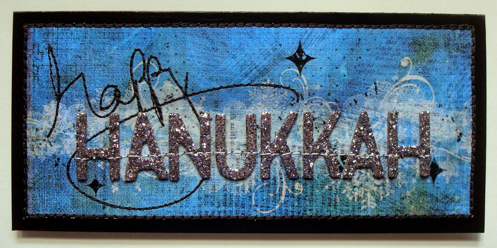
(digital products: trimmed down grungy blue background paper from kathryn wilson's "inner artist" set; handwritten "happy" overlay from anna aspnes' "retro holiday" art play palette; see-through snowflakes brushes by rhonna farrer; grungy lace brushes #1 by katie pertiet, designer digitals; real-life products: white texty patterned paper: basic grey; chunky silver glitter thickers: american crafts; glossy black cardstock: paper accents; ink: stewart superior; adhesives: staples brand gluetape runner, sewing machine)

you may not have noticed right away-- at least i kind of hope you didn't-- but there were NO official hanukkah-themed products involved in the making of this card. i used hanukkah colors (blue, white and silver) and sparkly letters to spell out the sentiment, and that's all; but i think it gets the message across. the letters are glitter-encrusted chipboard and the "happy" has been machine stitched to add a little texture. because even though i love and appreciate CAS cards, rather to my chagrin, i am physically unable to make them. here's a shot that shows the detail a little better. the operative words here being "a little":


be sure to hop over to ♥JINGLE BELLES♥ to check out Stephanie's gorgeous (and wonderfully photographed!) card and upload your own masterpiece!

*in tribute to the awesomely eponymous ditty by the great bard adam sandler! :)

Thursday, August 21, 2014

lettering and other stuff

my doodling + watercolor obsession has morphed... in the way these things do tend to morph... into a doodling + watercoloring (or markering) (yes, that is too a word!) my own fonts. ok, well, technically a few of them are my own fonts, whilst the others i've seen online and tried to copy. my favorite letterers (ok, i'm not sure that one is a word, actually, but you know what i mean) so far are pam garrison, joanne sharpe, julie balzer and martha lever, not to mention daisy yellow's creator, miss tammy! but there are sooooooooo many awesome examples out in the world, i want to try them all and then make them into my own thing!!! meanwhile, here's the latest batch of daily paper prompts, some of which feature... wait for iiiiiiiiiiit... LETTERING! :)


i'm getting more confident with shapes, i've started to play with patterns and of course i've always loved color. my biggest issue is SPACING. see the two S's at the end of success? yeah. for that matter, all of the doodles and arrows were added at the end to fill/balance my spatial issues, but i think i did an ok job of it, actually. oh yeah, and everything leans just slightly to the left, but that's an easy fix, i think i just need to pencil in center lines to keep me on track.


this prompt was devised and hosted by gretchen miller, whose blog, creativity in motion is quite seriously awesome. i definitely feel like i strayed away from the dictionary page being the focus; but since this is an example of my favorite way to work whilst journaling... basically to just keep DOING STUFF and see where it ends up... i'm fine with that, in fact i'm happy about it. 


ok, i confess, after a couple of late-night tries i realized that i had NO IDEA at all how to draw a chandelier, so rather than give up, i totally cheated and found one online that i liked and copied it. the left half took me about 10 minutes to sketch out; the mirror-image right half took like 40 minutes! symmetry is HARD, people!!! (and yeah, even more than my lettering-- or even my politics-- my drawings all lean to the left!!!) 


i already had a stand-by set of supplies that i keep in a little plastic schoolbox type thing for doing travel journals, but for this i made a second version in hopes it will encourage me to go out and sketch. watercolor tablet, travel set of paints, and the brush-wrap i made myself from a remnant of oilcloth when i couldn't find one at the art supply store. (my friend lelia gave me the cool ganesh mini-tote a couple of years ago, and it's the PERFECT size for this!)


i love the lettering on this (she said modestly!) and it's even STRAIGHT! i'm not uber-keen on the rest. especially since those magazine lips are sooooooooooooo awesome and i feel like i didn't do them justice. ah well. i do love the lettering, though. :)


this prompt was devised and hosted by patricia dattoma, whose examples are astonishing, you really need to click that link; and it was sooooooooooo totally ♥FUN♥ to do!

meanwhile, the lettering craze means i'm deeply in need of some short quotes or catch phrases on which to practice, so if you have a favorite quote OR quote site, leave me a link in the comments, k?! thanks, quotable darlings! ♥

Tuesday, August 19, 2014

chip off the old block

this week at shopping our stash the challenge is called "chipping away" and the assignment is to use some of that long-neglected chipboard that i just know you have sitting around in various boxes and bags! don't worry, i still have quite a bit, too, especially leftover 6x6 sets; and every time i break into it, i remember how much i love it. but let me show the card (which was commissioned by my aunt for her friends' 50th wedding anniversary!) first and explain it afterwards. please excuse the pics, pretty much every single thing on the card is reflective in some way, making it a serious challenge to photograph. in real life the gold is not as shrill and harsh-looking, i promise; it's actually quite elegant!

(naked chipboard frame by fancy pants: i painted it white and adorned it with bits of a vintage gold foil doily, see photo below; patterned paper: mambi, pink paislee, chatterbox, recollections; florals: prima; brads: my mind's eye; rhinestone flourishes: recollections; adhesives: staples brand gluetape runner, 3m foam tape, scotch brand gluestick, scotch tape, sewing machine)

ok, so where's the chipboard? it's the frame, which is approximately 5x5" and was completely unadorned when i started. i painted it white, and glued bits of a vintage gold foil doily on top, to make a sort of filigree effect. it was a bit fussy to do, but i love the way it turned out!


the other "fussy bit" of this card is the heart, for which i hand wove strips of paper into a big enough area from which to trace and cut another chipboard shape. that process looked a bit like this:


not that you need to see it, but by golly it was a production... a fact which is very much not apparent from the finished card (especially to civilians!) so i'm determined to show SOMEONE, lol! :) in case you're wondering, by far the best way to get a finished bit of paper weaving to stay woven is loads of scotch tape on the back before you cut out your shape. of course, the little cut ends will still want to curl up on the front, so after i tacked the woven heart to some ivory cardstock i machine stitched around the edge to hold those babies down. there's also a little bit of lace on the panels beneath the framed heart, which i wrapped around to the back and taped in place. i probably didn't need to sew around the edges, but i think it adds to the overall design, so i did anyway. here's the card again, for reference:


and now i suggest a visit to SOS to view the gorgeous work of my lovely design team mates and start planning your own chipboard-bedecked masterpiece! ciao, darlings! ♥

Friday, August 15, 2014

warm winter wishes

this fortnight's card prompt at ♥JINGLE BELLES♥ is called "the hanukkah song"* and the brief is to make cards for our friends and relatives who don't necessarily celebrate christmas. despite the title, you're not limited to hanukkah however; ANY of the "other" (aka non-christmas) winter holidays will work: kwanzaa, new year, hogmanay, solstice... OR... you can go completely non-denominational and make a general winter-themed card. that's what i did:

(digital products: vintage findings papers by jen allyson, design house digital; vintage christmas blendables #2 and text clusters #3 by katie pertiet, designer digitals; brushes from anna aspnes' "retro holiday" art play palette... collage printed on an inkjet transparency; real-life products: white texty patterned paper, green snowy paper and cardstock alphabet stickers: basic grey; other paper scraps: daisy d's, studio calico, crate paper; chunky white glitter thickers: american crafts; silver flowers and white felt snowflake: michaels; brad: my mind's eye; ink: stewart superior and colorbox chalk inks; adhesives: staples brand gluetape runner, 3m foam tape, sewing machine)

i know i've said this before, but in my opinion it's still true: the old school basic grey cardstock alphabet stickers are some of the coolest ones ever made! here i've combined them with chunky (and glittery!) chipboard letters to make a sentiment to be the focal point of the card. the background is a digital collage i made in photoshop some time ago. it was actually the label i used to mail my holiday packages last year; when i saw it again recently, i thought it would make a nice base for a card, and i stand by that decision! a few border-punched cardstock strips, a silver flower and lots of machine stitching round out the design.

be sure to hop over to ♥JINGLE BELLES♥ to check out Stephanie's gorgeous card and start planning your own!

*in tribute to the awesomely eponymous ditty by the great bard adam sandler! :)

Thursday, August 14, 2014

is it possible to become addicted to watercolors?

not that i mind, actually; or that i want any help to quit, for that matter. but i do seem to be totally hooked on painting pretty much everything at the moment, and even treated myself to a couple of new brushes at michaels the other day. here are some daily paper prompts i made with them:


every time i make something intricate with a lot of stitching, jeff always flips it over to look at the seemingly "free form" sewn pattern on the back. sometimes he even says, "i think you should post THIS side!" which got me thinking: what if i took a magazine photo or drawing and outlined the entire thing with machine stitching, but then turned it on the other side and... what? colored it with markers? no wait... how about paints? this was my first attempt. below is the front side showing the original artwork, i think it's an erte drawing from the 30's; i liked that it had really strong lines but not too much fussy detail.


the brief here was to do three different varieties, so i chose to use the same colors, but vary the scale, the outlines, and the way i applied the paint. 


this one's pretty simple, but i like the colors and the way the circles intersect. (i made them by outlining the inside and outside of a roll of tape!)


the assignment was to make a grid of paint or marker colors, but i had my box of deco tape sitting in front of me and my plan to make a black and white tape grid in which the painted colors would live got out of hand. my favorite parts are the variety of different grids stitched on top of the tapes, especially the diagonal.


having fallen in love with this journal page by birgit koopsen, i decided to see if i could recreate the beautiful, large, deeply pigmented, blendy droplets by using distress reinkers and a spray mister. ummmmm... NOPE! not even close!!! back to the drawing board, lol! :)

Tuesday, August 12, 2014

back in the day

this week at shopping our stash you've got a choice as to how you approach our theme. it's called "old fashioned" and you can choose to use images that evoke history (horse and carriage, vintage typewriter, antique box camera, a couple in 1920's clothing, etc) OR you can use a tool or technique that has somewhat evolved out of style... such as setting eyelets with a hammer and punch, or using a coluzzle (remember that?!) or other old-skool template to trace and cut shapes. there are only two rules: if you assay the first choice, you can't just do a general "shabby chic" style, there has to be something visibly antique on display; and if you choose option two, you have to tell us what "old fangled" technique you've used. i went with the first option, and here's how it came out:

(vintage map and antique images cut from old, falling-apart books; patterned paper: basic grey; black glossy cardstock: paper accents; adhesives: staples brand gluetape runner, 3m foam tape, xyron, sewing machine)

i have to confess that i'm not absolutely in love with this, but it a) fits the brief and b) features an antique car and vintage map that our chiropractor (whose birthday card this is*) will love. and c) it's DONE, which is pretty awesome, too, so i'm goin' with it!

hop on over to SOS to see what the rest of the gang has created, and be inspired to devise your very own old fashioned masterpiece! ♥

*what? you don't celebrate your chiropractor's birthday? really??! ok, this is one of those things that either already makes total sense to you or i could not possibly explain well enough to convey. jeff and i both have chronic back issues and have seen the same guy for like 20 years; at this point he's pretty much a member of our extended family. so yeah, once a year, i make a bit of a fuss. :)

Sunday, August 10, 2014

collage ahoy!

in case you were wondering when bits of randomly combined paper were going to make their appearance in my daily paper prompt collection, the answer is, "NOW"! :)


possibly my favorite kind of collage to make is the "more fun than cleaning up all these tiny scraps" variety, where i really do just grab every miscellaneous thing within reach and try to combine it. sometimes that results in a real mishmash, but this one came out pretty well, actually. (please note that i twisted this prompt for my own purposes!)


more papers from my dripping and blotting essperiments last week. i didn't really love any of them in their native state, but punched and stacked and sewn together they become a bit more than the sum of their parts. (...and clearly this summer's mini-obsession with circles is not over yet...)


some nights when i sit down at 9pm with no ideas at all the process of "powering through" results in something fresh and new and awesome. this was not one of those nights, lol. but i practiced hand-lettering (and numbering) and tried every color of paint in my new travel watercolor set, so WAHEY!