Showing posts with label daily paper prompt. Show all posts

Monday, September 29, 2014

just a few...

...daily paper prompts; but some of them are pretty cool. by the way, if you were only going to attempt one of these from the whole entire summer, might i suggest you grab some graph or ledger paper and try number 56? i think you'll find it seriously hypnotic and quite possibly addictive... in a GOOD way!

guest-hosted by anika starmer
i think i could easily sit and make repeating patterns like this until... well, realistically it'd only be until my hand cramped and spasmed past the point of ignoring it, which, in practice is about 45 minutes. but after an ice pack and some wrist exercises i'd be right back at it!

this was going to be just free-formed hills and sky until i started wondering if i'd be able to make a recognizable/interesting tree by tearing up paper scraps. turns out, i could; good to know!
my watchword for this summer, in terms of art, was definitely "FUN"! come to think of it, my watchword in terms of life this summer was also "FUN". but why limit it to summer? i think fun can easily be a four season word, right? possibly  more study is required, and i'm happy to put in the hours in the spirit of pure scientific enquiry. you're welcome, darlings!

happy monday!
here's an idea: how 'bout we all spend today 
trying to make that NOT be a contradiction in terms, ok?!
♥♥♥

Friday, September 26, 2014

the statue of liberty is NOT left-handed (observations and tips for working with ink jet transparencies)

today on the daisy yellow blog, i'm talking about using one of my favorite "non traditional" art supplies: transparency sheets made specially to use with an inkjet printer! i ♥LOVE♥ printing photos and other elements on them to simultaneously add my own personal content plus another texture and finish to my work! my daisy yellow piece references the images and results; this companion piece talks about the more practical/mechanical aspects of using them. please feel free to ask any questions via email or in the comments!

the transparency element is the yellow hibiscus photo. i lightly penciled the word "aloha" on the paper below the transparency, and hand-stitched along it with embroidery floss.

1. first things first: inkjet transparencies aren't cheap. sorry. i realize that the price alone will deter a lot of crafters, and i completely understand not wanting to dive into something you may not even like working with! keep an eye out at garage sales (where i often scoop up 2/3 full boxes of bargain office supplies) and maybe occasionally cruise the clearance aisle at your favorite discount office supply store. meanwhile, if you work for a business which uses transparencies, or know someone who does, you might be allowed to buy or borrow a few to experiment. it can't hurt to ASK, right?

2. since they ARE pricey, i like to use the entire 8.5x11" sheet every time. i add "filler" in the form of re-sized photos, digital papers and brushes, real-life or digital collages i've made, scans of vintage postcards or book pages... whatever's laying about my computer's desk top when it's time to print is fair game! (sometimes the weirdo "extras" turn out to be cooler than the well-considered image i intended to print in the first place, lol!)


the transparency element is the chandelier, from the first digital brush set i ever bought c.1999 from scrap-n-fonts; the great advantage of digi is you can print things any size, any color, and you never run out!
(for the record i STILL love this set!)

3. all inkjet transparencies have a smooth side and a pebbly side... it's the latter which is able to hold the ink and allow it to dry. this is actually the "back" of the sheet, so if your image contains text you're going to need to flip the whole thing. most printers have a dialog box somewhere --it might be in a printer menu called "paper settings" or "print properties"-- that you can check to do this easily. it could be called mirror image, reverse printing or iron-on transfer mode.

the geisha is the transparency element in this one, i scanned her from an old book 

4. i've occasionally forgotten to do the above, and it's not the end of the world. you CAN place the transparency pebbly-side-up on your work, with very little chance anyone except you will notice. in "borderline" cases, without text, you can also just go ahead and use the image in reverse. the title of this post alludes to the fact that i've done this, even with fairly well-known icons! :)

three index-card sized examples from last year's ICAD, the transparency elements are: the 1950's lady, the chandelier (told you i love those!) and a real-life collage of random text papers i scanned. 

5. if your printer has a setting for transparencies, you should definitely click it, or the one for high gloss paper; this allows the printer to use exactly the right amount of ink to avoid smearing!

6. forget about using proprietary store-bought scrapbooking transparencies (such as the late great hambly) in your ink jet printer. the ink will literally never dry, and it WILL smear... maybe even while it's still inside the printer.

the face is from a magazine, the transparency here is a very subtle watercolored pink background paper from a discontinued vera lim digital kit. I placed some sequins between the layers before sewing them to the ledger page... it's kind of a new take on a shaker card.

7. ink jet transparencies are not archival, if that kind of thing matters to you. some may even go slightly yellow over the course of time. (we're talking YEARS, though!)

8. you may need to fiddle about a bit before you find a brand that works perfectly with your particular printer. my old hp photosmart liked 3m brand transparencies best, they're a tiny bit thicker than normal and have a little "gripper" strip at the very edge which helped the printer grab the slippery surface better to draw it into the printer. my epson artisan 837 prefers highland brand, which have a thin cover sheet of paper attached to the reverse side of the transparency. it may be possible to "fool" your printer by using a thin line of repositionable adhesive to add such a sheet to a brand that doesn't have one.

The butterfly's a store-bought transparency; you don't HAVE TO create your own elements... but it IS fun! :)

9. the good news is that the print quality seems to be uniformly good and once you find a style that your printer is willing to "grab" your worries are over. it's POSSIBLE that you might find transparencies made for copiers or laser printers that will also work in your ink jet, but you would definitely want to try before you buy!

the letters are old heidi swapp acrylics that i frankly didn't like anymore until i outlined and layered them over an enhanced and stamped photo; gave them a whole new vibe, because staples are COOL, lol!
10. a few thoughts about adhesives: dryline glue (the kind in taperunners and ATGs) and gluedots will be very hard to spot under dark ink, but may show on lighter colors. wetter glues, gel medium and some brands of gluestick MIGHT smear or erase the ink, so be sure to test on a corner! i use hardware a lot: staples, brads and eyelets are all fairly awesome and give a nice industrial vibe. i also love to sew on top of transparencies since it adds such a nice texture. (if you sew only on three sides you have a transparent POCKET... just sayin'...) photo corners also work not to mention washi tape. like everything else in creative life, sometimes a "problem" like this inspires the most creative new ideas!


looking for cheaper alternatives to add customized clear elements to your work?

A. the clear labels for inkjet printers do a similar job of letting you layer a computer-printed image over something else. i buy the 8.5x11" sheets, but seldom work with a single image greater than about 4x6" since sticking a BIG label onto paper without wrinkling can be challenging. oh and test a scrap of the label on your preferred background because sometimes they can look cloudy; as a rule of thumb lighter backgrounds will look more seamless.

the small square bird collage tucked somewhat behind and to the left of the vintage landscape photo is a real life piece i scanned in and printed on an avery clear label made for inkjet printers. it's layered over some neutral text paper.

B. bits of clear plastic packaging (such as the salad bar containers from the grocery store or the extra-heavy zipper bags for freezers) won't work in your printer, obviously, but you can use permanent markers to draw, doodle, letter and sketch on them. the same is true for pre-printed transparencies and acrylic embellishments, actually, you can alter those to make them into your very own creations!

this window is also made of packing tape, with smooshed up cellophane and magazine bits inside and a photo + doodles + machine stitching on top. the best part of journaling is you can make WHATEVER you want using ANY ingredients you choose!  so g'head... walk on the wild side!!!

C. clear packing tape can be used for image transfers, which can be incorporated in a similar way to digital transparencies; but you can also use it to "float" real life elements over... or within... your main design. i like doilies, sequins, and bits of cellophane, especially. if you work neatly and flatly (see doily pic below) you get a window... if you scrunch and wrinkle the tape (see pic above) you get texture and interest. now that's what i call win/win! :)

this page is in last year's DPP journal, right before the "shaker card" one i showed you earlier. i cut a hole in the page and made a window of clear packing tape with doilies sandwiched inside; but plastic packaging, cellophane, or a commercial transparency would work just as well.

i hope this post has given you a bit of practical advice for using inkjet transparencies in your creations, and maybe even inspired a few new ideas you'd like to try. i'd love to see what you make, so please leave me a link! ♥

Thursday, September 25, 2014

assembling a ransom note is more work than you'd think!

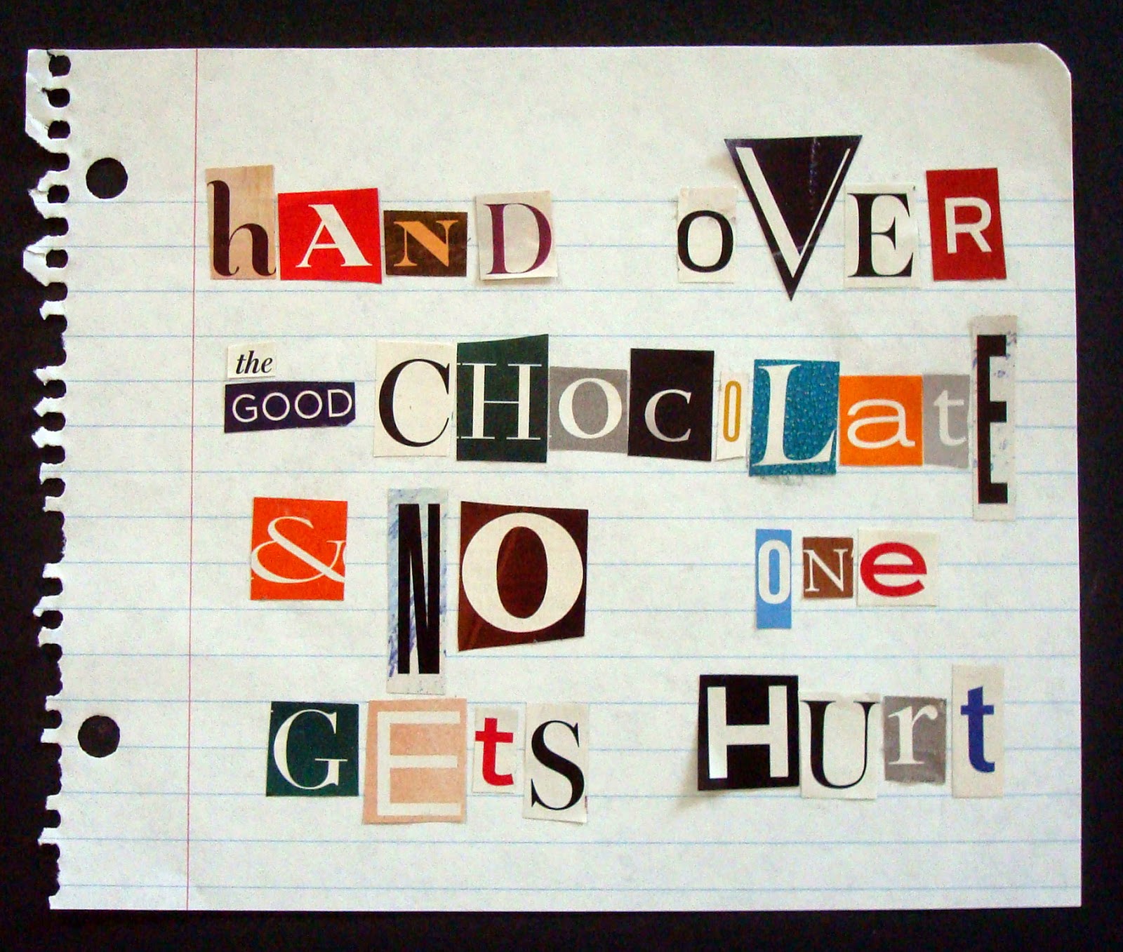
just as well i didn't have a desire to excel in the fields of kidnapping or bank robbery, eh? for one thing, the letter V is thin on the ground of magazine publishing. ...who knew...? also, it's harder than you might realize to assemble a mix of fonts with enough variety to be visually interesting whilst remaining clear and easy to read. (though possibly such stylistic considerations are less important to the professional ransom-note writer.) meanwhile, here are some new DPPs, including #48: ransom note!

this was the prompt i guest-hosted at daisy yellow last year! i was totally thrilled to be asked by tammy, and i love that my idea is now part of the official DPP rotation. this one came together super-fast, i found almost everything i wanted as i was flicking through a box of vintage bits and bobs. i did cut the sewing pattern lady out specially, and the sheet music is from a VERY old, completely falling apart, coverless music book that one of the volunteers at a recent library booksale very kindly put aside to save especially for me! thanks, phil, it's totally my favorite!

i used a bunch of jar lids out of our recycling bin for this, plus some black craft paint that had gone too gloppy for brushing on, but was awesome for stamping big textural circles; i filled them in with messy watercoloring.


i suppose the advent of digital technology has probably done away with the traditional ransom note? do modern kidnappers text their demands using an untraceable cellphone, or perhaps make a youtube video? "hey larry! our clip has 17 likes from the FBI!"

i wish i had put the magazine's title-- "clamour" --at the top, despite the fact that there was a little text from the original page that needed to be covered up, but otherwise i kind of like this.

guest hosted by jana bodin
ok, yeah, i cheated slightly by putting my text inside the negative space, but i realized after i got going that the buddha shape was proportionately too large to do anything else. it looks cool, though...

dpp051: borders
guest-hosted by kim hesson
in retrospect, a 4x6 card was probably too small to hold all of the different border ideas i wound up using, but kim hesson came up with so many cool examples, i wanted to try them ALL! (so i did, as you can see!)


a pretty simple collage of random "white stuff" that was nearby. one of the ways i "fill up" a page of photo paper (or sticker paper or inkjet transparency) is to add random images like clip art, digital papers and instagram photos. at the time of printing, i had NO IDEA how i'd ever use a 1.5x1.5" photo of the guggenheim, i just liked it...

guest hosted by denyse whelan
having been pleasantly surprised by the unexpected coolness of a *square* mandala earlier this summer, i thought a triangle-based one might also turn out fab. i still believe that to be true... it just didn't happen this time, lol! :) totally fun and engrossing to draw and paint though; which is the main thing, right?

Wednesday, September 24, 2014

more DPP, part uno

a couple of weeks ago i fell a bit behind in the daily paper prompts over at daisy yellow, and i caught myself being very critical inside my head. so i stopped. stopped being critical, i mean, not stopped doing DPP... though sadly i confess there is enough of the "all or nothing" mentality about me that for a nano-second that idea occurred to me. which is when i realized that i was being silly and told myself to knock it off. and for once i actually listened to me, which was cool! here's the thing: i started the project because i love it, and find it hugely valuable, creatively. to quit doing it, or to put some artificial time limit on it, makes it into a chore, not a pleasure. it also totally cheats me of the joy, which is an awfully foolish thing to do to oneself. i mention all of this because i'm pretty sure i'm not the only one who gets hung up on stuff like this and if this scenario sounds familiar to you, feel free to read this paragraph to yourself out loud. or read this cool thing i serendipitously found online. or heck read some lolcats! then go make something you *WANT* to make, purely because you want to make it! :)

acrylic paint + an old gift card = joy

dpp041alt: scraping paint, digitally 
this is what happened when i hit "auto" in the lighting levels dialog box 
whilst uploading the photo above!

i realized in the midst of this that i hadn't hand-stamped anything all summer! how is that possible?! 
(in my defense, i did do lots of hand-lettering, which is also fab.)

this prompt was guest-hosted by teresa robinson, who encouraged us to go free form and try lots of experimental styles, so i went crazy and it was awesome! :)
(yes, that's my real journal/planner that i write in every day; and yes, i had also drawn a mustache gallery down one side of the page that week; and no, said mustache gallery is not even close to being the weirdest thing in there, lol!) 

another page that i made in my planner because this really is a "wishlist" of house things i want to do... someday. i guess i should explain that my planner is a book i sort of use as a record of things i've done or want to remember, plus lists of things i want to try, doodle experiments, pasting-in of cool stickers or tags or adverts postcards that came in the mail. it's like a really lumpy, totally laureny version of project life, i s'pose. (i do also have a small date book that i carry around so to write down appointments and things, but that's a different book.)

i just could NOT resist the temptation to add the stitching at the end; sometimes i need to sit at the sewing machine and "doodle" i don't know why, exactly, but i try to go with the flow.

i was torn between making a sun, making a sunflower, and making some sun-themed text art, so i combined them all, because in art there are NO RULES, just RIGHT! ok, actually, i'm pretty sure that's outback steakhouse... but it also works really well for an art manifesto, so just go with me here, ok, darlings? thanks!
♥♥♥

Thursday, September 11, 2014

i ♥ watercolor paper!

i realize i've said that a few times this summer, but somehow i just keep marveling over what a huuuuuuuuuge difference it makes to paint on paper that's actually meant to get wet. i know, i know, it's such an obvious point, but somehow it keeps surprising me, lol! here are some more daily paper prompts, many of which involve watercolor paper, and indeed, watercolor paints, as well!


dpp035: messing around with paint with natasha white
this was meant to be more of a jackson pollock inspired exercise, but since i wound up doing it in my living room at 10pm, it became less "flinging of paint" and more "brushing on of paint in quite a random blendy hopefully still interesting way". i did add some splattery bits at the end, after placing my paper in the kitchen sink. (because i'm pretty sure the expressionists never had to clean up after themselves!)  :)


dpp036: pen testing
i got a set of pens at michaels this summer, and i did the "line test" at the front of my book, but you can't always tell from that exactly which pen you want in a given situation. so this time i drew a little bird and did some lettering with each one. i like to put things like this and my color charts right in the watercolor sketchbook i'm most likely to use, so they're easy to refer to.


dpp037: block letters
ok, not to be obnoxious, but i really like this one. probably because after i'd done the lettering itself i couldn't resist the temptation to add in the heart and rays and "finish" it! (which, yeah, is soooo not the point of this exercise but every once in a while a girl's gotta do what a girl's gotta do!)


dpp038: color grid with hanna andersson
i kind of cheated on this one, or at least, i went off on a tangent; but since i think that somewhat *IS* the point of the exercise, i just rolled with it. i still really like the idea of masking bits before painting and then going back and adding something in the negative space. so i did! :)
 

dpp029: paint lines
i did have distinct lines at the beginning of the exercise, but midway through they became blendy stripes. so again... i just rolled with it...


dpp040: create a list
here's a time when watercolor paper wasn't the best choice: if you want smooth script from a fine nibbed pen, you really need paper that's totally smooth. good to know!

happy thursday, everyone, 
let's get out there and win one for the gipper!!! 
(or, you know, if you aren't sporty just g'head and have a moderately 
nice day in which you're kind to yourself and others!)
♥♥♥

Thursday, September 4, 2014

want to see my latest painting?

it's a large scale tribute to mark rothko i like to call "garage interior" which I've executed on ummmm... ok, yeah... it's on the three interior walls of our garage, actually! :) this is how lovely husband jeff and i spent most of the uber-humid labor day weekend. we got two coats of bright white* on the naked dark grey block walls of half the structure, then started moving stuff into place and away from the walls of the unfinished side, which we'll tackle this weekend.


we did take a couple of breaks. on saturday we went to an awesome crafty garage sale at paper anthology in kenvil, nj**; and on monday we went to walgreens for the klutzy one of us (hint: not jeff) to get a tetanus booster after managing to scrape her leg hard enough on a rusty wire stake to draw blood. obviously the saturday outing was infinitely more fun; but holy wow, we were grateful to be able to walk in to the local pharmacy on a holiday and get attention right away!

meanwhile, i've been keeping up with the daily paper prompts at daisy yellow:

dpp031: finishing
the brief here was to catch up on an earlier prompt we hadn't completed, or take a second shot at one we'd already done already. i chose to have another go at slow journaling. i was inspired by elena nuez's beautiful color blending techniques, so i used masking fluid to draw wavy stripes, splashed blobs of paint over the rest of the page, and let the colors mix together somewhat randomly. after it was dry, i rubbed off the mask and wrote on the clean white strips. gotta say right now that i'm ♥IN LOVE♥ with this idea, so apologies in advance for its overuse, lol! :)

dpp032: invent a font
if you're obsessed with lettering and bright colors, as i currently am, this is pretty much as fun as it gets; i couldn't decide on just ONE font or ONE color, so i went a little crazy!

dpp33: art materials color palettes
i'm a little embarrassed to say that i've bought two new pan watercolor sets this summer, but in my defense i have been using BOTH of them. i've always made myself little charts with the colors painted on... (b/c they do look different in the pans!) ...this one is slightly fancier because i was in the mood to play. and it's actually inside the water color sketch book i've been using most often, which is handy.

dpp034: puzzled
this was one of those times that i just started gluing leftover shapes down on a crossword grid to see what would happen. sometimes there's a sort of magic where a collage takes on a life of its own. that didn't actually happen this time, but ti was fun to play with. i do like the stitched scalloppy outline around the edges of the second square, though, i think i'll revisit that sometime!

*i have to confess that i was skeptical on the subject of painting the inside of the garage at all, much less painting it *WHITE* but it is very much jeff's domain out there, and he wanted white walls, so of course i jumped in to help in the same way that he always jumps in to help with my projects even when he doesn't share my "vision". in this case, he was absolutely right: the white makes the room considerably brighter, and his plan to hang as many things as possible right up on the wall makes it super-easy to find exactly what you want. so it turns out, i married an organizational genius. wahey! :)

**thank you, amy t, for the head's up on that one! ♥

Saturday, August 30, 2014

nature and so forth

♥♥♥ more daily paper prompts, WAHEY! ♥♥♥

 
since 99% of my art journaling is done after 10pm, it wasn't really practical to go outside for this one, so i carried a pot with several different plants in it into the living room, and sketched and colored one leaf of each. i'll tell you what, if you really want to *SEE* something try to draw it... you focus and notice details that just kind of fly right past in "real life"!


for me, the hardest part of doing a daily journal exercise type of thing is trying to KEEP IT an exercise, rather than yielding to the impulse to create a finished piece. i think i might start calling mine a "workbook" instead of an art journal, just to remind me i'm supposed to be practicing! in the meantime, this page makes me happy because it's seriously UGLY but i didn't start over... i played with it until the assignment was done, noted the interesting things i learned (tombow markers can be blended with a paintbrush like watercolors!) and called it a night. go, me!!! :)


i always have a couple of art books or magazines in jeff's car and a couple next to the treadmill, just because i know those will be "dead" times i might want to flick through and soak up a little bit of someone else's creativity! at the moment i most often reach for dina wakley's art journal freedom, a sketchbook compilation called an illustrated life and joanne sharpe's whimsical lettering.


so what are ♥YOU♥ reading right now?

Sunday, August 24, 2014

i've ruined this one...

...and i'm pretty proud of that, actually. because it's soooooooooo tempting to stop while an experiment is going well, isn't it? but then you never make the awesome NEXT DISCOVERY! of course, sometimes the next discovery is, "there's waaaaaaaaay too flippin' much stitching on this!" which doesn't make it any less awesome to have been discovered. because that's the whole point of art journaling, generally, and the daily paper prompt, in particular. so here are a few new ones:


ok, strictly speaking, the prompt was STAMP a mandala, but it was late and my stamps were in another room and my circle and butterfly punches were sitting right next to me; i plead self-defense. (and it really does give a similar effect!) the grouping of the punched shapes and the colors were cool. the first layer of stitching made it even better. the second layer of stitching... not so much... but process is more important than outcome, so i'm callin' this a BIG WIN! :)
  

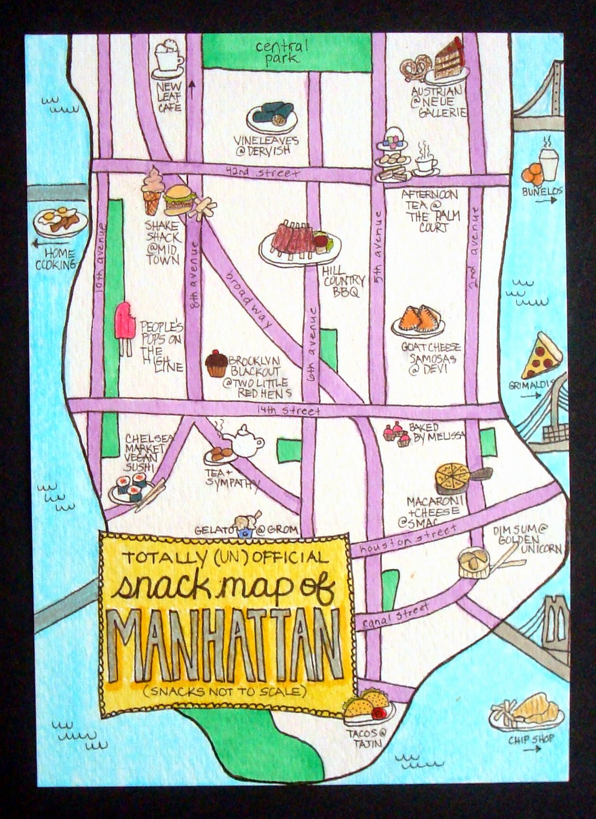
i very nearly didn't do this one. or at least, i was planning to make a collage. because as much as i looooooooooooove hand-drawn maps, one thing i knew for sure when i sat down is that i couldn't draw one. until i did!!! ok, yeah, i'm never going to win any prizes for realism or steadiness of hand. but it turns out i really ♥LOVE♥ drawing, and i really love this, my officially unofficial snack map of manhattan!* (and yes, for the record, these are all real snacks available at the named venues which are more or less where i've placed them in lower manhattan!)


something hitherto unsuspected that i learned the summer before last, via ICAD: i can draw mandalas and i really enjoy it! who knew?

*coming next week: the sweets of san francisco!!! :) (just kidding!) (ok, i was kidding, but we did have some AWESOME food there, too. hmmmmmmmmm...)

Thursday, August 21, 2014

lettering and other stuff

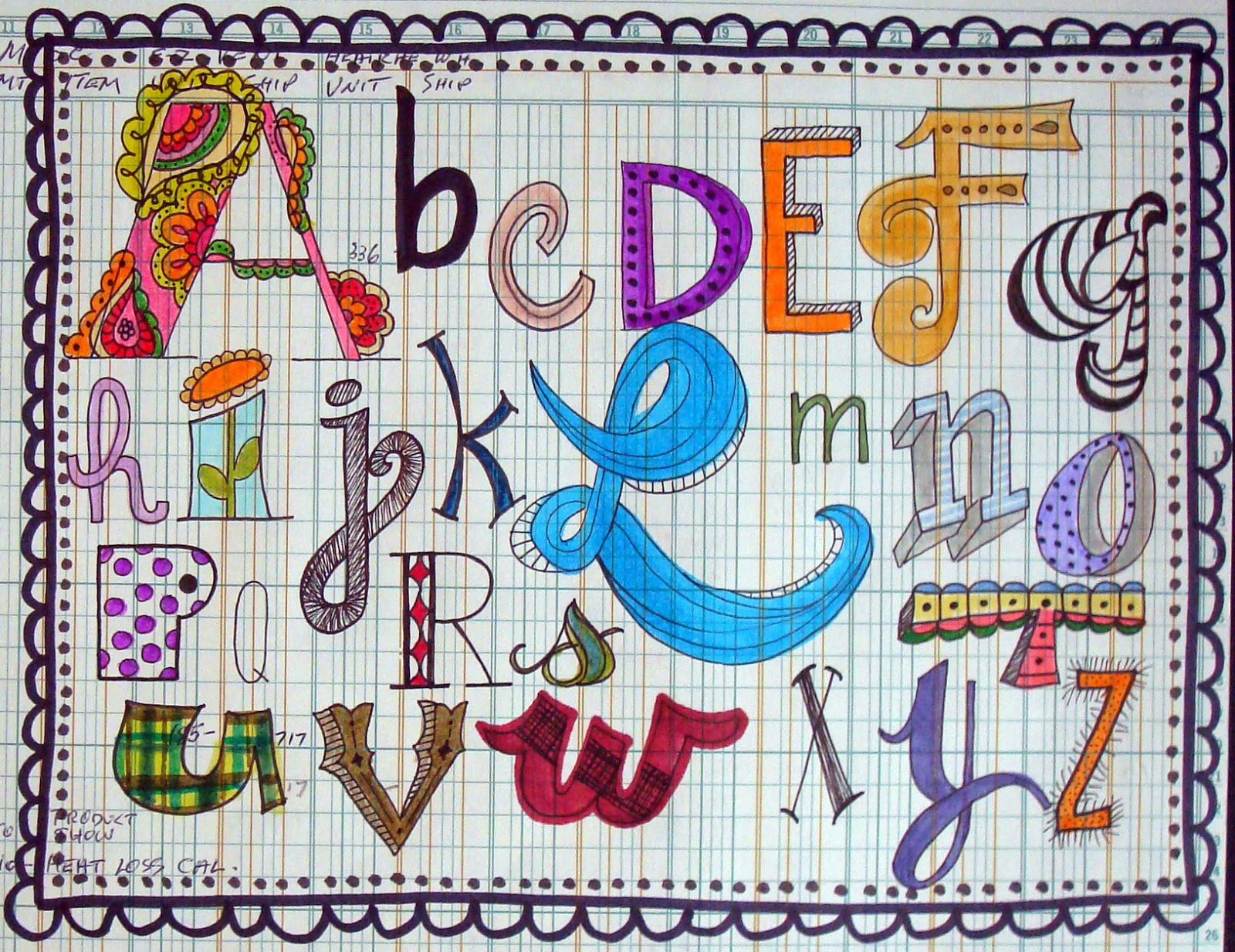
my doodling + watercolor obsession has morphed... in the way these things do tend to morph... into a doodling + watercoloring (or markering) (yes, that is too a word!) my own fonts. ok, well, technically a few of them are my own fonts, whilst the others i've seen online and tried to copy. my favorite letterers (ok, i'm not sure that one is a word, actually, but you know what i mean) so far are pam garrison, joanne sharpe, julie balzer and martha lever, not to mention daisy yellow's creator, miss tammy! but there are sooooooooo many awesome examples out in the world, i want to try them all and then make them into my own thing!!! meanwhile, here's the latest batch of daily paper prompts, some of which feature... wait for iiiiiiiiiiit... LETTERING! :)


i'm getting more confident with shapes, i've started to play with patterns and of course i've always loved color. my biggest issue is SPACING. see the two S's at the end of success? yeah. for that matter, all of the doodles and arrows were added at the end to fill/balance my spatial issues, but i think i did an ok job of it, actually. oh yeah, and everything leans just slightly to the left, but that's an easy fix, i think i just need to pencil in center lines to keep me on track.


this prompt was devised and hosted by gretchen miller, whose blog, creativity in motion is quite seriously awesome. i definitely feel like i strayed away from the dictionary page being the focus; but since this is an example of my favorite way to work whilst journaling... basically to just keep DOING STUFF and see where it ends up... i'm fine with that, in fact i'm happy about it. 


ok, i confess, after a couple of late-night tries i realized that i had NO IDEA at all how to draw a chandelier, so rather than give up, i totally cheated and found one online that i liked and copied it. the left half took me about 10 minutes to sketch out; the mirror-image right half took like 40 minutes! symmetry is HARD, people!!! (and yeah, even more than my lettering-- or even my politics-- my drawings all lean to the left!!!) 


i already had a stand-by set of supplies that i keep in a little plastic schoolbox type thing for doing travel journals, but for this i made a second version in hopes it will encourage me to go out and sketch. watercolor tablet, travel set of paints, and the brush-wrap i made myself from a remnant of oilcloth when i couldn't find one at the art supply store. (my friend lelia gave me the cool ganesh mini-tote a couple of years ago, and it's the PERFECT size for this!)


i love the lettering on this (she said modestly!) and it's even STRAIGHT! i'm not uber-keen on the rest. especially since those magazine lips are sooooooooooooo awesome and i feel like i didn't do them justice. ah well. i do love the lettering, though. :)


this prompt was devised and hosted by patricia dattoma, whose examples are astonishing, you really need to click that link; and it was sooooooooooo totally ♥FUN♥ to do!

meanwhile, the lettering craze means i'm deeply in need of some short quotes or catch phrases on which to practice, so if you have a favorite quote OR quote site, leave me a link in the comments, k?! thanks, quotable darlings! ♥