Friday, August 8, 2014

the shape of things to come

we're still celebrating cards that are not square or rectangular at ♥JINGLE BELLES♥ and we'd love for you to join us. i realize it's only august, but you know as well as i do that as soon as the kids go back to school in september, it's a fast downhill shlalom to halloween; and then fifteen seconds after that it'll be the december first. so the more cards we make now, the less that will be lurking around to bite us in the... (AHEM!) ...proverbial during the holiday season. plus, shaped cards are *FUN* aren't they?! thus, the world needs more of them! i realized the other day that i had not made any round cards yet this year. how is that even possible?! well, never mind, i've made one now, and it's kinda cool, i think. but you tell me:

(patterned papers: tim holtz, crafty secrets, making memories; glitter paper: doodlebug; sentiment sticker: hambly; doily sticker: echo park; brad and backer: my mind's eye; 1" circle punch: ek success; poinsettia and glittery gold leaves: michaels; ink: colorbox; adhesives: staples brand gluetape runner, sewing machine)

i used CASE study #202 as my inspiration, and you can see i liked the kraft patterned paper, the bold flower and the horizontal sentiment, specifically. the challenge ended earlier this week, but it's still worth a look since both the DT and readers' gallery cards are fab!


hop on over to ♥JINGLE BELLES♥ where you still have nearly a whole week left to link your own gorgeous creation on the shape-up post!

Thursday, August 7, 2014

starburst tangent

tammy has started a fab new series on the daisy yellow blog, called tangents and tactics. they're sort of amped up journaling prompts. in addition to giving you an idea and some examples of how it might be interpreted, she's provided a bit more specific/step-by-step information about method and materials, and even a little video! just another way to make it easy and fun to dip a toe into the art journaling arena. the first tangent is a starburst, and if you make one, there's a starburst tangent link love to display yours and leave some admiration for the creations of others. meanwhile, here's mine: 


speaking of tammy, she's written a very cool thing about daily art practice, in this post; my favorite part is the bit in smaller typeface, set off by "disclaimer". not to give it all away, but she makes the distinction between creating a journal full of beautiful finished pieces of art and making time for playing and experimenting and embracing new things. don't get me wrong, it's fabulous that there are soooooo many gorgeous inspirational sites and books and pages to be found online; but the less awesome flipside of that is (i think of it as "the pinterest effect") we can sometimes psych ourselves out, and start thinking things have to be perfect to be shared, or maybe even to be worth doing in the first place! and to me that feels so antithetical to a creative life.

ok, so, having explored the "TANGENT" concept in every conceivable sense, lol, i'm now gonna go make something pointless and crazy, just because i can! how about you?! (say yes, say YES, darlings!) ♥♥♥

Wednesday, August 6, 2014

more painty, stitchy, flowery goodness

i'm still following along with the daily paper prompt on the daisy yellow blog, and so far there isn't a collage in sight. trust me, i'm as shocked about this as anyone... probably MORE! i'm sure i'll be back to my regularly scheduled "gluing pieces of paper to other pieces of paper" routine any minute, but right now it's all-media, all the time, so i'm just goin' with it! :)


ok, technically, this particular exercise didn't quite come out the way i thought: i scribbled concentric circles of water soluble wax crayons and then sprayed the heck out of them with my plant mister. i thought they'd get runny and drippy, which they did... but because i'd filled the whole page with color there was nowhere for it all to drip TO... so it just sort of ran into the sink. but it looked cool anyway, so i just kept going and added loads of stitching.


still loving alisa burke, my watercolors, and practicing blending. as you can see. kind of psyched when lovely husband jeff asked me if i'd make this into his mom's birthday card. 
(i said yes, obviously!)


even more watercolors! this was sooooooooooo much fun to make, i can't even tell you. which is somewhat hilarious because the idea of making something with only straight lines totally flummoxed me for most of the day. then i stopped thinking and sat down with a pen. problem solved!


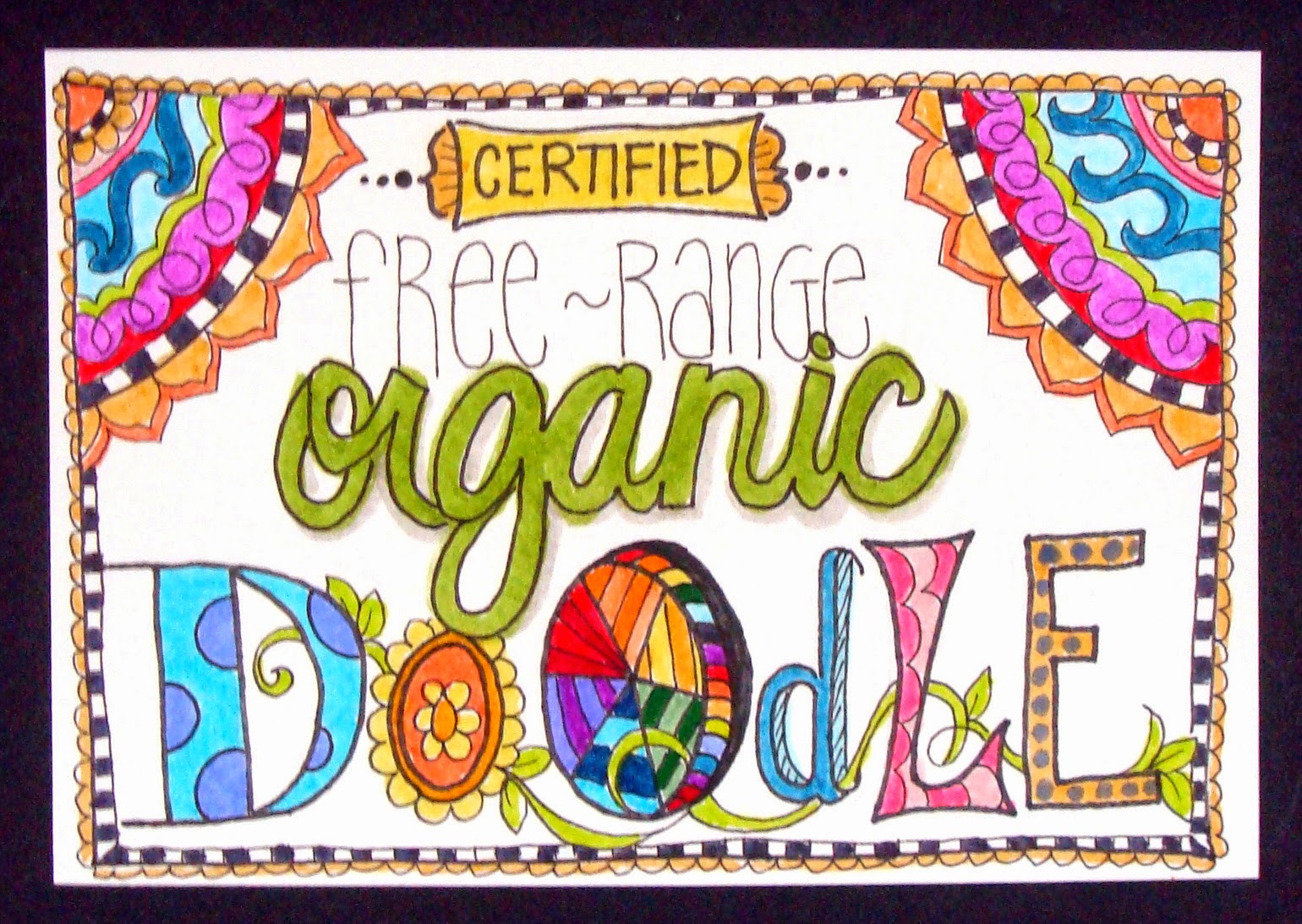
another prompt which had me scratching my head and thinking i might go freestyle for the day; until i got to the very last line of tammy's post which said, "long live free-range organic doodling!" well, YEAH!!!!! 

♥♥♥
long live free-range organic whatever-creative-thing you feel like doing today, darlings!
(though, as a matter of fact, i do actually highly recommend doodling!)
♥♥♥

Tuesday, August 5, 2014

"i ♥LOVE♥ this one!" she said, modestly

ok, yeah, i realize that's not very humble. but i also know that everyone reading this has had the experience of sitting down to make something with a very clear picture of how the finished project ought to look, and being pretty darned happy if the actual item comes anywhere even close to that. but every once in a while, if we're very, very lucky, we actually produce THE EXACT RESULT we wanted, and this is one of those times. so yeah... i'm obnoxiously happy! :)

(patterned paper scraps: basic grey, prima, my mind's eye, making memories, bo bunny, studio calico, crafter's secret ... plus... dictionary and book index paper; vellum: the paper co; pearl flourish: prima; watercolor paint: grumbacher, koi, loew-cornell; spray inks: tattered angels, mister huey, radiant rain; water soluble wax crayons: reeves; circle punch: ek success; adhesives: staples brand gluetape runner, xyron, scotch brand gluestick, sewing machine)

i probably should have mentioned that this week's challenge at shopping our stash is called "splish splash" and the brief is to use some sort of wet media-- spray ink, watercolor, acrylic paint, india ink, water soluble crayons, etc etc-- in any way at all; either as a background, or with stamps as a focal point, or maybe even just on their own? perfect idea for a hot summer's day, when you can go out in the backyard and make as big a mess as you want, am i right?

i used a few different wet media products on this: the sky and grass background is a combination of watercolor paints and spray inks that i brushed on, sprayed on, eye-droppered and blotted until i got the result i wanted. the heart is every color of red and pink water soluble wax crayon i own, brushed and blended together, then cut out. there's some scrappy goodness here, as well: a dictionary page house, topped with a roof composed of punched circles from leftover bits of tan and brown patterned papers; swirly white vellum clouds and part of a pearl flourish. i considered adding the sentiment, "home is where the heart is" but i ran out of room, so it's inside the card, instead.


be sure to check out the other designer projects at SOS; then get splishy... and/or splashy... and link up something fantabulous of your own, darlings! ♥

Sunday, August 3, 2014

hello, august!

i know for a fact that every day, week and month of the year consistently and unwaveringly takes up exactly the same amount of time as every other day, week and month of this (or any) year. having said that, july positively flew by at light speed, didn't it?! with the coming of august, we've transitioned out of the index card a day project and embarked on an equally cool tradition on the daisy yellow art blog, namely the daily paper prompt, in which miss tammy will give us a suggestion for something we can do each day to keep up our art journaling habit!

after 61 consecutive days working on 3x5" index cards, it's awesome to have the freedom to work at any size or shape that takes my fancy. on the other hand, in some ways, more choices can be overwhelming. i'm trying to stay loose, work fast, and not get bogged down in decision-making. i want to stay process- rather than outcome-based. having said that, i really like how day one came out, and it must be said that having a really cool first page in any new journal or collection is pretty motivating! :)


i scribbled water soluble wax crayons in the order of the spectrum, and blended them with a really really wet paintbrush to make them run. then i added some hearts diecut from rainbow colored scraps. in retrospect, i realize this would look better with the stitching horizontal rather than vertical, which is AWESOME... i'm so glad i did the experimental thing instead of tried-and-true!!!


ok, you caught me, there's nothing fast or loose about this one; it became a full-on graphic design extravaganza. you can't say it isn't experimental, though, because for me minimalism is the ultimate challenge. another smudgy rainbow, seen through a cloud-punched piece of white woodgrain cardstock, mounted on grey patterned paper. and for the record, NO, not every single dpp is going to have a rainbow. at least... i don't think so... hmmmmm...

oh yeah, i almost forgot AGAIN to thank everyone for the awesome comments about my new header! midway through ICAD i thought it'd be fun to have a photo of all my cards sprawled out on the table. i liked it so much, i decided it should be my header for the rest of the summer. it's by far the simplest one i've ever made: just the photo with text on top. the fab grungy font was free from dafont.com and is called 4990810; i made it look sparkly using a photoshop layer style called "over the rainbow glitters" by studio flergs from sweet shoppe designs. easy, peasy! ♥ 

Saturday, August 2, 2014

waiting for the grass to grow!

our path is complete, the dumpster full of concrete for recycling has been hauled away, the side yard has been re-seeded, and even as i type, mother nature is obligingly providing a light but steady rain to water everything in. can't ask for much more than that, eh? here's a new pic, bear in mind that (with a little luck!) all of the naked-brown-dirt areas will be grass in a few weeks, and the path will get another sanding (to fill in the little gaps between bricks) after it has settled. we want to replant some bushes and things against the house, as well, but that will take place at a later date. meanwhile, we're pretty happy with how this has turned out!


here's a reverse view taken from the little porch, so you can see the arched "landing" we created to visually anchor the whole thing to the house. that might be my favorite part!


meanwhile, the end of july signaled the end of ICAD, and here are my last couple of cards, but first a few interesting (ok, arguably interesting) (well, ok, possibly only interesting if you're ME) ICAD statistics. bear in mind that my goals for this project were to work pretty flat, to try new things-- especially wet media and pens, and to keep up better with timely posting:

total cards: 61
flat cards: 50 (wahey!)
cards with hand-drawing or lettering: 11 (pretty respectable)
cards using wet media: 14 (not bad)
collage cards: 45 (hello, comfort zone)

thematically, a few trends emerged:
rainbow cards: 14
cards with repeating circles: 14
cards with doilies: 12
sewn cards: 25 (ok, yeah, not a surprise)
cards with sparkly bits: 8 (holy wow, that's LOW for me!)

finally, the highs and lows:
cards i really really DO NOT like at all: 7 (just over 10%... not bad)
cards i absolutely totally love: 18 (YOWZA!)

060: ink blots
in its blank state i used this card to blot up the excess of a couple of last week's inky/painty/watery crayon essperiments... and it started looking cool enough that i filled in the rest with a blending sponge and then added on some little bits of leftover chinese newspaper. (apologies to chinese speakers if i've unwittingly used strips that say anything unpleasant; i THINK the more colorful bits are adverts.) 

061: rainbow heart
here's a shocking true confession: i made this card earlier in the week and deliberately saved it because i thought it would sum up my ICAD book-- and experience-- perfectly! colorful, vivid and fun... yep... that pretty much says it all! :) :) :)

moving into august, lest any of us start suffering from index card withdrawal, the lovely miss tammy, creator of ICAD (whose blog, daisy yellow, is a must-read!) will be hosting the daily paper prompt* so if you're an art journaler, or you'd LIKE to be... this is a fabulous way to start, re-start, or solidify a daily art habit! ♥♥♥

*i've made a start but not yet photographed, will post in a day or two.

Friday, August 1, 2014

putting the "mental" in ornamental! :)

this fortnight at ♥JINGLE BELLES♥ our theme is, "shape up for the holidays" in which we are embarking on any shape of card we'd like to make... except... (you can already see what's coming, right?) except square or rectangular! which means you can make a round card, a card shaped like a gingerbread house, a stocking-shaped card, a reindeer-shaped card, a triangular card that's decorated like a christmas tree; ok, i think you've probably got the idea, lol. you really only need to make ONE card, by the way; but i decided to make a set of cards shaped like ornaments, and somehow i wound up with twelve! here they are now:


ok, yeah, i know what you're thinking; you're thinking, "hey lauren, don't you famously hate to mass-produce cards?!" indeed i do. but i also hate to cut out just one of anything, when i can easily staple two or three layers together and get a lot more bang for my fussy-cutting buck. so when i decided to make four different ornament shapes, i wound up with a dozen ornament bases. and the next thing i knew, i had decorated all of them!


so why would i even want twelve cards that are similar without being the same? well, a couple of years ago i started sending individual cards to each of our nieces and nephews, and it's been a pretty popular idea! if you have more than one kid, i'm sure you'll realize that when embarking on this sort of project, it's important that each child's card be individually theirs; while at the same time making all the cards quite obviously equal. plus, it just makes the job go faster if you streamline the process.


i chose to use all older basic grey papers, since the different lines coordinate so beautifully together. i limited my pool of embellishments to flowers and snowflakes, stacked in the center as decoration for each ornament. i attached them with fairly flat brads so they'd be postal-friendly, too!


my goal was to wind up with a set of cards that would sort of resemble a box of assorted vintage ornaments: where each one is clearly different from the rest, but a member of the same family. i think i did pretty well on that score, if i do say so myself. (and, apparently, i do, lol!)


and now why not drop over at ♥JINGLE BELLES♥ to see stephanie's gorgeous creation and start planning your own shapely masterpiece! ♥