Sunday, March 31, 2019

happy lettering (part 2)

here are a few more sketchbook pages from the happy lettering challenge, which i found on instagram, and have enjoyed participating in (admittedly quite sporadically) throughout the month of march.

happiness
tombow dualbrush pens with a sort of neatened up version of the "scribbly ballpoint outline" i used on kite; plus some sunshine doodles to offset the fact that my lettering starts out MUCH bigger than it ends up, lol!

hope
back to the divinely juicy ecoline pens, with an offset tombow shadow in N60 (my favorite grey for shadows!)

flowers
this might be my favorite entry for the entire month, and i think i'm the only person who even likes it, which is fine. this time, i handcut the letters from origami paper... stuck them down in my sketchbook... then outlined and shadowed them as if they were done in pen. i can imagine A LOT of ways to use this technique, so no doubt you'll be seeing it again in future!

glimmer
turquoise and a touch of prussian blue colorburst, with plenty of sheer pearl liquid sparkle mixed in. it's hard to tell from the photos, but irl this is VERRRRRY glimmery indeed!

lime
i wish i had used a slightly smaller brush for lettering the "lime" (in lime green obvs!) over the chartreuse colorburst lime doodle, but otherwise i quite like this one.

garden
more flower doodles, not to mention a fern that is taking over the world, lol! with an offset .1mm pitt artist pen outline in lieu of shadow.

if you're interested in lettering, instagram is FULL 
of great examples, helpful vids and fun challenges, as well!

Saturday, March 30, 2019

happy lettering (part 1)

towards the beginning of the month i found the happy lettering challenge on instagram, and i've been playing along with their march prompts as time permits. this weekend seemed like a good time to round them up.

rainbow
all my standard lettering go-to's right here: a rainbow of tombow dualbrush pens, outlined with the skinniest (.1mm) pitt artist pen, and a shadow with my favorite grey, tombow's N60.


gold
i also like lettering with colorburst, or in this case, liquid metal... in yellow gold, with a coordinating marker outline and some stickles on top. 

lucky
very similar to rainbow, but with the blend across each letter (you need to leave quite a bit of room between!) a thicker outline and some posca paint pen dots.

spring
well obviously, i couldn't resist a few flower doodles! in order to cheat and not have to letter BEHIND the flowers, i wrote spring in a very light shade of chartreuse tombow, so that my flowers would cover it without getting too tinted; then did the black outline at the very very end.

kite
i had been wanting to try ecoline's brush pens and they do not disappoint... super juicy and a big tip that's exactly the right firmness! loads of funky/messy doodles on this one after i messed up the outline but didn't feel like starting over...

stay tuned for the thrilling conclusion... tomorrow!

Friday, March 29, 2019

we three... (it's a tricky one, lol!)

this fortnight's theme at ♥JINGLE BELLES♥ is called "we three kings" but you don't actually need to include any kings in your card's design. we just want to see *THREE* of... well, something! for example, i've got three beautiful ornaments on my card, see?

baubles: various shades of blue colorburst (ken oliver crafts) painted onto strathmore watercolor paper; cut into bauble shapes; liquitex matte white modeling paste and fabercastell glass bead gel spread through some tim holtz stencils and outlined (when dry!) with a pitt artist pen; bauble hangers: clear jewel bling strips from eyelet outlet; patterned paper: doodlebug + some bright white sheet music from my stash; colored cardstock: gina k; glossy white kromekote: the paper cut; scraps of glossy silver paper from tonic studios as the bauble tops, distressed with a little colorbox chalk ink;

one of my favorite uses for leftover colorburst (i *always* mix too much when i watercolor, lol!) or for panels that come out a little differently than i expected, and get put to one side, is diecutting! because you know that you've now got a beautiful hand-painted piece of paper that will be different from everything premade! technically, only one of these pretty baubles was diecut (the smallest is from a set of elizabethcraft dies that i adore!) and the other two were handcut using templates i made a few years ago from clipart. i've used several different types of modeling paste through various stencils to get the raised designs. then i used a very fine-tipped black pen to emphasize some of the patterns so they'd stand out a bit more. i layered them over sheet music and a coordinating panel of patterned paper, then added eyelet outlet jewel bling strips to serve as hangers. there's room for a  sentiment on the front, and i might add one later; but for now it's blank because i like to have a couple of "unaffiliated" cards in december, that can serve as all-occasion cards or even thank you notes, if necessary.

stephanie also has a trio of loveliness to show off. why not hop over to ♥JINGLE BELLES♥ right now and see that?

Wednesday, March 27, 2019

Everybody Loves...

...SNAIL MAIL!!! Am I right? Ok, maybe not boring old bills and circulars, but any time there is a card or letter awaiting me in the mailbox, I am a happy camper. And all the more so if it's a handmade card which features some fab Eyelet Outlet Brads and/or Washi Tape!


Both of my cards were inspired by this brand new and completely adorable Snail Washi... and also feature our Mail Brads! Because everybody loves Snail + Mail, lol!


My first card, which is a portrait style A2 (by which I mean tall rather than wide) also uses Heart BradsHeart Arrow Tape and Skinny Yellow Tape.


My second card is landscape style and features more Mail Brads, plus Blue Dot Washi and Skinny Blue Dot Tape as well. I used my trusty nested heart dies on this one, too. And small alphabet stickers to make the sentiments on both cards.  


I hope today will find you receiving --or maybe even SENDING-- some beautiful snail mail of your own! ♥

Tuesday, March 26, 2019

SOS392: make an atc!

this week's challenge at shopping our stash is all about format! we want to see artist trading cards (2.5x3.5" rectangles) or artist trading coins (2.5" circles) with any theme, materials and technique you desire. i went with spring and collage. because it's SPRING... and i love collage, lol! :)

vintage images from old nature books, garden plans from a landscaping handbook and sheet music from my stash;  transparency bases: hambly; washi tape: eyelet outlet, little b, mt; rub-on transfers: basic grey; ink: colorbox; corner rounder: we r memory keepers; adhesives: elmers brand gluetape, scotch create gluestick

i made four traditional ATC cards because i was already committed to a swap with an instagram friend that specified 3 cards with a "spring" theme. my "extra" card is to swap with my SOS teammate donna!


all four of my cards are built on a base of hambly transparency scraps, then i made a background of torn vintage paper... in this case bits of garden plans and some sheet music. i added strips of torn washi tape with brick, wood and flower designs to the background add to the "gardeny" feeling; because to me spring means it's finally time to get out into the garden and get ready for the warm weather!


from a few different older books i chose images that signified spring to me: flowers, nesting birds, and a butterfly. i liked how my cards looked, but there was still an awful lot of bright white paper showing, so i felt like i needed one more element.


i don't know about you, but i still have a whole bunch of older rub-on transfers. some of them are still in awesome condtion and rub-on perfectly. others do not. the only problem is: you cannot actually tell which are which until you try to rub them on something. my solution is to cut them up and use them really loosely in collage backgrounds. which is what i did here. 


i hope you'll be inspired to make some artist trading cards or coins and swap with your friends OR use them as the centerpiece for your next card or journal page! be sure to check out all the gorgeous design team creations over at SOS! ♥

Monday, March 25, 2019

frida kahlo: appearances can be deceiving

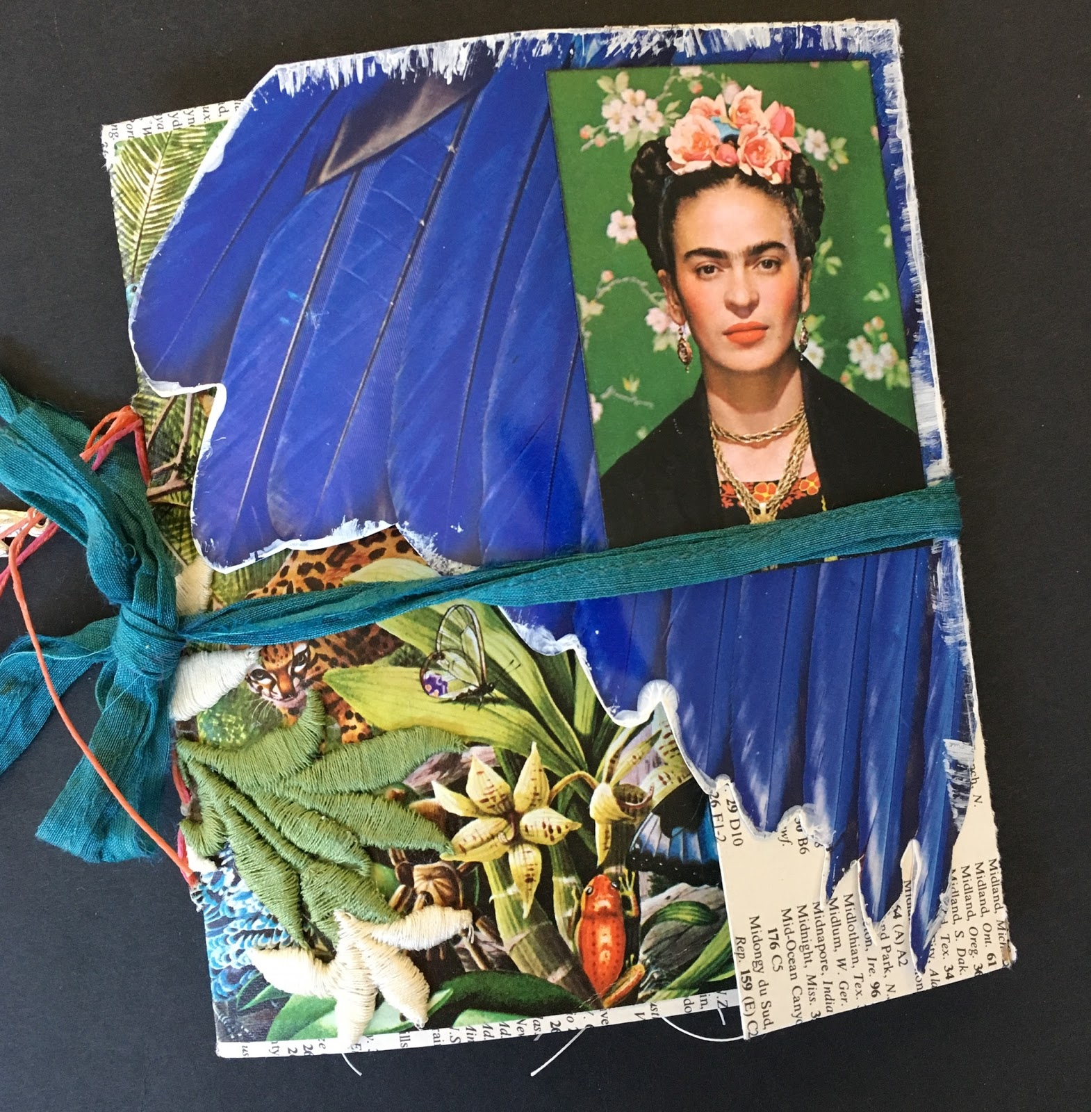
i was super-excited to see the amazing frida kahlo exhibit that is currently at the brooklyn museum, and what made it even cooler was that i went with my friend linda brun while she was here for a visit! linda and i both love making little books, so the idea of making a small remembrance was already in my head before we even arrived at the museum. when we got there, i was somewhat flummoxed by the strict NO PHOTOGRAPHY policy for this exhibit. because there were so many amazing images, words and ideas i wanted to remember and convey when i made my book. *HOW* could i do that without pictures? as it turns out, i think the restriction actually helped me... because it forced me to work in completely different ways. and while that doesn't always feel comfortable, i think it almost always leads to some interesting epiphanies!


first, let me tell you the nuts and bolts stuff:  this book is 6" tall and 5" wide. it's got 18 pages that range from 2 x 4" up to 4.5 x 5" some of which are neatly trimmed with a paper cutter, while others have randomly torn edges. its single signature is bound with a 6-hole pamphlet stitch, using waxed floss. traditionally, you'd keep the stitching hidden inside the cover of the book, but i sometimes like to stitch right through the cover and let the mechanics of the binding be part of the design, which is what i did here. (this is either lazy or innovative, depending on your perspective!) instead of trimming the ends of the floss and weaving them in, i left them long and tied a few small "milagro" charms i found in a funky shop in encinitas, california, on vacation last month. 


the cover is made from very thin chipboard, like the kind from which cereal boxes are made. (i sometimes use a cereal box for this if i don't have any "clean" cardboard on hand!) i wrapped the chipboard with an oversized index page from an old atlas and used some floral illustrations from a calendar as the interior endpapers. i decorated the outside with a jungle illustration, a few fussy cut magazine images and a vintage daisy applique that i got a few years ago at a thrift store in the same brooklyn neighborhood as the museum is in-- park slope. that is what you call "full circle" right there, lol!


since i knew i wouldn't have my own photos to work with, i was secretly hoping the museum's gift shop would have lots of amazing postcards and greeting cards. ahem. they did not. at this point, i was starting to think there was no way to make a *VISUAL* book, since i had no actual images to use. but luckily i'm a very stubborn person!


as i was going through the exhibit, i got glared at by some of my fellow attendees for typing into my phone. i think people thought i was texting continuously, but really what i was doing was making notes! and this turned out to be the "twist" that made this project different than anything else i had ever made. because instead of photographs, what i had when i got home was about 15 short emails that contained quotes from and about frida, snippets of her letters, phrases she used a lot, descriptions of many of the objects in the show, notes about her clothing, her hair, the plaster casts in which she recuperated after the many spinal surgeries she went through after being struck by a trolley. in short, i wrote about the articles and artworks in the show instead of photographing them.


so instead of starting with images, i was starting with words this time. i narrowed down to about a dozen of the quotes i thought were most meaningful, and then tried to find images that conveyed similar feelings to those inspired by the show.


i did get one postcard in the giftshop (the b&w image of frida and diego above) and i found two brochures at the museum which had photos of frida, including the image i used on the front cover. for everything else, i just kind of improvised.


since i love collage, i have a pretty good collection of falling-apart old books and magazines that i buy at garage sales. the worse shape they are, the better i like them, lol! because i usually get them really cheaply ...and...i don't have to feel guilty about cutting them up. i realize this whole subject --cutting up books-- freaks some people out. so much so that years and years ago, i wrote a post about my experience at a local book sale, when i found out what usually happens to the leftover books at book sales. it's archived here, if you'd like to read it, but spoiler alert: most leftover books at sales are recycled or discarded... in other words, the day after the sale, they will no longer be "books" in their current state. that was the turning point for me!


so i started looking through some of my "collage books" for images that would work. i knew i wanted some exotic plants, birds and animals, since frida used so many in her paintings. the exhibit featured some of her clothing, which had bright colors, beads, pleats and beautiful embroidery, so i looked for that as well. i also looked at nearly everything i have that's in spanish, for obvious reasons, lol. and it seemed like maps would give a sense of place; so then, i reasoned, old maps would maybe give a sense of the time in which frida lived? 


but i tried not to be too literal about my selection of images... basically if it "felt right" i put it aside. there were a few images i wanted that i couldn't find. i wanted a row of tall cacti, like the cactus fence at frida's home, casa azul; and also an artists' palette. in the end, i did without them. but... i found the large blue wing image that's on the front of the book on the cover of an art magazine, and it's the same shade as the blue of casa azul. i also had a fun kawaii version of frida (above) from a set of playing cards my friend stephanie gave me for xmas. i couldn't quite bear to cut it up or staple it, so i made a little pocket from a glassine envelope to serve as one of the book's pages.


once i had my selection of pages, i had a pretty good idea of what size my book needed to be. i had planned to make a book about the size of that cool playing card, but it would've meant cutting a lot of medium-sized images quite small; so i did a re-think, midstream. (this is why i always make my pages first and my covers LAST!)


i folded my pages and arranged them in order. then i thought about how to add all of those snippets of text i had made notes of in the exhibit. my first idea was to type them, on vellum, so i could layer them right over my pages and still see the images underneath. but that made the text very small indeed. so i kept the vellum idea but used a medium-sized set of wood-mount alphabet stamps to add the text. i considered staples and handstitching to attach the vellum pieces, but in the end, i used my sewing machine.


i am still not sure the recycled sari silk ribbon with which i have tied the book shut is quite right. so i haven't attached it permanently. i'm hoping to have a brainwave at some point, where i suddenly figure out what to use as the "real" closure. in the meantime, i find that i prefer to display the book standing open, as it is in the first photo of this post. who knows, maybe that is the answer, afterall? maybe some books are not meant to close flat. frida kahlo's life was definitely not ordinary, so maybe this book shouldn't be, either. ♥


♥♥♥♥♥
"appearances can be deceiving" will remain at the brooklyn museum until may 12, 2019. it is a very, very good idea to book tickets in advance, especially if you go towards the end of the run. for this special exhibition, the museum is also open on mondays and tuesdays, though you will only have access to the first floor on those days. there is NO photography allowed within the exhibit and you will be asked to check any large bags or backpacks.
♥♥♥♥♥

Friday, March 22, 2019

season's tweetings

we're still rockin' with the robins, prancin' with the penguins or possibly even attending a flamingo fiesta this fortnight at ♥JINGLE BELLES♥ and you still have until wednesday evening to join the fun, which we hope you will! here's what i made this week:

patterned papers, distressing tool and frosty poinsettia: prima marketing; border punches: recollections; washi tape: october afternoon; pinecone stickers: bo bunny; velvet leaves: petaloo; adhesives: elmers brand taperunner, 3m foam tape, gluedots, sewing machine

yes, i've gone very distressed and shabby chic, with papers from prima's "santa baby" and "sweet peppermint" collections, not to mention that lusciously frosted, dimensional poinsettia! i've added in a washi tape sentiment, a few punched borders, velvetty leaves and ancient clear pinecone stickers. at the very end, i felt like there was not enough of the darker red from the flower to anchor the design, so i slipped in a burgundy mat before adding lots (and lots!) of machine stitching.

there miiiiiiiiiiiiiiiiiight be a little prize this time; and i know for sure that stephanie has made an awesome card... so you should probably hop over to ♥JINGLE BELLES♥ right now, darlings!