
au contraire, darlings! i've made *TEN*--count 'em, 10--cards this week...and i can't show you any of them yet.
waaaaaaaaaaaaaaaaaaaah!!!!!
i can't even hint mysteriously about their theme. dang! this is kind of a bummer. oooh wait, i know, i can throw some stats at ya:
- two have a parisian theme
- one is a bit indian...ish...
- one is kind of "shabby chic"
- two have plain (unpatterned) backgrounds (what?! is this still LAUREN's blog??!)
- two feature photos and are what i would call "layout cards" (kind of like a scrapbook page, but smaller and...ummm...well, they're cards!)
- one has *72* embellishments on it--mostly rhinestones--in an area that measures approximately 4" x 1" (believe it or not, this is not even a record for me!) (it looks *good* though, trust me--it's not too much!) :)
- three are pretty "boyish", six are definitely girlish, one is gender neutral (i need to focus on GUY cards for the rest of the year!)
- techniques used: painting, faux stitching, altering/cutting out pattern paper & stickers & chipboard, inking, distressing, layering...and glueing on a whoooooooooole LOT of teeny tiny rhinestones!
the only other thing i can reveal is that these are all destined for CAARDVARKS' september 5th challenge, sponsored by frances meyer, for which we have the biggest DT gallery ever--(utilizing the fruits of the gi-HUGE-ic product packs they sent us--thanks, lana!) it will knock your socks off, and possibly your shoes as well...although they had best not be WHITE SHOES...since by then it'll be after labor day! :)

 however, i'm sad to report that, delicious chocolateyness notwithstanding, like many such sweets today, these particular cookies violated the terms of the (lesser known) geneva convention policies for truthfulness in baked goods...by which i mean...they did not contain fortunes so much as

 my conclusions: dye-based ink works better than pigment; the flatter the flower, the better the image transfers; paper flowers take ink slightly better than fabric ones...which can become very slightly blurry; 7 gypsies pre-inked stamps work just fine & are easily positioned; the more contrast between ink color and flower color the better it shows up; a medium sized stamp transfers better than a really big all-over image b/c of the uneven surface. on a personal note: i think i like the allover patterns the best, especially the crackle effect, the wood grain and the leopard spots!


 woohoo it's new challenge day on
 their website is currently being redesigned, but keep checking back there, b/c when they start putting the new stuff on there...you will SOOOOO want to see it! ...oh yeah, & you're gonna need your checkbook...trust me!!! ;)
 i finally got to use LOTS of my love, elsie epoxies (plus some from MOD, sue dreamer, provocraft, ek success & sei) & a few of her alphas (they are a great size); patterned paper is doodlebug & making memories; rub-ons are ki. upon reflection, i wish i'd made the card slightly narrower, so there was less space between the epoxies and the left & right edges; but other than that i am fairly happy, and i'm pretty confident my brother will not receive another one like it for his birthday next month!
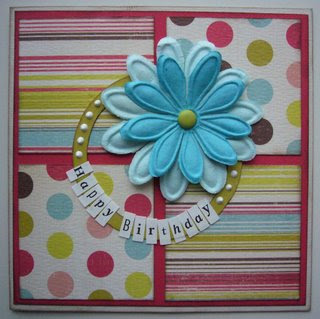

 which features wavy lines--and which took me quite some time to crack! here's what i came up with. my waves overlap each other...


