Thursday, April 30, 2020

City Thoughts

New York City has been on my mind a lot lately, for perhaps obvious reasons! I like using my Michelle Ward Exclusive New York themed products from The Ink Pad at any time, but they seem especially useful right now, to make a hopeful card. All of the stamps on this card come from Michelle Ward's Manhattan Map Stamp Set, and the star-centered stencil is from Michelle's Manhole Covers II Stencils and Masks set.


I made the pink butterfly wings and the creamy butterscotch "argyle" background using two of Sally Lynn MacDonald's Sweet Nature Shapes Gel Press Petite set. One of my favorite ways to use the Gel Press Petites is to stick them on an acrylic block, cover them with paint or ink, and "stamp" them. Sometimes I just stamp a few and cut them out... like the two layers of butterfly wings, stamped in Charming Pink VersaFine Clair ink. Other times I stamp them over and over to make a pattern, as for the argyle, which used Scattered Straw Distress Oxide. I used the fully inked diamond mini to make the dark areas of the pattern and stamped a second time with just the residual ink to get the lighter shade.


I stamped the Manhattan Map on a large manilla tag. On a fussy-cut manhole-stenciled gel print I added the Places in New YorkNY Postmark and Building, stamped in Memento Tuxedo Black. I stamped the Building a second time, on the offcut of that manilla tag, and cut it out, so I could mount it on foam tape on top of the butterfly wings, and above the "shadow" building, after I assembled the little collage of items that make up the finished card. 


I hope you'll be inspired to make a card or journal page based on your favorite city, and if that town happens to be New York, Michelle Ward and The Ink Pad definitely have you covered!!! ♥

Wednesday, April 29, 2020

Timely ATCs

Here's a very Lauren-y story: I saw Taylored Expressions' set of funny Covid19 digital sentiments and especially loved the one about jeans. Eyelet Outlet make a fab set of Jeans and Tee Shirt Brads, so I decided to make a fast card combining them. As it turns out, I have EVERY color of Tee Shirt Brad, but... (can you see where this is going?!) ...not even one pair of jeans left! Argh! As it turned out, I did have brads that worked with three of the other sentiments, so the day was saved!


Before I talk about the ATCs I'll just mention that the sentiments are a free download from the Taylored Expressions Website, you just have to make a (FREE!) account, sign in, add the Big Grumpy Covid19 Sentiments to your cart, and check out. You'll get an email with a link to the download; easy-peasy, not even a credit card required! They're in a pdf format, which you can then print out on the paper or cardstock of your choice. My first ATC uses the "Stay Home" sentiment, which I printed on white cardstock and just trimmed down to fit in the patterned paper frame. I added a Computer and Headphones at opposite corners, and made my 2.5 x 3.5" Artist Trading Card based from patterned paper in coordinating colors... one piece even has little houses on it!


The "Messy House" sentiment seemed perfect to pair with our Vacuum and Broom Brads. This time I only framed up the brads, and set them above the sentiment, which I had printed on clear ink jet labels and stuck to this fun ledger-print paper. Again I found a sweet pattern of little houses, this time as a background. 
 

I'm sort of excited about the third ATC, which uses the "Shampoo" sentiment, because I don't think I've ever before used the EO Brush and Hair Dryer Brads! But they really are just right for this. Again I put one at each corner, so that the sentiment takes center stage.


Thank you Taylored Expressions for the inspiration and the fun sentiments! And thank you Eyelet Outlet for literally having a brad for EVERY occasion! 

Tuesday, April 28, 2020

Happy Mother's Day

...from the gang at Shopping Our Stash, we're making cards that celebrate our moms this fortnight and we'd love for you to join us! Here's what I made:

patterned papers: ciao bella's ducato d'este collection, except the very bottom layer which is authentique; flowers: prima and recollections + some white ken oliver paper leaves; sticky-back pears: eyelet outlet; antique lace trimming from my late mother-in-law's sewing basket; ancient pearl stickpins and also resin flowers: unknown; embroidery floss: dmc; the world's most awesome distressing tool, that alas, they no longer sell: prima marketing; adhesives: elmers brand glue tape, 3m foam tape, hot glue, sewing machine

You'll notice there isn't a sentiment on this card, but I assure you that anyone who knows my mother could immediately peg this as being a card for her! The chickadee... (ok, the Ciao Bella Ducato D'este patterned paper version has a lot of blue in it, but I think he's still a chickadee?) ...the flowers, the shabby chic vibe, the vintage lace, etc, etc, all spell, "M-O-M" from where I'm sitting. The papers themselves are only about a year old, from my lss, Paper Anthology; I'm super glad I bought two sheets of the paper with the chickadee on it, so I could fussy cut one and put it over top of the one on my background panel, like in old-school decoupage. All the rest of the card is seriously stash-centric: the dimensional flowers are ancient, the bling has been around for a bit, the resin flowers are so old I'm not even sure where they came from, and the pale blue pearl stick-pins have to be pre-2013 because I remember very nearly throwing them out when we moved, lol!


Be sure to check out the beautiful and inspirational design team cards at SOS and start planning your own MOTHER of a card! :)

Monday, April 27, 2020

Step-by-Step Mandala

Enough people have asked me about the mechanics of drawing (somewhat) symmetrical mandalas that I thought I'd try taking still pics of all the steps to give you an idea of the process. So here we go. I did each successive ring in a different color, to (hopefully) make it easier to see the way I work. I'm happy to answer any specific questions, just email or ask in the comments!


step one: set up a "round grid"
if you're aiming at symmetry, it will help to have some way of measuring your space, both side to side (working around the circle) and also working from the center, outwards. this is the easiest way i've found. (ordinarily, i would draw this lightly and erase it at the end, but i wanted to make it nice and dark so you could really see it!) mark the center of your paper both horizontally and vertically. the intersection of these is the center of your page, and of your mandala. once you have the center, you can make several rings using a compass or circle-scribing tool. you can also divide the four quarters of the circle further. i've gone with eighths on this one, but obviously you could make as many or as few as you'd like. 


step two: make your first ring
ok, yeah, i realize it looks like i made TWO sets of petals with my hot pink pitt pen, because my shapes overlap. i added six tear-drop shaped petals, each centered on one of the "spokes" and stretching from the smallest circle at the center, to the next ring, about an inch further out. the bases of the petals meet the next spoke over, and there's a very slight curve to the shape. i personally don't use a template for drawing my petals, but you could if you'd like. i also don't pencil them in first, but lots of folks do. for that matter, you can avoid curves and use a ruler to connect up nice straight lines. (the result of straight vs. curved lines will be more like a starburst, but still very cool!)


step 3: second ring
for this set of blue half circles, each one fits between two pink petals, stopping just a hair below the next "ring" of the grid. this time, i used one of the circle templates in this helix circle maker that i found pretty cheaply in a stationery store. you definitely do not need a special tool to draw mandalas, but this one is quite helpful. it can even help you to divide a circle into lots of different sectors, by dividing the 360 degrees into smaller equal segments. 


step 4: a ring of green petals
this set of marks starts at the next outward loop, dead center between two spokes. you can measure that distance and make a little dot, or just sort of wing it. the lines, which end at the base of the blue circles from the last round, are not quiiiiite straight, they flare just a bit at the bottom, to accomodate the blue circles. as with all of the rings in any mandala, they could, theoretically start anywhere and end anywhere. the thing that makes them symmetical is that they are consistent.


step 5: another set of overlapping petals
the next time i draw a step-by-step mandala, there will be NO shapes that overlap, i promise! and i apologize if the overlappiness (yes, that's a word!) is confusing in this case. on the other hand, if you want to create quite a complicated-looking mandala pretty quickly, overlapping lines work really well. this ring of shapes, drawn with a teal pitt pen, is an echo of our first ring of pink petals, and it's one of the classic mandala shapes. this set is again centered on the spokes. each gently curving line starts at the end of a spoke and winds up right next to the base of a green petal. but, as you can see, each completed teal tear drop brackets TWO green petals.


step 6: squaring off
ordinarily, when i am this far into a mandala, i'd be erasing the pencil marks of the original round grid. but this time i made them extra dark, for visibility. also... i thought they looked kind of cool, so i left them. i added a ring of small petals and a smaller circle at the very center. i also drew a square that's perfectly centered between the largest ring and the second largest. partially because i left the grid lines which are ruler-straight. also, most mandalas in the buddhist tradition incorporate a square or two. again, there are no particular rules you have to follow. if you think a square might look cool, try adding one. if you dislike the square, by all means, leave it out!


step 7: getting fancy
ok, yes... this is really more like steps 7-12, because i added quite a few more details, in the form of dots, doodles and more circles. but since i consider them cosmetic rather than structural, i've lumped them all together. obviously the mandala could have been considered "done" after step six. but i added the doodles, because, for one thing, they are FUN! for another, they're the perfect way to correct any wonky lines! they boil down to three basic styles of detail, that i use in a lot of my mandalas: echoes to lines that were already there, hashmarks or chevrons to "fill in" some of the open spaces, and dots. by varying the size shape and color of each, you can get many different looks.


and that's about it! i hope this has given you some sort of an idea of the basic steps, and maybe even inspired you to dry drawing your own mandalas! ♥

Sunday, April 26, 2020

Positively Negative Tulips

Possibly the weirdest title EVER, lol! But it's fairly descriptive, because today I've made a card that uses the negative space that's left when we cut out Hero Arts' Tulip Frame Cuts and layer the Tulip-shaped hole above some fun zen doodle designs. Needless to say, all of my supplies came from The Ink Pad, a place that I cannot wait to go back to in real life, whenever it is safe for us all to be released into the wild.


This idea would work with any die (or punch, or hand cut window!) but the main point is that we need to think about TWO distinct layers. First, we'll make the top layer. I used my Picket Fence Studio Blender Brushes to blend (from the top down) Mermaid Lagoon, Cracked Pistachio and Squeezed Lemonade Distress Oxides on a piece of Canson Watercolor Paper. When my panel was finished, I taped both Tulip Frame Cut Dies to the lower left side of the panel and cut them out. I put the actual diecuts aside to use on a future project, and kept the panel which is now a vague landscape with a blue sky, green grass (to which I added some detail with a green brush pen) and two tulip-shaped holes.


The bottom layer is going to be the "interior" of the tulips, it's the way we color them in. From plain cardstock I made a second, "scrap paper" version of the top layer, and used it like a stencil to fill in with Squeezed Lemonade and Shabby Shutters Distress Oxides in the correct places to work as flowers and leaves. Then I removed the stencil and widened out the areas of color a little more.


Finally, the fun part: filling in the zen doodle patterns. You could go wild with lots of different lines and swirls, but to make it easy to see (and explain!) I used a black .005 Pigma Micron Pen to put arcs within the flowers and an openwork plaid for the leaves. When I was finished, the panels looked like this:


I added a machine stitched border, a sentiment (from Hero Arts' Bookcase Peek-a-Boo Stamp Set) and an Eyelet Outlet Mini Ladybug Brad to the top layer, and mounted it over the bottom layer using foam tape. The I matted the whole thing on another panel of blended Oxides (this time Dried Marigold and Scattered Straw) and finally attached it to a glossy black A2 card.


Just think how many DIFFERENT versions of this card you could create, just by changing the blends of ink on each panel, and selecting different dies. The possibilities are nearly endless!

Friday, April 24, 2020

Fetch the Sketch!

It's time for a fun sketch challenge at Jingle Belles, where Stephanie has devised this beauty for us:


You can rotate, flip or stretch it, swap the shapes, etc, just make sure we can see the "bones" of the sketch ok?

papers and stickers: prima marketing; tape: october afternoon (pink) and little b (white); star accents: tim holtz/ida-ology; flourish die: th/sizzix; pink cardstock: bazzill; grey semi-solid: crafts consortium; adhesives: elmers brand tape runner, nuvo deluxe adhesive, 3m foam tape, sewing machine

I flipped the sketch horizontally, and chose a mug rather than a tag, but I think it's a fairly faithful adaptation. Most of my ingredients are Prima, from the Santa Baby collection; plus a bit of non-holiday paper from Pretty Pale. I used tape for the sketch's horizontal band and a Tim Holtz/Sizzix die for those pink flourishy things, which I thought looked a bit like steam rising off the delightful mug of cocoa.

Jump on over to Jingle Belles to see Stephanie's card and link up your own!

Thursday, April 23, 2020

Quilt-Inspired Cards

But don't worry, there's absolutely NO sewing required! In fact the only supplies you need are stickers and washi tape. Mine are by Pepin and from The Ink Pad, naturally! And all the info you need to try this technique is on The Ink Pad Blog today!


Wednesday, April 22, 2020

Just Hanging Out!

...with the brand new Eyelet Outlet Sloth Brads. Ok, technically, this item is called Sloth and Koala Brads, and the packs come with six of each; but in today's post I'm only featuring the sloths. But don't be insulted, koalas, you'll get your turn, I promise!


My very first thought when I saw the adorable sloths was the "Sloth Mail" sentiment! (No, I don't really think like other people, lol!) It was one of those times when had the whole picture of the card inside my head, from Sloth holding an envelope from the Mail Brad set, down to what font I'd use for the sentiment (Bohemian Typewriter!) and the fact that I'd line up strips of Mail Washi on the diagonal to make my own patterned paper. Of course, I hadn't realized that this particular tape is out of stock at the moment, and I'm hoping it will come back in soon; but meanwhile, the idea would work perfectly well with any of our other Mail Tapes or Postage Tapes or with postal-themed patterned paper, or REAL postage, or... well, you get the idea, it's pretty flexible!


But not everybody wants to get as silly as I do, so I also made up a more "mainstream" sentiment, as well. This one uses a free font called Stamp Act. Both of these sentiments will be on the freebies page as jpg files you can right click and save or print if you'd like to use them to make your own cards!


This card is also designed around a specific tape, in this case it's the adorable Sloth Washi. Again, I made a background panel from the tape, but this time instead of insetting my sentiment, I've added it on top. I used a pencil to very lightly draw "vines" for the Sloth Brads to frolic on, and then I machine stitched to add some fun texture, but you could draw them, instead, or stamp some foliage!


I hope you'll be inspired to create your own sentiments to go with our Eyelet Outlet Brads, and if you do, please share them on the EO FaceBook page because we'd love to see them!

Sunday, April 19, 2020

Why Hashtags Are Awesome

In this case, the hashtag I'm talking about is #aworldofhearts on Instagram. My friend Anna Chiang, the owner of The Ink Pad, saw it first and loved the way small business owners, artists and families are decorating their windows with hundreds of rainbow colored hearts as a greeting to their neighbors and the world outside. When I (Lauren) saw it, my first thought was to try to translate the idea into card form, so I could send the message to my friends who are further afield.


But then, the more I thought about it, the more I wanted to do a window, as well, so then I did that, too!


It turned out to be fairly easy to make the hearts (especially if you own nested heart dies and lots of colors of cardstock... which I do!) and only slightly harder to arrange them in a cool pattern. The really hard part turned out to be getting a great photo of the window I decorated. So you'll have to trust me when I tell you it's cooler looking in real life, ok?


But let's get back to the cards, because we're lucky enough to have a big "window" on the whole entire world, it's called the post office! So why not use it to spread a little joy? I used the smallest dies from the same set of nested ones, and scraps of plastic packaging to make myself a few sizes of heart stencils. Which I then used to cover two card fronts with Distress Oxide hearts. But... for that matter... the idea would work equally well with stickers, or hand-drawn hearts, or ones cut out of folded construction paper, like the valentines we made as children. In fact, this would be such a fun project to do with kids, because you could give them the structure of hearts + rainbow colors, then let them interpret it in their own way! 


My first card has the serpentine of hearts, rising from the bottom edge and floating off the top. It's on a dictionary page which has the definition of "heart" on it. (The same page also had heartless and hearse... but sequins and careful trimming helped me out there!) I used multiple shades of Distress Oxides and my Picket Fence Studios Blender Brushes, taking care to wipe the stencil and get most of the ink off my brush each time I changed colors. At the end I outlined with a Pigma Micron pen, added a grey brush pen shadow and finally a few Neat and Tangled Sequins. The sentiment is made with ancient alphabet dies and my trusty old school labelmaker.


For my second card, I started with plain white cardstock and used just one color per heart. I outlined again and then filled in the white spaces between the hearts with zen doodles. The sentiment is Hero Arts' Thinking of You die, cut once from purple cardstock and once from black, then layered to make a drop shadow effect.


I hope you'll be inspired to make your own "HEART-y" creations to brighten someone's day! ♥

used up almost a whole roll
of sticky tape in a single afternoon!

Friday, April 17, 2020

THIS is Why I Love Themed Challenges!

Because a challenge that pushes me out of my comfort zone often leads to ideas I would not otherwise have had; which lead to cards I would not otherwise have made. But before we get to the card, let me show you the ingredients I assembled for the second week of our Earth Day RECYCLING prompt at Jingle Belles:


Possibly you're wondering, "HOW would you use a cocoa tin?" Well, I didn't, exactly; I used the lid, which is a 2" metal circle with a 1/4" lip around the edge. Possibly I've been stuck inside my house for too long, but the other day when I was adding a spoon of the cocoa mix to my coffee (a combo I *highly* recommend!) I saw it and thought, "That would make a cool frame!" The rest of the cocoa mix is now in a tupperware, since the original canister has no lid, because it's HERE:

recycled items: metal cocoa lid, 2 different received xmas cards, small piece of woodgrain packaging; vintage/stash items: 2 random golden metallic wired leaves that i have NO IDEA where they came from and some very old white seam binding with a decorative edge that i think my MIL gave me; dimensional flowers: prima, recollections, ideaology; velvet leaves: petaloo; green cardstock mat and white card: bazzill; adhesives: elmers brand taperunner, gluedots, hot glue, sewing machine

I save a lot of incoming cards that have a sort of highlighted frame area, like this one with the golden snowflakes. Because essentially, the designer of the card has done most of your work, you just add in a new thing to be featured in their frame et voila! I punched a circle of glittery trees from a different card, a slightly larger circle of woodgrain packaging as a mat, and placed them inside the cocoa lid frame. Since the frame is 1/4" deep, this card will have to be tucked in with a present, or given to the recipient irl, but that's ok with me. In order to make it look like a frame and not a cocoa lid glued to the front of my card, I needed to sort of "build up" the area around it, for which I used dimensional flowers and velvetty leaves. When I was five minutes from done, my husband helpfully suggested that I could have punched a hole in the card and inset the lid, with the lip overlapping the front of the card. Of course I did not hurt him in any way, but if glares could harm a person he would be a little bit bruised right now, lol!!! I will definitely do that with the very next similar lid I find. I might have to increase my cocoa consumption?! 

Be sure to visit Stephanie's beautiful card at Jingle Belles and start making plans to link up your own recycling-centric masterpiece!

Thursday, April 16, 2020

Don't Worry, Be CRAFTY!

There's a lot of worry about right now. Understandably so. Because let's face it, even the word "pandemic" is frightening. I (Lauren) think creative people might be particularly susceptible to anxiety, because our imagination didn't come with an off switch, did it? But... sometimes it's possible to change channels, and keeping busy helps with that. Keeping busy by playing with art supplies seems to especially help me, AND at the end of it I sometimes have something pretty or fun to share with my friends. Like this:


A couple of months ago, my friend, Anna Chiang, the owner of The Ink Pad, found some really cool word art that was done on top of vintage dictionary pages. And we've both been obsessed with it ever since. So of course when I had a lettering idea I had to get out my Karin Markers and Karin DecoBrush Metallic Pens and grab some dictionary paper! I decided to make the pivotal word, "Crafty" a bit stronger and more interesting by swapping out ordinary pen letters for mixed media.


The letters are as follows:
  • C: handmade paper, vintage buttons and a sequin 
  • R: an experiment blending Gansai Tambi Watercolors on Canson paper
  • A: skinny washi tape and two sizes of Eyelet Outlet Bee Brads
  • F: origami paper stitched with embroidery floss
  • T: measuring tape washi
  • Y: a scrap of pink burlap, a paper flower, Eyelet Outlet Flower Brad and sequins

The lettering was done with my Karin BrushMarkers and DecoBrush Metallic pens. The outlines are Pigma Micron pen in a nice fine tip. The shadows are grey brush pen. The little pink hearts (and a few other details) are Posca Paint Pen. There are Neat and Tangled Sequins scattered about, just because I will take any excuse to scatter some sequins!


I hope that you are having a happy, hopeful day already, but if not, why not spend some quality time with your art supplies? ♥

finds rainbow shades of ANY
media immediately comforting!

Wednesday, April 15, 2020

Brads of a Feather...

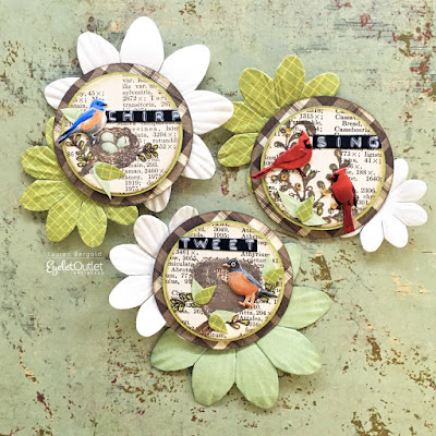
...Flock together! Eyelet Outlet Bird Brads, that is! There are Bluebird and Robin Brads (which come in the same packet) and two styles of very handsome Cardinal and Cardinal Profile Brads! Please don't ask me to choose a favorite, because that would be impossible!


I haven't made Artist Trading Cards or, in this particular case, Artist Trading Coins... in a while, but suddenly I was in the mood, so that's what I made. What are "Artist Trading" items? As the name implies, they're intended to be small handmade items for crafters and artists to trade via the mail, at conventions and meetups. Generally, an artist will make a series of similar ones at a sitting, in order to swap with several people at the same time. Artist Trading Cards are the size of a playing card (2.5 x 3.5") and Coins are 2.5" circles. The etiquette of this artform demands that they never be sold, only traded; though you can also find something called ACEO (Art Card Originals and Editions) which are essentially the same format, but intended for sale.


This trio of Artist Trading Coins feature our various bird brads, with stamped backgrounds of nests and foliage on some lovely, slightly yellowed, book paper. The Robin and Bluebird each stands proudly in front of a nest. Surrounding it, there are some tiny paper leaves, which I made by cutting apart the smallest size of EO green Paper Flowers


The Cardinal and Cardinal Profile are perched in some branches, to which I've added more paper leaves and some tiny berries snipped from the edge of a Bling Swirl. Each ATC has a Dymo Label sentiment, from which I trimmed away the excess tape, so that the scale fit my design better.


Whether you've made Artist Trading Coins before OR you've always wanted to try, wouldn't this be a great time to make some and surprise your crafty pals with Happy Mail? And I bet for any subject or idea you can dream up, there's an Eyelet Outlet Brad that will make your design even better! ♥

Tuesday, April 14, 2020

Spring Fling

This fortnight at Shopping Our Stash, we're celebrating the fact that is is finally Spring, woohoo! You can create any type of project, with any colors and themes, as long as it conveys "SPRING" in some way. Alternately, if you had a last-minute Easter or Passover card, you can share that. I went with spring!

k and co flower and butterfly diecuts; craft consortium "nearly solid" patterned paper; core'dinations cardstock; colorbox inks (for edging); adhesives: elmers brand gluetape, 3m foam tape, sewing machine

I *think* this is going to be a birthday card, but I'm not positive, so you'll notice there is no sentiment attached. I like to leave some of my cards undeclared until it's time to send them, because you never know when you'll need an unexpected "genre" of card at the very last minute. This was a super-fast make, unless you count the time I spent flipping through several sections of my stash, wondering what I was in the mood to use. When I found half a pack of ancient K and Co diecuts in soft blues and purples with all my favorite spring flowers, the choice became a no-brainer. I layered a few flowers for a garden-y feel, popped up a beautiful butterfly and called it good!

Be sure to visit Shopping Our Stash for more inspiration and to link up your own creations!

Sunday, April 12, 2020

Some Folks...

...are celebrating Easter today, though their celebration might look a bit different than in other years. Some folks are in the middle of Passover; but again, the "gathering together" aspect that holidays often contain might be missing. Or, the Seder table might have a laptop or iPad set up with some family members visiting via FaceTime or Zoom. Whether you're celebrating anything or not, I hope that you're having a good day, and I hope you'll accept this bouquet of daffodils!


I'm a huge fan of PaperGame Sticker Packs and I love that The Ink Pad has a bunch of different ones, many which are exclusive; with new ones arriving at intervals. This is an older pack of Botanical Floral stickers, printed as plain black line drawings on beautifully sheer vellum; though many of the sets come fully colored and/or with more opaque backgrounds. If you leave me alone with a pack of stickers (or a plate of brownies, lol!) there will not be many left when you return. But this photo gives an idea of these particular stickers in their natural state. I used alcohol ink markers to color in my daffodils and leaves, using a couple of graduated shades of yellow and soft green. I love that the shading lines on the stickers give me excellent clues as to where I should add more color!


Since the daffodils were clearly meant to be the stars of the show, the rest of the card is quite restrained. I used the smaller-scale half of Michelle Ward's Hex Pattern Stencil to add a subtle pattern in Pale Ochre Archival Ink on some Canson Watercolor Paper; trimmed some very pale blueish green mats and finished off with pretty yellow sequins for a bit of glam.


I hope there are some REAL daffodils where you are, but if not, please share these with me!