Wednesday, July 30, 2014

landscaping (& icad-ing) update

i'm sure everyone is positively dying to see a picture of the new path, and i'm here for you, darlings! :) it still needs to be trimmed and sanded (i have very professionally used the yellow extension cord to show where the finished left edge will be) then the adjacent area gets filled in with dirt to make the correct grade, and finally the side yard will be re-seeded with grass. but i think you can see the basic size and shape. my cousin greg, who is an amazing landscaper, is doing the work, and he's been reallllllllllly (really, REALLY!) nice* about "collaborating"... which, in this context, of course means patiently letting me try out a million ideas until i figure out what i want, and then translating that into something that will actually WORK in terms of construction!!! after playing around with various scenarios, we've settled on a 38" width and switched from a horizontal edging to a vertical one, on the grounds that it shows off the herringbone pattern better. i think it's going to be pretty fab when completed, and it's almost exactly like the picture i had in my head, maybe better! :)


and now the ICADs... we're in the home stretch on that, as well, which is equally exciting!

054: cactus collage
not much explanation necessary; my mom gave me some vintage nature stamps recently and i'm fairly well smitten.

055: jerry garcia tribute card
playing around with water soluble wax crayons and stitching. it's a good combo, though in this case donning protective eyewear is recommended.

056: texy new york skyline
inspired by some amazing tape on a package the lovely amy t (♥♥♥!) sent me; my version's a little overcrowded for an index card, but i still kinda like it.

057: rainbow arcs
we spent a couple of days this week (intermittently) working on the arc for the top of the path; clearly i had that shape burned onto my brain!!! :)

058: inky embossed doilies
there are only a few ICADs i made this year that really just do not like at all... and this is one of them. there are a couple of pretty good ideas here, but they don't gel into anything. and i'm 100% ok with that, failure should always an option for creative pursuits, imo!

059: red collage
again, i think the title and the card sort of speak for themselves. one thing they are definitely saying, "i ♥LOVE♥ collage!"


*i should also mention, once again, that i am married to the nicest man in the entire universe; and i'm not just saying that because he gives me a free hand to do whatever i want in terms of decor and landscaping... although he does! :) :) :)

Tuesday, July 29, 2014

triple threat

this week at shopping our stash, it's something of a "make your own challenge" scenario. we've provided a list of ingredients, from which you must use at least three. sound fun? ok, here's the list:

ribbon
flowers
lace
pearls
spray ink/glimmer mist
punched elements or die cut elements
rhinestones
doilies (stamped will work too)
dry embossing or scoring 

what? you don't see ANYTHING there that inspires you? seriously?! ok, then, alternately, you could also choose to use three of one type of embellishment. better? awesome, off you go then! i, on the other hand-- being the type of gal who enthusiastically enjoys embellishment-- really liked the list. so i used... EVERYTHING on it!  bwahahahaha!!!!! no seriously. i did. see?

(patterned paper: 7 gypsies, maggie holmes/crate paper. pink paislee, studio calico, prima; doily die: cheery lynn designs; hollyhock die: impression obsession; doily embossing folder: maggie holmes/crate paper; rhinestone and pearl flourishes: want2scrap; border punches: recollections; mists: tattered angels + ranger; ink: ranger + colorbox; adhesives: staples brand gluetape runner, 3m foam tape, sewing machine)

told ya! don't believe me? check it: may arts leafy ribbon, diecut hollyhock flowers, a strip of lace in my horizontal border, pearl flourishes, two shades of pink mist on my white frame panel, punched border strips on either side of the lace, rhinestone flourishes mixed in with the pearl ones, diecut doily, and a doily-embossed effect on the white framed panel. admittedly it's hard to see the mists and the embossing in the photo above, so here's a better look:


there are some glorious design team projects awaiting you over at SOS, not to mention the opportunity to create your own embellished masterpiece! join us, won't you? ♥

Friday, July 25, 2014

lilac, kraft, silver and white...

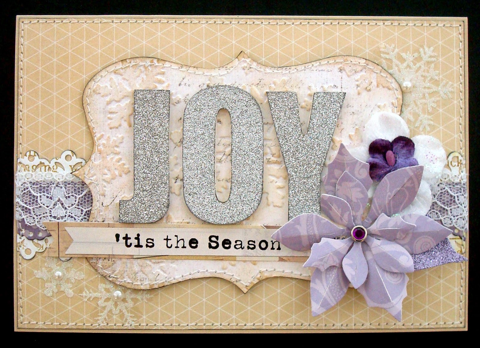
...possibly my new favorite christmas colors?! it's a palette i'm not sure i ever considered for a holiday card before; although admittedly, i did make this year's ♥JINGLE BELLES♥ header using those colors and elements from mary pop designs' christmas joy digital kit, which i got at o'scraps:
 
full image credits for this header are on this post

but it wasn't until our lovely guest star and fellow christmas cardmaking enthusiast marie bingaman suggested we use the header as our inspiration this fortnight, that i thought about making a card in those tones. and now i can't stop! here's what i made this week:

(patterned paper: girls' paperie, lilybee design, recollections; white glitter cardstock: doodlebug; white glossy cardstock: paper accents; diecut-able wood veneer sheet: kate's paperie; reindeer die: tim holtz/sizzix; poinsettia flowers: from a deconstructed garland bought at michaels; snowflake brad: oriental trading; sentiment sticker: making memories; partial pearl flourish: prima; silver hydrangeas from my stash of vintage goodies; adheisves: staples brand gluetape runner, 3m foam tape, sewing machine)

something else i can't seem to get enough of is the current cardabilities sketch (#103). i used it pretty loosely earlier this week to make my fruity SOS card, but this time i've been a lot more literal!


i mentioned last week that a lot of my purple and kraft elements were from my regular, non-xmas stash, and that's true again this time. the reindeer die is christmassy, of course, and i used it on some very thin wood veneer sheets that stephanie and i found at kate's paperie in new york. i'd like a bit more of that stuff, actually. i might have to arrange a little detour down to soho on my next trip into the city! :)


be sure to stop over at ♥JINGLE BELLES♥ to see marie's and stephanie's amazingly gorgeous cards, and start planning one of your own!

Wednesday, July 23, 2014

ep henry, coventry brickstone, harvest blend

that's our choice of pavers. because i'm sure the suspense has been killing you since last week! :) the bond will be a 45 degree herringbone pattern with a horizontal brick border. bonus points have been awarded to me for having instinctively picked the most expensive way to do this! because a herringbone pattern uses the most bricks, since you waste part of the ones that need to be trimmed along the edge; and the most labor, because the trimming gets done by hand. so given this information and the opportunity to switch to something a little less costly, have i changed my mind? ummmmm... nope. as sally so wisely said to harry, "i want what i want." even if it means we won't be doing much planting until next spring? yeah, i'm ok with that. we've had a couple of delays in the last year to various household projects in which the extra time resulted in an entirely new-- and much better-- idea that evolved during the waiting period. so i'm willing to roll the dice in hopes of a similar epiphany. plus, in the meantime, we'll be getting the result we really want. here's how it's going so far:

from a lovely green side yard...

...to a whole lotta dirt!

now is probably a good time to mention that the walkway project is actually secondary to the fact that we needed to tear up the whole side yard in order to re-grade around the basement window that's just below foundation level on this side of the house. so on the one hand, this isn't quite as frivolous as it seems. on the other hand, it's going to get considerably messier before it looks nice again. ah well. that pretty much sums up most things in life, doesn't it?

meanwhile, there are more ICADs, woohoo!

051: chinese sewn collage
this was going to be a stapled collage, but i thought some lumpy bumpy stitches and dangly threads might be even more fun. i stand by that decision!

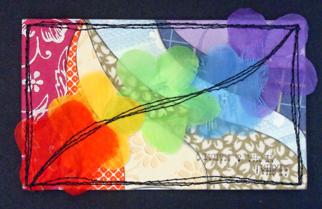
052: mehndi rainbow
the base of this was an ad for fiesta-ware-like plates in a catalog. i thought they looked like a rainbow. so i decided to go crazy with a sharpie ...like ya do... :)

053: vintage owl collage
the owl is one of those old school, pre-rub-on-style transfers that you soak in warm water and then slide caaaaaaaaaaaarefully onto your target. this one was on a very eldery sheet that my aunt found at a garage sale. i was actually pretty sure it would disintegrate the moment water hit it, but decided to give it a try anyway. i now feel i owe the meyrcord company of carol stream, illinois, a bit of an apology, since their 40+ year old product worked better than some of the brand new fancy craft supplies i've bought recently. go figure!

ok, so, now that we're caught up, does anybody wanna come outside with me and play in the dirt pile? no? i bet nephew matthew will be up for it, excuse me whilst i phone to enquire, darlings! :) :) :)

Tuesday, July 22, 2014

fruits and veggies...

...are an important part of a healthy diet; and this week, they're the inspiration for the new challenge at shopping our stash: we want to see projects with fruit or veggies (or both) on them! here's what i made:

(patterned paper: sei, my mind's eye, amy tangerine/american crafts, studio calico, bo bunny, ki memories; stickers: crate paper, fancy pants, american crafts, basic grey; glossy white cardstock: paper accents; ink: colorbox; adhesives: staples brand gluetape runner, 3m foam tape, sewing machine)

yep, it's an anniversary card with a visual pun based on pairs/pears, featuring some very old... but still quite beloved... "fruit stand" paper from sei. i've made quite a few different versions of this joke over the years; as with "best fishes" on birthday cards, it's a favorite that i enjoying revisiting from time to time. plus, those pears are just soooooooooooo very appealing, aren't they?

i used cardabilities sketch #103 to guide my layout. admittedly, mine is a pretty loosey-goosey interpretation of the sketch, but it really did inspire me!


another "recycled" element of this design is the faux polaroid. it's one of my favorite ways to make a smaller-sized element, like these pears (which are only 1.5" tall) a little more substantial. there are some cute dies on the market, but really all you need is a square of paper to be your background (clouds work really well, imo) and a slightly larger bit of white to make the frame. i save my offcuts of glossy cardstock or photo paper just for the purpose. technically speaking, the inner corners of authentic old polaroids were not rounded; but i like the look, so mine usually are. i mean, if we want to get realllllly accurate i'm pretty sure i've never seen an authentic photograph of two pears hovering above the earth in a beautifully cloudy sky, either, so i think it's ok to stretch a point. :)


i happen to know that the lovely gang at SOS have been working hard to impress you with their latest projects, so please pop over there and admire the fruits... and veggies... of their labor! ciao, darlings! ♥

Sunday, July 20, 2014

running around in circles

but you know, in a ♥GOOD♥ way... and mostly on index cards! to tell the truth, the memory of shari carroll's interlocking rings card (CASE study #199) has given me a bit of an obsession with circles that overlap, interlock, and just generally interact with each other. if you scroll down a little, you'll see what i mean:


047: rings and a rainbow
rainbows seem to be a recurring mini-theme of my ICAD cards this summer. i'm not sure why, exactly, but i kind of like it. this background was made by placing a tiny drop of acrylic paint in each color of the rainbow side by side, then scraping the paint out over the surface with an old giftcard.


048: citrus and circles
the same idea, but different. i wish i'd done the stitching in white or yellow and then added one more tone-on-tone element. but i didn't. ah well. maybe next time.


049: watercolor lillies
couldn't resist going back to watercolor flowers with stitched outlines. lillies this time, inspired by an anuschka bag i saw in a magazine. pretty sure i'm gonna try hibiscus next! :)


050: circles under tissue
this is a fairly cool jane maxwell-ish background that i THOUGHT was finished until i photographed it. now i wonder if it needs one more thing. i could stitch on top... or add a sewing pattern lady... or even some more of those rings? hmmmmmm... can we call this one a work in progress?


hope you are having the most awesome of weekends!
♥♥♥

Friday, July 18, 2014

taking a header

the ♥JINGLE BELLES♥ header, to be specific. and this fortnight we're using it as the inspiration for our holiday cards! ok, yeah, i suppose it might sound a little conceited, seeing as i was the one to *make* the header, but actually this theme was the suggestion of our lovely guest star and christmas-card-maker extraordinaire, marie bingaman. i mean... it would've been rude of me to argue, wouldn't it? :) so here's the piece in question, just to refresh your memory:

(digital image credits: paper: antique prints, jen allyson, design house digital; elements: christmas joy kit, mary pop designs, o'scraps; brushes: snowsprays #3, anna aspnes, o'scraps; glitter layer style: over the rainbow, studio flergs, scrapbook graphics; font: vogue, dafont.com)

and here's what i made:

(patterned paper: studio calico, glitz design, lily bee, prima, k and co; chunky silver glitter letters: mambi; sentiment sticker: my mind's eye; poinsettia die: velvet blossoms: prima; snowflake stickers: recollections; snowflake e/f and label die: tim holtz/sizzix; brad: oriental trading; scrap of lace from my stash; border punches: recollections and martha stewart; inks: tim holtz, colorbox; adhesives: staples brand gluetape runner, 3m foam tape, mini gluedots, sewing machine) 

ok, yeah, i had a serious advantage this time, since i did make the header and thus it's full of the digital versions of things i love to use in my real life christmas cards. things like bling, distressing, loads of layers, glitter, flowers, lace, and all that good girly stuff! one thing that may surprise you: apart from the poinsettia die, the sentiment sticker and the snowflakes, everything here came from my ordinary, non-xmas stash. it's surprising how often you can get away with that kind of thing, really, and i love doing it because i think it makes my cards just that little bit more unique.


but i don't want to keep you here all day when there are AMAZING cards by marie and stephanie over at ♥JINGLE BELLES♥!

Thursday, July 17, 2014

who knew it would be so difficult to choose PAVERS?!

do you have any idea just how many brands of engineered stone there are for making patios and walkways? ok, neither do i, but i can tell you it's A LOT, and they vary considerably as to price* and availability! then you have to choose a shape, a size, a finish, a colorway**, the pattern in which you want to place them (this, i now know, is called "the bond") and any borders or trim you need to finish the design. if you managed to deduce from all of this that we are doing a bit of hardscaping around our lovely chateau, you are quite correct. if you're wondering why i'm telling you all this, i'm not really sure except it's pretty much all i've thought about this week, so please bear with me. hey, i know, want to see some ICAD's?! :)

043: like a dream
your basic magazine/book collage, but kinda fun, right?

044: watercolor leaves
still experimenting with paints and markers; still quite clearly in love with alisa burke!

045: strips and circles
remember the stitched circles card from the other day? behold: the leftovers!!!

046: jane maxwell-ish... again!
what can i say? i♥ silhouettes and funky backgrounds. and PINK! :)


*when i say "vary" i mean that they  range from expensive... to REALLY expensive... yikes! :0

**if you ever embark on such a project be sure to drive however far you have to in order to find a dealer who has samples arrayed outdoors, so that you can see what they really look like. because i assure you, you really cannot tell at all from photos in a catalog or even three little stones in a showroom! tip for the day, darlings! you're welcome, lol. ♥

Tuesday, July 15, 2014

can't get enough?

this week at shopping our stash we're celebrating artistic addiction. intrigued??! then i'll tell you that this week's challenge is called, "i can't put it down" and what we want to see are projects using whatever it is that you're using tons of lately. so you've pretty much got carte blanche to do what you like; just be sure to tell us what element is your current obsession; whether it's a fabulous new (or old!) product, a beloved tool, a favorite technique or... whatever! at the moment i'm hooked on sketching my own fanciful flowers, (a la alisa burke) painting them with watercolors, and adding detail with markers or (as in this case) with lots and lots (and lots!) of machine stitching.


how much stitching is there? well, i put a completely full bobbin of thread in the machine when i sat down, and it ran out as i was doing the outline around edge of the painted panel which attaches it to the card. so there's a pretty lot, lol. here's a closeup which shows a little more detail:


i've made a few of these on index cards during ICAD, and even more in my journal. but it turns out they are even more fun to do when you use proper watercolor paper! ok, admittedly, that's a pretty obvious observation, isn't it? (duh, lauren!) see, it's not that i didn't realize it WOULD be better, i just had no idea how much better. so now i'm even more hooked. i'm afraid there's every chance you'll be sick of flowers by the end of summer. sorry in advance for that, darlings! :)

the gallery of design team creations at SOS is particularly colorful and inspiring this week, so be sure to check it out! ♥♥♥

Saturday, July 12, 2014

more ICADdery!

have i mentioned how much i ♥LOVE♥ this project? ok, yeah, like elebenty million times over the last three summers. but every year the index card a day project totally sparks my love of making "pointless" art that is only for me, and generally reinvigorates my creative energy. so yeah, i'm probably going to continue to enthuse about it publicly. anyway, here are a few more cards:

040: torn layers collage
for me ICAD is roughly divided between adventurously trying NEW stuff (particularly using paint and other wet media) ...OR... rewarding myself by making tiny little collages that don't make any sense, but do make me really really happy. obviously, this is one of the latter. :)

041: watercolor + pattern
i spend a fair amount of time trying to disguise or ignore the lines on most of my index cards, but every once in a while it's fun to embrace them!

042: plotting and skulduggery
the text and photo came from two different magazines, plus i'm pretty sure the japanese text is upside down; but i still really LOVE this one!

what are you doing this weekend? whatever it is, i hope it's fun, and creative, and maybe involves a tiny bit of plotting and skulduggery. but... you know... in a good way, darlings! ♥♥♥

Friday, July 11, 2014

more stashy goodness!

we're still celebrating the shopping our stash ethos at ♥JINGLE BELLES♥ by making holiday cards welllllllll in advance... using stuff we've had for a while! it's win/win people!!! :) here's what i made this week:

(basic grey nordic holiday patterned paper... c. 2011?; making memories scalloppy journal card from around the same time; k and co dimensional felt poinsettias from about 2010, i think; newish elle's studio sentiment flag; card base made from heavy cardstock that i think HAS TO BE ten years old, because it's 8.5x11" and came from the stationary store, not a craft place, and it has to be that long since i've shopped there!!!  other supplies: staples brand gluetape runner, 3m foam tape, colorbox ink, upholstery and machine embroidery thread from joann fabrics)

everything on this card is at least three or four years old. at least. probably older! those dimensional felt flowers are probably the oldest of the main ingredients, which is ironic because they are my favorite part. but i confess they do make a card awfully lumpy! and remember,it's me-- the queen of lumpy cards-- sayin' that!!! so how will i mail this? ideally, it'll go in a package with some gifts. if not, i'll slide it into an ordinary envelope, then slip the whole thing inside a padded jiffy mailer, possibly with a bit of corrugated cardboard to make it unbendable. it'll cost a little more to mail but will still be well UNDER the price of a store-bought card. i have definitely been more thoughtful this year on the subject of mail-ability, and swapping out lumpy items for postage-friendly when i'ts possible for me to do so and still love the card as much! but that last bit-- "still love the card as much" --really is crucial to me, so i'm willing to pay more to mail cards i love more.

i used the current retro sketch (#122) for my layout:


speaking of cards to ♥lOOoOooOOooove♥ i happen to know there are a bunch of 'em at SOS and JINGLE BELLES, so be sure to check those out when you link up your own stashy holiday creations at both sites!

Wednesday, July 9, 2014

brand new art crush!

this time i'm captivated by watercolors, specifically the whimsical, colorful, doodle-y flowers of alisa burke! if you want to see some totally drool-worthy examples, click this link! meanwhile, here's my ICAD tribute:

036: inspired by alisa burke
i'm determined to practice more with my watercolors. specifically, i'd like to be better at blending!

037: je connais tiny stapled collage
(posted on monday to go with my daisy yellow guest spot!)

038: collage of leftovers
this was most of the stuff left on my worktable the other night: paper strips, a dina wakley stamped bird, scraps of lace and ribbon and tape, and a little bit of magazine text.

039: doily collage
yep, i'm still totally obsessed with both overlapping layers and using even the tiniest scraps of doily, so clearly this one was just a matter of time! :)

speaking of time, i'm trying to blog more regularly and avoid loading an entire week's worth of index cards into one post. it's hard to believe that ICAD is more than half over already, this summer is just totally flying by!!! ♥

Tuesday, July 8, 2014

wooden ships

isn't that a fabulous title... "wooden ships"? i've had stephen stills singing it in my head for days now because it's this week's challenge at shopping our stashi bet you can't guess what the brief is, so i'll just tell you: make a card or project which incorporates wood veneer embellishments ...OR... which has a nautical theme. see, told ya you wouldn't guess it, but isn't it cool to do something completely different? yeah, i thought so too! i have to confess that i've been slow to embrace the wood veneer trend. for example, i've had this packet of pink paislee wood shapes that are beyond cuuuuuuuuute for at least two years, and hadn't even opened them yet! so this was the perfect inspiration to get me going:

(patterned paper: amy tangerine/american crafts, maggie holmes/crate paper, plus a few clouds punched from miscellaneous scraps; tag and wood veneer arrow: pink paislee; index card sticker: amy tangerine; flair button: october afternoon; deco tape: oriental trading; twine: doodlebug; embroidery floss: dmc; cloud punch: fiskars; ink: colorbox; adhesives: staples brand gluetape runner, 3m foam tape, sewing machine)

some of the wooden shapes in that collection had little pierced holes around the edges-- including the arrow i wanted to use. i decided that meant you were supposed to stitch around the perimeter with embroidery floss. so i did! :)

my lovely friend amy tsuruta is one of the july guest designers at CASE study, and the current inspiration (#198) is VERY cool indeed, so i had to jump in and play along with that. you can see i was inspired by the sketch, the clusters of smaller items, and the bright colors:


speaking of inspiration there is a ton of it to be found at SOS so why not drop by and get some?! ♥

Monday, July 7, 2014

"je connais" tiny stapled collage

i'm super-excited to be the guest ICAD artist on the daisy yellow blog today. thank you very much, tammy, for inviting me! when i started thinking about making this card, i knew immediately that i wanted to make a stapled collage. i also thought it would probably a neatly stacked one, as inspired by this gorgeousness; but lately i've been realllllllllly into torn layers, too. then it occurred to me to wonder, "wouldn't both of those ideas work pretty well together?!" ummm... YEAH!!! see?


this card has a little bit of pretty much EVERYTHING i love! well, ok, it isn't pink, which is obviously a drawback, lol. but other than that it's got all my faves: vintage sheet music, torn layers, foreign text, doily scraps, a butterfly diecut from an old book of green stamps that stephanie shared with me... and it's all held together with a staple. ok, technically, there are in fact two staples, but the second one is just decorative! :)

i heartily recommend that you check out daisy yellow generally, the index card a day project in particular, and the flickr group especially! ciao, darlings, you can thank me later! ♥

Saturday, July 5, 2014

have i mentioned how much i ♥LOVE♥ jane maxwell?

i'm sure i have; i've been lucky enough to see a few of her one-woman shows at the campton gallery in new york, and her large scale collages just totally blow my mind; especially when she combines vintage paper with really clean, modern silhouettes. why am i telling you all this? because the other night it occurred to me that i could try making something inspired by jane maxwell for one of my ICAD's... so i did:


031: inspired by jane maxwell
i found an index-card-sized lady in a magazine with a nice silhouette... stapled her to a couple of nice contrasting layers... and cut the whole thing out. then i layered her on top of punched circles covered with transparent sewing pattern to get an appropriately maxwellian background. i have to tell you that making this was soooooooooo much fun, i guarantee there will be 
MORE OF THESE!!! :)


032: namaste collage
if you ever make inkjet image transfers, you know that sometimes they come out well and sometimes they just don't, for no reason you can fathom. this one of pink waterlillies came off in irregular strips, so i decided to fool around with tearing some hindi newspaper bits to fill in the blank spaces. and it worked! (ok yeah, it's odd looking... but in a good way, imo!)


033: rainbow lei
here's an idea that didn't work out the way i wanted. at all. but the best part of ICAD is you can try new things every single day! (actually, if i don't produce at least a few total clunkers, i start feeling like i'm playing it way too safe. so this card makes me oddly happy!)


034: rainbow strips
conversely, this came out even better than i expected. go figure!


035: denim stapled collage
remember the card from last week with the denim panel? well, there was some extra denim! also a bit of vintage doily, a tag from japanese yarn, and some very small sequins that i painstakingly tacked into place with a small amount of gluestick and then machine stitched over. fussy to do, but i love how it looks!

if you're not checking out daisy yellow and the flickr group during ICAD, you are missing some spectacularly creative art! off you go, darlings! ♥