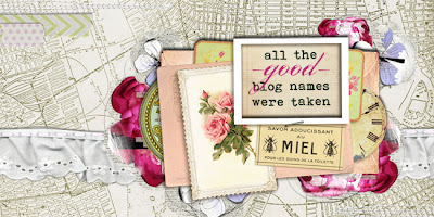
and about time, too, eh?! not that i didn't love my old blog banner, but i do like to change things up once a year or so, just
for the variety, and it's been a bit longer than that at this point! usually header-making is something i do on my laptop,
on long car trips, but i guess we just haven't been traveling as much with the move, etc?!
 |
| digital elements: city maps #1 (manhattan) and lace from collageables #4, both by katie pertiet, designer digitals; multimedia flowers #1 and artplay palette #4 stitching both by anna aspnes, o'scraps; ephemera clusters by juliana kneipp, design house digital; washi love tape pieces by robin meierotto, dhd; antique prints paper by jen allyson, dhd; chunky stitching from spudunkity kit by corina nielsen, funky playground design; fonts: bohemian typewriter, porcelain; software: pse9 |
anyway, thanks to a longish wait
at subaru yesterday, i was able to grab a few of my favorite recent acquisitions and knock this baby out!
i figure that the specifics of
digi-collage constitute one of those things you either already KNOW how to do, or don't really care about, so i'm going to limit
myself to image credits, but as with all the things
i make, i'm happy to share whatever minor insights i might have, and will gladly answer questions, if
i'm able. in general, my best digi tip is, if you're only going to learn ONE THING in photoshop,
it really ought to be layer styles; specifically the application and variation of the drop shadow. because there
is no quicker way to elevate a combination of varied elements, and also make them much more dimensional (and thus realistic-looking) than
by giving the impression of depth, and it's hard to beat shadows for that, in my opinion. so there. you
now know my best digital-collage-making secret! you're welcome, darlings! :) :) :)
eta thursday morning: sorry for the re-post, after seeing the header full-sized on the big monitor i went back and tweaked a few of the background flowers, added some stitching, etc; isn't it funny how things can look totally different, just depending on the format??


NICE! I haz no digital skillz. :(
ReplyDeleteLOVE
ReplyDeleteWow Wow Wow!!!!! I love this header ... clever Miss Lauren!
ReplyDeleteI also haz no digi skillz, but I greatly admire yours! This header is fabulous...just like the person who created it ;)
ReplyDeleteYour new header looks great. I have played with my photos in PS.. But thats it.. maybe I should broaden my horizons and play a little bit more..
ReplyDeleteHugs~
Lovely new look!!!! Thanks for the photoshop tips, ummmm.... I haven't learn how to use mine after 1, or maybe 2 years by now? : (
ReplyDeleteI love the new banner!! Its awesome. I need to fix mine badly. I've just been a bit lazy when it comes to that. You have to do it when the moment strikes right. Which sometimes can take years right? lol.
ReplyDelete