Saturday, July 30, 2011

butterfly masquerade

i am proud to say *I* found the inspiration piece for this month's pixie dust paperie group project! i bought a pack of six plain white cardstock butterfly masks at michaels, in the kids' crafts section, for about a dollar; i thought how fun they would be to "dress up" with pixie-style accoutrements, such as those in this month's MIDSUMMER NIGHT'S DREAM kit.

and i was right, see?!


i've used pink paislee's butterfly garden paper as my base; most of a pack of pebbles' felt roses (with copic-ed centers to match my color scheme!); some signature pixie crinkled ribbon... all from the july kit; everything else is a leftover from previous pixie kits: some pebbles' pearl flourish, a tim holtz trinket pink, etc.


i ♥LOVE♥ how this turned out, it is actually even better than the picture in my head when i was dreaming this project up!!! (dontcha LOVE IT when that happens??!)


hop on over to the pixie blog today to see more butterfly goodness, and then tomorrow the previews for the august kit begin!!! ♥♥♥

Friday, July 29, 2011

JB31: blue christmas

as soon as my dear friend june houck suggested "BLUE CHRISTMAS" as a jingle belles theme, i knew that in addition to the *official* brief of this week's prompt (to make a card that's predominantly blue) i wanted to try and work elvis into the equation, too. i've had this sheet of elvis stickers for ages. it's the sort of thing i tend to buy, without necessarily having a plan. afterall, someone went to the trouble of producing and selling an entire 6 x 12" sheet of elvis stickers!!! that alone is enough to make me smile broadly and fork over $2.00! :)

so i had my little elvis and a selection of blue scraps and i found this cool sheet music in a little vintage mini songbook... and i kind of stalled there for a bit. then i found a really old scrap of paper (dcwv, i think) with lots of whimsical little trees in every color, including blue. they were about the same size as elvis, so i thought they had possibilities, and i started cutting them out. (when i get "stuck" in the creative process i will often do some busy work like die-cutting, stitching or fussy-cutting, to stall for time until i figure out what to do next!) i decoratively punched and outlined the edges of my smaller blue scraps (still stuck!) ...and then finally i found the little sei tag. well, obviously the "who" was elvis, the "what" was blue christmas and the "where" was graceland... and SHAZAM... the whole card made sense! (to *ME*, anyway!!!) now you know what it's like inside my head when a card is bein' made. you're welcome. or sorry. whichever seems most appropriate! :) :) :)

(patterned paper: we r memory keepers, love elsie, dcwv, basic grey, creative imaginations, fancy pants + vintage sheet music; black cardstock: core'dinations; tag: sei; elvis sticker: paperhouse productions; inks: colorbox; pen: copic outliner; labels: dymo; adhesives: tombow monorunner, uhu gluestick, 3m foam tape)

i hope you'll "get the blues" with us... in a GOOD WAY... over at jingle belles this week! this prompt will be open until next wednesday evening, and we cannot wait to see what you will do!

in the meantime, rounding out "christmas in july" week, there's a pretty cool feature on the crafty steals blog today... just sayin'... :)

Thursday, July 28, 2011

crafty christmas sketch card!

have you noticed that there have been a lot of cool "christmas in july" features and promotions this year? being an avid ♥JINGLE BELLE♥ who makes holiday cards year 'round i cannot help but be happy about this! one of my favorite digi sites, designer digitals, has been having a .99 cent xmas item each day; and one of my favorite bargain sites, crafty steals, has been having a "christmas steal" every day for the last week, with some FABULOUS deals! (this was my fave so far!) i discovered that they have a cool blog, as well, and at the moment they're having a "grab bag" giveaway AND a sketch challenge with the twist that you need to incorporate some winter or holiday goodness. no problem!!! :)


it's a pretty great sketch, as well, dontcha think? you could take that thing pretty much ANYWHERE and be happy, i reckon. here's what i did:


(patterned paper: basic grey + vintage sheet music; cardstock: core'dinations; stickers: little yellow bicycle; florals: prima; gems: recollections; ink: colorbox; adhesives: uhu gluestick, tombow monorunner, sewing machine)


this was a quick card for me, and light on product! i found a pack of stickers i had not even opened yet, which had the banner pennants in it and the cool sticker with the presents. the latter was ONE rectangular item that i sliced up and re-mounted to fit the sketch. some vintage sheet music, a couple of layered mats, a little stitching et VOILA! another card for the ever-growing xmas stash!

if you've been playing along with us this year, i hope you'll drop in at JINGLE BELLES tomorrow when we'll have a brand new prompt. if you haven't made a christmas card yet, it's definitely NOT TOO LATE (still quite early, in fact!) to start and we'd love the opportunity to cheer you on! one of the best--and quite unexpected-- parts of this whole card-a-week adventure has been how many new friends stef and i have made, there's a really loyal gang of BELLES who've played along all year and not only do they impress and inspire *US* every week, they are completely supportive of EACH OTHER as well, which is so very cool to see! this whole thing is soooooo much more wonderful than i ever could have expected and i am very grateful to everyone concerned, especially miss stephanie, of course! without her, i would never ever have even considered doing this! ♥♥♥

plus... it's the end of july and already i have a stash of MORE THAN THIRTY unique and beautiful christmas cards that only need to be signed and mailed!!! woooooooooohoooooooooo!!! i'm telling you, you've GOTTA try this!!! :)

Wednesday, July 27, 2011

dangly birdcage card

believe it or not, i made this card over a month ago, before we'd lined up miss ros and her uber-clever "oh HOLE-y night" idea over at jingle belles, but how ♥COOL♥ is it that pixie-in-chief kirsty v just happened to schedule it to run on the last day of that xmassy prompt?! if you feel like making a quick christmas "window card" jump over to JB and post it before 6pm tonight! :)

in the meantime, here is today's pixie dust paperie project, it's an aperture card made with this month's kit, MIDSUMMER NIGHT'S DREAM! in this case, instead of placing something inside, and something else outside, i've dangled one of the awesome girls' paperie vintage whimsy birdcage charms that come in the kit from the little window:


i am utterly IN LOVE with those things, and as you can see, there is no shortage of gorgeous paper, stickers and ribbons to go with them, either; as always, everything is perfectly coordinated to make lovely projects a snap! drop by the PDP blog and do a bit of scrolling down to see what gorgeousness my fellow pixies have been creating all month, won't you?! ♥

Tuesday, July 26, 2011

hollyhocks... that might not meet ANY of these challenges!

i had so much fun stamping and water-coloring poppies last week, and then suddenly i remembered i had *another* silhouette type stamp that i might be able to use to similar effect. i thought i might just be able to whip up another entry for moxie fab world's "fanatical about botanical" challenge... but in the end, i'm not positive my card is botanical enough, so i will not be surprised or upset if i am disqualified.

i used the current color palette (#34) at CR84FN, it's quite gorgeous, don't you think? again, i'm not 100% sure my card qualifies because i've used a bit of green in addition to the main colors. it's kind of hard NOT TO have a few leaves on one's hollyhocks... :) ...but i do understand that it's important to stick to the terms of the challenge, so no biggie if the judges don't rule in my favor!


a challenge i KNOW i don't meet (& am thus not even submitting for) is twisted sketch #11 which is labelled specifically for layouts, whereas they have a separate card sketch each week. but it's still a fab sketch and was very helpful to me, so of course i want them to have credit! (i even worked a button into my design for the "twist" in their honor; and i LITERALLY twisted the sketch 90 degrees to the right!)


and now, finally, here's my card!


(patterned paper: creative imaginations, glitz design; flower diecut: glitz; burlap flowers: prima; button: tim holtz; stamps: prima, rubber stampede, SU; border punches: recollections, martha stewart, fiskars; beads: millhill; tulle: michaels; inks: ranger, colorbox, glimmer mist; adhesives: tombow monorunner, 3m foam tape, hot glue, sewing machine)


again i stamped with a custom mix of distress inks and glimmer mists, and then went back in with a brush, more colors of mist, ink and watercolor paints, and finally a bit of really fine sharpie pen as an outline. the centers are seed beads set into crystal lacquer with a bit more inking on top. and finally all of the panels are inked, aged, distressed and sewn on... because i was on a roll & got a little carried away. (& boy it was ♥FUN♥!!!)

hope you'll get to make the good kind of mess today and will be as happy with the result as i am with this! :)

Monday, July 25, 2011

beachy keen three-fer!

this week's theme at city crafter challenge blog (#66), set by my lovely and amazing friend cheryl nelson, is beach-related and rather wonderfully called it's a shore thing!

simultaneously, at sketchy thursdays, this week's (7-21) scheme is particularly awesome, and easily adapted to any number of cool ideas:


meanwhile, over at shopping our stash, week #9 is technique turn back. now, you know that despite the fine tutelage & generous efforts of my amazing friend marisol, i'm still pretty much of a technique-free zone... but for this challenge i've dusted off a couple of things i haven't done in a while: i threaded shells beads & pearls onto wire; i digitally embellished & "creatively cropped" (in slices--to fit heidi's sketch!) a photo; and i printed the photo in question on a transparency and mounted it onto a subtly text-printed patterned paper. are any of those "techniques"??! i dunno. but i had fun making this card, which is the main thing, right?! :)


(photo of the shoreline at la jolla beach, ca, taken by me in april 2011; software: photoshop; digital swirly frame: scrap-n-fonts; patterned paper: glitz design, pink paislee, fancy pants;cherish rub-on: basic grey; flowers, pearls, silver wire, purple beads: michaels; inks: ranger; other: 3m inkjet transparency, plastic netting, shells from a rummage sale necklace & vintage seam binding; adhesives: xyron, tombow, sewing machine, low temp hot glue gun)


lately i've been trying to devote saturday afternoons to some different challenges, just so i can keep fresh and get a little play time. it is fun to just kind of be free form without a real plan (except to try to fill the challenge!) and i am willing to potentially "waste" the time trying out fanciful ideas. if they don't work i'm happy to walk away empty handed, but generally it's been paying off. gotta love that, right?!


i hope you have time for some crafty experiments this week and that they are either fun, or successful... or maybe even BOTH, darlings! ♥♥♥

Saturday, July 23, 2011

pixie garden tray: the photos

my project today on the pixie dust paperie blog is a very cool (well i think it is, lol!) tim holtz printer's tray. i used this month's gorgeous MIDSUMMER NIGHT'S DREAM kit and a whole bunch of photos of my mother's garden to fill it up!


there are lots more pictures of the tray on the pixie blog, including detail shots of the papers & embellishments i used, and photos of the pull-out booklet that is housed in the middle section of the far right of the tray, and i hope you'll check them out! meanwhile, over here i thought i'd talk about the photos a little bit, and show how i formatted them to fit the spaces in the tray.


i measured each section of the tray, and made a grid in printshop (my favorite graphics program) which i used to size and crop the pictures. this way i could move things around until i had an arrangement i liked in terms of shapes, colors, etc. when i was happy with the proportions, i did a test print on plain paper, just to check that color and lighting were good. which is when i noticed the "problem": the photos were full of dark saturated colors, and almost all of the green shades were on the "blue side". whereas the tray and the pink paislee butterfly garden papers i planned to use were much more faded in tone, with greens very much on the "yellow side". it didn't *CLASH* exactly, but it wasn't ideal. this is exactly why i test print; things can look quite different on the screen!


i used photoshop to adjust the saturation downwards, and change the hue from blue to more yellow. you can see the difference in the two screen shots above, but actually, irl, it was even more dramatic. something else i did in the "cropping" process was change the orientation of a couple of pictures to fit better in the frame. for example this rose, which i wanted to use in the top left corner was not only "portrait" orientation, the flower was on the right hand side, and i thought in this case i'd like to reverse that. i did so using the "flip: horizontal" command in the rotate menu.


and now, since the spaces in the tray are quite small, i thought you might like to see the originals of some of the pictures. again you can see that most of them only needed the color adjustments i talked about above, but a few needed to be cropped quite a bit to fit their "slots"


i found that when working with the small "frames" in the tray (the smallest being only 1.5" square!) it was best to stick with bold closeups, and crop them quite tightly.

for the slightly larger spaces, mid-ground shots worked well, although you'll notice again that i did at least a little cropping to fit.


the biggest spaces in the tray were nearly full-sized standard photo sized, and thus could be filled with almost anything, because at that size you can "read" a lot more detail!


i saved the most general photos for the pull-out booklet, since i knew they'd get the most attention and the closest looks. that gave me ten more 3.5 x 5" vertically oriented spaces to fill, but trust me, i have *PLENTY* of great shots yet, and at some point i'd like to compile them in a project that's more comprehensive. maybe a minibook of some sort?

in the meantime, you can see the whole tray in greater detail over at the pixie blog, i hope you will enjoy it! ♥

Friday, July 22, 2011

JB30: oh HOLE-y night! :)

ok, you have to know i LOVE this ♥JINGLE BELLES♥ prompt, just from the name, right? oh how i wish it was me who came up with it, but alas, the credit goes to my very clever & very generous blogging friend ros crawford, who graciously agreed to be our lovely guest star this week. she didn't just come up with the best title of the whole year, though... nuh-uh... she's got an equally cool CONCEPT to go with it: this week we're making APERTURE (aka "window") CARDS! so they are literally HOLE-y!!! awesome!!! :)

here's mine:

(patterned paper: tim holtz, dcwv; stickers: k&co; rub-on & brads: making memories; florals & leaves: prima; ink: colorbox; dies: nestabilities; adhesives: tombow monorunner, uhu gluestick, 3m foam tape)


for this card i used nesties to both cut the aperture into the cardbase, and also to make a frame for the resulting window, out of contrasting paper. i'm sure neither of these things is a challenge to anybody else... but i think i came up with a couple of ideas to make it easier; specifically in terms of making the dies STAY WHERE YOU WANT THEM for long enough to make the right cuts! here they are:

to easily make the aperture in your card:

position nestie on card
where you want the window, with the cutting surface against the cardstock, and secure using "fuzzy tape" (that you've pulled on and off your t-shirt a few times, so it will still stick, but not rip the paper when you take it off.)

flip the card with attached nestie
so that cardstock is at the top of the "cutting sandwich" under your "b" plate (this is for a cuttlebug; make the sandwich your specific die-cutting machine prefers)

carefully remove the die
and reveal a perfectly placed aperture!!!

to make a frame for the above:

roll a tiny bit of dryline glue
(such as from a tombow mono runner) on to one edge of the back of the same nestie used for your card's window, and also the next size up; position them carefully--evenly spaced inside each other--face up on your c-bug's "c" plate

place paper on top of nested dies
and cut as usual... you will get one large shape (the size of the smaller die) and one frame

affix frame to aperture in card
with the adhesive of your choice... it'll be exactly the right size!!!
nice, huh?! :)

and now i hope you'll take these ideas... or some of your own... and make a HOLE-y card that you'll link up at JINGLE BELLES between now and next wednesday evening! cannot wait to see what you will make! ♥

Wednesday, July 20, 2011

flutter by this month's pixie challenge...

...for a shot at a lovely prize! just create a project of your choice (layout, card, journal page, altered item) and include a butterfly; then post it at the pixie blog before august 5th. EASY PEASY!!!*

another very cool current challenge in the blogosphere is moxie fab world's "fanatical about botanical" for which we're asked to depict *realistic* plants and flowers, but in an interesting or innovative graphic style.

i told you the other day that once i had broken out my new pti poppy stamps i just could not get enough of stamping them in watercolory custom-blended inks and mists... and then going back with a brush and some regular water colors, smooch spritz, and black stickles to give the flowers depth and a sense of dimension. i hope you like the effect because i think i am HOOKED! my favorite part is how you can use so many of the exact same items and get a completely different look!


i'd say this card is about two thirds pixie dust kit leftovers from various months (most of the papers, signature crinkly ribbon, and the mme brad) and one third other stuff (the vintage tickets and rub-on, plus the flowery paper strip). i also matted the layers and die-cut the butterfly out of my beloved glossy black ranger cardstock. i love the way it both anchors all of the elements and makes everything just seem to pop off the page.

so what are *YOU* going to make? can't wait to see, darlings! ♥

*lemon squeezy!!! :)

Tuesday, July 19, 2011

a different (weirder!) kind of travel book

i don't scrapbook, as such. i do make travel books, which mainly consist of souvenirs, brochures and photos collected from a vacation, punched & held together with a bookring. they have a sort of loose handwritten narrative that i work on each night whilst on the trip, mostly it's an outline of what we did each day, plus any funny stories i want to remember, or details i think would come in handy on a return trip. usually i make them myself from chipboard and patterned paper, and until now they have been finite, covering one trip-- from start to finish and then ending. this works for me, and i really enjoy both making and then owning those keepsakes.

but when it came to new york, i was kind of stumped. because, living in central new jersey, i'm lucky enough to spend a fair amount of time in the city, and i have an accumulation of cool things i've been collecting for years. ...but... we're talking about day trips, with maybe a few overnights; and the "documentation" is sketchy at best. and you can't make a travel book full of completely random, non-chronological and utterly unrelated junk!!

...ummmmmmmmmmm... who says??!?!

actually, the dictionary definition of a scrapbook is, "a blank book used for the mounting and preserving of pictures, clippings and mementos". DUDE!!! that's totally what i *HAVE*!!! :)

the other thing that's different about this book is that i built it around a ready-made volume. i got this beautiful desk calendar for like $1 at borders in march. i was going to use the abundance of gorgeous b&w new york photos in artwork or... something... but about a month ago it occurred to me that it would make an excellent home for the NYC stuff!


the problem was, sometimes i had loads of "stuff" (tickets, photos, postcards, museum badges, business cards, etc) but no photos. sometimes i had photos--but they're snaps i took b/c they looked cool and don't really relate to anything significant that we did. sometimes i just have stories and nothing at all to go with them.


then i had another problem: if i was using a ready-made book, i'd need to work chronologically, wouldn't i?! b/c i wouldn't be able to go back and add or subtract pages! any my stuff is SCATTERY to say the least! some is from 2 weeks ago, some from years gone by, and i don't necessarily know the dates of ANYTHING.


...but again... why does it have to be in a particular order? up until now everything has been in a couple of hanging files that i'd occasionally take out and flip through. and i still enjoyed taking it out and flipping through it! if i put it all in a book at least i wouldn't have to worry about dropping the file and having stuff go EVERYWHERE, right?! ;)

the more i thought about the idea of making everything into a book... however weird and non-traditional that book might turn out to be... the more excited i was about the idea. so i decided to just WING IT. and i did. and i looooooooooove what i came up with!


when i had things/photos that related to a particular day, i grouped them together and labelled them, and wrote as much or as little as i remembered from that outing. i deliberately spaced these throughout the book, leaving gaps in between, so that if more are found, they can go anywhere at all.

when i didn't have any kind of chronology, i worked thematically. for example, a few years back, my mom asked if i'd take her to see the the xmas spectacular at radio city music hall, which she remembered as a very special treat when she was a girl. that trip spawned other holiday adventures, and now we go every december, to check out the department store windows, have a nice lunch, do some shopping, etc. it's a day we both look forward to each year, and i have loads of stories, but honestly, i could not tell you what happened when, and i don't have many pictures.

whilst i was puzzling what to do, i found some cool radio city images in a guidebook. and some text about the rink at rockefeller center, and the department stores in a brochure. and i did a google image search and found some GORGEOUS photos! in the end the 4-5 pages i put together capture a WHOLE BUNCH memories, and look cool, too.

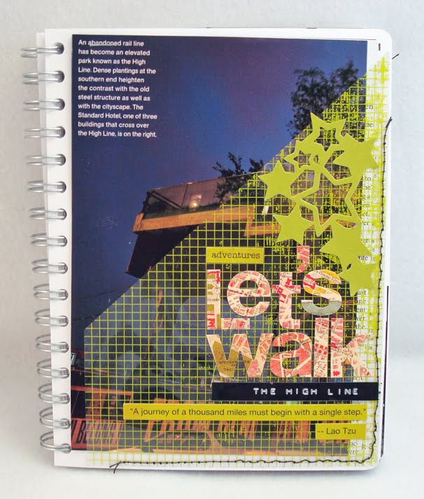
sometimes i have things that are too big to fit, but i want to save them, anyhow. like the "itinerary" i (ALREADY!) made for this year's xmas trip, with as yet un-visited venues i found while looking for the photos i used above. or the national geographic article my friend kim read, that made her want to go in to the city and walk the disused elevated railway through the meatpacking district, called the highline--one of new york's newest and most inventive city parks! (this turned out to be a WONDERFUL day, which i'll blog about it in more detail later!) in these cases i sewed transparent pockets into the book to hold my "treasures".


i had (& still have) plenty of photos-- either in a natural state or which i have altered--that i adore, but they just don't go with anything. which didn't stop me from wanting them in the book. i arranged a bunch into a grid for my title page (shown several shots above), and i made a "farewell" page at the end. i expect to fill in here and there with more of these shots. at the same time, i'm keeping in all of the beautiful b&w photographs by christopher bliss. afterall, they are what made me want the book in the first place.

i've also got things like old letterman "top ten lists", and a digi LO i made last year, and funny new york cartoons, newspaper clippings, etc. if i like it, and it's "new yorky" it's going in!!! :)

at the very end of this "preliminary session" i made the cover. i very nearly psyched myself out because suddenly, it really MATTERED to me that it should come out well. but by this point i was having soooooo much fun, i don't think i could've made something i didn't love, and i love this:


so what's my point in telling you all this, or i am just showing off?! well, yeah, i am a bit! ;) but also, i think there's maybe a bit of a moral here: sometimes, we make things harder than they need to be. sometimes, we get so fixated on problems that we don't stop and consider possibilities. and SOMETIMES if we just trust our instincts a little bit, forget what everyone else is doing, and work only to please ourselves, things turn out really, REALLY cool! ♥♥♥


ps: many thanks, yet again, to the ineffable bruce mau and his incomplete manifesto; especially point #3!!! (process *IS* more important than outcome!) (definitely!) :)